Audiology New Patient Landing Page Template
Calibrate is a sidebar companion landing page template built for audiology clinics that want to convert first-time visitors into booked appointments. It combines a Checklist and Audit creative direction with a Corporate Precision design system. Every section reduces patient anxiety step by step, from an award badge wall to a scroll-triggered readiness checklist, until booking feels like the natural next move.
by Rocket studio
Quick summary
Calibrate is a precision-built landing page template for audiologists who want to turn hesitant visitors into scheduled patients. A persistent sidebar checklist guides users through symptom recognition, appointment preparation, and insurance verification. The page earns each click by making the process feel structured, predictable, and clinically authoritative from the first scroll to the final form submission.
Who this template is for
This template is designed for healthcare professionals running audiology clinics, private practices, and hearing health services. It suits anyone who needs a high-converting, trust-first landing page that speaks directly to patients who are anxious about their first hearing assessment.
- Audiologists and hearing specialists at independent clinics and private practices who want a dedicated web page for new patient intake
- Healthcare providers at medical practices seeking a structured, lead-generating page that addresses patient hesitation
- Practice managers and marketing teams at audiology websites who want a landing page that works alongside other marketing materials and ad campaigns
What problem this template solves
Most potential patients delay booking a hearing assessment because the process feels unclear and the stakes feel personal. A generic practice website does not address that anxiety. This landing page template solves the problem by transforming uncertainty into a guided, step-by-step experience.
- Patients arrive with vague symptoms and leave with a completed form and a booked appointment, because the page walks them through each stage of the process
- The scroll-triggered checklist removes guesswork about what the first visit includes, addressing the critical information gap that stalls most first-time visitors
- The persistent sidebar keeps a clear call to action visible at all times, so users never have to search for the next step
What you get with this template
You get a fully structured, single-page layout built around a sidebar companion design. The template is ready to adapt for your audiology clinic with your credentials, availability windows, and insurance details already mapped to specific sections.
- A five-section landing page covering the award badge hero, symptom audit, appointment walkthrough, lead generation form, and patient outcome testimonials
- An interactive sidebar with a sticky "Check My Availability" call to action, a scroll-synced readiness checklist, and a secondary PDF lead capture path
- A complete design system using the Slate and Sky color palette, DM Sans for body text, and Fraunces for display headlines
Feature list
This landing page template includes a focused set of built-in components. Each one is designed to build trust and move potential patients toward booking.
Scroll-Triggered Readiness Checklist
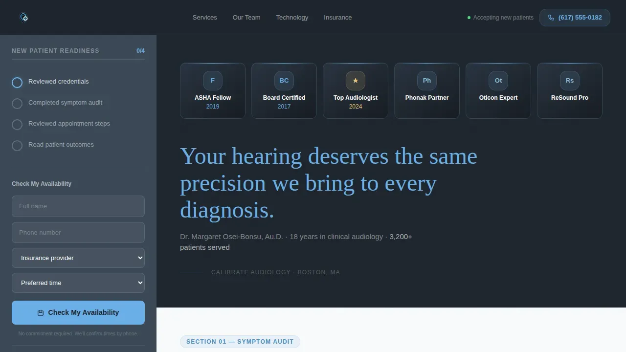
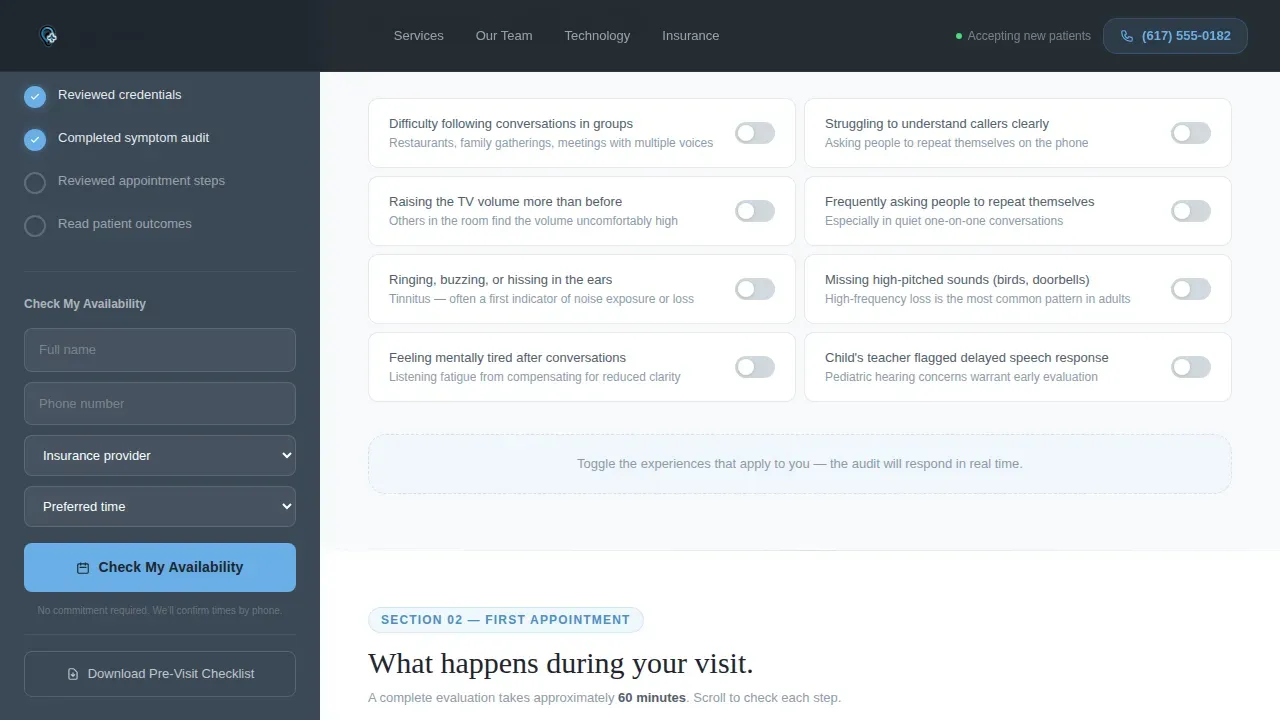
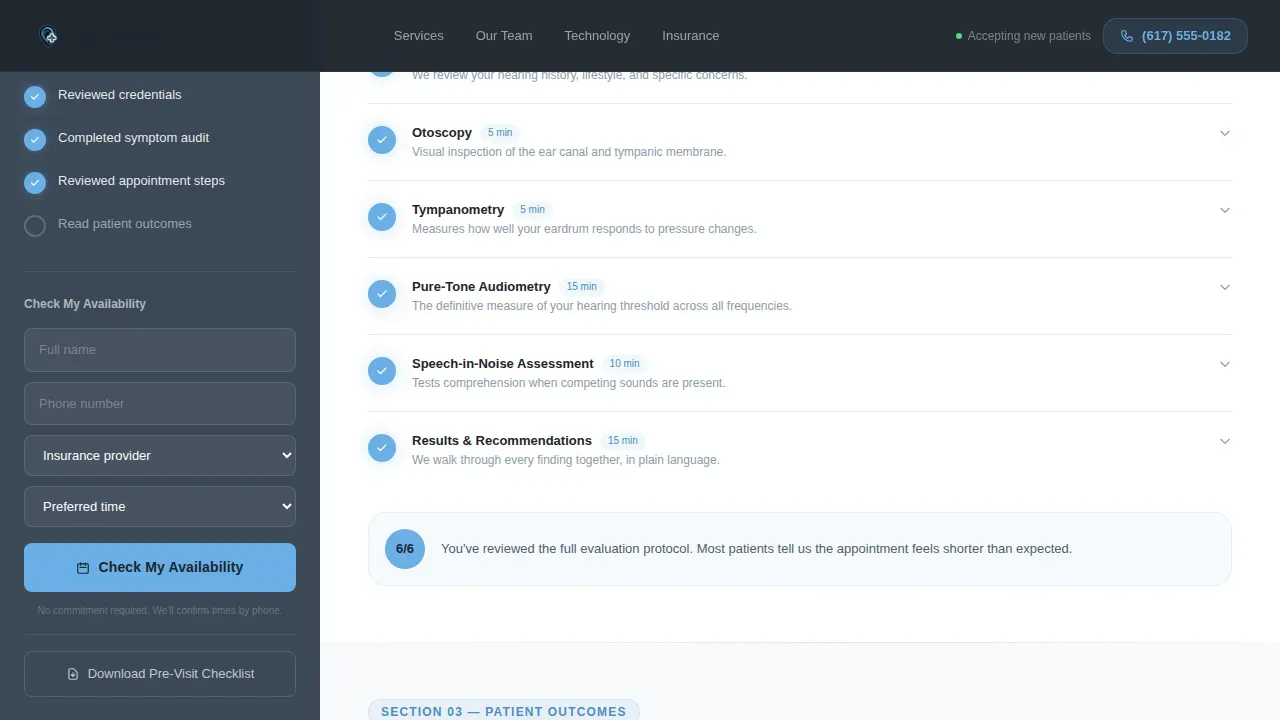
The persistent sidebar displays a "New Patient Readiness" checklist that checks itself automatically as visitors scroll. Section one covers symptom recognition with interactive toggles. Section two walks through each diagnostic step of the first appointment, including otoscopy, tympanometry, pure-tone testing, and speech-in-noise assessment. Each item checks off in sequence, so the visit feels familiar before it happens.
Award Badge Hero Wall
The header opens with a horizontal row of credential shields rendered against a charcoal background. Board certifications, regional recognition honors, and manufacturer partnership logos are displayed as metallic-edged badges. There is no lifestyle imagery. The badges function as the primary social proof, and each one is designed to be clickable with a link to its verification source.
Interactive Symptom Audit
The first content section presents a "Do you experience this?" toggle list. Visitors can self-identify with symptoms like difficulty hearing in groups, phone struggles, tinnitus, or frequently asking others to repeat themselves. This patient-centered approach qualifies the visitor as a genuine candidate for care before they reach the form, which improves the overall quality of leads the page generates.
Dual-Path Lead Generation Form
The primary path captures name, phone number, insurance provider via a dropdown that includes an "I'll check later" option, and preferred appointment window. The secondary path offers a downloadable pre-visit checklist PDF requiring only an email address. This dual structure means potential patients who are not ready to book still enter the practice's contact list.
Outcome-Specific Testimonials Section
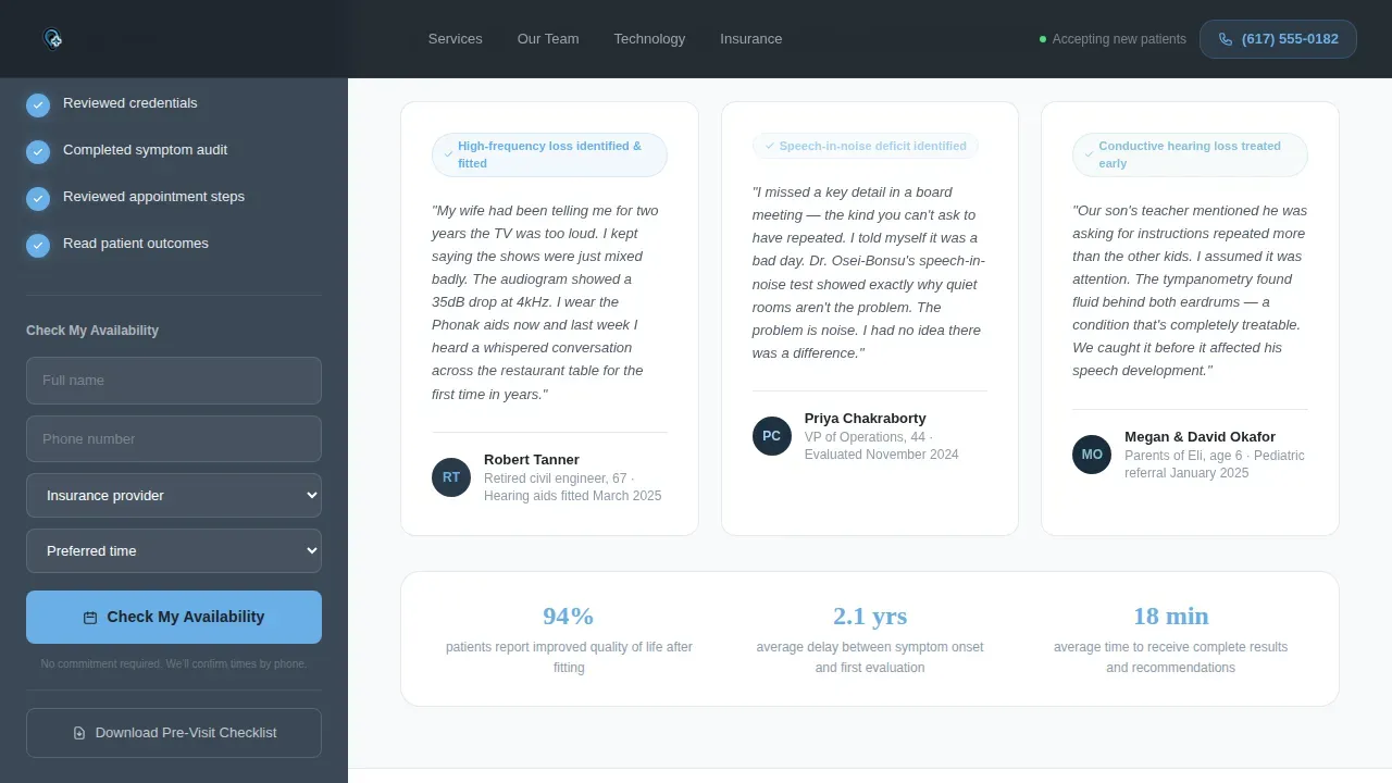
Three patient outcome testimonials are built into the page, each matched to a distinct visitor type: a retiree, a working professional, and a parent of a child with a hearing concern. Verified badges accompany each testimonial. This specificity helps visitors see themselves in the outcomes and build trust before they reach the booking form.
Clinical Precision Typography and Color System
The template uses DM Sans for all body and user interface text and Fraunces as the serif display typeface for headlines. Morning sky blue (#6AAFE6) appears exclusively on interactive and affirmative elements: completed checklist steps, call to action buttons, and verified badges. Deep clinical slate (#3B4856) anchors the sidebar and primary text, and sterile white (#F7F9FB) keeps content panels clean and easy to scan.
Page sections overview
| Section | Purpose |
|---|---|
| Award Badge Hero | Establishes clinical authority with credential shields and a precision headline |
| Symptom Audit Toggles | Helps visitors self-identify hearing concerns through interactive symptom toggles |
| Appointment Walkthrough Checklist | Demystifies the first visit with auto-checking diagnostic steps |
| Insurance and Booking Form | Captures lead details with availability preferences and insurance dropdown |
| Patient Outcome Testimonials | Reinforces trust with three specific, verified patient outcome stories |
| Linear Footer Row | Closes the page with minimal clinical contact and practice details |
Design & branding system
The design follows a Corporate Precision theme. Every visual decision earns its place. There is no decorative imagery and no warm filler. The palette feels like a well-organized medical chart: authoritative, still, and immediately trustworthy.
- Colors: deep clinical slate (#3B4856) for the sidebar and primary text, morning sky blue (#6AAFE6) for interactive and affirmative elements, sterile white (#F7F9FB) for content panels, and charcoal (#1E252D) for headers
- Typography: DM Sans handles all body copy and user interface elements for readability at every screen size; Fraunces handles display headlines with serif authority
- Sky blue is reserved exclusively for completed steps, verified badges, and call to action buttons, so it always reads as forward motion rather than decoration
Mobile & speed optimization
The template is desktop-first by design, with a sidebar layout that anchors the checklist and the action call to action alongside scrolling content. On smaller screen sizes, the layout stacks gracefully so mobile users retain access to every section without losing context.
- The sidebar converts to a stacked flow on mobile devices, keeping the booking form and readiness checklist accessible throughout the scroll
- High color contrast between slate backgrounds and white content panels supports readability at minimum 16-pixel font sizes across all device types
- Mobile optimization for the layout ensures that mobile users who arrive from ad campaigns or social media platforms land on a page that loads fast and functions cleanly on every screen size
How this template helps you convert
This landing page is built around one outcome: turning a hesitant visitor into a scheduled appointment. The page does not ask for trust upfront. It earns it section by section.
- The award badge wall establishes medical authority in the first three to five seconds, so visitors stay long enough to engage with the symptom audit and recognize their own experience in the toggle list
- The scroll-triggered checklist builds a sense of progress and familiarity, so that by the time visitors reach the lead generation form, the first appointment already feels like a known quantity rather than an unknown risk
- The dual-path form structure with a clear call to action on both the primary booking path and the PDF secondary path means the page captures value from visitors at every level of readiness, which improves conversion rates across the full range of web traffic
Other information about this template
This template is designed for medical organizations and healthcare organizations that want a landing page capable of functioning as both a primary booking tool and a supporting asset alongside other marketing materials. It works well as a dedicated web page linked from a practice website, search engines results, or social media platforms. Healthcare landing pages built with this structure give audiology websites a clear value proposition that supports lead generation and helps drive traffic from ad campaigns.
- The Calibrate Precision Audiology New Patient Landing Page Template is designed for audiologists and can be adapted by other clinics where a patient-centered approach to the first visit is a key practice differentiator
- Relevant keywords and essential information can be updated directly within each section to match your specific services, location, and insurance network, supporting data accuracy across the page
- The template suits private practices, independent audiology clinics, and healthcare professionals at larger medical practices who want a landing page that reflects the quality of their patient care
- Background information about hearing aid options, physician referrals, and diagnostic equipment can be added to the appointment walkthrough section without disrupting the overall layout
- Physicians, clinics, and other healthcare providers looking for a medical landing page that addresses the full new patient journey will find this template a practical starting point that can be customized without development experience
Theme
Corporate Precision
Creative direction
Checklist & Audit
Color system
Slate & Sky
Style
Sidebar Companion
Direction
Lead Generation
Page Sections
Scroll-triggered Readiness Checklist
Award Badge Hero Wall
Interactive Symptom Audit Toggles
Dual-path Lead Generation Form
Verified Patient Outcome Testimonials
Corporate Precision Design System
Related questions
Can this landing page template be used without coding experience?
What makes this landing page effective for potential patients nervous about their first visit?
Does the template include a secondary lead capture option for visitors not ready to book?
How does the template present hearing aid information within the page?
Is this landing page template suitable for both desktop and mobile users?



