Specialist Clinic Landing page Template
Calibrate is a comparison table landing page for an ADHD specialist clinic. It leads with an interactive ADHD Impact Score calculator, moves visitors through a before-and-after comparison table anchored by real patient quotes, and closes with a free downloadable guide and a screening call booking path. The design feels botanical, calm, and deeply human.
by Rocket studio
Quick summary
Calibrate is a single-page template built for an ADHD specialist clinic. It opens with a six-question interactive calculator, walks visitors through a human-voiced comparison table, and offers two clear next steps: a free PDF guide and a screening call. The tone is quiet confidence. The structure earns trust before it asks for anything.
Who this template is for
This template is designed for ADHD-focused clinics and mental health practices that want to connect with people who have gone undiagnosed or undertreated for years. It speaks directly to three groups who rarely feel seen by generic healthcare marketing.
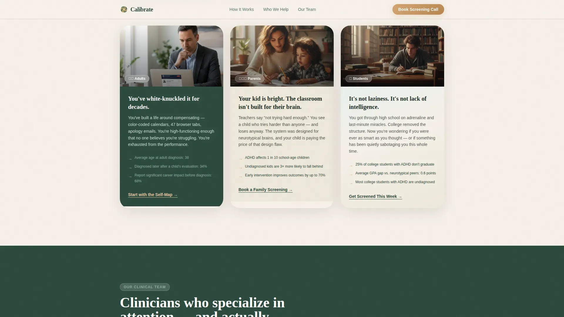
- Adults in their late twenties through mid-forties who have managed missed deadlines and unfinished tasks for years without a clear explanation
- Parents whose children are struggling in standard classroom settings and who are actively looking for specialist support
- College students who have failed semesters and are trying to understand whether attention difficulties are the cause
What problem this template solves
Most healthcare landing pages list services and credentials and then ask for a booking. That approach fails with an ADHD audience. People who suspect they have attention-related difficulties often feel shame, skepticism, or decision fatigue before they ever reach a contact form.
- The template addresses shame by leading with language that validates the visitor's experience before presenting any clinical information
- It addresses skepticism through a structured before-and-after comparison that shows what changes with proper care, supported by embedded patient voices
- It addresses decision fatigue by offering a lightweight first step, a free downloadable guide requiring only a first name and email, before asking for a booked appointment
What you get with this template
You get a fully structured, single-page layout built around the specific emotional and decision-making patterns of people seeking ADHD care. Every section has a defined purpose and a defined audience state.
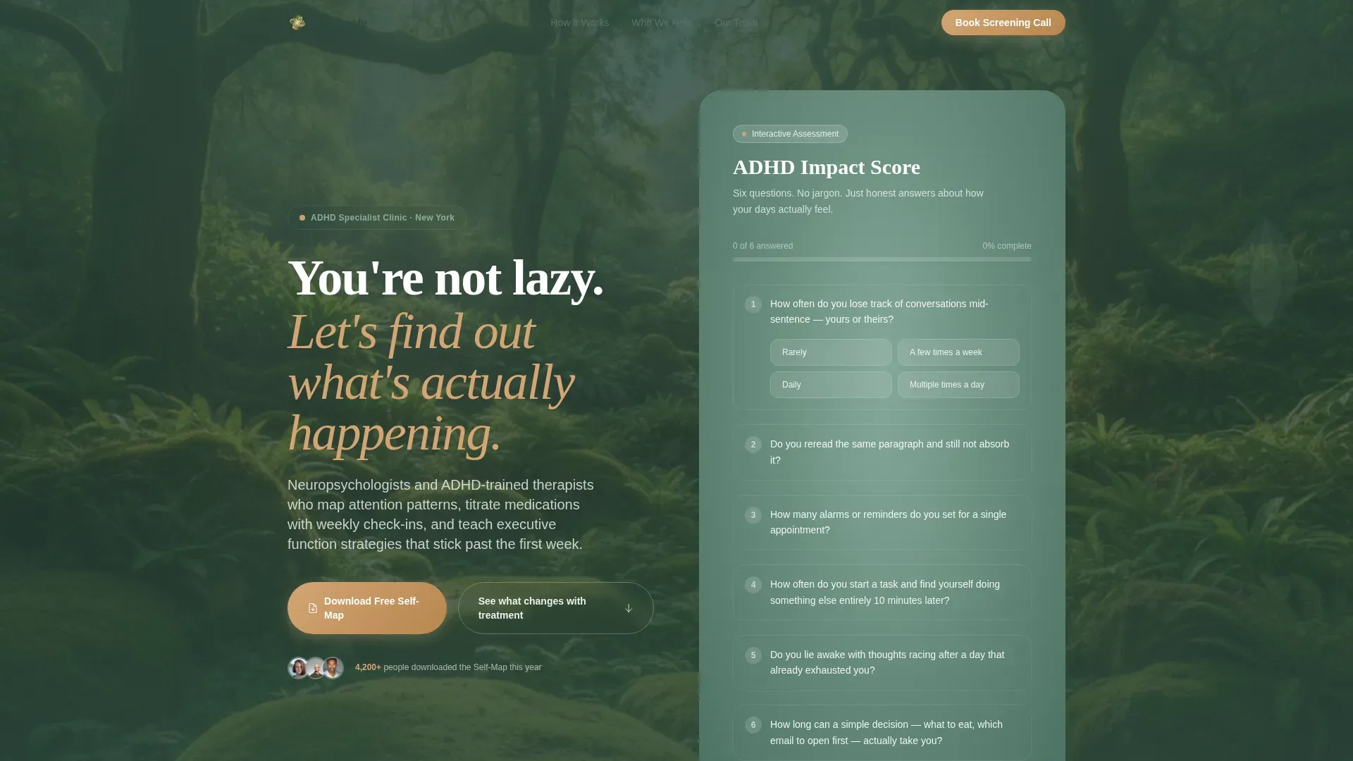
- An interactive ADHD Impact Score calculator that responds visually to each answer, giving visitors a personalized, non-diagnostic result
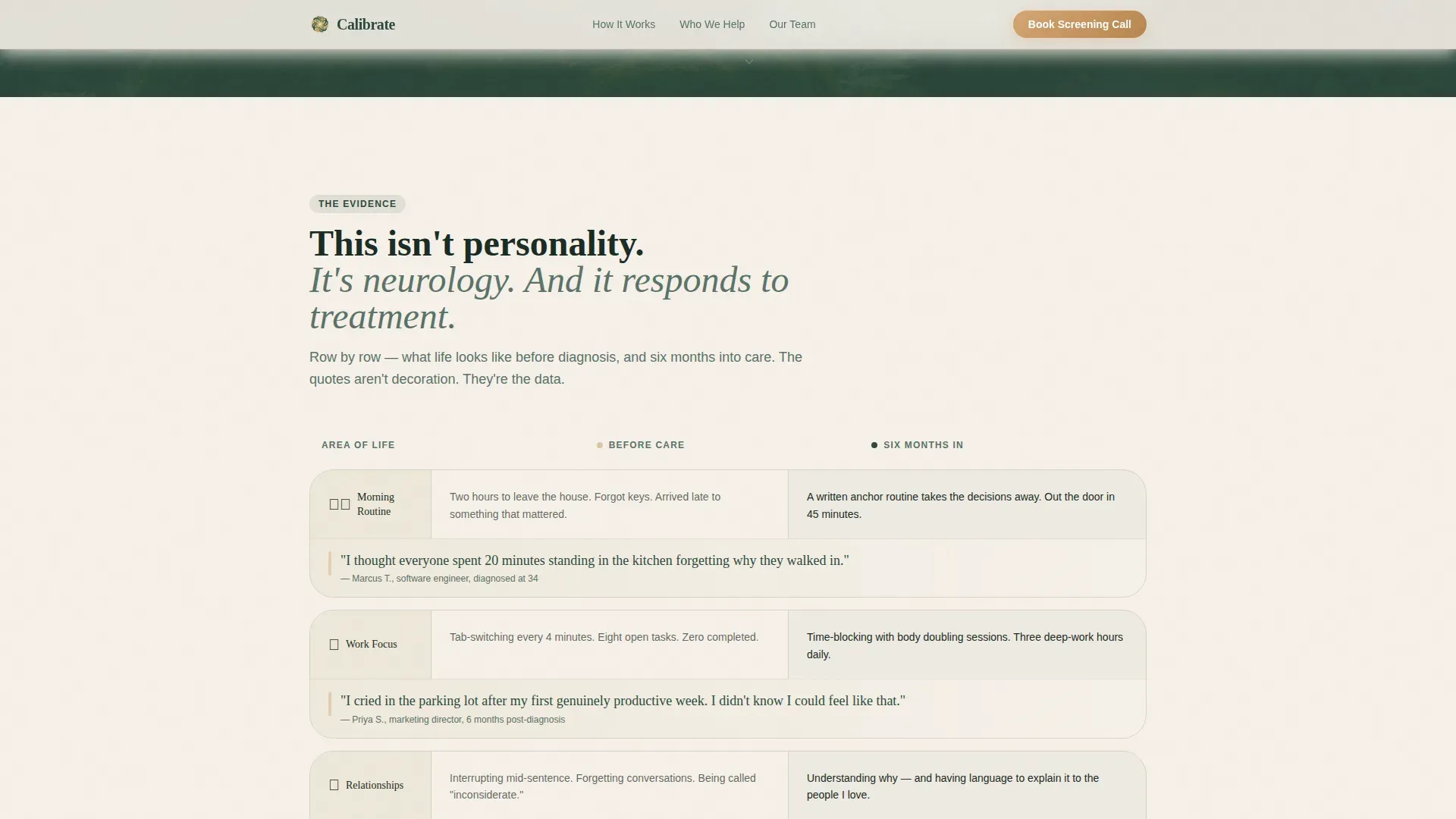
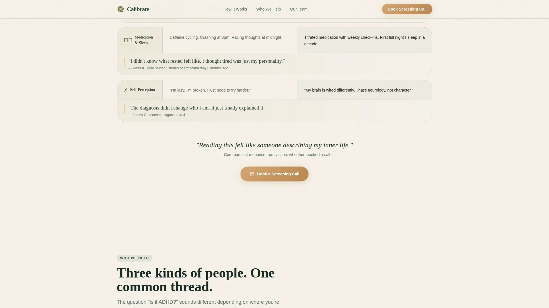
- A comparison table with embedded patient quotes that moves visitors from recognition to conviction row by row
- A dual call-to-action section offering both a free resource download and a secondary booking path, placed at the moment of highest readiness
Feature list
This section covers the core functional and design capabilities built into the template.
Interactive ADHD Impact Score Calculator
The header section contains a six-question tool. Visitors answer plainly worded questions about attention, focus, and daily disruption. Each response subtly shifts a radial gradient behind the score display. The result, such as "Your daily focus disruption: ~3.4 hours," is shown in clean type against a birch cream background. A clear disclaimer sits below the score to confirm the tool is not diagnostic.
Comparison Table with Embedded Testimonials
The core of the page is a structured before-and-after table. Each row compares a common ADHD experience labeled "Before Diagnosis" against its "Six Months In" counterpart. Embedded within each row is a real patient quote set in handwritten-style typography. The testimonials are not decorative sidebars. They are integral to the table layout, making the clinical comparison feel personal and specific.
Dual Call-to-Action Section
After the comparison table, the page presents two clear next steps. The primary call to action is an amber-styled button to download the Adult ADHD Self-Map, a free 12-page PDF guide covering symptom tracking, workplace accommodation templates, and a provider-question checklist. The form requests only a first name and email address. The secondary path offers a screening call booking option for visitors who are already past the research phase.
Who We Help Audience Portraits
A dedicated section presents three audience portraits: adults navigating professional life with undiagnosed attention difficulties, parents of children in neurotypical classroom environments, and college students questioning whether their struggles are structural. Each portrait is concise and written in language the reader will recognize from their own experience.
Clinical Team and Trust Signals
A section covers the clinic's professional approach: neuropsychologists, ADHD-trained therapists, medication titration with weekly check-ins, and executive function strategy sessions. Credential badges and session count indicators appear as social proof elements alongside the team presentation.
Soft Gradient Botanical Visual System
The entire page uses a Forest Trust color palette applied through moss-to-fern gradients across section backgrounds. Birch cream holds the primary reading space. Amber appears exclusively on interactive elements and call-to-action buttons. The gradient shifts respond to calculator interactions, making color part of the functional experience rather than decoration alone.
Page sections overview
| Section | Purpose |
|---|---|
| Hero + Calculator | Opens with the ADHD Impact Score tool and a validating headline |
| Comparison Table | Shows before-and-after rows with embedded patient quotes |
| Who We Help | Presents three audience portraits with direct, recognizable language |
| Clinical Team | Establishes credentials, methodology, and practitioner trust signals |
| Download + Booking | Delivers the free PDF offer and the secondary screening call path |
| Footer | Single-row linear layout with essential navigation and contact links |
Design & branding system
The visual identity follows a Soft Gradient theme built on a Forest Trust color system. Every color choice carries emotional weight: moss grounds the page, fern softens transitions, birch cream keeps reading comfortable, and amber signals the moments that require action.
- Color palette: deep moss (#2D4A3E) for primary structure, morning fern (#6B9080) for gradient transitions, birch bark cream (#F5F0E8) for content backgrounds, and gentle amber (#D4A574) reserved for interactive elements and call-to-action buttons
- Typography: Fraunces serif for headings to give warmth and a literary quality, DM Sans for body copy to keep reading fast and clean
- Gradient behavior: moss-to-fern gradients wash section backgrounds softly, and the hero gradient responds dynamically to calculator inputs
Mobile & speed optimization
This template is built mobile-first. The intended audience browses in fragmented attention windows, often on a phone, and the layout reflects that reality. Every section is designed to deliver its core message quickly and without requiring horizontal scrolling or dense reading.
- The calculator interaction is isolated as a client-side component so the rest of the page loads as static content, keeping the initial render fast
- Scroll reveals use staggered animation at a medium intensity, bringing content into view gradually without overwhelming a visitor who is already managing attention load
- The comparison table is structured to remain readable and scannable on small screens, with embedded quotes visible without expanding or tapping
How this template helps you convert
The page is designed to move a skeptical, distracted visitor from quiet recognition to confident action. It does this in a deliberate sequence rather than by presenting a list of features and a form.
- The calculator creates a personalized, visible result early in the visit, making the visitor's experience feel real and quantified before any clinical claim is made, which builds immediate relevance
- The comparison table accumulates emotional evidence row by row through patient voices, so by the time the download call to action appears, the visitor is not being sold to but rather handed something they already feel they need
- The low-friction form, first name and email only, removes the abandonment trigger that long intake forms create in this audience, keeping the conversion path open for people who would otherwise close the tab
Other information about this template
This template was built for the specific intersection of ADHD care, lead generation, and content-first conversion. A few additional details are worth noting for practices evaluating fit.
- The Adult ADHD Self-Map PDF concept includes three content areas: symptom tracking, workplace accommodation templates, and a provider-question checklist, giving the download real standalone value
- The footer uses a Pattern 1 linear single-row layout, keeping the bottom of the page clean and uncluttered
- The page is localized for English-language audiences in the United States, using USD pricing conventions and US date format where applicable
- Animation intensity is set to medium, with scroll reveals and a subtle floating effect, intentional choices for an audience that can be overstimulated by heavy motion
- The template supports the clinical messaging principle that ADHD is neurological and responds to treatment, which the comparison table structure reinforces through data and lived experience together
Theme
Soft Gradient
Creative direction
Testimonial Mosaic
Color system
Forest Trust
Style
Comparison Table
Direction
Content/Resource
Page Sections
ADHD Impact Score Calculator
Before-and-after Comparison Table
Dual Conversion Path Design
Audience Portrait Section
Clinical Team Presentation
Forest Trust Gradient Visual System
Related questions
Who is this landing page template designed for?
What makes the comparison table format effective for this audience?
What does the ADHD Impact Score calculator actually do?
What is included in the Adult ADHD Self-Map download?
Can this template support both a download offer and an appointment booking flow?



