Fitness Consulting Specialist Booking Website Template
Calibrate is a split-screen landing page template built for fitness strategy consultants who work with serious clients. It combines a bold typographic header, human-centered case study sections, and an embedded booking flow with a short pre-call intake form. The design follows an Ink and Paper palette that feels like a well-used training journal.
by Rocket studio
Quick summary
Calibrate is a single-page, split-screen landing page template for fitness strategy consultants. It uses a case-study storytelling format to build trust through real client outcomes. A fixed booking button and embedded calendar with a short intake form turn engaged visitors into warm, context-rich leads before the first call.
Who this template is for
This template is built for fitness consultants whose value lies in strategic thinking, not generic programming. If your clients come to you after other methods have failed, this page speaks directly to that story.
- Fitness strategy consultants working with high-demand clients such as founders, postpartum mothers, and competitive amateur athletes
- Coaches who want to replace a generic portfolio page with a story-driven, booking-ready landing page
- Independent professionals who need a polished page that filters serious leads from casual browsers
What problem this template solves
Most fitness consultants lose potential clients at the page level. Generic layouts list credentials and services, but they never demonstrate the depth of thinking that separates a strategist from a regular trainer. Visitors leave before they trust the offer.
- The template replaces feature lists with human proof points, showing outcomes instead of claiming them
- The intake form attached to the booking calendar pre-qualifies leads, so the consultant enters every call with context
- The split-screen structure keeps copy and imagery balanced, preventing the page from feeling like a wall of text or a photo gallery
What you get with this template
You get a fully structured, single-page layout designed specifically for a fitness strategy consulting practice. Every section serves a defined purpose, from the first headline to the final booking step.
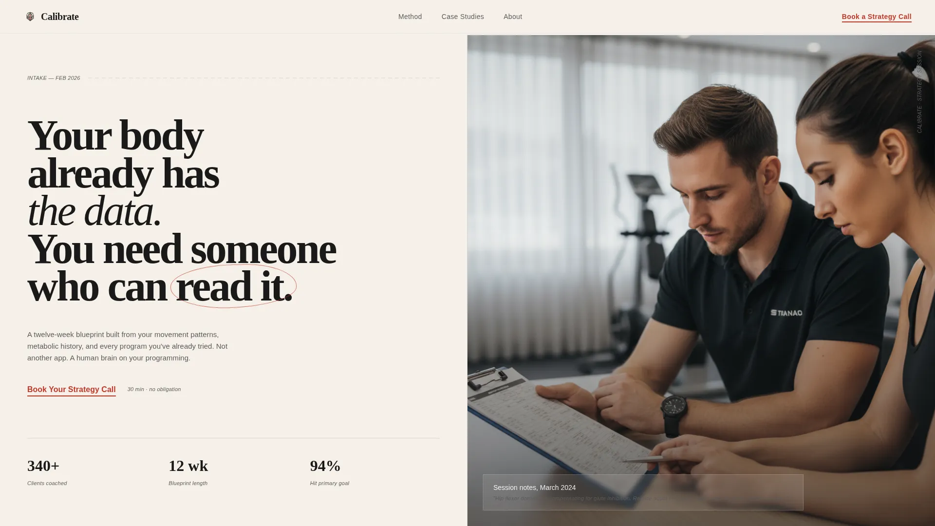
- A bold split-screen header with a 72-point serif typographic statement and space for a candid consultant portrait
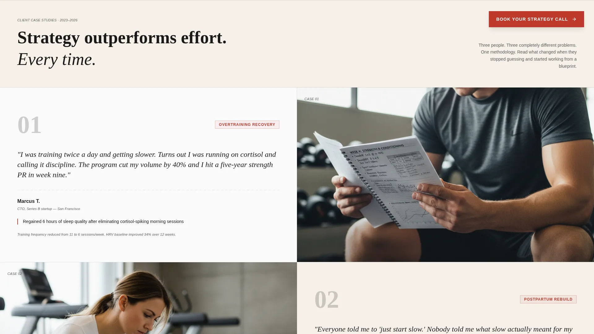
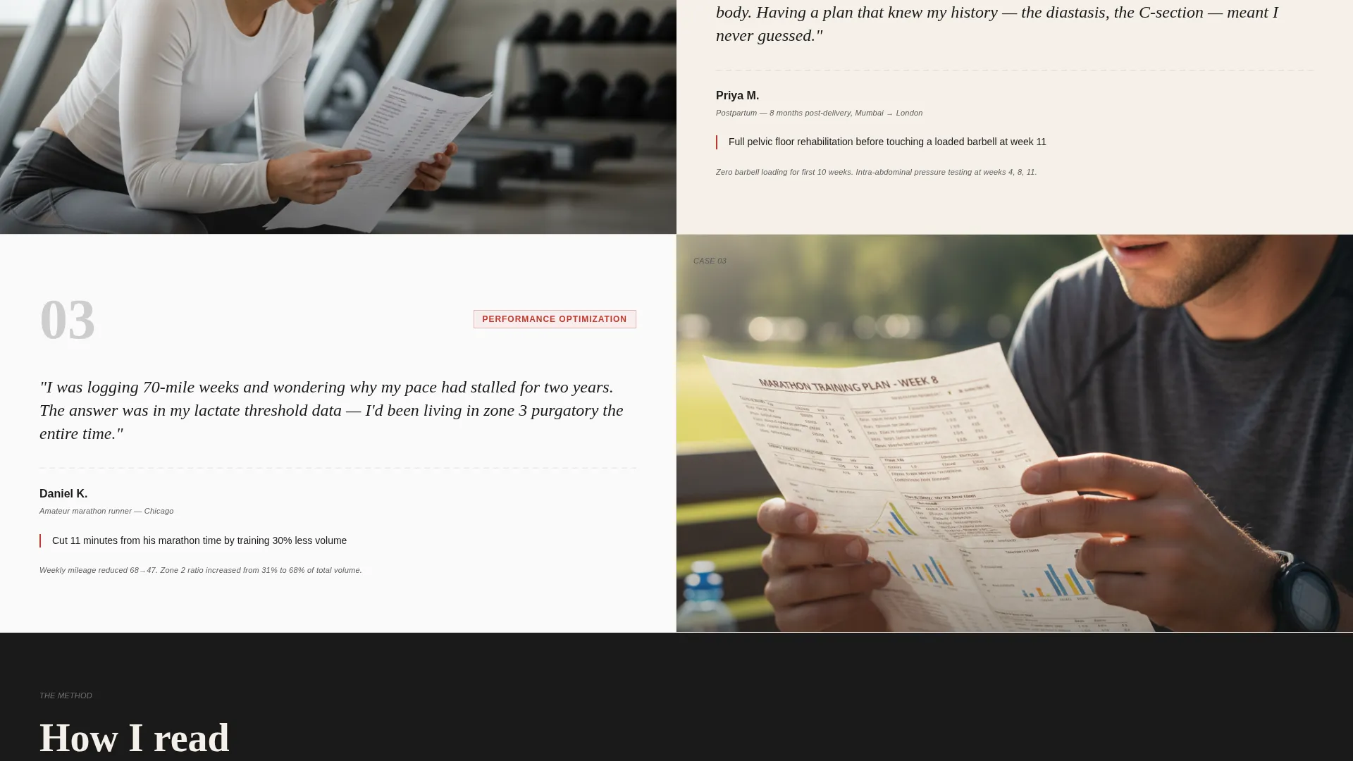
- A scrolling case study section featuring paired client stories and training images, structured to deepen trust with each scroll
- An embedded booking calendar with thirty-minute slots and a three-field pre-call intake form covering training frequency, primary goal, and prior attempts
Feature list
This section describes the core built-in components that make Calibrate work as a consulting landing page.
Split-Screen Header Layout
The header divides the viewport into two equal 50/50 panels. The left side holds a bold serif typographic statement at roughly 72 points. The right side is reserved for a candid, warmly lit consultant portrait. The composition immediately signals expertise without relying on stock imagery.
Red-Underlined Primary call to action
The call to action "Book Your Strategy Call" appears first as a red-underlined text link inside the header panel. It reappears as a fixed button after the second scroll section. The underline red is the only accent color on the page, making every call to action unmistakably visible against the parchment and white backgrounds.
Scrolling Case Study Sections
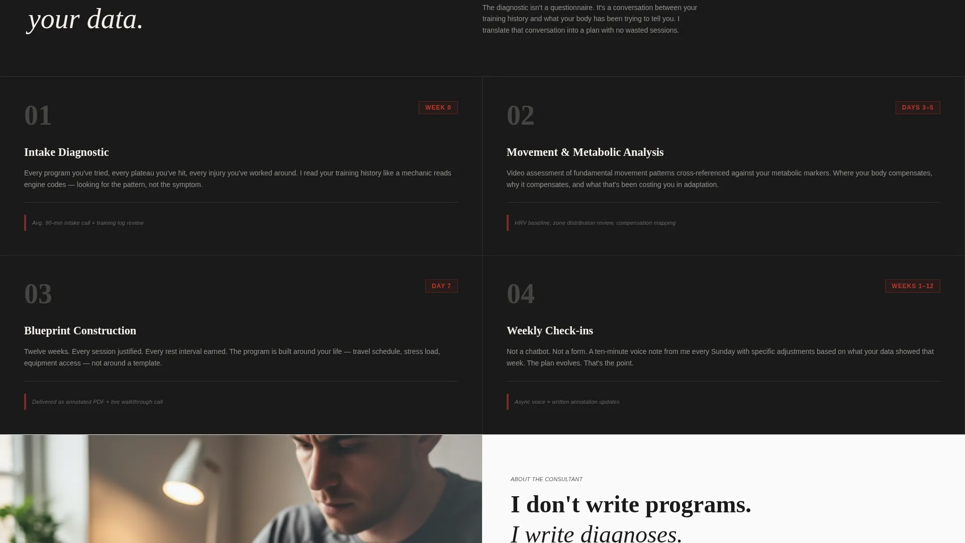
Each scroll section pairs a short client story written in the client's own voice with a corresponding image of that client mid-training or reviewing their program. Stories cover a burned-out tech lead, a marathon runner, and a postpartum mother. The format reads like a case-study journal rather than a testimonial carousel.
Embedded Booking Calendar
A calendar widget is built into the page and displays thirty-minute appointment slots. Visitors select a time after completing the three-field intake form. This sequence keeps the booking flow on-page and hands the consultant a warm, contextualized lead before any call begins.
Pre-Call Intake Form
Before a visitor can select a calendar slot, they complete three short fields: current training frequency, primary goal selected from a dropdown of fat loss, performance, rehabilitation, or general health, and a single open-text line asking what they have already tried. The form filters casual browsers and ensures every booked call starts with useful context.
Fixed Sticky Booking Button
After the visitor scrolls past the second content section, a fixed button remains visible at all times. It keeps the booking action accessible without interrupting the storytelling flow of the page.
Page sections overview
| Section | Purpose |
|---|---|
| Split-screen header | Establishes positioning with a bold typographic statement and consultant portrait |
| Red call to action link | Prompts immediate booking action from engaged first-time visitors |
| Client story one | Introduces the burned-out tech lead outcome to build early trust |
| Client story two | Presents the marathon runner case to demonstrate performance strategy |
| Client story three | Shares the postpartum mother story to broaden audience identification |
| Fixed booking button | Keeps the primary action visible after the second scroll section |
| Embedded calendar | Displays thirty-minute slots for the strategy call booking flow |
| Pre-call intake form | Captures training frequency, goal, and prior attempts before scheduling |
Design & branding system
The visual identity follows an Educational Guide theme with an Ink and Paper color system. Every design decision references the feeling of a well-worn training journal left open on a gym bench.
- Color palette: warm parchment (#F5F0E8), deep manuscript black (#1A1A1A), pencil-lead gray (#5C5C5C), and underline red (#C0392B) reserved exclusively for calls to action and key annotations
- Typography: bold serif headline at roughly 72 points for the header statement, with manuscript black for body copy and pencil-lead gray for secondary labels and margin notes
- Backgrounds alternate between parchment and soft white (#FAFAFA), creating a page rhythm that feels like turning the pages of a printed case-study journal
Mobile & speed optimization
The split-screen layout is structured to restack cleanly on smaller screens. Each panel becomes a full-width block in the mobile view, preserving the pairing of story and image without losing context.
- The fixed booking button remains accessible on mobile, sitting at a comfortable tap height without obscuring content
- Image slots are sized to avoid oversized file loads while maintaining the warmly lit, candid portrait aesthetic the template requires
- The intake form fields are touch-friendly, with a dropdown selector for the goal field that works naturally on both iOS and Android devices
How this template helps you convert
This template is engineered around one outcome: turning a skeptical visitor into a booked, pre-qualified strategy call. Every structural choice serves that goal.
- The case study scroll builds trust progressively. Each client story addresses a different audience segment, so most visitors find at least one story that mirrors their own situation before they reach the booking section.
- The pre-call intake form does double duty. It filters out visitors who are not ready to commit, and it gives the consultant a detailed picture of the lead before the call begins, making the first conversation far more productive.
Other information about this template
Calibrate is designed as a standalone landing page for fitness strategy consultants operating as independent professionals or small practices. It does not require a multi-page site structure to function.
- The template style is Split Screen (50/50), meaning the two-column format runs consistently through the header and all case study sections
- The creative direction is Team and People, so the visual emphasis throughout the page is on real human interactions rather than abstract graphics or equipment photography
- The booking direction is Booking and Scheduling, making the calendar and intake form the structural endpoint of the entire page flow
- The theme is Educational Guide, which means the copy and layout are designed to inform and build confidence rather than to hard-sell a service package
- This template is suited for consultants whose niche involves fitness strategy for demanding client profiles, including performance athletes and clients in recovery or rehabilitation contexts
Theme
Educational Guide
Creative direction
Team & People
Color system
Ink & Paper
Style
Split Screen (50/50)
Direction
Booking/Scheduling
Page Sections
Split-screen 50/50 Header Layout
Red-underlined Call to Action
Scrolling Case Study Sections
Embedded Booking Calendar
Pre-call Intake Form
Fixed Sticky Booking Button
Related questions
Can I replace the client story content with my own cases?
Does the booking calendar connect to a real scheduling tool?
Is the intake form customizable?
Who is the ideal consultant for this template?
Can I use this template without a full website?



