Clinical Research & Trial Professional Website Template
Calibrate is a split-screen landing page template built for medical device trial facilities. It pairs a metrics-driven stats wall with a checklist-audit scroll experience that walks visitors through biocompatibility, hemodynamic performance, and fatigue testing. The layout is designed to convert regulatory affairs professionals and biomedical startup teams into facility clients before they ever reach the form.
by Rocket studio
Quick summary
Calibrate is a single-page landing page template for a 40,000-square-foot medical device testing facility. It uses a split-screen (50/50) layout to pair regulatory requirements with facility capabilities, section by section. The visual identity is clinical yet warm, and every scroll step is designed to build quiet confidence in a technically demanding audience.
Who this template is for
This template is built for medical device testing facilities that need to speak directly to a B2B audience with high regulatory stakes. It suits teams presenting ISO 13485-compliant environments to clients who cannot build them in-house.
- Biomedical startups with regulatory affairs leads racing Food and Drug Administration (FDA) 510(k) submission deadlines
- Multinational device companies needing independent bench testing for regulatory clearances
- Contract research organizations presenting accredited facility capabilities to prospective clients
What problem this template solves
Regulatory affairs professionals do not convert on generic marketing pages. They need to see specific credentials, exact protocol references, and proof of capability before they make contact. Most facility websites bury that information or present it without structure.
- Visitors cannot quickly match their testing needs to a facility's actual accreditations and equipment
- Vague claims about "compliance" fail to reassure teams already deep in a pre-submission process
- There is no clear path from passive reading to a meaningful next step like a gap analysis or a resource download
What you get with this template
You get a fully structured, single-page layout that walks visitors through a simulated pre-submission audit, one checklist section at a time. Every panel is purpose-built for a technically literate audience that values precision over style.
- A hero split-screen with an oversized metrics wall on the left and a macro video panel on the right
- Three checklist audit sections covering biocompatibility, hemodynamic performance, and fatigue and durability testing
- A content hub section with a primary resource download form and a mid-page gap analysis call to action
Feature list
This section covers the core functional and design capabilities built into the Calibrate template.
Split-Screen Stats Wall Hero
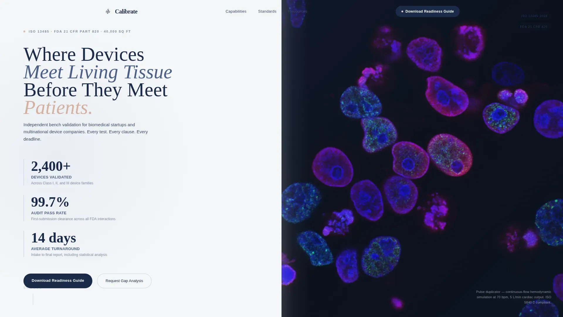
The hero section divides the viewport 50/50. The left panel displays three oversized metrics in deep compliance navy against fog white: 2,400+ devices validated, 99.7% audit pass rate, and a 14-day average turnaround from intake to final report. The right panel is reserved for a slow looping macro video of a mechanical heart valve operating inside a pulse duplicator.
Checklist Audit Scroll Sections
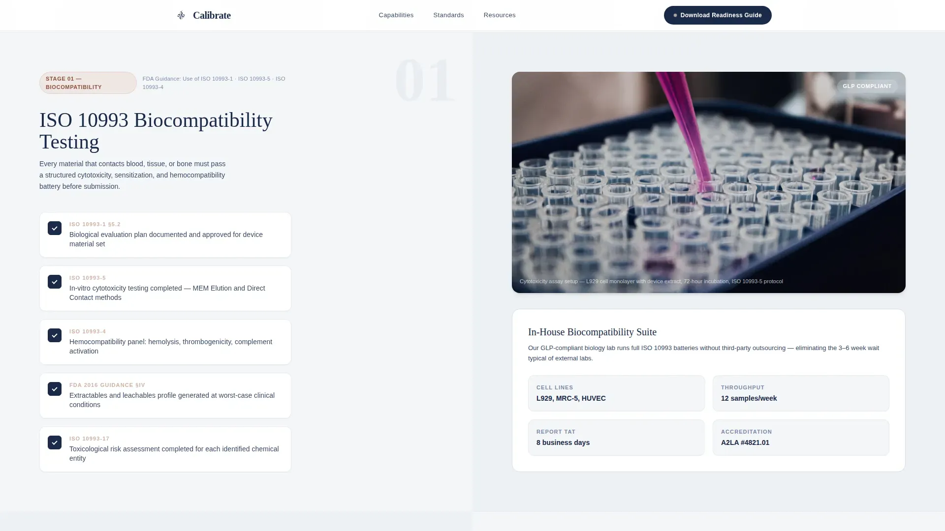
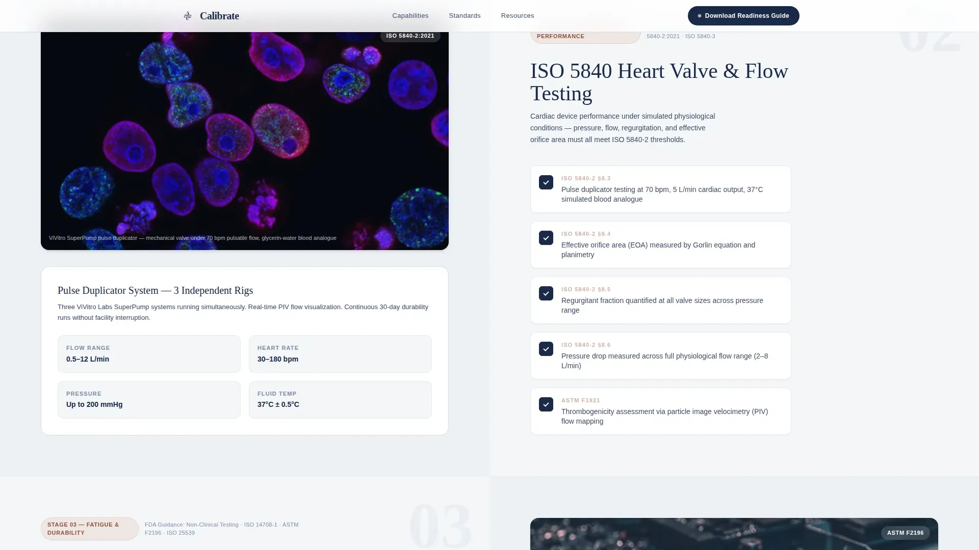
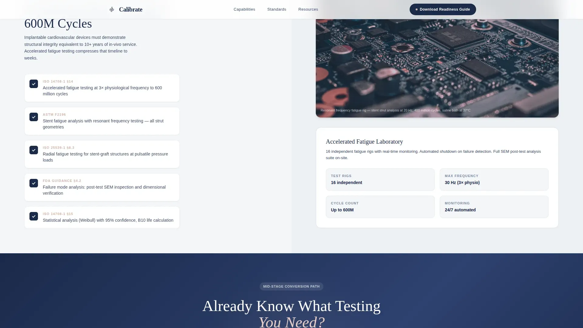
Three sequential sections each present one stage of the validation pipeline as a split-screen pair. The left side renders the regulatory requirement as a clean checklist with toggle-style checkmarks, including FDA guidance references and ISO clause numbers. The right side shows the corresponding facility capability, whether that is equipment specifications, accreditation badges, or a short ambient clip of the test being performed.
Validation Readiness Guide Download Form
The primary call to action is a resource download form that appears after three checklist sections have already demonstrated facility expertise. The form collects company name, device classification via a Class I, II, or III dropdown, and a work email address, in that order.
Mid-Page Gap Analysis call to action
A secondary conversion path sits at mid-page for visitors who already know what testing they need. The "Request a Gap Analysis" prompt gives technically prepared teams a direct route to engagement without requiring them to complete the full resource download form.
GSAP ScrollTrigger Animations
The template uses GSAP ScrollTrigger for staggered checklist reveals and parallax panel transitions as the visitor scrolls. Each checklist item appears in sequence, reinforcing the feeling of walking through a live pre-submission audit where every question already has an answer beside it.
Organic Flow Typography and Color System
Headlines are set in Fraunces, a serif typeface that carries precision without feeling cold. Body copy and interface text use DM Sans for clarity at small sizes. The four-color palette, fog white, surgical-glove lavender, living-tissue blush, and deep compliance navy, creates a visual field that feels both sterile and quietly biological.
Page sections overview
| Section | Purpose |
|---|---|
| Hero Stats Wall | Display three core facility metrics alongside a looping valve video |
| Biocompatibility Checklist | Pair ISO 10993 and FDA guidance requirements with facility capability |
| Hemodynamic Performance Checklist | Map ISO 5840 protocol requirements to equipment and test footage |
| Fatigue and Durability Checklist | Align ISO 14708 clauses with facility accreditation and specs |
| Validation Guide Download | Capture leads via a three-field resource download form |
| Gap Analysis call to action | Provide a direct contact path for teams with defined testing needs |
| Footer | Single-row linear footer with essential navigation and contact links |
Design & branding system
The visual identity follows an Organic Flow theme that balances clinical precision with biological warmth. The palette is called Soft Mist, and it reads like morning condensation on a laboratory window: soft, translucent, and purposeful.
- Four core colors: fog white (#F4F6F8), surgical-glove lavender (#D6DCEA), living-tissue blush (#E8CFC4), and deep compliance navy (#1B2A4A)
- Typography pairing: Fraunces serif for headlines, DM Sans for body and user interface elements
- No stock photography; visual content is device-first, featuring only the equipment and the process
Mobile & speed optimization
The template is designed desktop-first, reflecting the working environment of regulatory affairs professionals who review vendor materials on large screens during pre-submission preparation. The layout and animation system are built with that primary context in mind.
- Server components handle static content for reliable rendering; client components manage animations and interactive elements
- GSAP ScrollTrigger animations and parallax panels are scoped to client-side rendering to keep static content fast
- Toggle checkmarks and form validation are handled client-side without blocking the initial page load
How this template helps you convert
The conversion architecture is built around a principle of earned trust. Visitors do not see a form until the page has already demonstrated expertise across three distinct regulatory domains.
- The metrics wall in the hero section establishes immediate credibility with specific, verifiable numbers before any scroll occurs.
- Each checklist audit section adds a layer of regulatory fluency, so by the time the download form appears, visitors feel they are continuing a conversation rather than starting one.
- The mid-page gap analysis call to action captures technically ready visitors who do not need the guide but are ready to engage directly, ensuring no high-intent visit goes unconverted.
Other information about this template
This template is part of a Health and Medical category build, specifically matched to the Clinical Research and Trial subcategory and the Medical Device Trial Facility niche. It was designed for a 40,000-square-foot facility context and carries a high intersection match score for its category alignment.
- The creative direction is Checklist and Audit, a format that mirrors the actual pre-submission review process familiar to regulatory affairs teams
- The header concept is a Stats and Metrics wall, chosen because quantified proof outperforms descriptive claims for this audience
- The landing page direction is Content and Resource, anchored to a downloadable Validation Readiness Guide as the primary conversion asset
- The template style is Split Screen (50/50), applied consistently from the hero through each pipeline audit section
- Animation complexity is set to high, using GSAP ScrollTrigger with staggered reveals and parallax panels throughout the scroll journey
- Interactivity is set to medium, covering toggle checkmarks, form field validation, and scroll-triggered navigation effects
Theme
Organic Flow
Creative direction
Checklist & Audit
Color system
Soft Mist
Style
Split Screen (50/50)
Direction
Content/Resource
Page Sections
Split-screen Hero with Metrics Wall
Checklist Audit Scroll Experience
Validation Readiness Guide Download Form
Mid-page Gap Analysis Call to Action
GSAP Scrolltrigger Animation System
Organic Flow Visual Identity
Related questions
What types of facility businesses does this template suit best?
Can I adapt the checklist sections for different testing protocols?
How does the two-step conversion path work?
Is this template designed for desktop or mobile users?
What makes this landing page different from a standard services page?



