Endodontist Complete Booking Website Template
A single-page landing template built for endodontic practices that want to convert anxious patients into booked appointments. It combines a bold Stacked Type Tower hero, a side-by-side comparison table, a scroll-driven tooth cross-section reveal, and a five-question diagnostic quiz that routes visitors to the right appointment pathway automatically.
by Rocket studio
Quick summary
This template is a single-page, conversion-focused landing page for an endodontist practice. It leads anxious visitors through a calm, structured journey from fear to decision. The page uses a comparison table, an animated tooth cross-section reveal, and a five-step diagnostic quiz to answer every patient concern before they ever pick up the phone.
Who this template is for
This template is designed for endodontic specialists who want a dedicated appointment booking page that works for multiple visitor types at once.
- Anxious patients holding a referral they do not fully understand and looking for reassurance before booking
- General dentists and dental practices sending complex retreatment cases to a trusted specialist
- Parents seeking same-day clarity after a teenager experiences acute dental trauma
What problem this template solves
Many patients arrive at a dental specialist's page still carrying the weight of a confusing or alarming diagnosis. They need answers, not more forms. This template replaces generic booking pages with a guided experience that addresses fear directly.
- Patients leave other pages without booking because their core questions go unanswered
- Misdiagnosis anxiety stalls decisions, patients are told conflicting things and freeze
- There is no clear triage path to distinguish a same-day emergency from a standard consultation
What you get with this template
The template delivers a complete single-page layout with five distinct content sections and a quiz engine, all wired together in a logical scroll sequence.
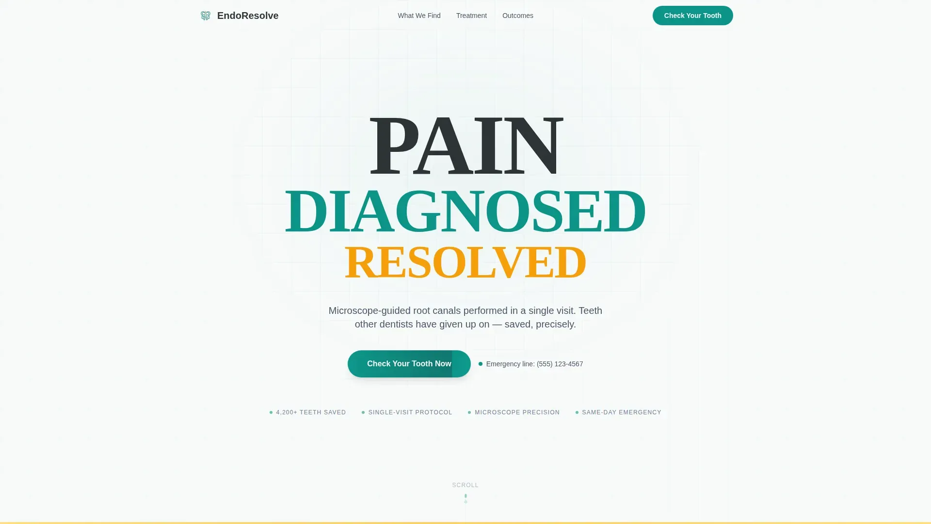
- A hero section with a Stacked Type Tower (PAIN, DIAGNOSED, RESOLVED) and a "Check Your Tooth Now" call to action
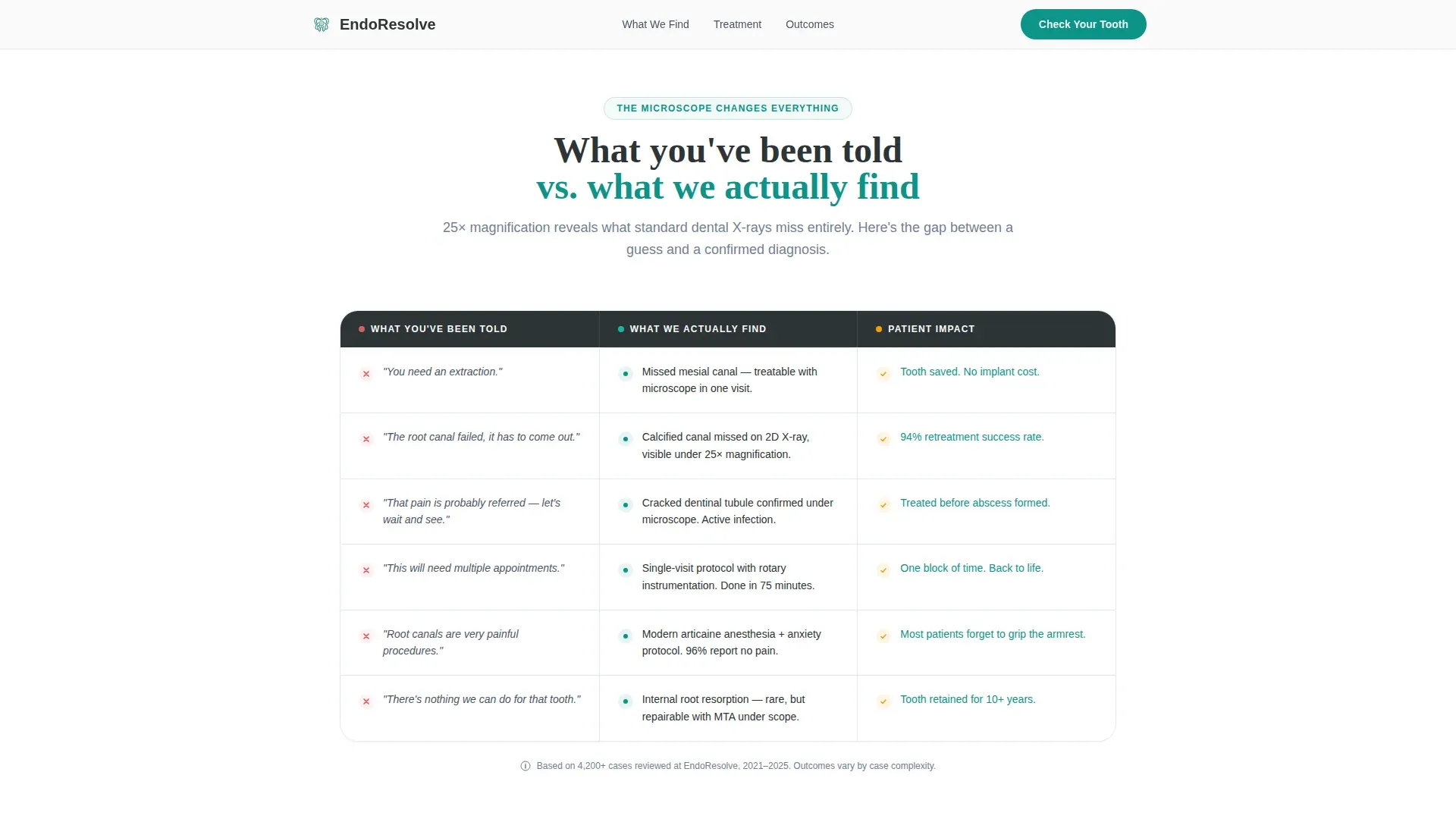
- A comparison table contrasting common patient-reported diagnoses against microscope-confirmed clinical realities
- A five-question diagnostic screener that routes visitors to one of three appointment pathways
Feature list
This template ships with six purpose-built features drawn directly from the brief.
Stacked Type Tower Hero
The hero uses oversized Fraunces display type arranged in a descending staircase: PAIN in heavy charcoal, DIAGNOSED in surgical teal, and RESOLVED in warm amber. No imagery is used. The negative space around the type stack is pure sterilized white, letting each word land with clinical confidence.
Misdiagnosis Comparison Table
A two-column table places "What you've been told" against "What we actually find." Rows pair common misdiagnoses with microscope-confirmed realities, using staggered scroll-triggered row animations to pace the reveal and keep visitors reading.
Animated Tooth Cross-Section Arc
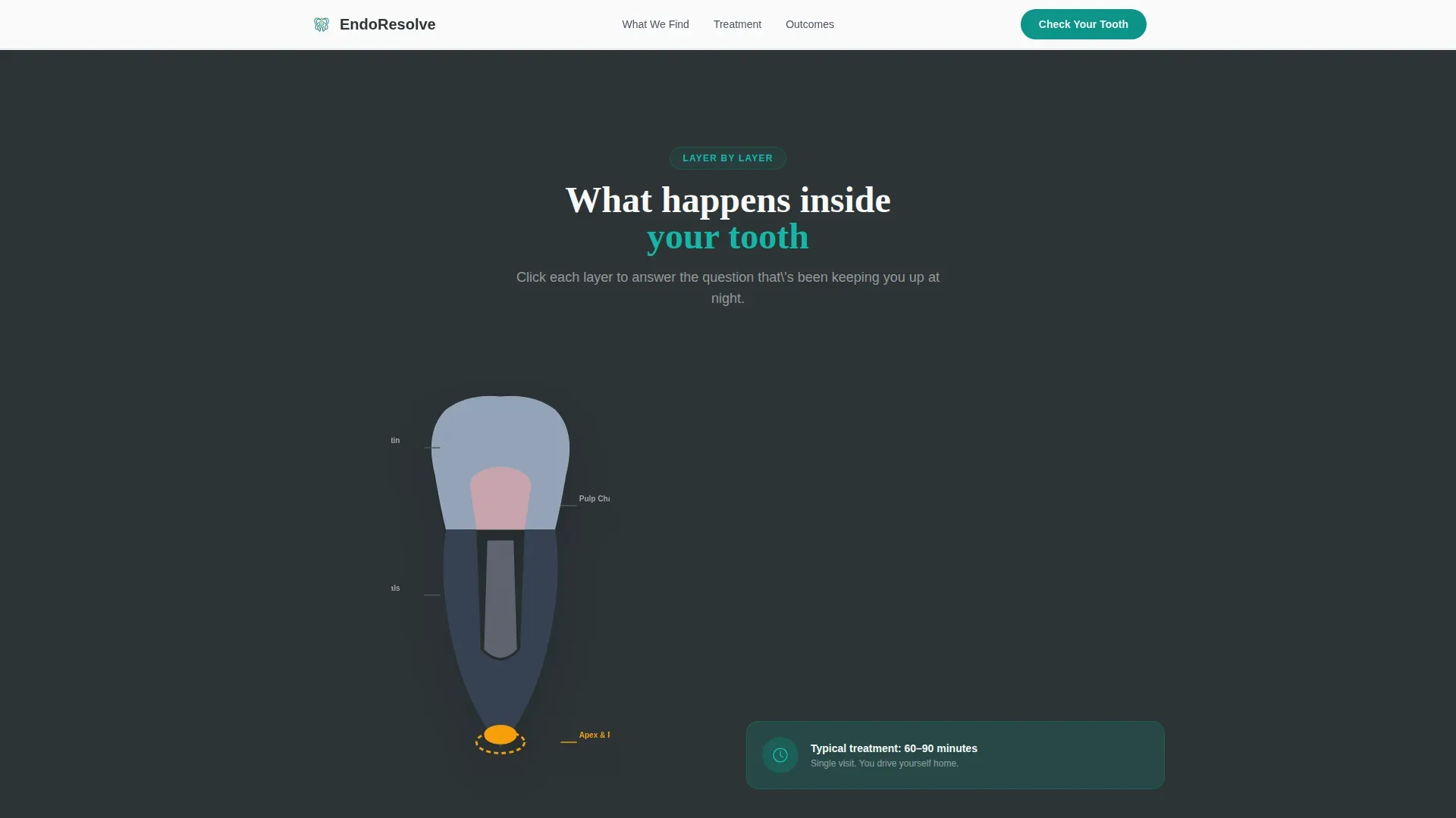
A scroll-driven illustration reveals a tooth layer by layer during a root canal procedure. Each scroll section resolves one specific patient anxiety in sequence: Will it hurt? How long will it take? Will I lose the tooth? The arc ends with the patient having no unanswered questions remaining.
Five-Question Diagnostic Quiz
A multi-step quiz launches from the primary call to action. It asks which tooth hurts via a clickable jaw diagram, the pain type (sharp, throbbing, or pressure), pain duration, whether the patient has a referral, and their insurance carrier. Results route to one of three pathways: emergency same-day, standard consultation, or second-opinion retreatment.
Three-Pathway Appointment Picker
Each quiz result connects directly to a specific appointment slot picker matched to that care pathway. Emergency, standard, and retreatment cases all land on a booking flow built for their situation, not a generic calendar.
Patient Outcome Cards
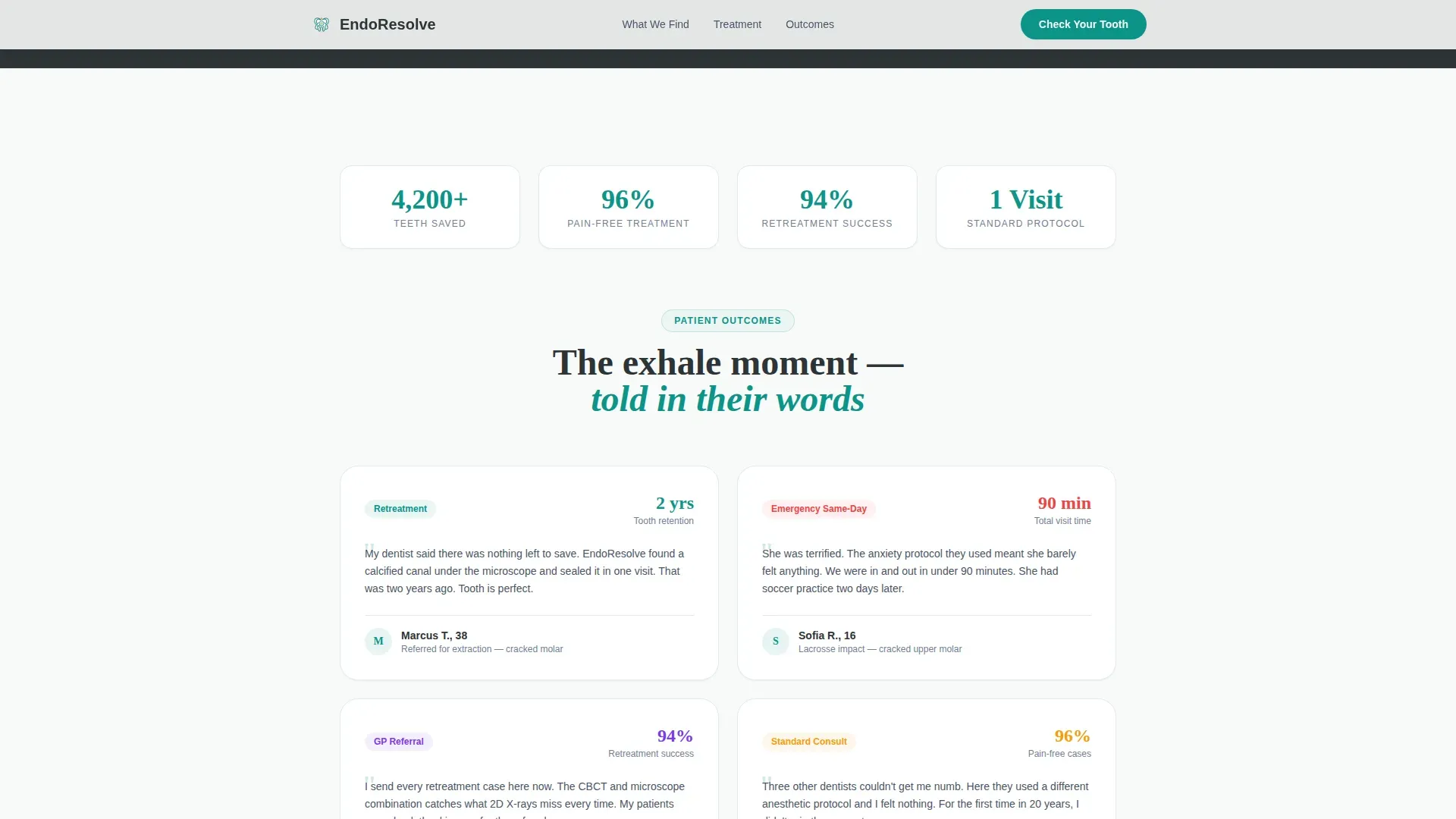
A social proof section displays outcome cards built around specific results rather than generic testimonials. Each card ties a named patient story to a measurable outcome, reinforcing trust before the visitor commits to booking.
Page sections overview
| Section | Purpose |
|---|---|
| Hero Type Tower | Deliver the practice's core promise instantly through typographic hierarchy |
| Comparison Table | Counter misdiagnosis anxiety with microscope-backed clinical reality |
| Tooth Cross-Section Arc | Resolve the top three procedure fears through animated scroll storytelling |
| Patient Outcome Cards | Build trust through specific, named patient results |
| Diagnostic Quiz | Triage visitor needs and route each person to the right appointment type |
| Footer Row | Provide essential practice contact and navigation links in a single line |
Design & branding system
The visual identity follows a Medical Clarity theme. The palette feels like a modern operatory: LED-bright, immaculately clean, and warmed by a single human touch.
- Surgical teal (#0D9488) is the primary action color used on interactive elements and key headings; sterilized white (#F8FAFA) fills the background; charcoal instrument gray (#2D3436) anchors heavy display type
- Warm reassurance amber (#F59E0B) is reserved for progress indicators and positive outcome moments, such as the word RESOLVED and quiz result confirmations
- Typography pairs DM Sans for all body copy and user interface labels with Fraunces for display headlines, giving the page both clinical clarity and human warmth
Mobile & speed optimization
The template is built mobile-first. Anxious patients most commonly search on a phone late at night after a day of tooth pain, so every section is sized and sequenced for small screens.
- The hero type stack scales fluidly so the staircase effect reads clearly on any screen width without wrapping awkwardly
- The quiz is built as a separate interactive island (Client Component) while the hero section renders as a static element (Server Component), keeping the initial page load light
- The clickable jaw diagram and multi-step quiz transitions are designed to work accurately on touch screens without requiring fine motor precision
How this template helps you convert
The page is structured to move a frightened, uncertain visitor toward a booked appointment by answering questions in the exact order patients naturally ask them.
- The comparison table earns credibility early by validating what the patient already suspects, that they may have been given incomplete information, and replacing that uncertainty with specific, verifiable clinical context.
- The diagnostic quiz earns the click by giving the visitor something their current dentist has not provided: a clear, immediate answer about which type of appointment they actually need, along with a specific slot to book it.
Other information about this template
This template is purpose-built for the endodontist appointment booking niche inside the broader Health and Medical category. A few additional details worth knowing before you use it:
- The template uses a linear single-row footer pattern, keeping the bottom of the page clean and uncluttered
- Animation intensity is set to high throughout: scroll-triggered comparison row reveals, tooth cross-section layer animations, and quiz step transitions are all included in the build
- Interactivity is also set to high, with a clickable jaw diagram, a multi-step quiz form, and a slot-based appointment picker all functioning as distinct interactive components
- Localization defaults are set for English language, United States date format (MM/DD/YYYY), and USD currency
- The template is designed to support three distinct visitor types simultaneously without requiring the practice to build or maintain separate pages for each audience
Theme
Medical Clarity
Creative direction
Problem→Solution Arc
Color system
Teal Catalyst
Style
Comparison Table
Direction
Quiz/Assessment
Page Sections
Stacked Type Tower Hero
Misdiagnosis Comparison Table
Animated Tooth Cross-section
Five-question Diagnostic Quiz
Three-pathway Appointment Routing
Patient Outcome Cards
Related questions
What types of patients is this landing page designed to attract?
How does the diagnostic quiz route visitors to the correct appointment?
Does the comparison table content come pre-filled in the template?
Can the color scheme be updated to match an existing practice brand?
Is this template suitable for a practice that receives referrals from general dentists?



