Endodontist Advanced Booking Website Template
Canal is a split-screen endodontist directory landing page built for patients in acute dental pain. It guides users from symptom recognition to confirmed appointment through a clean three-step journey. The design pairs clinical teal with sterile white and amber urgency accents, keeping the experience calm, precise, and conversion-focused from the first search to the final booking confirmation.
by Rocket studio
Quick summary
Canal is a booking-focused endodontist directory landing page. It connects patients in acute tooth pain with board-certified root canal specialists by zip code, insurance coverage, and same-day availability. The split-screen layout and three-step guided flow make the path from "throbbing toothache" to "confirmed appointment" feel fast, trustworthy, and completely manageable.
Who this template is for
This template serves anyone who needs fast access to a dental specialist and anyone building that access point. The experience is designed for urgency and clarity in equal measure.
- Patients in acute pain searching late at night for a root canal specialist or emergency endodontist near them
- Referred patients who want to vet a specialist's credentials, insurance acceptance, and availability before calling
- Front-desk coordinators at dental practices hunting for an endodontist who accepts a specific insurance plan
What problem this template solves
Finding a board-certified endodontist in a crisis is genuinely hard. Dental directories are often cluttered, outdated, or require multiple phone calls before a patient even knows if the practice accepts their insurance. Canal removes that friction at every step.
- Patients waste time on general search results that do not show real-time availability or insurance fit
- Anxiety spikes when the path from pain to appointment feels unclear, slow, or requires too much effort
- Referred patients and coordinators need credential verification and insurance details in one view, not scattered across multiple pages
What you get with this template
Canal delivers a fully structured, single-page directory experience built around a precise patient journey. Every section has a defined role, and nothing is decorative without also being functional.
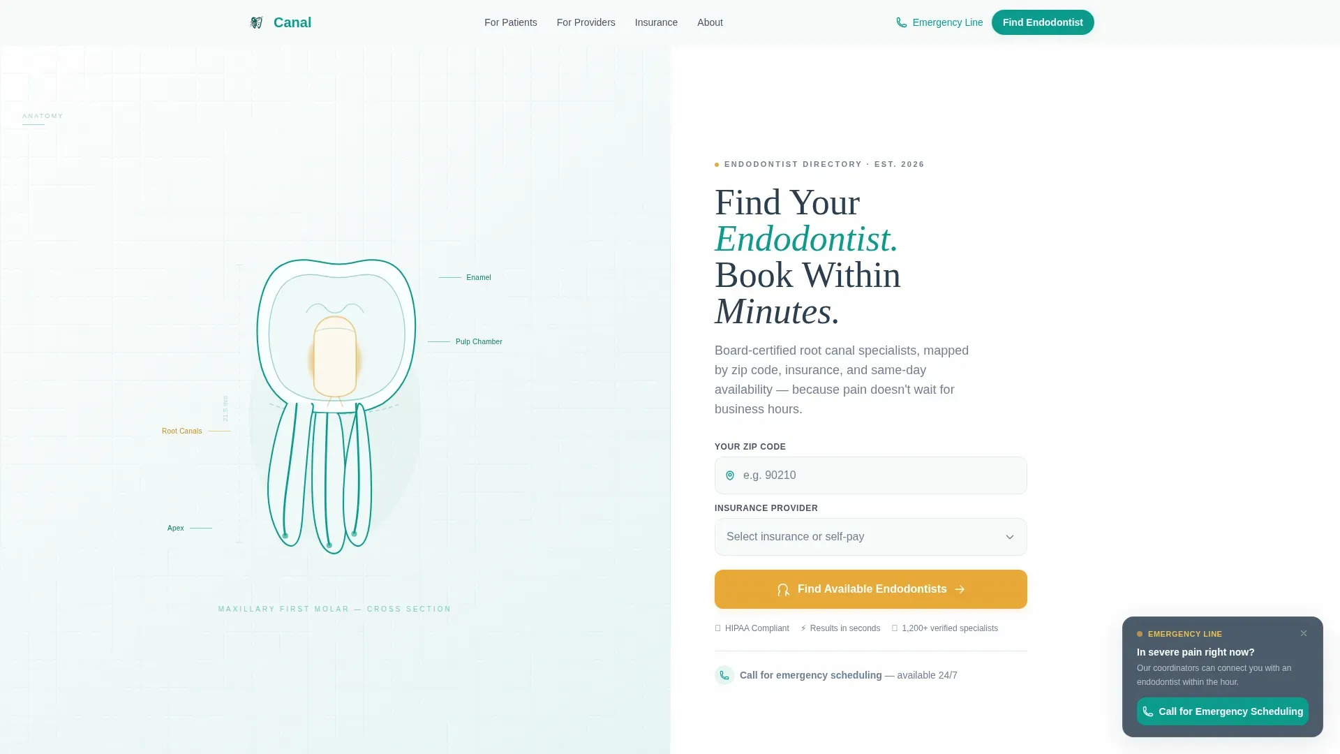
- A split-screen hero with an SVG molar anatomy illustration on the left and a zip code plus insurance search form on the right
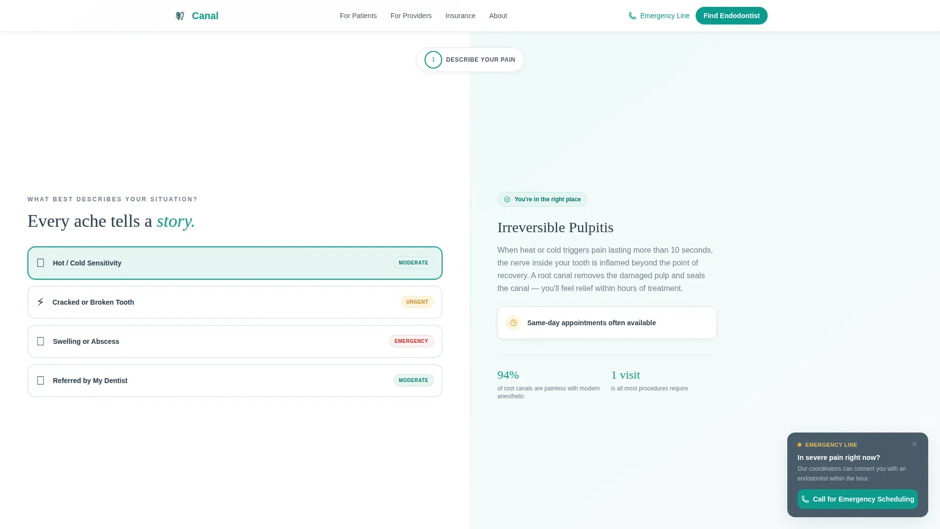
- Three alternating split-panel sections that walk users through describing their pain, matching with a specialist, and booking an appointment
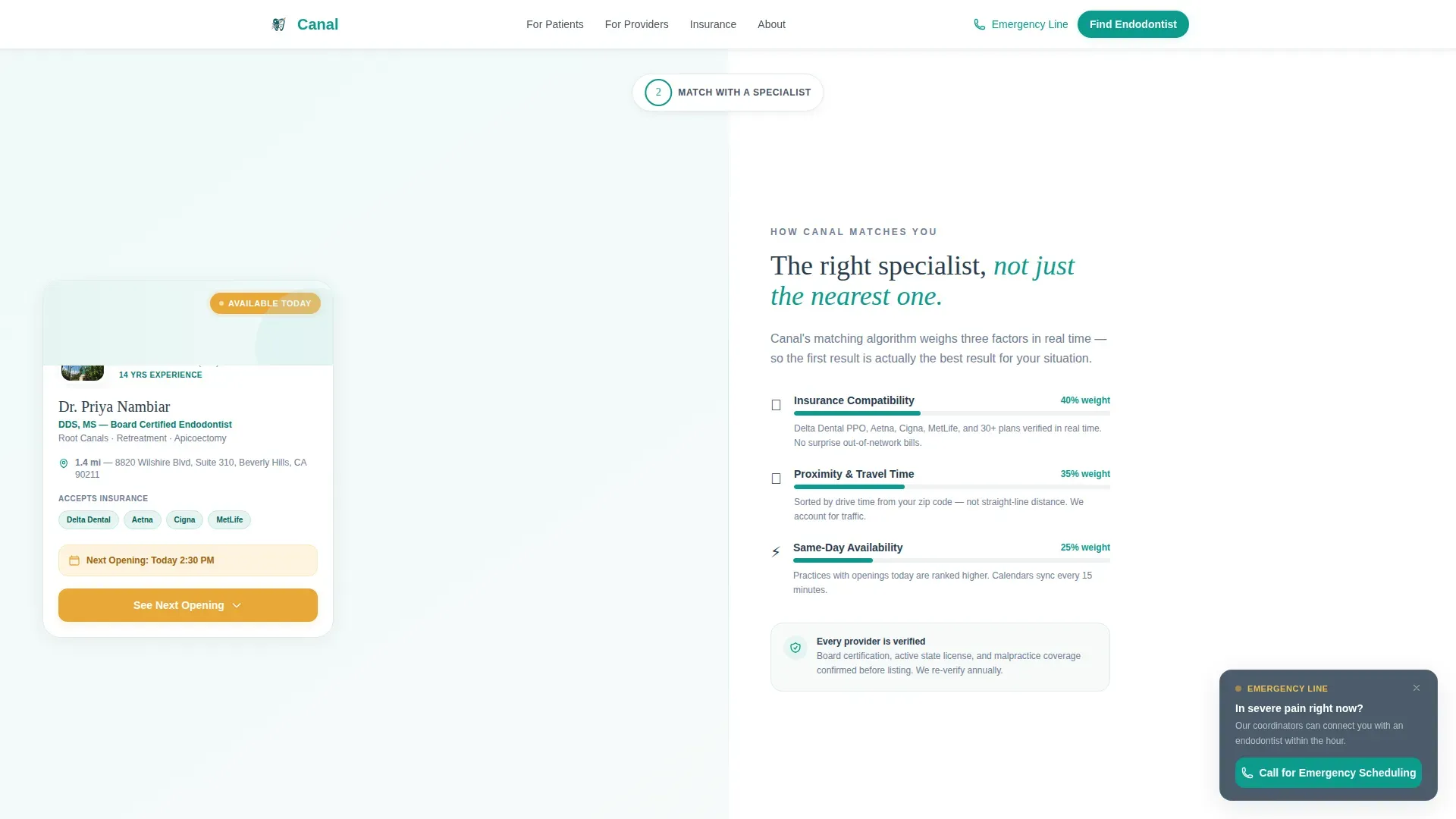
- Provider cards with credential badges, insurance logos, star ratings, and an expandable amber "See Next Opening" scheduling widget
Feature list
Canal includes purposefully designed components drawn directly from the patient booking journey.
Split-Screen Hero with Search Form
The header divides into two equal halves. The left panel holds detailed line art of a molar cross-section drawn in clinical teal, with the pulp chamber carrying a faint amber glow. The right panel presents a headline above a two-field form asking only for zip code and insurance provider, with a "No Insurance / Self-Pay" option included.
Visual Pain-Type Selector
Section One features an interactive symptom selector. Patients choose from options such as hot sensitivity, cracked tooth, swelling, or dentist referral. Each selection triggers reassuring micro-copy on the right panel explaining what that symptom typically means and what kind of specialist can help.
Provider Card with Booking Widget
Each specialist card displays name, credentials, distance, accepted insurance logos, and star ratings. An amber "See Next Opening" button expands inline into a scheduling widget showing available date and time slots plus a phone number field for appointment confirmation.
Three-Step Guided Journey
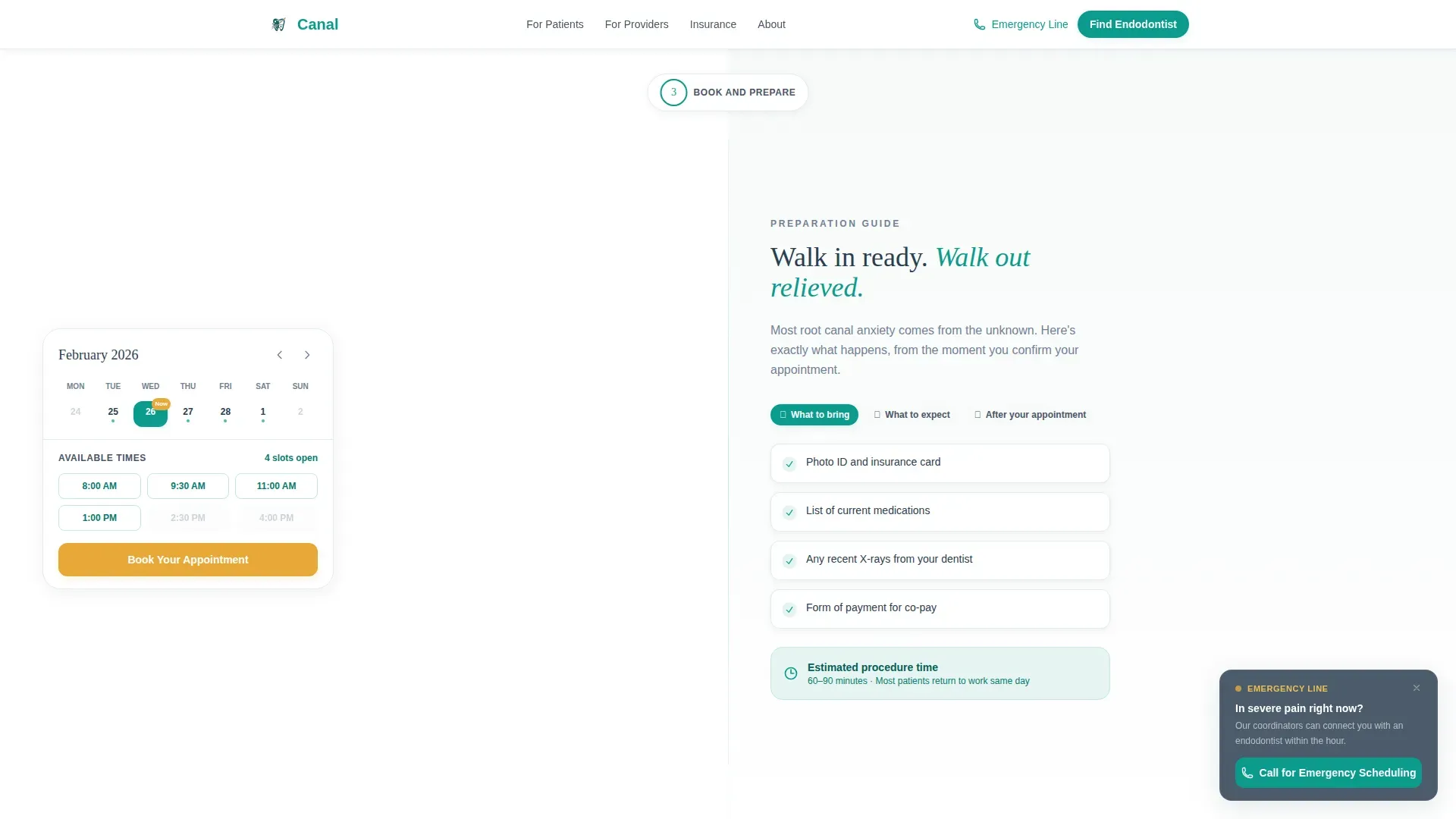
The "How It Works" flow uses three alternating split panels. Each step moves the patient one stage closer to a booking: describe the pain, match with a verified provider, then confirm a time slot. The progression mirrors the emotional arc from panic to reassurance.
Emergency Call-to-Action Banner
A floating teal banner reading "Call Now for Emergency Scheduling" stays anchored at the bottom of mobile viewports. It is a click-to-call element designed for patients in acute pain who need a voice on the line rather than a form on a screen.
Trust and Credentials Section
A dedicated section surfaces board certification proof, patient count statistics, insurance network logos, and testimonials. These elements work together to give both anxious patients and professional coordinators the verification they need before committing to a booking.
Page sections overview
| Section | Purpose |
|---|---|
| Split-Screen Hero | Zip and insurance search entry point |
| Pain Type Selector | Symptom identification with reassuring context |
| Specialist Match Panel | Provider card demo with credentials and coverage |
| Book and Prepare | Calendar widget with open slot highlights |
| Emergency Access Banner | Urgent click-to-call path for acute pain |
| Trust and Credentials | Certification, ratings, and social proof |
| Footer | Single-row linear navigation and contact links |
Design & branding system
The visual identity follows a Corporate Precision theme built on the Teal Catalyst color system. Every color choice has a functional role, keeping the experience clinical without feeling cold.
- Clinical teal (#0D9B8C) is the primary action color used on buttons, icon strokes, and interactive borders
- Sterile white (#F7FAFA) fills open backgrounds to create breathing room and reduce visual anxiety
- Charcoal instrument gray (#2C3E50) handles all body text and navigation for strong legibility
- Warm amber (#E8A838) is reserved exclusively for call-to-action buttons and urgency indicators such as "Available Today" badges
- Typography pairs DM Sans for interface text and form labels with Fraunces for editorial headings, creating a balance of precision and warmth
Mobile & speed optimization
Canal is built mobile-first because the primary user is a patient searching on a phone at two in the morning. Every interaction is designed to work with one hand and minimal effort.
- The floating "Call Now for Emergency Scheduling" banner stays visible at the bottom of all mobile viewports so the call path is always one tap away
- The search form requests only zip code and insurance provider, keeping the initial interaction short and results-focused
- Scroll reveals, card hover states, and step transitions use a medium animation weight to feel responsive without adding visual noise
How this template helps you convert
Canal reduces every possible hesitation between a patient's first search and their confirmed appointment. The structure builds trust incrementally and keeps the primary action always in view.
- The two-field search form at the hero asks for the minimum required information, putting results on screen before hesitation can set in
- Provider cards combine credentials, insurance fit, ratings, and an inline booking widget so the patient never has to leave the page to verify or commit
- The floating mobile call banner creates a secondary conversion path for users who are in too much pain to complete a form
Other information about this template
Canal sits at the intersection of healthcare directory design and patient-centered booking experience. It is built specifically for the endodontist website and endodontist provider directory niche within the Health and Medical category.
- The template is designed for USA localization, including United States phone number formats, MM/DD/YYYY date formatting, and United States dollar pricing display
- Insurance carrier logos and selector options are scoped to common United States carriers, making the search immediately relevant to most domestic patients
- The Step-by-Step Guide creative direction and Line Art header concept are core to the template's intersection match, ensuring the design language aligns with both the specialty vertical and the booking conversion goal
- The SVG molar anatomy illustration uses thin teal strokes and a subtle amber pulse animation to signal dental specialty without relying on clinical photography
- The footer uses a Pattern 1 Linear Single-Row layout, keeping the bottom of the page clean and uncluttered
Theme
Corporate Precision
Creative direction
Step-by-Step Guide
Color system
Teal Catalyst
Style
Split Screen (50/50)
Direction
Booking/Scheduling
Page Sections
Split-screen Hero with Search Form
Visual Pain-type Selector
Provider Card with Inline Booking Widget
Three-step Guided Patient Journey
Floating Emergency Call Banner
Trust and Credentials Section
Related questions
Who is this landing page template designed for?
Can I customize the insurance carriers shown in the search form?
Does the template support same-day appointment visibility?
What makes this template different from a generic medical directory layout?
Is the template optimized for mobile users?



