Canopy — Proven Woodland Management Landing Page Template
Canopy is an editorial-style landing page template built for Tokyo tree service professionals. It opens with credential badges, unfolds through magazine-format case study sections, and guides visitors toward a site visit request. The design uses a restrained slate-and-sky palette with serif typography to project authority, precision, and trust to property managers, shrine administrators, and municipal clients.
by Rocket studio
Quick summary
Canopy is a single-page, click-through landing page template for a premium Tokyo arborist service. It leads with certification badges and an editorial headline, then walks visitors through real job case studies before delivering a clear "Request a Site Visit" call to action. The design feels like a quiet Japanese garden: every element purposeful, nothing excessive.
Who this template is for
This template is built for established tree care professionals who serve discerning clients in dense urban environments. It suits operators who have credentials to show, complex jobs to tell, and clients who need more than a price list before they call.
- Arborist teams serving shrines, temples, and estate gardens in Greater Tokyo
- Tree service businesses targeting property managers, municipal parks departments, and corporate campuses
- Operators who lead with certification and expertise rather than promotional pricing
What problem this template solves
Most service landing pages look the same: a hero image, a bullet list of services, and a contact form. For an arborist working on 200-year camphor trees next to copper shrine roofs, that approach undersells the work entirely. Clients who manage historic or high-value properties need proof of judgment, not just availability.
- Generic templates cannot convey the technical depth that experienced arborists bring to complex removals and crown work
- Property managers and municipal buyers require a portfolio of past decisions, not just a list of services offered
- First-time visitors leave before converting when a page lacks the authority signals their trust threshold demands
What you get with this template
You get a fully structured editorial landing page that builds credibility through every scroll section. The layout moves visitors from credential recognition to narrative proof to a confident call to action without a single wasted element.
- Award badge header row with space for certification seals, contractor marks, and a safety record counter
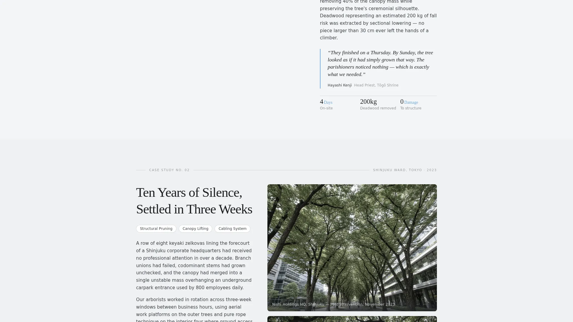
- Magazine-style case study sections, each structured as a standalone job feature with a photograph, problem description, technique, and client pull quote
- A fixed mobile call-to-action bar and a secondary PDF download link for visitors not yet ready to book
Feature list
The template's key capabilities are grounded in its editorial structure and conversion flow. Each section below describes a built-in component you can use immediately.
Award Badge Masthead Header
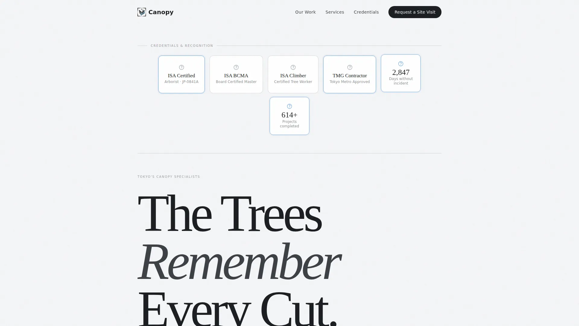
The page opens with a row of credential badges arranged like masthead honors in a premium magazine. This space holds certification seals, contractor registration marks, a safety record counter, and a before-and-after project count. No hero image, no stock photography. The restraint communicates authority before a single word is read.
Editorial Headline and Dateline Block
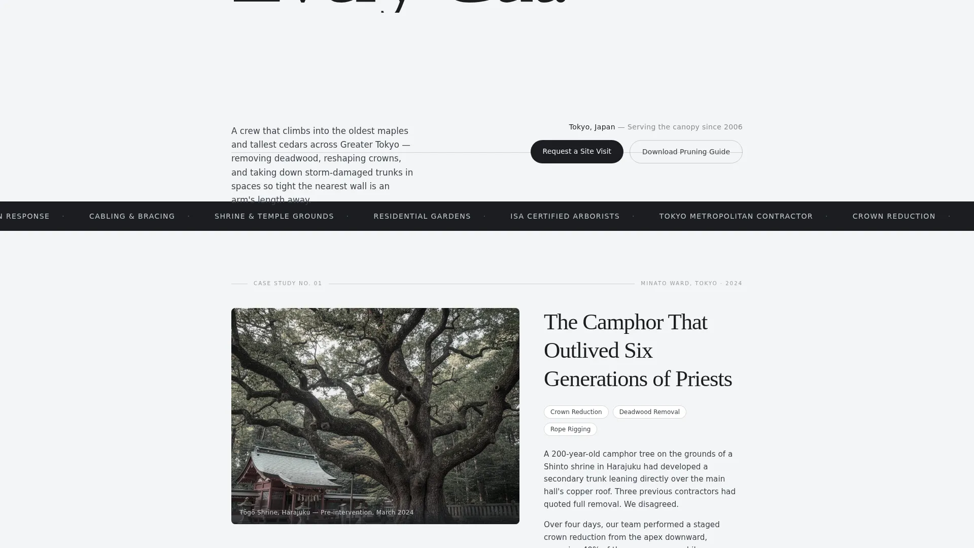
Below the badge row, a large serif headline anchors the page's identity. A dateline-style subhead sits beneath it, giving the brand a sense of history and continuity. This block sets an authoritative, magazine-editorial tone that separates the service from commodity competitors.
Case Study Narrative Scroll Sections
Each scroll section tells a single job as a short magazine feature. The structure opens with a dramatic photograph, moves through the problem and technique chosen, and closes with a short client pull quote. Jobs escalate in complexity as the visitor scrolls, building an undeniable record of professional judgment.
Click-Through Call-to-Action Placement
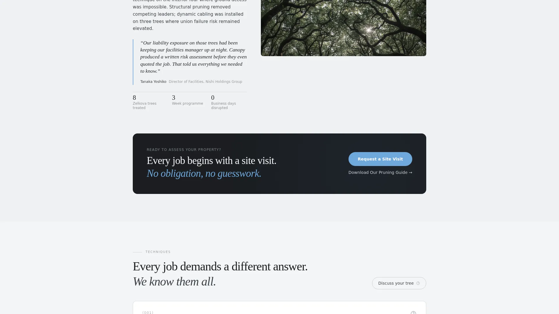
The primary "Request a Site Visit" button appears after the second case study and again as a fixed bottom bar on mobile screens. There is no form on this page. The click routes visitors to a dedicated scheduling page where they choose property type, upload a photo, and select a visit window.
Secondary Lead Capture Link
A text link offering a downloadable pruning guide captures visitors who are not ready to book. The PDF builds trust by teaching seasonal timing and tree care principles, keeping the brand present during earlier stages of the buyer's decision process.
Restrained Slate and Sky Palette
The color system uses wet-stone charcoal, silver bark, open-sky blue, and deep ink body text on a soft cloud-white background. The palette reads like a black-and-white photograph of a Japanese garden with one branch of sky breaking through. It frames credentials and case study text without distraction.
Page sections overview
| Section | Purpose |
|---|---|
| Badge masthead row | Displays certifications, contractor marks, safety record, and project count |
| Editorial headline block | Sets authoritative tone with serif headline and dateline subhead |
| Case study one | First job feature with photograph, problem, technique, and pull quote |
| Case study two | Second job feature, raises complexity and introduces primary call to action |
| Case study three+ | Additional job features that deepen the portfolio evidence |
| Primary call to action block | "Request a Site Visit" button linking to scheduling page |
| Secondary capture link | "Download Our Pruning Guide" text link for earlier-stage visitors |
| Fixed mobile call to action bar | Persistent bottom bar keeping the primary action reachable on mobile |
Design & branding system
The visual identity follows an editorial magazine theme that prioritizes restraint and authority over visual noise. Large serif type, a controlled color palette, and dramatic single photographs do the heavy lifting. There are no busy backgrounds, decorative elements, or stock imagery clichés.
- Color palette: wet-stone charcoal (#3B3F45), silver bark (#C8CDD3), open-sky blue (#6FA8DC), deep ink (#1A1D21), and soft cloud white (#F4F5F7)
- Typography is serif-led for headlines and datelines, with clean body text that keeps long case study paragraphs easy to read
- Photography slots are formatted to accept single dramatic images per case study, keeping the editorial rhythm consistent throughout the scroll
Mobile & speed optimization
The template is structured for a single-column scroll on mobile, keeping the case study narrative fully readable on smaller screens. The fixed bottom call-to-action bar ensures the primary action stays reachable without scrolling back up.
- Single-column layout adapts the badge row, headline block, and case study sections cleanly to portrait screens
- The fixed mobile call to action bar persists through the full scroll so visitors can act at any point in the journey
- Lightweight design choices, including no hero video and controlled image slots, keep the layout lean and load-friendly
How this template helps you convert
This template is engineered as a click-through page. It does not ask visitors to fill out a form. Instead, it builds the confidence to click through to a scheduling page where a qualified request is completed in three steps.
- The badge header and editorial headline establish authority in the first viewport, reducing drop-off before the case studies begin.
- Each case study section raises the stakes and complexity of past work, qualifying the visitor and strengthening their intent to book a site visit.
- The dual call to action structure, a mid-page button after case study two and a persistent mobile bar, captures visitors at their peak confidence without forcing premature commitment.
Other information about this template
This template is a strong fit for any arborist or tree care business that needs to differentiate on expertise rather than price. It works especially well when the service area includes properties where the stakes of a poor decision are high.
- The template is designed as a click-through landing page, not a lead generation form page; the conversion happens on a linked scheduling page
- The "Download Our Pruning Guide" secondary link supports a two-stage buyer journey for clients who research before committing
- Property type targeting on the destination scheduling page (residential, commercial, shrine or temple, municipal) makes the follow-up experience feel tailored
- The case study format is flexible enough to accommodate any number of job types, from crown reduction and sectional dismantle to cabling and storm damage response
Theme
Service Utility
Creative direction
Testimonial Mosaic
Color system
Arctic White
Style
Single Column Flow
Direction
Lead Generation
Page Sections
Award Badge Masthead Header
Editorial Headline and Dateline Block
Case Study Narrative Scroll Sections
Click-through Call-to-action Placement
Secondary Lead Capture Link
Restrained Slate and Sky Color System
Related questions
Does this template include a contact form?
Can I add more case study sections beyond the ones shown?
What is the secondary call to action for?
Who is the ideal client type this template speaks to?
Is the fixed mobile bottom bar always visible while scrolling?



