Horse Booking Website Template
Canter is a nature-inspired equestrian landing page built for horse training schools. It tells your founding story through a zigzag layout, moves visitors emotionally from first scroll to form submission, and closes with a lead-generation banner offering a Discovery Ride booking. The design draws from a Japanese Zen color system, feeling as grounded and intentional as a well-ridden school horse.
by Rocket studio
Quick summary
Canter is a single-page equestrian landing page template built for horse training schools. It uses an origin story structure, a zigzag alternating layout, and a warm Japanese Zen color palette to guide first-time visitors toward booking a Discovery Ride. Every section advances a narrative, ending with a clear lead-generation form.
Who this template is for
This template fits equestrian businesses that want to attract new students through storytelling rather than a simple service list. It works well for schools that serve mixed riding experience levels and need to build trust before asking for commitment.
- Riding school owners who want to share their founding story
- Instructors targeting nervous adult beginners and ambitious teen riders
- Equestrian programs that offer dressage, jumping, or general horsemanship
What problem this template solves
Most horse training schools rely on basic websites that list services without context. Prospective students rarely understand what to expect from a first lesson, and parents need reassurance before enrolling a child. This template closes that gap.
- It replaces a flat service list with a personal narrative arc
- It handles mixed audiences by framing the school as a place for every rider
- It lowers commitment friction with a secondary video path before the booking form
What you get with this template
You get a fully structured, single-page layout with every section pre-designed and ready to personalize. The page moves from a full-bleed golden-hour header through a chronological origin story, then resolves into a lead-generation form.
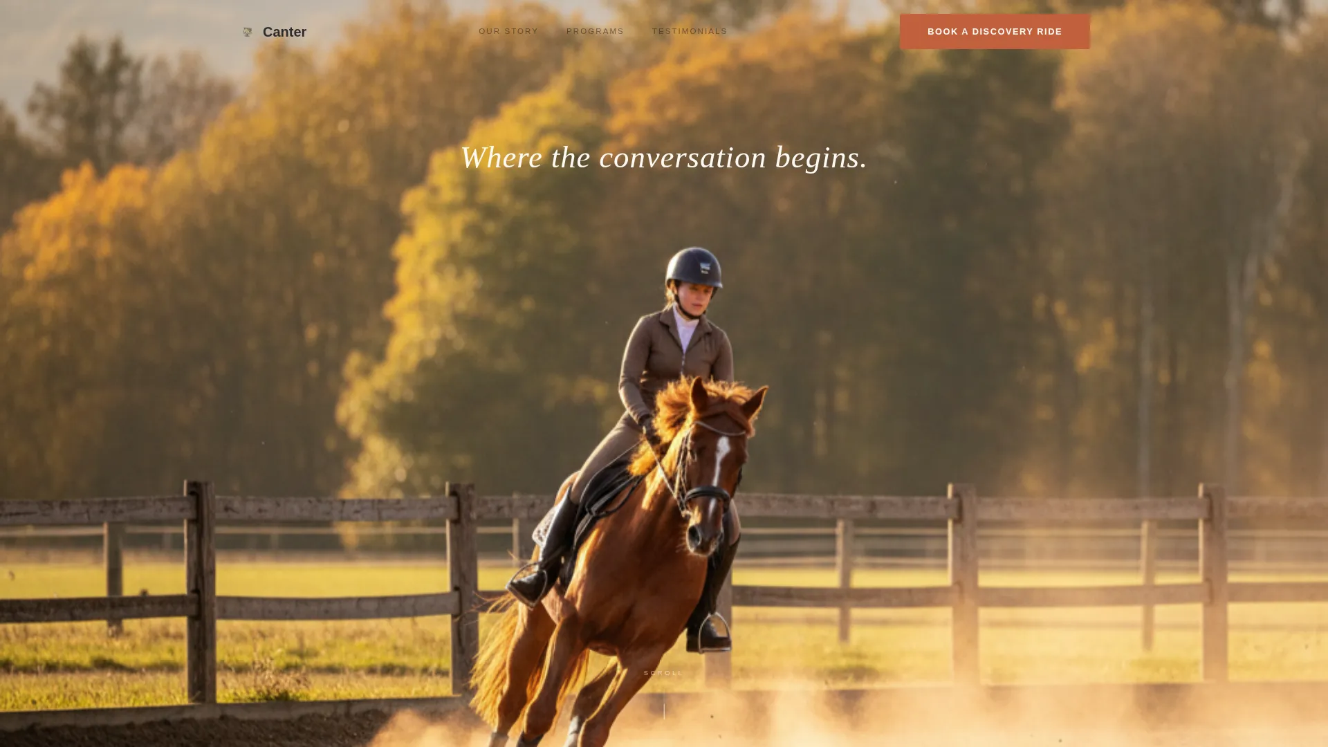
- A full-bleed photo header with a centered white serif tagline
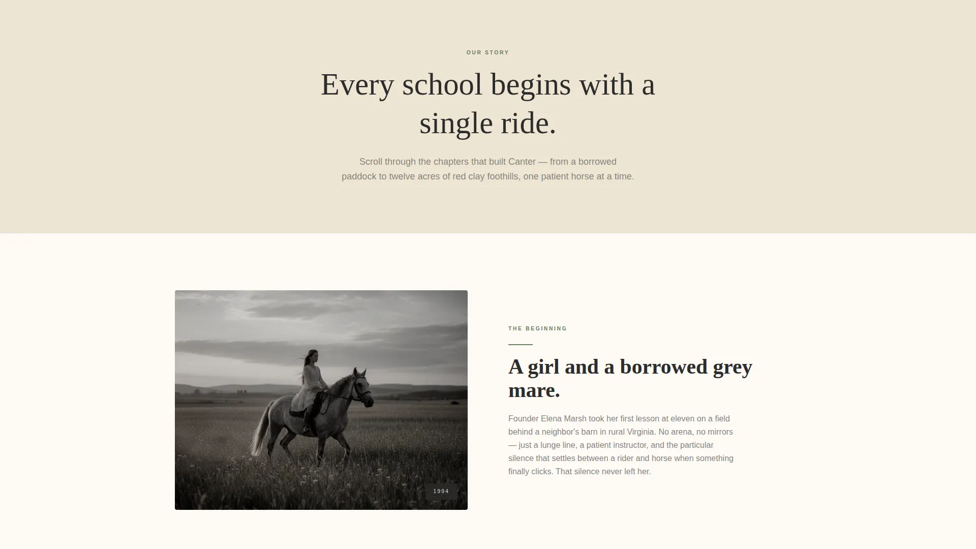
- An alternating zigzag story section that moves from historical grainy imagery to crisp modern photography
- A moss-green lead-generation banner with a four-field booking form and a secondary video call to action
Feature list
This template is built around a focused set of design and layout capabilities drawn directly from the brief.
Full-Bleed Golden Hour Header
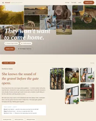
A wide-angle arena photograph fills the entire viewport. The horizon sits on the lower third, the tree line is soft-focused, and a single white serif line reads "Where the conversation begins." No overlay gradient interrupts the image.
Zigzag Origin Story Layout
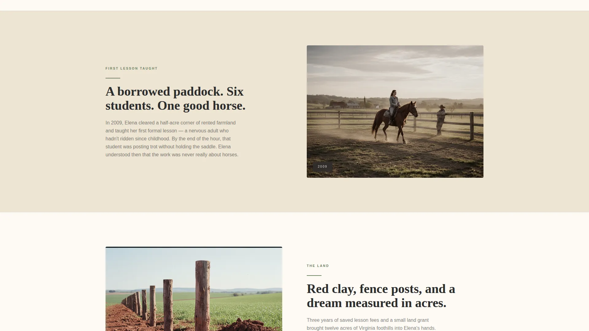
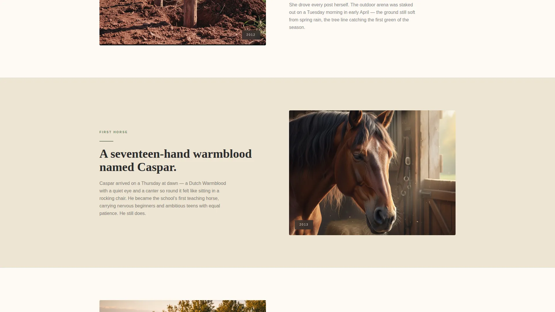
Sections alternate left and right as the school's history unfolds. Images shift from grainy nostalgic grain to sharp modern photography, visually mirroring the school's growth and the student's own transformation arc.
Lead Generation Booking Banner
A moss-green banner appears after the origin story resolves. It holds a short form asking for first name, riding experience level, discipline interest, and phone number. The experience selector offers four clear options: never, lapsed, intermediate, and competitive.
Secondary Video Call to Action
A "Watch a Lesson" link sits alongside the primary booking form. It connects to a sixty-second lesson video, warming visitors who are not yet ready to book toward a return conversion.
Japanese Zen Color System
The palette uses washed ink black for headlines, tatami sand for backgrounds, moss after rain for secondary text and icons, and a quiet persimmon accent strictly on buttons and hover states. Every color serves a role and nothing competes for attention.
Experience-Level Selector
The booking form includes a friendly four-option selector so visitors can self-identify their riding background. This reduces form anxiety and helps the school prepare for each incoming inquiry.
Page sections overview
| Section | Purpose |
|---|---|
| Full-Bleed Header | Opens with arena photograph and tagline |
| Founder Young Rider | Begins origin story with historical image |
| First Lesson Section | Advances story to borrowed paddock era |
| Land and Fences | Shows school grounds taking shape |
| First Horse Arrives | Marks the school's founding milestone |
| Modern School Today | Resolves story with present-day photography |
| Discovery Ride Banner | Delivers lead-generation form and video link |
Design & branding system
The visual identity follows a Nature-Inspired theme interpreted through a Japanese Zen color system. The palette feels unhurried and deliberate, placing every color with purpose so the visitor's eye moves naturally from section to section.
- Ink black (#2C2C2C) anchors all headlines and keeps text grounded
- Tatami sand (#D4C5A9) dominates backgrounds, evoking arena footing
- Moss after rain (#6B7F5E) handles secondary text, icons, and the call to action banner
- Persimmon (#C1603D) appears only on buttons and hover states, directing the eye precisely where action is needed
Mobile & speed optimization
The template is designed with a single-page, section-led structure that naturally supports clean mobile rendering. Alternating sections restack vertically on smaller screens without losing the narrative order.
- Zigzag columns collapse to a single vertical stack on mobile, preserving the story sequence
- The lead-generation form is compact and touch-friendly, with a dropdown selector replacing radio buttons at small sizes
- The full-bleed header image is cropped to keep the rider and horse centered on portrait viewports
How this template helps you convert
The page is built around a deliberate emotional journey that moves a skeptical visitor toward a single action: booking a Discovery Ride.
- The origin story builds credibility and personal connection before any sales language appears, so visitors trust the school before they see the form.
- The secondary "Watch a Lesson" video path provides a low-commitment middle step for hesitant visitors, reducing drop-off and creating a second opportunity to convert on return visits.
Other information about this template
This template fits naturally into the equestrian services market, where personal trust and school reputation matter more than price comparisons. It is especially relevant for horse training school operators who want a landing page that feels as carefully considered as the discipline itself.
- The template style is Zigzag/Alternating, a proven layout for storytelling-led service pages
- The creative direction is Origin Story, which works particularly well for established schools with a founding narrative worth telling
- The header concept is Full-Bleed Photo, designed to lead with visual impact before any text-based claim
- The landing page direction is Lead Generation, with the entire scroll optimized toward one primary form submission
- The Nature-Inspired theme and Japanese Zen color system make this template visually distinctive in a category that often defaults to generic green-and-brown barn aesthetics
Theme
Nature-Inspired
Creative direction
Origin Story
Color system
Japanese Zen
Style
Zigzag/Alternating
Direction
Lead Generation
Page Sections
Full-bleed Golden Hour Header
Zigzag Origin Story Layout
Lead Generation Booking Banner
Secondary Video Call to Action
Japanese Zen Color System
Experience-level Selector
Related questions
Can I use this template without a professional equestrian photographer?
Is the booking form connected to a scheduling system?
Can I change the four riding experience options in the selector?
Does the template work for schools that teach multiple disciplines?
What does the secondary 'Watch a Lesson' call to action do?