Vibrant Art Gallery Landing Page Template
Canvas is a vibrant art gallery landing page template built for a senior-founded marketplace where artists over sixty sell original work directly to buyers. It pairs a Dopamine Pop color system with an Unboxing Experience scroll journey, guiding visitors from discovery to purchase with dual conversion paths for both buyers and applying artists.
by Rocket studio
Quick summary
Canvas is a Gallery + Detail landing page template for a curated art marketplace celebrating artists over sixty. It blends a Directory and Discovery theme with a joyful Dopamine Pop palette, moving visitors through a tactile unboxing scroll experience. Dual calls to action serve buyers browsing original work and artists ready to apply to sell.
Who this template is for
This template was designed for founders running a niche art marketplace with a specific, story-driven audience on both sides of the platform. It suits operators who want a single landing page that speaks to buyers and sellers at once.
- Design-conscious buyers hunting for one-of-a-kind original art, interior stylists sourcing statement pieces, and gift-givers who want a personal story behind their purchase
- Artists over sixty who have decades of finished work and need a credible, welcoming platform to finally show and sell it
- Marketplace founders who need dual conversion flows without building two separate pages
What problem this template solves
Most art marketplace templates feel either too clinical or too artsy, and they rarely speak to both sides of the platform at once. Buyers feel like they are browsing a spreadsheet. Artists feel like they are filling out a job application. This template closes that gap.
- Buyers have no reason to trust that the work is authentic, handmade, or worth the price without context and story
- Senior artists face invisible barriers: platforms that feel too technical, too cold, or simply not built for them
- Marketplace owners lose potential sellers because the artist application flow is buried or intimidating
What you get with this template
You get a fully structured, single-page layout that takes visitors through a natural journey from browsing to buying to belonging. Every section is purposeful and sequenced.
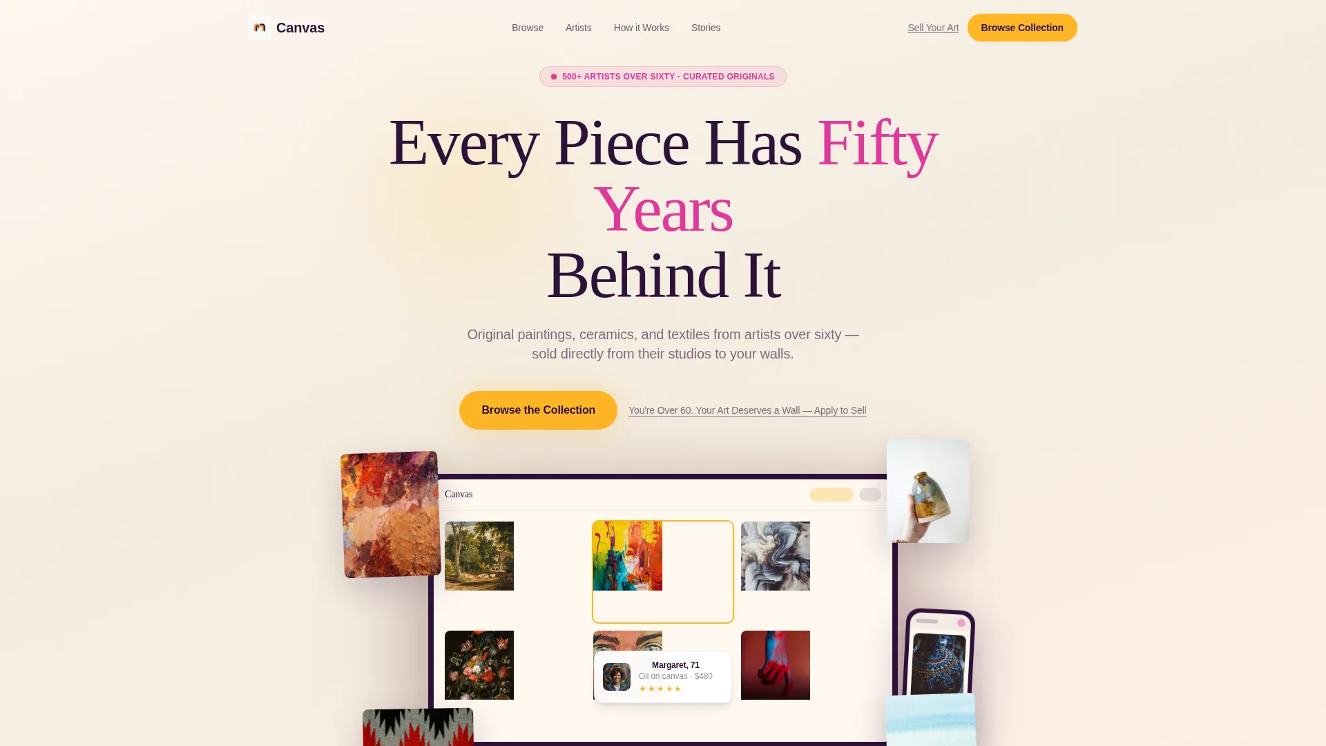
- A device mockup header with floating iPhone and laptop visuals, artwork thumbnails spilling outward, and a headline that lands immediately
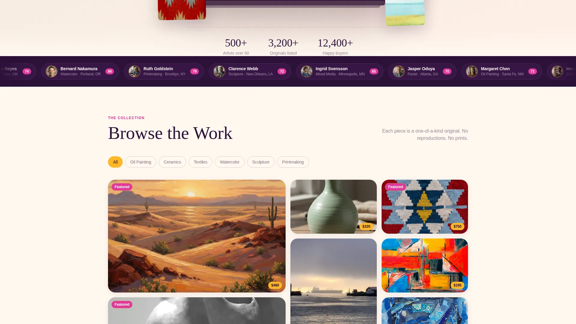
- A filterable gallery grid section, a lifted artwork detail view with artist story and price, a packaging reveal section, and a real buyer photo wall with city tags
- Dual calls to action: a marigold "Browse the Collection" button for buyers and a quiet aubergine artist application link with a short intake form including three upload slots
Feature list
This template is built from a clear set of prompt-defined components. Each one serves a specific moment in the visitor's scroll journey.
Device Mockup Header Section
The header floats an iPhone and a laptop at a slight angle against a warm cream background. The screens show a live-feeling marketplace interface with a ceramic vase detail page mid-scroll and a partially cropped five-star review. Artwork thumbnails spill outward around the devices, blurring the line between digital platform and physical art.
Unboxing Scroll Experience
Each scroll section peels back a layer of the buying journey. The sequence moves from a discovery grid, to a zoomed detail view, to a packaging reveal photographed mid-unwrap, to real buyer photos on real walls. The structure builds intimacy with every section, ending with a sense of belonging rather than just a completed transaction.
Gallery Grid with Detail View
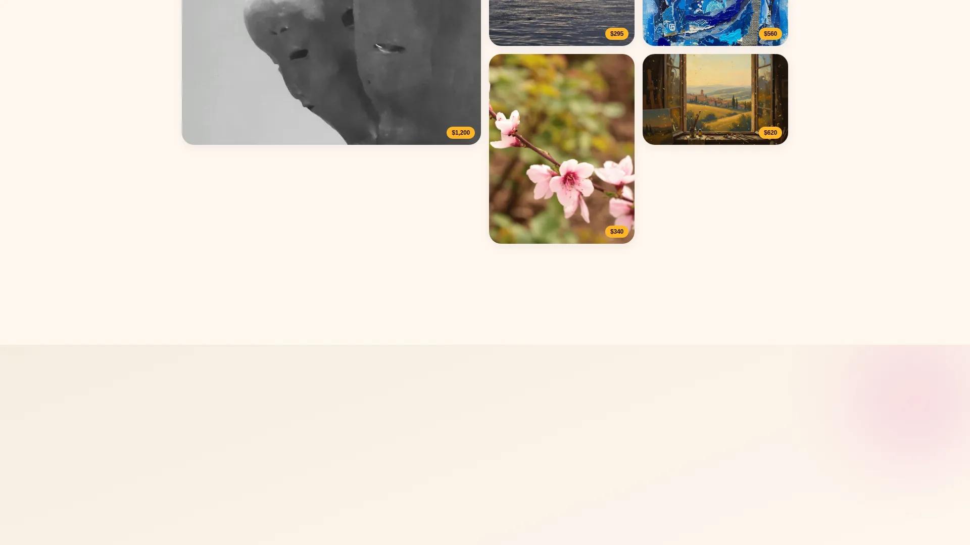
The gallery section mimics a discovery feed with slightly overlapping artwork tiles spread across the page like prints on a table. One piece lifts into a full detail view showing close brushstroke photography, a looping artist-at-work video, a three-sentence artist story, and the price. This moves visitors from browsing to genuine emotional connection.
Dual Conversion Call-to-Action System
A marigold primary button reading "Browse the Collection" anchors below the header and repeats as a sticky bottom bar on mobile. A quieter aubergine text link invites artists with the line "You're Over 60. Your Art Deserves a Wall." Both paths coexist without competing, keeping the page focused for each visitor type.
Artist Application Intake Form
The artist-side conversion path leads to a short form asking for name, medium, three work sample upload slots, and a single open-ended textarea: "Tell us about one piece you've never shown anyone." The form is brief by design, reducing friction for artists who may be unfamiliar with lengthy digital onboarding.
Frictionless Buyer Checkout Flow
Visitors can browse without creating an account. Account creation triggers only at checkout and is pre-filled from the shipping form. This collapses the commitment into a single natural moment rather than forcing sign-up before the visitor is ready.
Page sections overview
| Section | Purpose |
|---|---|
| Device Mockup Header | Establish platform identity and draw immediate emotional attention |
| Headline Fade-In | Land the core brand message before the visitor scrolls |
| Gallery Discovery Grid | Let buyers browse artwork tiles in a tactile, overlapping layout |
| Artwork Detail View | Convert browser to buyer with story, video, and price in one view |
| Packaging Reveal Section | Build tactile trust by showing the care behind every shipment |
| Buyer Photo Wall | Provide social proof with real art on real walls, tagged by city |
| Artist Application Link | Open a low-friction path for senior artists to apply to sell |
| Artist Intake Form | Collect name, medium, work samples, and one personal story prompt |
| Sticky Mobile call to action Bar | Keep the primary buyer action visible throughout the mobile scroll |
Design & branding system
The visual identity follows a Dopamine Pop color system built around four specific values that each carry a defined role. The result feels like walking into a Palm Springs flea market at golden hour: sun-saturated, joyful, and unapologetically alive.
- Warm cream (#FFF8F0) dominates backgrounds so artwork breathes and pops without competing with the interface; electric marigold (#FFB627) marks hover states and price tags; punchy magenta (#E0399A) highlights featured artists and notification badges
- Deep aubergine (#2D1138) anchors navigation and typography with the weight of a gallery placard, giving the palette its grounding point amid the brighter tones
- The Directory and Discovery theme shapes layout logic: tiles overlap slightly, artwork spills beyond device frames, and the overall visual rhythm feels curated rather than corporate
Mobile & speed optimization
The mobile layout is purpose-built for the buyer who discovers the marketplace mid-scroll on a phone. The sticky bottom bar keeps the primary call to action within thumb reach at all times.
- The "Browse the Collection" button repeats as a sticky bottom bar on mobile, ensuring the primary conversion action never leaves the screen during scroll
- The intake form is kept intentionally short with three upload slots and minimal required fields, reducing friction for artists applying from any device
- The no-login browse experience means a visitor on mobile can explore the full gallery without any interruption before they are ready to commit
How this template helps you convert
This template is structured around dual-sided marketplace logic. Every design and copy decision serves either the buyer journey or the artist application path, and the two paths run in parallel without interfering.
- The unboxing scroll sequence moves buyers through discovery, emotional connection, tactile trust, and social proof before they ever reach a checkout decision, making the purchase feel inevitable rather than pressured.
- The artist application form strips away intimidation by asking one personal, story-based question alongside the basic fields, which lowers the psychological barrier for senior artists who may never have sold work online before.
Other information about this template
Canvas fits within the broader landscape of art marketplace and creative directory templates. It is specifically designed around the Gallery + Detail template style, making it well suited for any curated product marketplace where story and provenance matter as much as price.
- The template style is Gallery + Detail, meaning it supports both a browsing overview layer and a deep-dive product view within a single page flow
- The Unboxing Experience creative direction and Device Mockup header concept are integral to the layout sequence and cannot be separated from the conversion logic
- This template is categorized under Retail and E-Commerce with a Senior-Founded Business subcategory, reflecting its niche intent and audience specificity

Theme
Directory & Discovery
Creative direction
Unboxing Experience
Color system
Dopamine Pop
Style
Gallery + Detail
Direction
Marketplace/Multi
Page Sections
Device Mockup Header with Floating Artwork
Unboxing Scroll Journey
Gallery Grid and Lifted Detail View
Dual-path Conversion Design
Artist Intake Form
Frictionless Browse and Checkout
Related questions
Can buyers browse the gallery without creating an account?
How does the artist application section work?
Is this template practical for a marketplace with multiple artist profiles?
Does the template include the looping artist video component?
Can I use this template if most of my visitors arrive on mobile?



