Turkey Travel Specialist Booking Website Template
The Cappadocia template is a masonry-style honeymoon landing page built for Turkey travel concierge services. It guides newly married couples through a visual journey from the Aegean coast to Istanbul, using mood-board cards, poetic captions, and a direct booking drawer. The design blends warm mineral tones with a story-led scroll that turns browsing into planning.
by Rocket studio
Quick summary
The Cappadocia template is a single-page honeymoon travel landing page with a masonry card layout. It layers destination photography, poetic captions, and per-couple pricing into one scroll that doubles as an itinerary. The Organic Flow design and Alpine Fresh color palette make the page feel as curated as the trips it sells.
Who this template is for
This template is built for honeymoon travel concierge brands that sell experience-first packages across Turkey. It works best when your offer is built around multiple destinations rather than a single resort.
- Travel businesses selling curated two-week Turkey honeymoon itineraries
- Boutique tour operators whose couples expect atmosphere and detail alongside a price
- Independent travel designers who want a direct-sales page without a traditional product catalog feel
What problem this template solves
Most travel landing pages flatten a dream trip into a list of bullet points and a form. Couples planning a honeymoon deserve more than that. This template closes the gap between inspiration and purchase by letting the page itself tell the story.
- Couples who browse Instagram for cave hotels need a page that matches that emotional register
- Generic booking pages kill momentum before the reservation is made
- Destinations as rich as Turkey's require a layout that can hold Cappadocia, the Aegean coast, and Istanbul without feeling cluttered
What you get with this template
You get a fully designed landing page ready to be filled with your own photography, packages, and pricing. Every section has a clear job, from the full-viewport header image down to the mobile sticky booking bar.
- A masonry card grid with varied heights, destination captions, and detail icons for duration, season, and included experiences
- A booking drawer that collects travel dates, departure city, and add-on toggles such as a private balloon flight or hammam ritual
- A mobile sticky bottom bar showing the most popular package name, its price, and a single call-to-action button
Feature list
This template includes a focused set of built-in features grounded in the brief above.
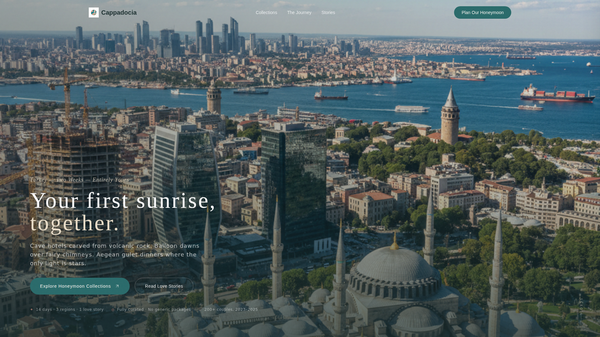
Full-Viewport Lifestyle Header
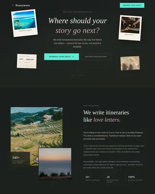
The header opens with a full-screen image slot designed for a long-lens golden-hour couple shot. A single translucent text line fades in after two seconds: "Your first sunrise, together." The effect is cinematic and unhurried, setting the emotional tone before any package details appear.
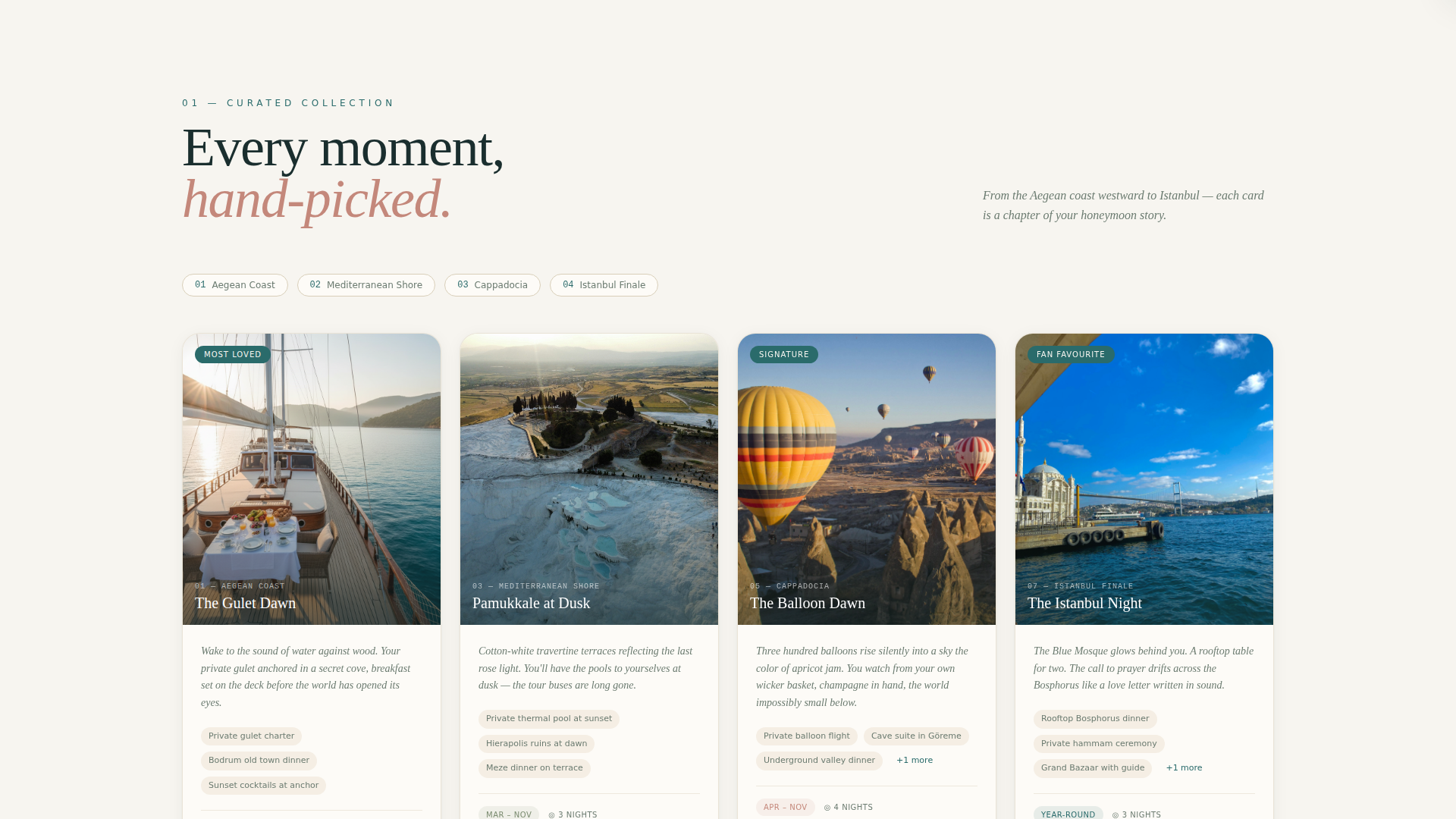
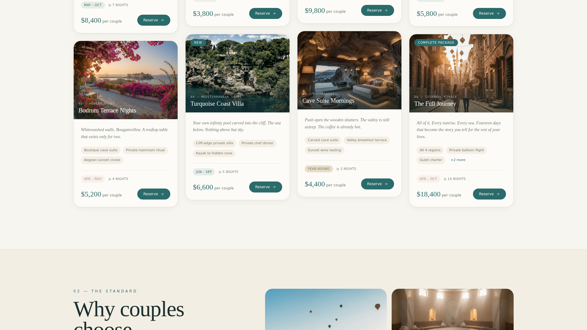
Masonry Card Grid
Cards vary in height and mix destination photography with short poetic captions and small detail icons. As visitors scroll, the collection moves west to east across the Turkish map, from the Aegean coast through the Mediterranean shore, Cappadocia highlands, and finally an Istanbul finale. The layout feels like a curated mood board rather than a product catalog.
Per-Couple Pricing Callouts
Each package card carries a clear per-couple price displayed in Bosphorus teal so it stands out without breaking the visual mood. A season badge sits alongside the price, helping couples quickly match packages to their travel window.
Slim Booking Drawer
The "Reserve This Honeymoon" button on each card opens a lightweight booking drawer. The drawer collects travel dates, departure city, and optional add-ons. It stays minimal so couples can complete their reservation without leaving the page experience.
Mobile Sticky Bottom Bar
On smaller screens, a sticky bar anchors to the bottom of the viewport. It displays the most popular package name, its price, and a single "Book for Two" button. Couples browsing on their phones always have the primary call-to-action within reach.
Alternating Background System
Section backgrounds alternate between mountain air white and sun-warmed travertine. Cards float on soft shadows. Bosphorus teal appears only on interactive elements and price callouts. The system keeps the page visually calm while guiding attention exactly where it needs to go.
Page sections overview
| Section | Purpose |
|---|---|
| Full-Viewport Header | Opens with a couple-at-golden-hour lifestyle image and a delayed text reveal |
| Masonry Card Grid | Displays honeymoon package moments as a scrollable, mood-board-style collection |
| Package Detail Icons | Surfaces duration, season, and included experiences inside each card |
| Per-Couple Pricing | Shows price and season badge on every package card in a clear teal callout |
| Reserve Booking Drawer | Collects travel dates, departure city, and add-on selections without a page redirect |
| Mobile Sticky Bar | Pins the top package name, price, and a single booking button to the screen bottom |
Design & branding system
The visual identity follows an Organic Flow theme built on the Alpine Fresh color system. Every color choice is deliberate: warm mineral tones for calm, teal only for action.
- Core palette: sun-warmed travertine (#E8DCC8), Cappadocian rose (#C4887B), deep Bosphorus teal (#2A6B6B), mountain air white (#F7F5F0), and wild sage (#7A8B6F) for secondary text and dividers
- Backgrounds alternate between travertine and mountain air white; cards use soft drop shadows; teal is reserved exclusively for interactive elements and price callouts
- The overall effect mirrors a linen-wrapped boutique hotel gift box with soft mineral tones that feel grounded and romantic without being overwrought
Mobile & speed optimization
The layout is designed with small-screen browsing in mind, because couples typically discover and revisit travel inspiration on their phones.
- The masonry grid adapts to narrower viewports so cards stack without losing their varied-height rhythm
- The sticky bottom bar on mobile keeps the primary booking call-to-action always visible during long scrolls
- The booking drawer opens inline so couples never navigate away from the immersive page experience
How this template helps you convert
The page builds trust through immersion before it ever asks for a commitment. By the time a couple reaches the booking drawer, they have already pictured themselves inside the trip.
- The west-to-east card sequence acts as a soft itinerary, helping couples see a coherent two-week journey rather than a list of disconnected packages
- Teal price callouts and season badges answer the two most common pre-booking questions, cost and timing, without requiring a separate inquiry
- The slim booking drawer keeps the reservation moment frictionless, reducing the steps between emotional decision and confirmed booking
Other information about this template
This template is purpose-built for the Turkey honeymoon package niche inside the Travel and Hospitality category. It sits at the intersection of Turkey travel inspiration and direct online sales.
- The template style is Masonry/Pinterest, which suits content-rich travel niches where atmosphere and detail both matter
- The creative direction is Curated Collection, meaning the scroll itself is the sales argument rather than a traditional features-and-benefits layout
- The header concept is a Lifestyle Shot, intended for real couple photography that prioritizes feeling over branding
- The landing page direction is Direct Sales, so every design decision, from card layout to sticky bar, points toward a reservation
- This template works particularly well for Turkey honeymoon itineraries that span the Aegean coast, Mediterranean shore, Cappadocia, and Istanbul
Theme
Organic Flow
Creative direction
Curated Collection
Color system
Alpine Fresh
Style
Masonry/Pinterest
Direction
Direct Sales
Page Sections
Full-viewport Lifestyle Header
Masonry Mood-board Card Grid
Per-couple Pricing and Season Badges
Slim Inline Booking Drawer
Mobile Sticky Booking Bar
Alternating Background and Teal Accent System
Related questions
Can I use my own photography in this template?
How does the booking drawer work?
Can I update the packages, captions, and pricing on the cards?
Is this template designed for multi-destination itineraries?
Does the mobile sticky bar appear on all screen sizes?