Diamond Mining Landing Page Template | Precision Design
Carat is a split-screen landing page template built for diamond mining operations targeting procurement directors, operations managers, and CFOs. It uses a Problem→Solution Arc layout, a sticky comparison table, and a Navy Authority color system to communicate extraction performance, process efficiency, and operational credibility to serious industrial buyers.
by Rocket studio
Quick summary
Carat is a precision-built landing page template for diamond mining operations. It uses a 50/50 split-screen layout to present industry pain points alongside measurable solutions. Every section is designed to speak directly to procurement directors, operations managers, and CFOs evaluating vendors before a board cycle.
Who this template is for
This template is built for companies operating in the diamond mining sector that need to present their process capabilities to sophisticated industrial buyers. It suits organizations where the sales conversation involves data, benchmarks, and capital decisions rather than general brand awareness.
- Procurement directors comparing drill-bit and equipment suppliers
- Operations managers benchmarking extraction yields and recovery rates
- CFOs evaluating capital expenditure on sorting technology
What problem this template solves
Mining vendors struggle to communicate technical differentiation to buyers who already know the numbers. A generic company page does not hold attention when the visitor is comparing cost-per-carat figures against established industry benchmarks. This template is structured to close that gap.
- No clear side-by-side comparison of process performance versus industry standard
- Pain points like ore grade decline, water-use penalties, and tailings liability go unaddressed in typical vendor pages
- Leads who need data before a conversation have no self-qualification path
What you get with this template
You get a fully structured single-page layout that guides industrial buyers from problem recognition to conversion. Every visual and copy element is anchored to operational credibility, not decoration.
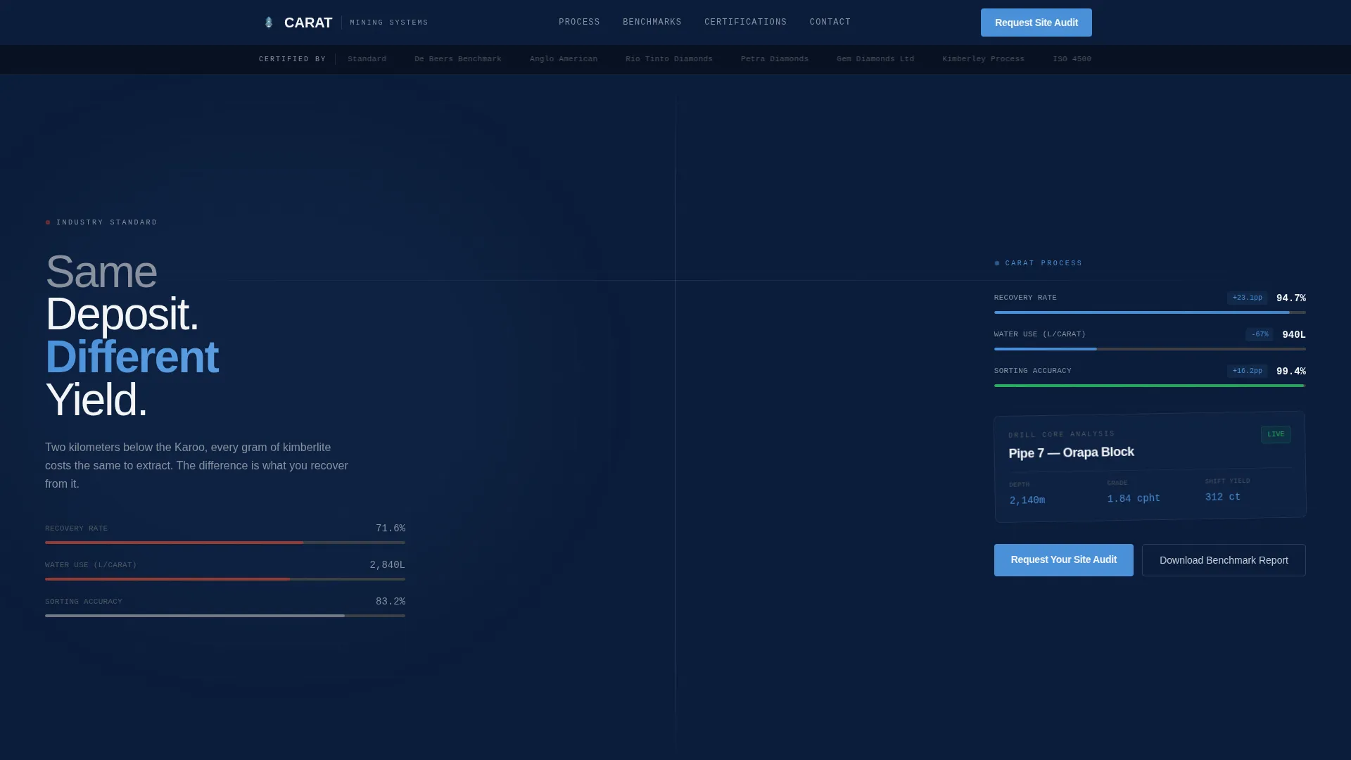
- A 50/50 split-screen layout with left-panel problem visualization and right-panel solution metrics
- A persistent sticky comparison table toggling between "Industry Standard" and "Our Process"
- Dual conversion paths: a site audit request form and a gated benchmark report download
Feature list
This template delivers a tightly scoped set of components, each serving a specific function in the buyer journey from first scroll to qualified lead.
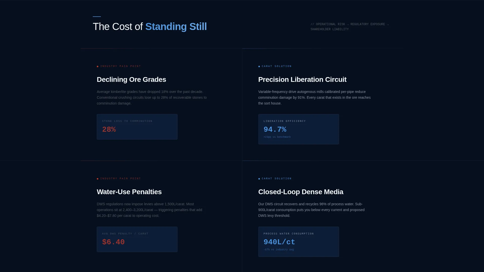
Split-Screen Problem and Solution Layout
Each section divides the screen into two equal panels. The left panel renders an industry pain point using stark data visualizations in graphite and white. The right panel responds with solution metrics and animated counters highlighted in kimberlite-blue accent.
Logo Bar Header
A clean horizontal header strip displays partner and certification marks set against command-deck navy. A single typographic headline anchors the bar, seeding the comparison narrative that drives the rest of the page.
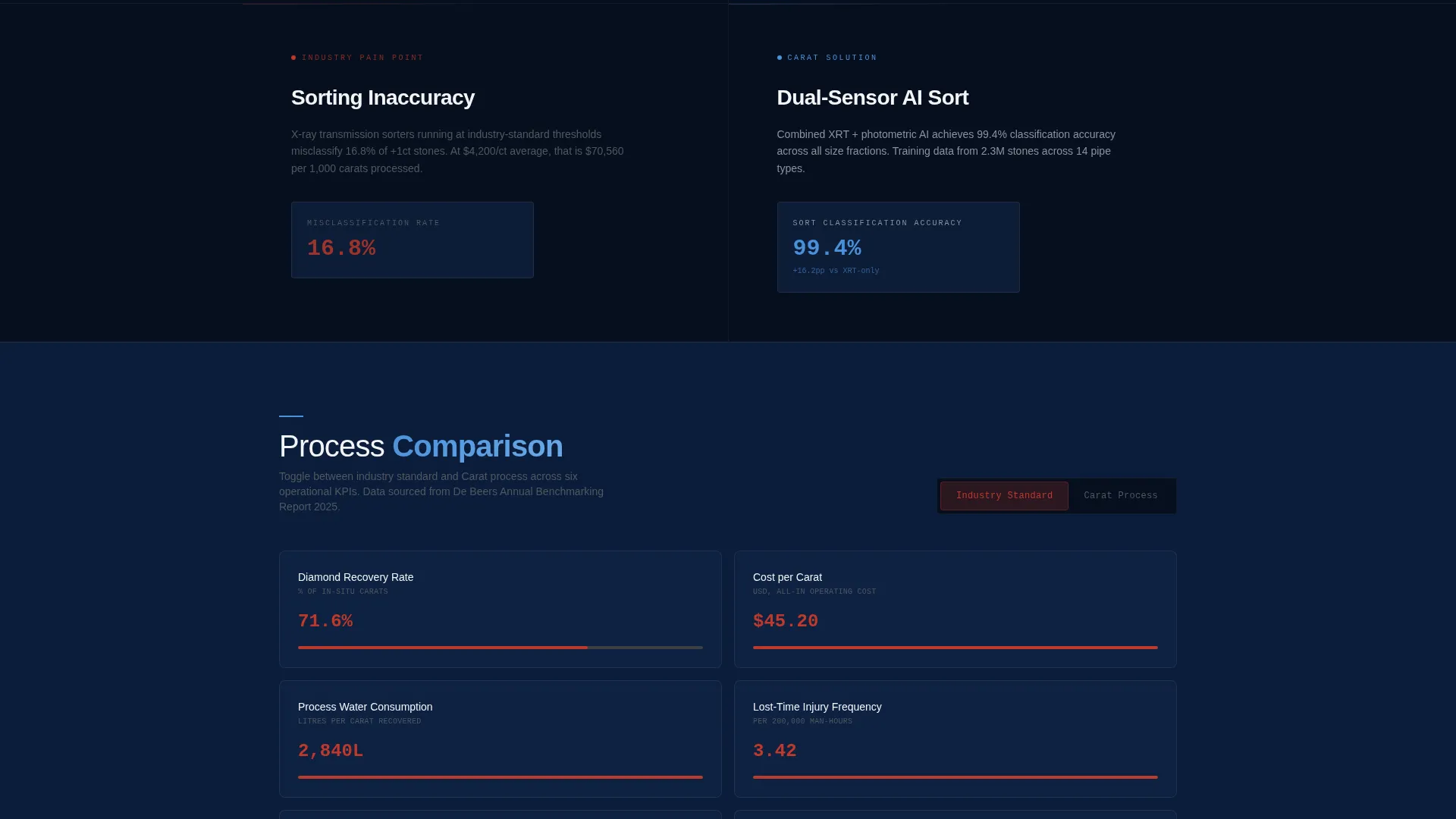
Sticky Comparison Table
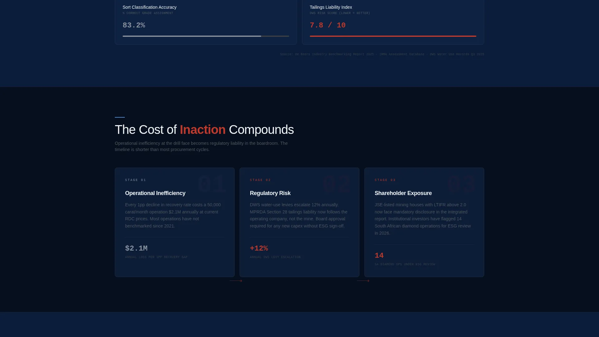
A persistent table anchored to the bottom third of the page lets visitors toggle between "Industry Standard" and "Our Process" across four tracked dimensions: recovery rate, cost-per-carat, water consumption, and safety incidents.
Primary Conversion Form
The main call to action reads "Request Your Site Audit." The form collects mine location, current throughput in carats per month, and primary ore type, ensuring leads arrive with operational context attached.
Gated Benchmark Report Download
A secondary conversion path offers a downloadable benchmark report gated behind a company email address. This captures leads who are deep in research but not yet ready for a direct conversation.
Problem-to-Stakes Scroll Arc
As the visitor scrolls, the narrative escalates. Operational inefficiency becomes regulatory risk, which becomes shareholder exposure. The page does not just explain what is better; it makes the cost of inaction tangible at each stage.
Page sections overview
| Section | Purpose |
|---|---|
| Logo Bar Header | Establish institutional trust with certification and partner marks |
| Headline Statement | Seed the comparison narrative with a single typographic line |
| Ore Grade Problem | Present declining ore grade as a measurable operational risk |
| Extraction Solution | Show recovery-rate gains with kimberlite-blue metric highlights |
| Water Use Problem | Render water-use penalty data as a regulatory liability visual |
| Water Use Solution | Display water-consumption improvements with animated counters |
| Sorting Accuracy Problem | Illustrate sorting inaccuracy and its downstream cost impact |
| Sorting Solution | Reveal precision sorting metrics against industry benchmarks |
| Tailings Liability Problem | Frame tailings exposure as a shareholder risk data point |
| Tailings Solution | Present the corresponding process response with live figures |
| Sticky Comparison Table | Let visitors toggle process metrics against the industry standard |
| Site Audit Form | Capture qualified leads with mine-specific intake fields |
| Benchmark Report Gate | Convert research-stage visitors via gated company email download |
Design & branding system
The visual identity follows a Corporate Precision theme. Every color and typographic choice is derived from the operational environment of a mine control room: functional surfaces, data-forward layouts, and zero decorative noise.
- Navy Authority palette: command-deck navy (#0B1D3A), mine-shaft graphite (#3B3F45), assay-report white (#F4F5F7), and kimberlite-blue accent (#4A90D9) reserved for interactive elements and data highlights
- Typography is set as a single typographic headline in the header with data visualizations rendered in graphite and white across left panels
- Kimberlite-blue accent is used exclusively for metrics, animated counters, and interactive table toggles to direct the eye toward performance data
Mobile & speed optimization
The split-screen layout is structured to reflow cleanly on smaller viewports so that the problem-and-solution pairing remains clear on mobile screens. Procurement and operations staff often review vendor materials on tablets during site visits, making mobile legibility a practical requirement.
- Each 50/50 panel is designed to stack vertically on narrow screens without losing the visual contrast between problem and solution
- The sticky comparison table is built to remain accessible as a scrollable component on touch devices
How this template helps you convert
The page is architected around two distinct buyer types: the decision-ready buyer and the research-stage evaluator. Both paths are served without one undermining the other.
- The primary "Request Your Site Audit" form converts visitors who are ready to engage directly, collecting operational data at the point of submission so follow-up conversations start with context.
- The gated "Download the Benchmark Report" path captures company emails from evaluators who need more data before committing, creating a self-qualified lead pool from visitors already deep in the comparison process.
Other information about this template
This template was designed specifically for the diamond mining sector and its institutional buyer profile. The content architecture reflects how capital decisions actually move through a mining house: from operations data to procurement comparison to board-level justification.
- The Kimberley Process, ISO 45001, and IRMA certification marks are referenced in the logo bar as trust anchors appropriate to this industry context
- The comparison table dimensions, recovery rate, cost-per-carat, water consumption, and safety incidents, reflect the metrics most relevant to procurement and operations evaluations in this sector
- The template is categorized under Mining and Natural Resources, Mineral and Ore Mining, with a niche focus on diamond mining operations
Theme
Corporate Precision
Creative direction
Problem→Solution Arc
Color system
Navy Authority
Style
Split Screen (50/50)
Direction
Comparison/Versus
Page Sections
Split-screen Problem and Solution Panels
Sticky Comparison Table with Toggle
Logo Bar with Certification Marks
Primary Site Audit Request Form
Gated Benchmark Report Download
Escalating Scroll Narrative Arc
Related questions
Who is this landing page template designed for?
What conversion paths does this template include?
What does the sticky comparison table do?
Can I adapt the comparison table metrics for my specific operation?
Is the split-screen layout a fixed structural choice?


