Local Brick & Mortar Business Professional Website Template
Cartridge is a nostalgic retro video game store landing page built on a Neo-Retro visual theme. It guides visitors through an immersive unboxing experience, from featured arrivals to hardware specs to store story, using layered, overlapping sections and warm ink-and-paper colors. The goal is simple: build the ache for ownership before the first click.
by Rocket studio
Quick summary
Cartridge is a single-page retro video game store landing page that recreates the feeling of opening a sealed game for the first time. Layered, overlapping sections guide collectors, parents, and speedrunners through featured arrivals, hardware, store story, and testimonials before sending them into a live inventory catalog.
Who this template is for
This template is built for retro game shop owners who want a storefront that feels as authentic as their inventory. It works whether you run a physical shop, an online store, or both.
- Collectors and enthusiast-led stores selling complete-in-box retro titles and original hardware
- Brick-and-mortar game shops wanting a landing page that drives foot traffic and online catalog visits
- Small retailers who buy and sell pre-owned games and want a page that builds trust before the first click
What problem this template solves
Most generic retail templates feel cold and transactional. Retro game stores need a page that earns emotional buy-in before asking visitors to shop. This template solves that gap by letting the nostalgia do the selling first.
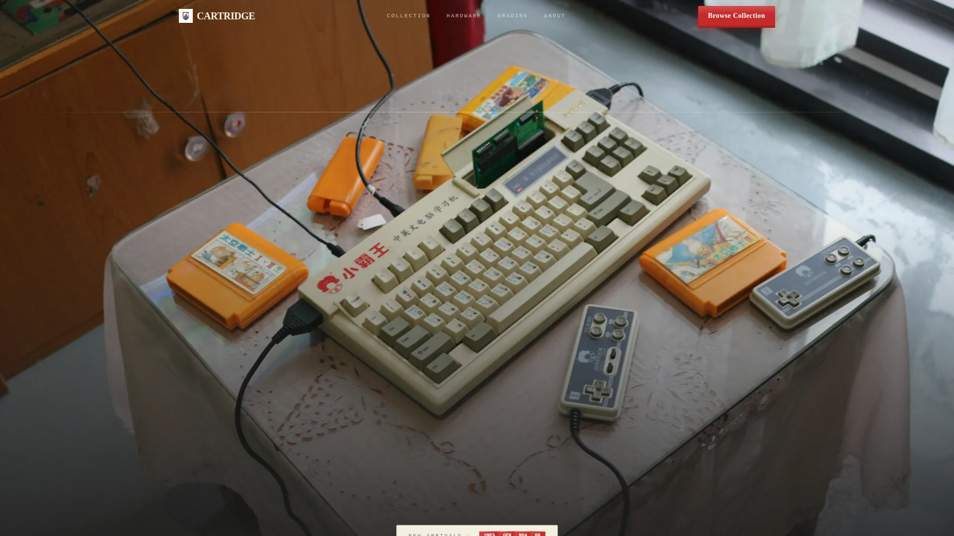
- Visitors arrive on a beautiful full-bleed flat-lay image before any call to action appears, giving them a moment to feel the atmosphere
- The layered scroll structure peels back sections like unwrapping a real game, keeping attention without relying on popups or aggressive prompts
- A persistent bottom call-to-action bar appears after the second scroll, so the path to the catalog is always visible without being intrusive
What you get with this template
You get a complete, ready-to-customize single-page layout built around the unboxing experience creative direction. Every section is designed to move a visitor emotionally before moving them commercially.
- A full-bleed overhead photo header with a store name layered in chunky pixel-serif type between the cartridges
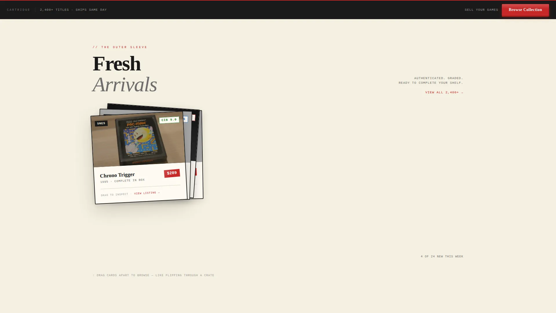
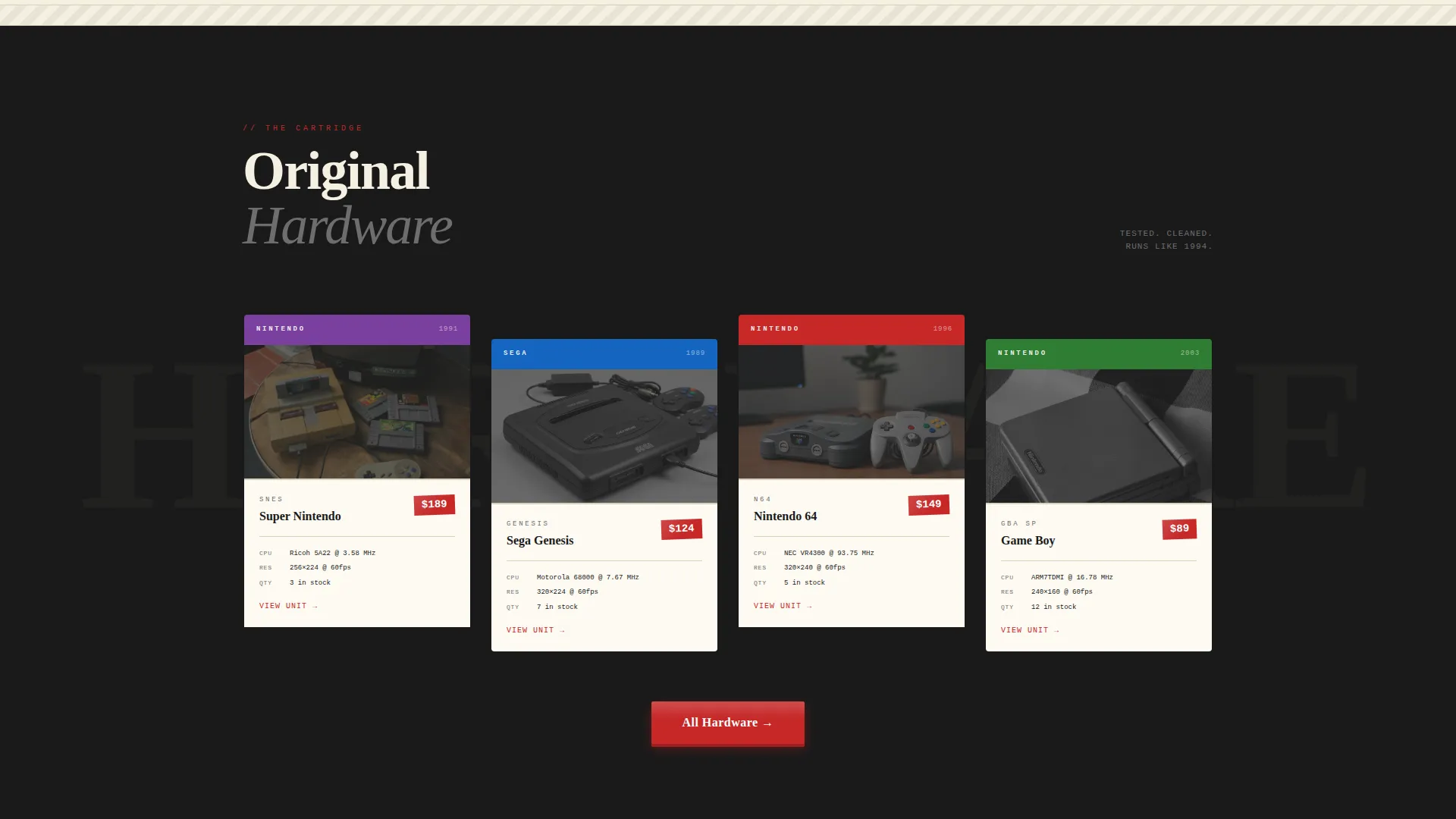
- Four distinct content zones: featured arrivals as draggable overlapping cards, hardware with faux label art specs, a two-column manual-style store story, and foam-cutout testimonial shapes
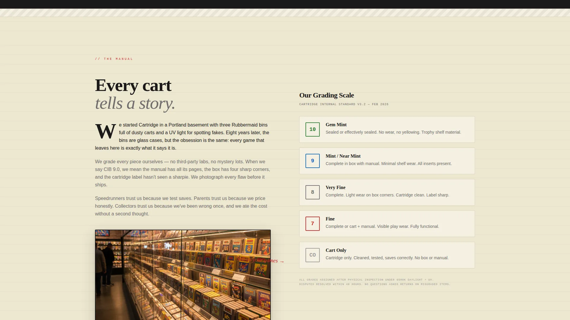
- A primary "Browse the Collection" call to action at the header bottom and as a persistent bottom bar, plus a handwritten-style "Sell Us Your Games" secondary path in the manual section
Feature list
This template packs purposeful design decisions into every scroll layer. Each feature below comes directly from the brief.
Full-Bleed Overhead Photo Header
The header opens with a warm, shallow-depth flat-lay of cartridges, controllers, and manuals on a wood-grain surface. A kid's hand reaches into frame. The store name rises from behind the objects in chunky pixel-serif type, creating a layered, tucked-between-the-cartridges effect before any marketing copy appears.
Draggable Overlapping Featured Arrivals Cards
The first content zone presents new inventory as stacked, overlapping cards that visitors can drag apart, mimicking the act of flipping through a sleeve of cartridges. This interaction makes browsing feel tactile and personal, not like a standard product grid.
Faux Label Art Hardware Section
The hardware zone displays console and controller specs printed directly onto faux cartridge label artwork. It gives technical details the same visual weight as the collectibles themselves, making specs feel like part of the store's personality rather than a spec sheet.
Two-Column Manual Typography Story Section
The store story and grading guide are laid out in a two-column format that references classic instruction booklet design. This section builds credibility by explaining how items are graded and priced, using typography and layout familiar to any collector.
Molded Foam Cutout Testimonial Shapes
Customer testimonials sit inside shapes that reference the foam inserts found in boxed game packaging. The design keeps social proof feeling thematic and on-brand rather than dropped in as an afterthought.
Persistent Bottom Call-to-Action Bar
After the second scroll, a fixed bottom bar carries the primary "Browse the Collection" call to action. It stays visible throughout the rest of the page without covering content, ensuring the path to the catalog is always one tap away.
Page sections overview
| Section | Purpose |
|---|---|
| Full-bleed header | Opens with flat-lay photo and layered store name |
| Featured arrivals cards | Showcases new inventory as draggable overlapping cards |
| Hardware label art | Displays hardware specs on faux cartridge label designs |
| Manual story section | Tells the store story and grading guide in two-column layout |
| Foam cutout testimonials | Presents customer reviews in molded foam insert shapes |
| Persistent call to action bar | Keeps "Browse the Collection" visible after second scroll |
Design & branding system
The visual identity follows a Neo-Retro theme using an ink-and-paper color palette. Every color choice references a specific physical artifact from the era of cartridge gaming.
- Yellowed manual cream (#F5F0E1) dominates the background like aged paper stock; cartridge-slot black (#1A1A1A) frames each layered card; price-sticker red (#C62828) appears only on calls to action and price callouts
- Receipt-ink gray (#6D6D6D) carries body copy with a dot-matrix print feel, and chunky pixel-serif typography anchors headings throughout
- Scroll transitions lift, slide, or peel between sections rather than fading, reinforcing the physical unboxing metaphor at every layer
Mobile & speed optimization
The template is structured with mobile visitors in mind. The layered, overlap-heavy layout adapts so nothing important gets hidden on smaller screens.
- The persistent bottom call-to-action bar is especially useful on mobile, keeping the catalog link within thumb reach at all times
- The draggable card interaction in the featured arrivals section is designed to translate to touch gestures naturally
- Image-heavy sections like the full-bleed header use warm, intentionally shallow depth-of-field photography that retains visual impact even at smaller display sizes
How this template helps you convert
This landing page is built as a click-through page. Its only job is to earn the visit to your live inventory catalog by making visitors feel something first.
- The header withholds selling entirely for the first beat, letting the photography build atmosphere and curiosity before the store name even appears, which reduces bounce from visitors who feel immediately sold at.
- The unboxing scroll structure spaces the commercial ask across multiple emotional layers, so by the time a visitor reaches the persistent bottom bar, they have already handled the nostalgia and are ready to browse.
Other information about this template
This template sits at the intersection of retail e-commerce and local brick-and-mortar business presentation. It is designed to serve shops that deal in physical, collectible goods where emotional connection drives purchasing decisions.
- The "Sell Us Your Games" secondary path in the manual section opens a buying channel without competing visually with the primary catalog call to action
- The masonry and overlapping card layout style gives the page a Pinterest-like browsing feel, which suits inventory-heavy stores where discovery is part of the appeal
- No forms are embedded on the landing page itself; all conversion paths lead outward to the catalog or a buying inquiry, keeping the page focused and fast to navigate
- This template works well for antique mall vendors, retro media shops, and collectible game stores that want a storefront with genuine personality
Theme
Neo-Retro
Creative direction
Unboxing Experience
Color system
Citrus Burst
Style
Masonry/Pinterest
Direction
Marketplace/Multi
Page Sections
Full-bleed Overhead Photo Header
Draggable Overlapping Arrivals Cards
Faux Label Art Hardware Section
Two-column Manual Story Layout
Foam Cutout Testimonial Shapes
Persistent Bottom Call to Action Bar
Related questions
Is this template suitable for an online-only retro game store?
Can I change the color palette to match my existing branding?
Does the landing page include a product listing or shopping cart?
What kind of photography works best in the header?
Can the 'Sell Us Your Games' path link to a separate contact page or form?



