Ski Instructor Certification Resource Landing Page
Carve is a single-column, editorial-style landing page built for ski instructor certification resources. It presents qualification paths, cost comparisons, and earning data in structured side-by-side tables. The tone is direct and data-led. The design uses a monochrome steel palette with electric frost blue accents to feel authoritative, not promotional.
by Rocket studio
Quick summary
Carve is a resource-focused landing page template for ski instructor certification content. It guides readers through qualification levels, exam formats, and cost comparisons using editorial typography and data-dense tables. The design is monochrome and restrained. Every section earns trust by showing data openly rather than selling a course.
Who this template is for
This template suits anyone building a comprehensive ski instructor resource hub. It is built for content-led pages where trust comes from information density, not persuasion.
- Gap-year researchers comparing certification bodies and qualification timelines
- Career-changers weighing the financial reality of leaving employment for a ski instructor role
- Already-qualified instructors deciding whether advancing to the next certification level is worth the investment
What problem this template solves
Most certification resource pages either oversimplify the process or bury critical cost and timeline data behind a contact form. Readers lose trust and leave. This template solves that by leading with full transparency.
- It removes the need to hunt across multiple sources for exam format, duration, pass rate, and cost data
- It structures complex multi-level qualification paths into scannable side-by-side comparison tables
- It presents earning potential by season clearly, so readers can model their own decision without guessing
What you get with this template
You get a fully structured, single-column landing page with a clear editorial rhythm. Each section opens with a direct question, then resolves it with a table or short factual paragraph.
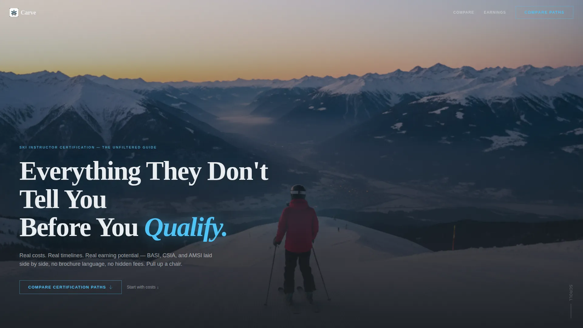
- A dark full-bleed header with editorial headline treatment and a ghost-button call to action
- Side-by-side comparison tables covering duration, price, pass rate, and employability rating across certification paths
- Two conversion touchpoints: a ghost button in the header and repeating section-level text link calls to action
Feature list
A paragraph introduces each feature below. Together they define what makes Carve a purposeful resource template rather than a generic information page.
Dark Full-Bleed Editorial Header
The header uses a full-width photograph of a lone instructor standing at the top of a steep, empty piste at dawn. A single editorial headline fades in over the image. A ghost button anchored in the header scrolls visitors directly into the comparison tables below.
Side-by-Side Certification Comparison Tables
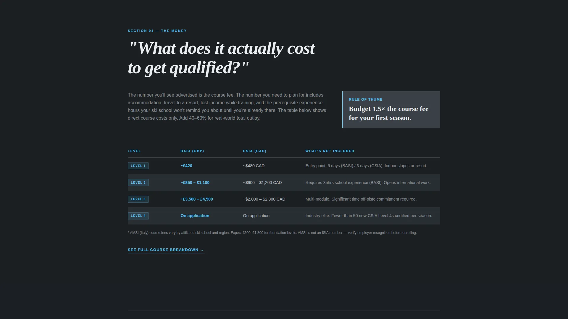
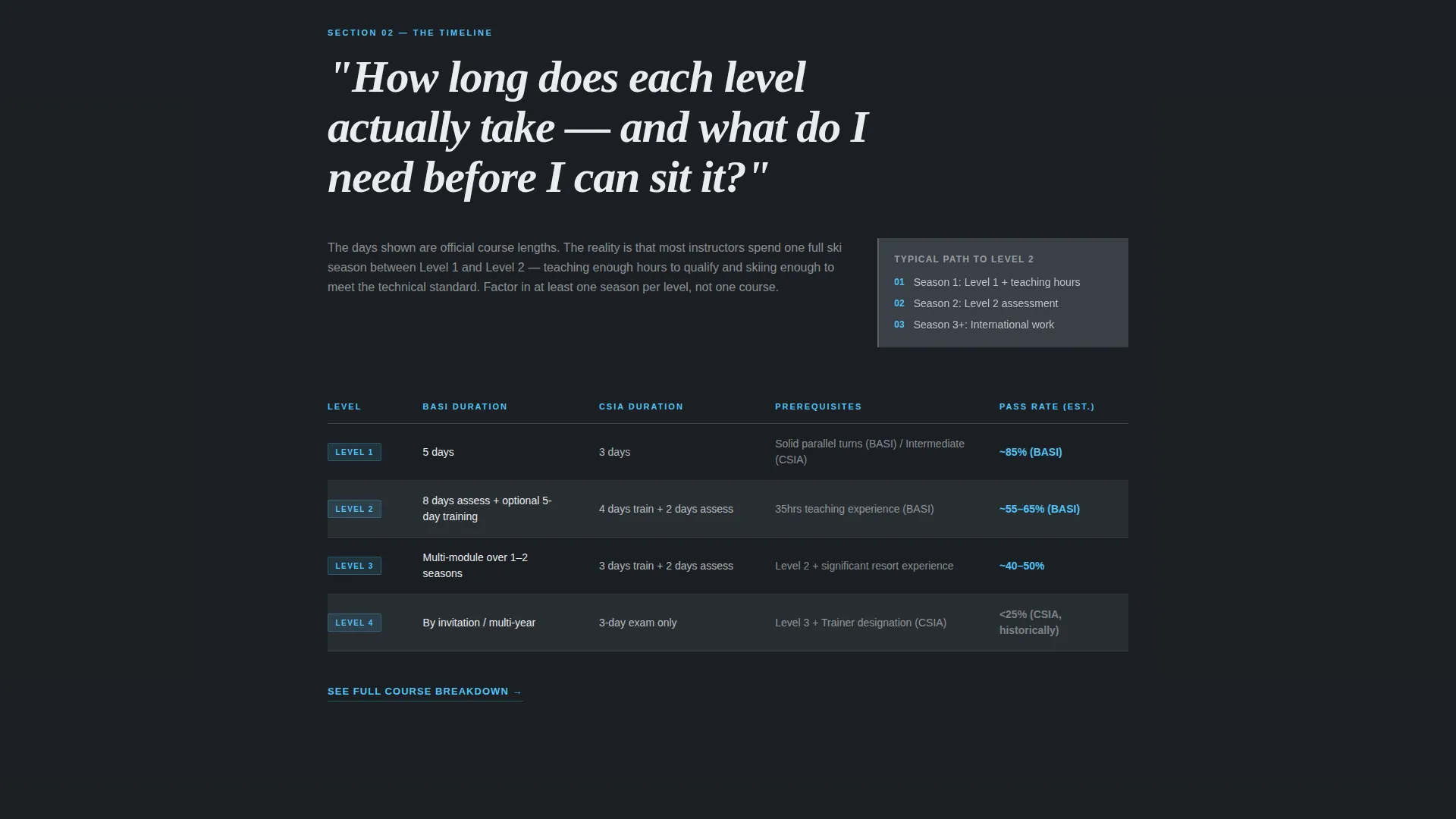
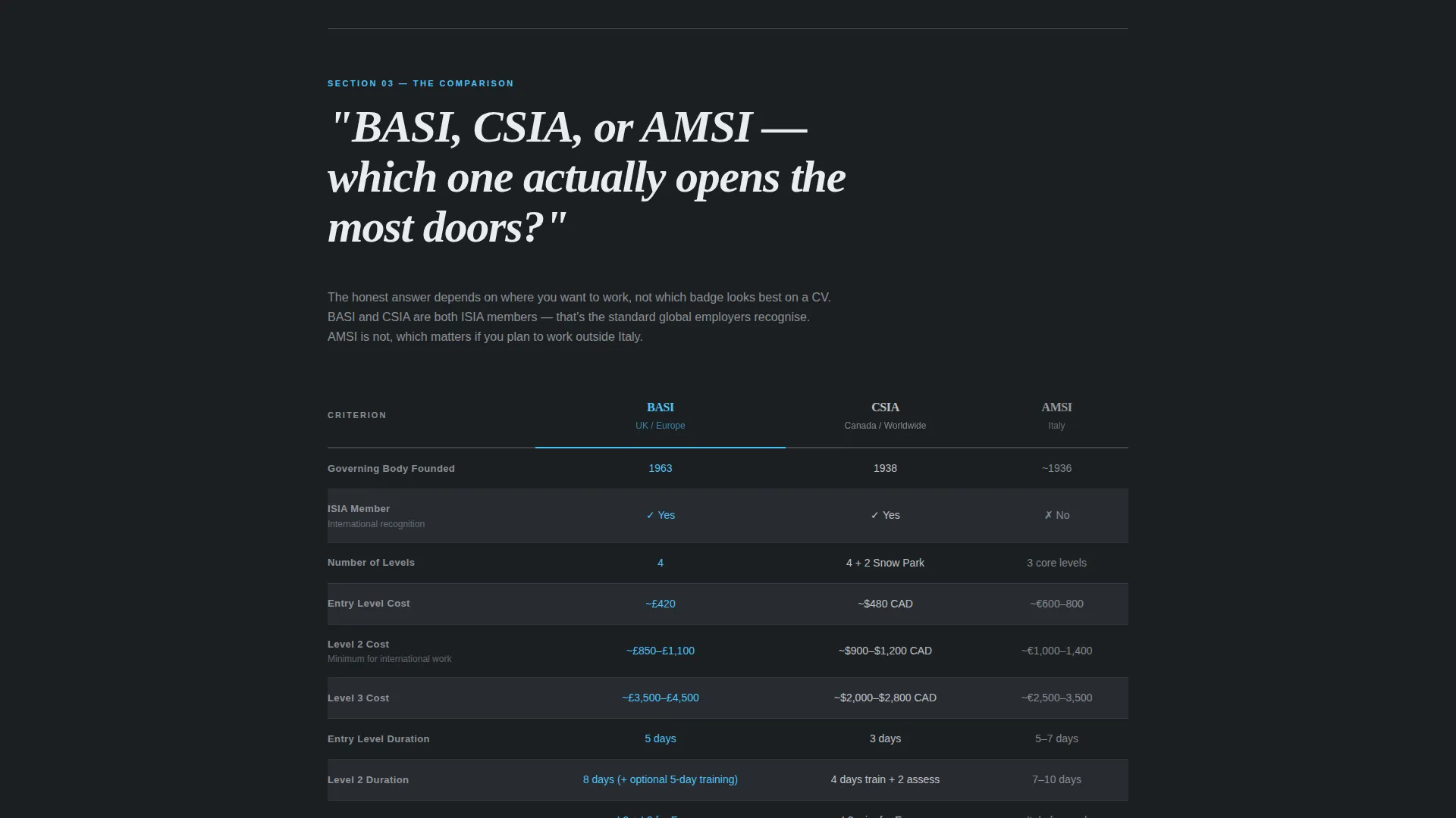
The page includes structured comparison tables that place certification paths next to each other. Columns cover duration, price, pass rate, and employability rating. Alternating table rows shift between deep charcoal and brushed gunmetal for clear visual separation without color noise.
Oversized Editorial Section Openers
Each content section opens with a large serif question set in an editorial style. This typographic rhythm signals that the page will answer directly. The ask-then-reveal structure keeps readers moving through the page with confidence.
Repeating Section-Level Calls to Action
A "See Full Course Breakdown" text link appears at the bottom of each table section. This keeps navigation consistent and lowers the friction for readers ready to explore a dedicated certification detail page.
Secondary Cost Calculator Link
A text link labeled "Download the Cost Calculator" sits beneath the final comparison table. It gives budget-focused readers a low-commitment next step without requiring a form or email submission on this page.
Page sections overview
| Section | Purpose |
|---|---|
| Full-Bleed Header | Anchors editorial tone and delivers the ghost-button primary call to action |
| Cost Question Block | Opens the financial section with a direct question and cost data table |
| Timeline Question Block | Presents level-by-level duration data in a structured comparison format |
| Certification Comparison Table | Places qualification paths side by side across key decision columns |
| Earning Potential Section | Reveals seasonal earning data to support the reader's personal budget model |
| Section-Level call to action | Repeats the course breakdown link after each major table |
| Cost Calculator Footer | Offers the spreadsheet download link as a final low-commitment action |
Design & branding system
The visual identity follows an editorial magazine direction. The palette is built on restraint: no warm tones, no lifestyle photography clichés, no gradient noise.
- Deep charcoal (#1B1F23) for primary backgrounds, brushed gunmetal (#3A3F47) for card surfaces and alternating table rows, and cold alpine white (#EAEDF0) for body text and dividers
- Electric frost blue (#4FC3F7) is used exclusively for links, hover states, and the glow accent that traces the ridgeline in the header image
- Typography pairs an editorial serif for oversized section openers with clean sans-serif body text to keep data tables highly readable
Mobile & speed optimization
The single-column flow is well suited to narrow viewports. Tables and typographic elements are structured to remain readable without horizontal scrolling on mobile screens.
- The full-bleed header image scales with the viewport so the dawn piste composition remains legible on smaller screens
- Section-level calls to action are positioned as standalone text links, keeping tap targets clear and uncluttered on touch devices
How this template helps you convert
Carve earns clicks by proving its resource value before asking for anything. The conversion logic is transparency-first.
- The ghost button in the header anchors the primary call to action immediately, directing readers to the comparison tables before they need to scroll
- The repeating section-level links give readers a clear next step after each table, reducing the distance between reading and clicking through to a detail page
Other information about this template
This template is designed for the professional services context where a ski instructor booking page or certification resource hub needs to demonstrate expertise before inviting a next step.
- The lp direction is content and resource led, meaning the page earns trust through data density rather than promotional copy
- The single-column flow keeps the reading path linear and distraction-free, which suits long-form comparison content
- The template does not include a contact form or email capture on the page; the conversion action is a click to a linked page or a spreadsheet download
- The header concept draws from a stats and metrics editorial approach, using data points and structured tables as the primary trust signals rather than testimonials or logos
Theme
Legal Shield
Creative direction
Logo Wall Authority
Color system
Navy Authority
Style
Single Column Flow
Direction
Content/Resource
Page Sections
Dark Full-bleed Editorial Header
Side-by-side Certification Comparison Tables
Oversized Editorial Section Openers
Repeating Section-level Calls to Action
Secondary Cost Calculator Link
Related questions
Is this template suitable for a single certification body or multiple paths?
Does this template include a contact form or email capture?
Can the comparison table columns be changed to fit different data?
Who is responsible for keeping the cost and timeline data accurate?
Can this template be used for certification resource pages outside ski instruction?



