Ski Instructor Booking Website Template
Carve is a single-page landing page template built for independent ski instructors. It pairs a fixed sidebar booking module with a proof-driven main column so visitors move from first impression to confirmed lesson with minimal friction. The layout uses a bold monochrome steel palette with safety orange call-to-action accents to signal professionalism and trust immediately.
by Rocket studio
Quick summary
Carve is a focused landing page template for a solo ski instructor business. It uses a sidebar-plus-main-column layout to keep the booking form always visible while the main content builds trust through resort credentials, certification badges, and real client progression stories. Visitors arrive, see the proof, and book without ever leaving the page.
Who this template is for
This template is designed for independent ski instructors running a one-person operation. It works especially well for instructors who already have a client base and want a polished page to convert new inquiries into confirmed bookings.
- Solo ski instructors targeting families, corporate groups, and returning local skiers
- Instructors with visible certifications and resort affiliations who want those credentials front and center
- Ski teaching professionals ready to replace a basic contact page with a dedicated booking-focused landing page
What problem this template solves
Most ski instructors rely on referrals or resort booking systems that bury their personal profile. This template gives the instructor full ownership of their first impression. It removes the gap between a visitor finding you and actually booking a lesson.
- Visitors leave before booking because there is no visible availability or easy entry point
- Credentials and client results are scattered or missing, so trust builds too slowly
- A generic website does not reflect the energy and specificity of a skilled, personable instructor
What you get with this template
The template delivers a complete, single-page layout structured around one goal: turning a curious visitor into a booked client. Every section is positioned to add a layer of confidence before the booking form is touched.
- A fixed sidebar booking module with a date picker, group size stepper, and ability level selector
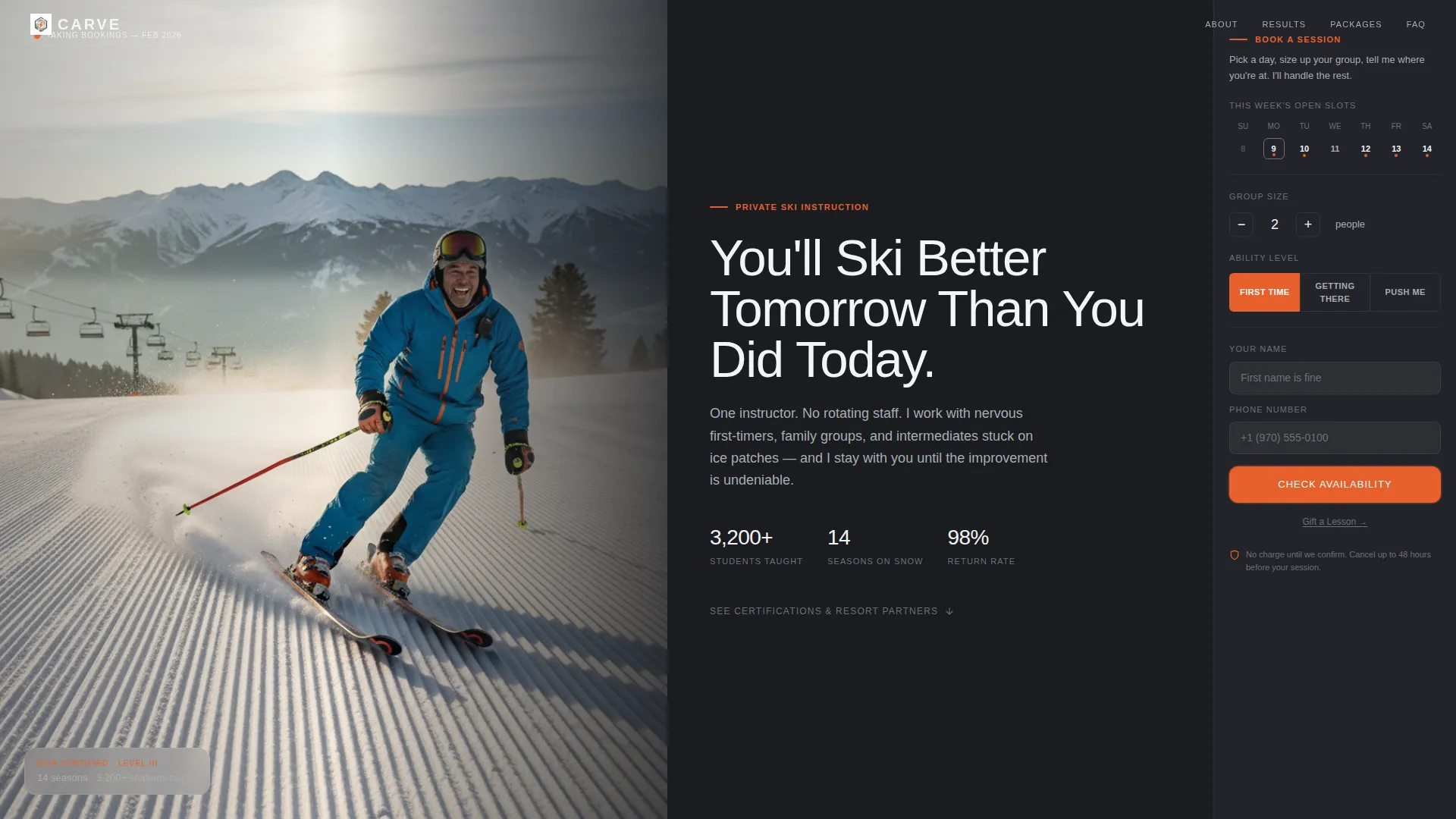
- A half-page photo-and-text header with a headline, credential count, and an orange-accented availability calendar
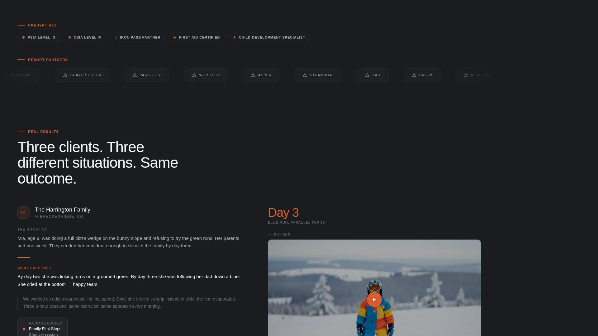
- A main content column featuring a logo wall, certification badge rail, and three stacked client result stories with before-and-after video clip placeholders
Feature list
This template is built around a small number of purposeful components. Each one earns its place on the page.
Fixed Sidebar Booking Module
The sidebar stays locked as the visitor scrolls. It holds a date picker, a group size stepper, and a three-option ability toggle labeled First Time, Getting Comfortable, and Ready for More. A name and phone field complete the short form. A secondary "Gift a Lesson" text link sits below the primary button for holiday gift buyers.
Half-Page Photo and Text Header
The header splits the screen. The left side holds a candid mid-turn instructor photograph shot from below, capturing a real human face mid-laugh with a plume of fine snow catching morning light. The right side carries a heavyweight sans-serif headline against a charcoal background with a one-line credential count and a booking calendar widget showing open slots highlighted in safety orange.
Logo Wall and Certification Rail
A horizontally scrollable rail sits just below the header fold. It displays resort logos and certification badges to establish credibility in the first scroll. This section is built for logos such as professional instructor association badges and partner resort marks, giving visitors immediate reassurance about the instructor's qualifications.
Client Result Story Blocks
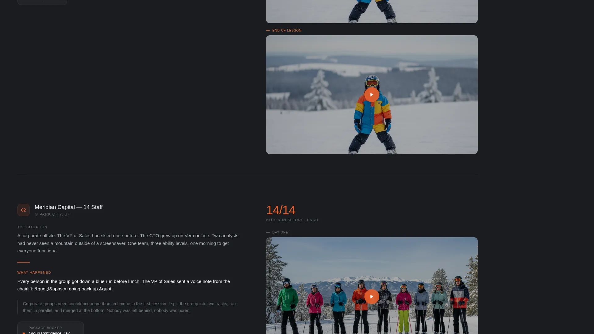
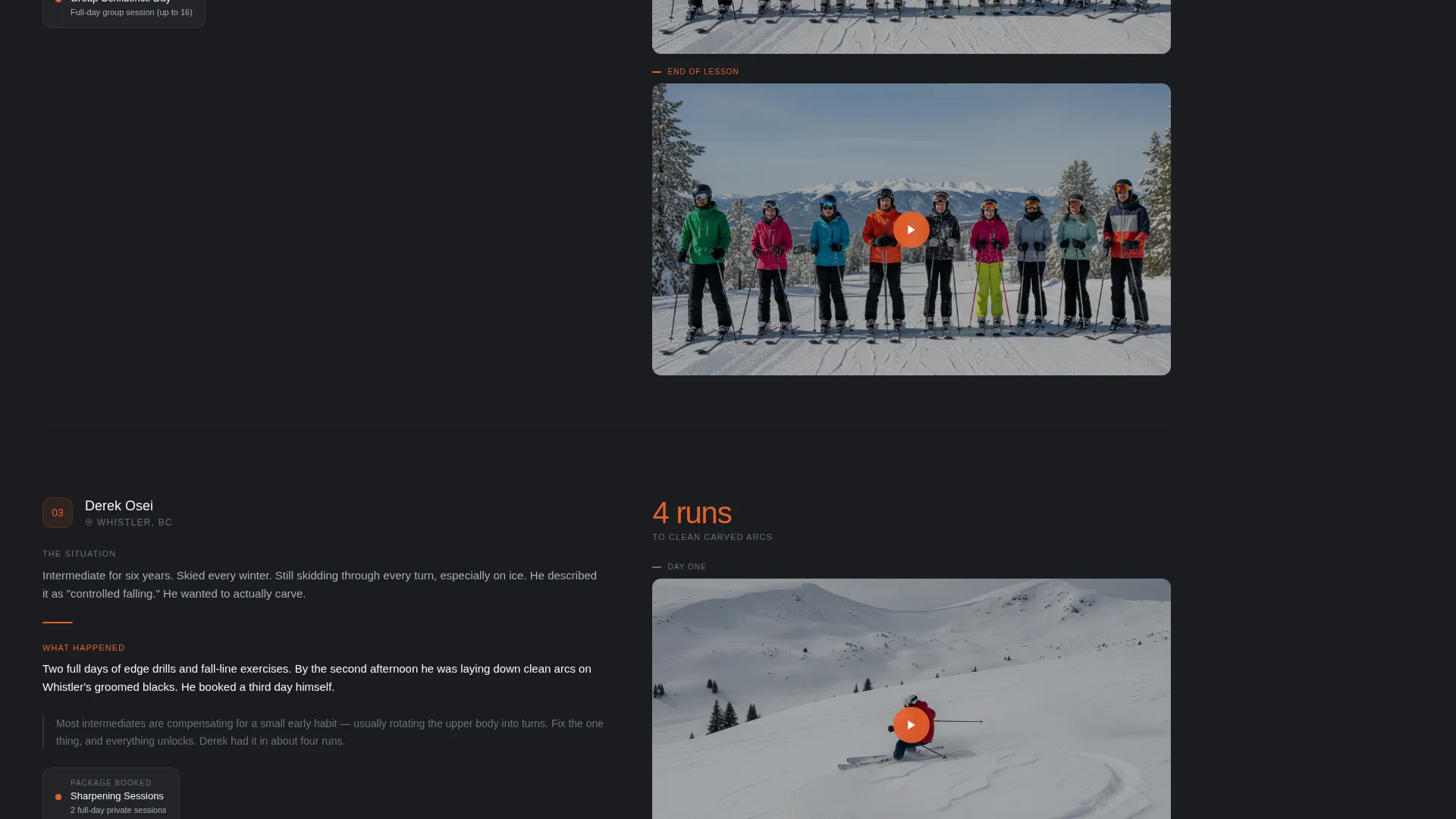
Three stacked story sections each tell a short before-and-after account of a real client experience. Each block includes a written paragraph, a placeholder for a before-and-after video clip, and a clear label showing the exact lesson package that client booked. The rhythm is deliberate: proof, then proof, then proof.
Safety Orange Call-to-Action System
The accent color is reserved exclusively for booking buttons and availability indicators. The "Check Availability" button lives permanently in the sidebar. This strict color discipline means visitors always know what to click and the booking action never competes visually with other page elements.
Page sections overview
| Section | Purpose |
|---|---|
| Header Split | Introduce instructor with photo, headline, credential count, and open-slot calendar |
| Sidebar Booking Module | Keep date picker, group size, and ability selector permanently visible while scrolling |
| Logo and Badge Rail | Build instant credibility with resort logos and certification badges |
| Client Story One | Show first client's progression from nervous beginner to linked turns with booked package |
| Client Story Two | Show second client's result and reinforce proof with video clip placeholder |
| Client Story Three | Show third client's outcome and close the proof sequence before the booking form feels optional |
Design & branding system
The visual identity uses a Service Utility theme built around a Monochrome Steel color system. The palette feels deliberate and functional, like the interior of a well-maintained ski patrol hut where everything is built for clarity under difficult conditions.
- Four-color palette: charcoal base (#2B2D33), brushed aluminum (#A8ADB3), hard-pack white (#F4F5F7), and safety-jacket orange (#E8602C) used only for booking buttons and availability indicators
- Heavyweight sans-serif typography for headlines, paired with clean body text that stays readable at all sizes against the dark charcoal base
- A Logo Wall Authority creative direction keeps the above-the-fold area feeling credentialed and professional without relying on decorative illustration
Mobile & speed optimization
The template is structured to translate cleanly from desktop to smaller screens. The sidebar booking module adapts so the booking form remains accessible without dominating the reading experience on a phone.
- The fixed sidebar collapses to an accessible sticky footer or inline form on narrow viewports so the booking action is never more than a scroll away
- The half-page header photo and text stack vertically on mobile, keeping the headline and availability calendar visible without crowding
- The horizontally scrollable logo and badge rail functions naturally on touch devices, letting visitors swipe through credentials without layout disruption
How this template helps you convert
Every structural decision in this template is pointed at one outcome: a confirmed booking. The page earns the form submission before the form is ever opened.
- The booking sidebar is visible from the first second on the page, so visitors never have to hunt for a way to get started. Availability in orange pips makes open slots feel real and time-sensitive.
- The logo wall and certification section build authority before a single word of sales copy appears. Resort partnerships and professional credentials do the persuading quietly.
- Three client result stories with specific packages attached give visitors a concrete picture of what they are buying. By the time a visitor reaches the third story, filling in the date picker feels like a natural next step rather than a risk.
Other information about this template
This template is a strong fit for ski instructor booking pages where personal credibility and lesson clarity matter more than volume. It is designed as a single-column flow in the main content area paired with a persistent sidebar, making it a practical choice for instructors who want a clean online presence without managing a multi-page site.
- The "Gift a Lesson" secondary link makes this template useful during holiday booking periods when gift purchases peak
- The three-option ability toggle (First Time / Getting Comfortable / Ready for More) keeps the booking form approachable for all incoming client types without requiring a lengthy intake questionnaire
- The template supports a ski instructor online presence that feels personal and specific rather than generic, which is particularly important for solo operators competing against larger resort-managed programs
Theme
Legal Shield
Creative direction
Logo Wall Authority
Color system
Navy Authority
Style
Single Column Flow
Direction
Content/Resource
Page Sections
Fixed Sidebar Booking Module
Half-page Photo and Text Header
Logo Wall and Certification Rail
Stacked Client Result Stories
Safety Orange Call-to-action System
Gift a Lesson Secondary Path
Related questions
Can I use this template if I only offer one type of ski lesson?
Does the sidebar booking module stay accessible on mobile devices?
What if I do not have before-and-after video clips for the client stories?
Why is the orange accent color restricted to buttons and availability indicators?
Is this template suitable for instructors who work across multiple resorts?



