Sports & Outdoor Store Blog Website Template
Carve is a masonry-style ski and snowboard shop landing page built for gear discovery and quiz-driven conversion. It combines a user-generated content photo wall, a Pinterest-style masonry grid with scarcity badges, and an interactive "Match My Ride" quiz that surfaces personalized gear recommendations. The template uses a bold Citrus Burst palette and high-energy editorial design to match the bluebird-day feeling of a true mountain shop.
by Rocket studio
Quick summary
Carve is a single-page gear discovery template designed for ski and snowboard shops that want to move customers from "browsing" to "reserved" in one scroll. It combines a live-feeling user-generated content hero, an urgency-driven masonry product grid, a guided "Match My Ride" quiz, curated staff picks, and a closeout deals cluster. Every section is built to create momentum and reduce the friction that stops customers from committing to the right setup.
Who this template is for
Carve is built for independent mountain sports retailers, direct-to-consumer snowsport brands, and specialty ski and snowboard shops that sell online or want to drive in-store visits from digital marketing. It serves shop owners and marketing teams who want a high-energy site that reflects real mountain culture rather than a generic e-commerce catalog.
- Shop owners and retail teams who want a discovery-first experience for new and returning customers
- Marketing leads who need a structured approach to seasonal promotions, clearance events, and pre-season launch windows
- Developers and no-code builders who want a rich, interactive template they can deploy and adapt quickly for a specific shop's brand
What problem this template solves
Most gear sites overwhelm shoppers with flat catalog grids and zero context. A first-time buyer lands on a product page for a 156cm all-mountain board and has no idea whether it is right for them. They bounce. The shop loses the sale. Carve solves that by making discovery feel like a conversation with a knowledgeable shop employee rather than a database search. It gives customers a structured path from curiosity to confident purchase.
The template directly addresses several recurring pain points for specialty retailers:
- Customers leave without converting because they face too many options and receive no guidance on which setup fits their ability level, terrain preference, and body size
- Seasonal urgency is invisible in standard catalog layouts, so customers do not feel the pressure of limited stock or closing pre-season windows
- Social proof is underused in most shop sites, leaving real customer moments locked on social channels instead of embedded in the purchase flow
What you get with this template
Carve delivers a fully structured, section-led single-page experience with six distinct zones. Each section has a specific job: capture attention, drive discovery, qualify the buyer, surface curated picks, close with urgency, and confirm with a clean footer. The template is ready to customize with your own product copy, photography, and brand adjustments.
Key deliverables included in this template:
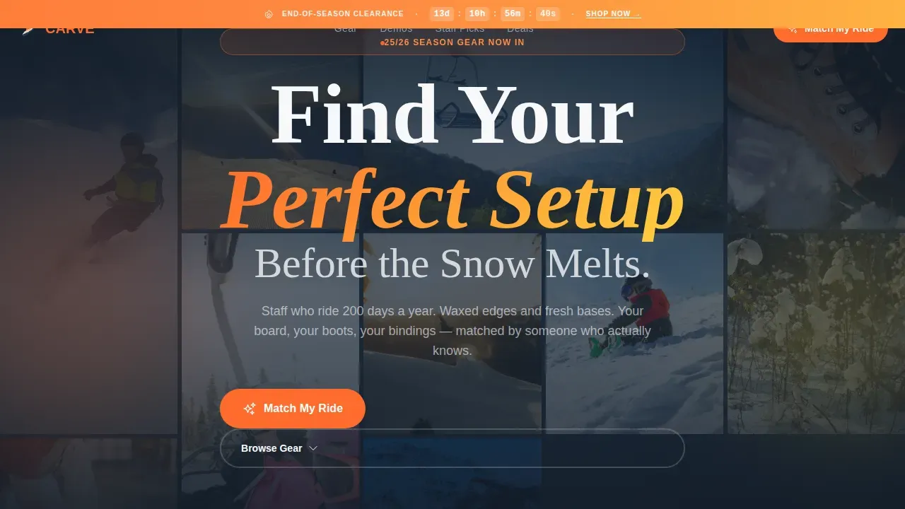
- Hero section with a viewport-filling user-generated content photo wall, bold headline, and persistent countdown urgency bar
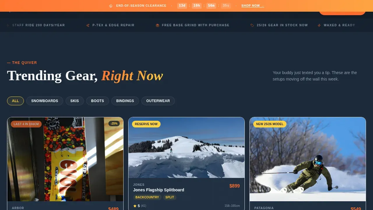
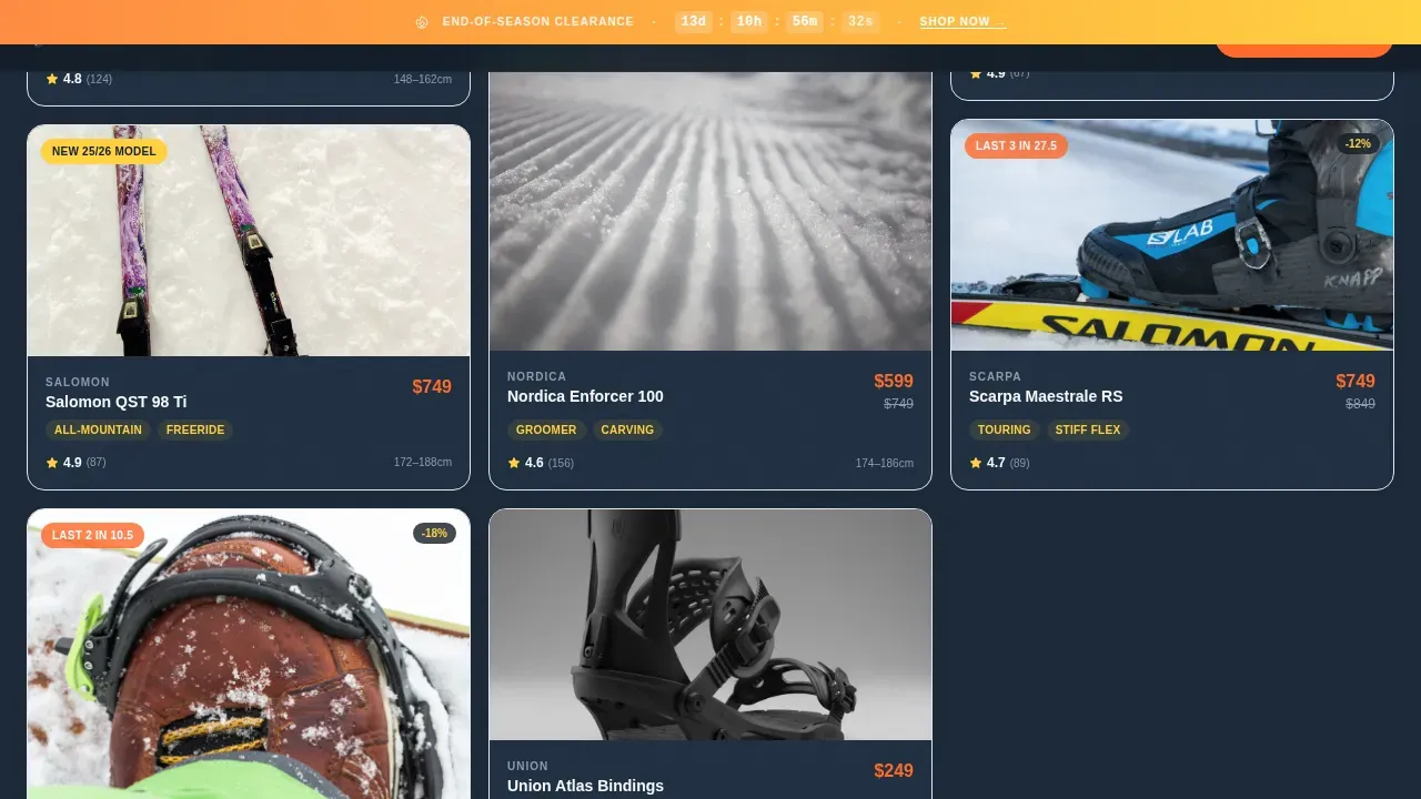
- Gear Discovery grid built as a masonry layout with filter tabs, category chips, and per-tile scarcity badges
- Match My Ride quiz modal with ability, terrain, size, and buy-or-demo inputs that return three curated gear recommendations
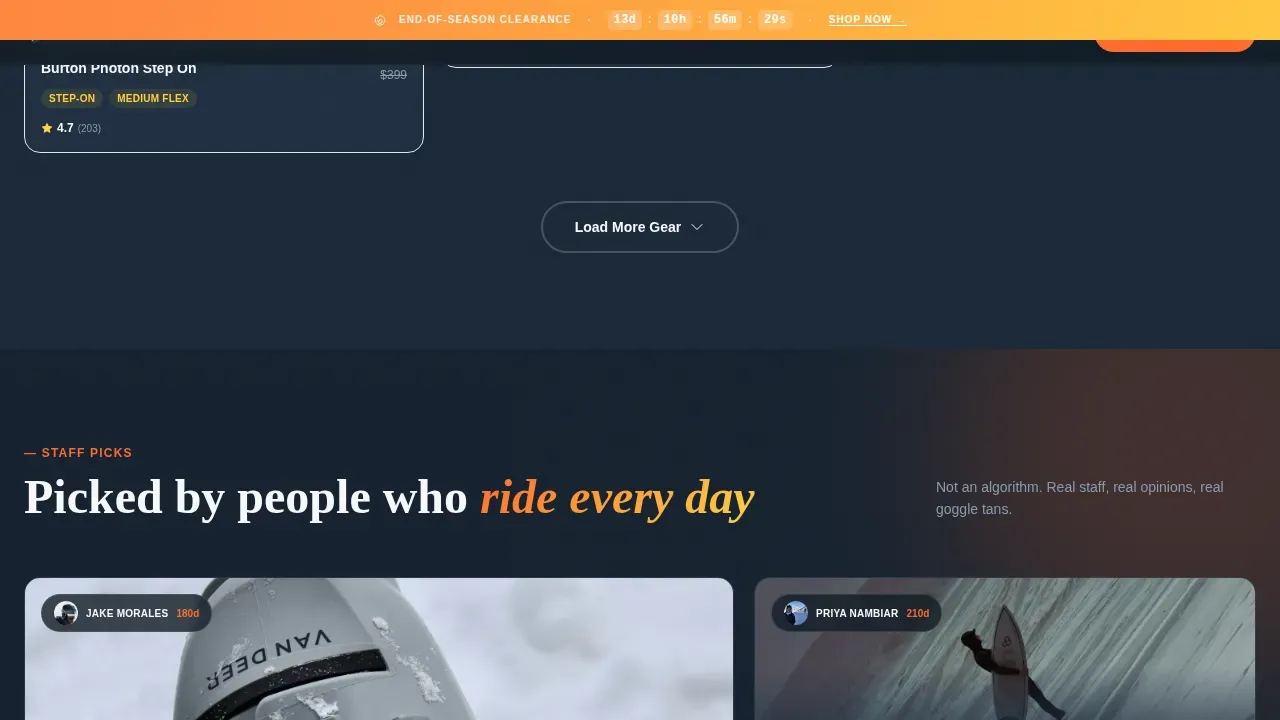
- Staff Picks bento grid with asymmetric layout and credential-backed selections
- Closeout Deals cluster with urgency-driven masonry tiles and a repeat call-to-action
- Linear single-row footer with essential links and minimal distraction
Feature list
Carve is built around six core capabilities that work together to drive discovery and conversion. Each feature reflects a deliberate design and interaction decision grounded in the shop's real customer experience.
UGC Photo Wall Hero
The hero fills the full viewport with a mosaic of customer-submitted images: powder sprays, chairlift selfies, boot-fitting close-ups, and on-mountain action. Tiles load in staggered, slightly overlapping layers with a parallax drift effect. A bold headline punches through the center and a persistent countdown bar anchors urgency above the fold. The first thing a user sees immediately communicates the shop's authentic identity and value proposition.
Masonry Gear Discovery Grid
The product discovery grid uses a Pinterest-style masonry layout with filter tabs and category chips that let customers narrow by terrain type, gear category, or deal status. Each tile carries a real-time scarcity badge such as "Last 3 in 176cm" or "New 25/26 Model, Reserve Now." As users scroll, the grid transitions between trending gear, staff picks, and closeout clusters. Each cluster is introduced by a single punchy line that reads like a tip from a friend.
Match My Ride Quiz Modal
The primary call-to-action launches an interactive gear-finder quiz. It asks four key inputs: ability level (described in honest, relatable language), preferred terrain, height and weight for sizing, and whether the customer is buying or demoing. Results surface three curated masonry cards with a "Reserve This Setup" secondary call-to-action. This quiz earns the click by promising specificity rather than generic advice, turning a passive browser into a qualified buyer with a clear next step.
Staff Picks Bento Grid
The staff picks section uses an asymmetric bento grid layout where each tile is backed by a staff credential. Selections are presented as personal recommendations from people who ride two hundred days a year. This format builds trust through specific context: real people with real experience making real suggestions. Social proof is embedded at the selection level, not bolted on as an afterthought.
Countdown Urgency Bar
A persistent countdown bar tracks end-of-season clearance windows or early-bird pre-season offers. It stays visible as the user scrolls, maintaining a subtle but constant reminder that the window is closing. This drives momentum without interrupting the discovery flow. The bar uses tangerine color treatment to stay visually distinct against the navy grid background.
Citrus Burst Visual System
The template ships with a complete four-color Citrus Burst identity: electric tangerine (#FF6B2B), high-noon yellow (#FFD23F), deep mogul navy (#1B2838), and snowpack white (#F8F9FB). Typography pairs Fraunces for display headings with Manrope for body text. Hover states, countdown badges, and category chips each use specific palette roles so the visual language is consistent and purposeful across every scroll depth.
Page sections overview
| Section | Purpose |
|---|---|
| Hero Photo Wall | Viewport-filling UGC mosaic with bold headline and urgency countdown bar |
| Gear Discovery Grid | Masonry product tiles with filter tabs, category chips, and scarcity badges |
| Match My Ride | Interactive quiz modal returning three personalized gear recommendations |
| Staff Picks Grid | Asymmetric bento layout with staff-credentialed product selections |
| Closeout Deals | Urgency-driven masonry cluster with repeat call-to-action |
| Single-Row Footer | Minimal linear footer with essential links |
Design & branding system
Carve uses the Citrus Burst color system to create a palette that feels like a lift ticket against a neon jacket on a bluebird day. Every color has a defined role across the layout so the visual language stays coherent from hero to footer without feeling chaotic or over-designed.
- Color roles: navy (#1B2838) anchors grid backgrounds and body typography; snowpack white (#F8F9FB) provides breathing room between masonry tiles; tangerine (#FF6B2B) fires on hover states and countdown badges; yellow (#FFD23F) marks tags, filters, and category chips like trail markers on a gladed run
- Typography: Fraunces serif handles display headings and punch-through overlay text for a raw, editorial feel; Manrope sans-serif handles body copy, filter labels, and badge text for clean legibility at small sizes
- Animation style: staggered masonry tile reveals, parallax photo layers, spotlight hover effects on product cards, and a live countdown timer create a high-energy, mountain-authentic interaction feel built entirely on CSS transforms
Mobile & speed optimization
Carve is designed mobile-first, reflecting the reality that most ski trip planning happens on a phone between runs, in a lodge, or on a chairlift. The masonry grid adapts from a rich multi-column desktop layout to a single-column stack on smaller screens without losing the scarcity badge context or the quiz call-to-action prominence.
- Mobile-first masonry: the grid collapses cleanly on small screens, keeping filter tabs accessible and badge text readable without horizontal scroll
- Intersection Observer lazy reveals: masonry tiles and photo wall layers use Intersection Observer triggers for lazy loading, so content enters the viewport only when needed rather than all at once
- CSS-only transforms: all animation effects including parallax drift, staggered tile reveals, and hover spotlights run on CSS transforms only, keeping the interaction layer lightweight and smooth on mobile hardware
How this template helps you convert
Carve is built around a single conversion philosophy: make the right setup feel inevitable. Every section moves the customer one step closer to clicking "Reserve This Setup" by reducing uncertainty, raising urgency, and making the shop feel like a trusted guide rather than a vendor.
- Discovery builds confidence before the ask: the masonry grid, staff picks, and UGC hero let customers absorb the shop's identity and product depth before they encounter any purchase pressure, so by the time the quiz call-to-action appears they already trust the source
- The quiz earns the click through specificity: rather than pointing customers at a catalog, the "Match My Ride" modal asks four focused questions and returns three named setups with a direct reservation path, converting a vague browsing session into an informed decision with clear milestones
- Urgency is structural, not decorative: the countdown bar, scarcity badges, and closeout deals cluster are not just visual flourishes, they create a consistent signal that real time visibility into stock and season windows matters, which motivates action without manufactured pressure
Other information about this template
Carve is a purpose-built template for ski and snowboard shops, but the underlying design system and interaction patterns are applicable across a range of specialty retail and direct-to-consumer contexts. Below is additional context that helps teams understand the broader value and use-case fit of this template.
The template structure reflects strong product discovery principles. Product managers and shop teams alike benefit from a structured approach that helps customers move through a clear discovery journey. Product discovery templates are structured frameworks that guide teams through identifying user problems, validating ideas, and deciding what to build, and Carve embeds that same logic into its customer-facing flow. The "Match My Ride" quiz functions like a lightweight opportunity solution tree, helping the customer break down their needs and surface the most relevant solution from multiple product paths.
Effective product management involves balancing structure with flexibility. Carve does this visually: the grid provides structure through its masonry layout and filter tabs, but the masonry tile variety and staggered clusters give each session a feeling of organic discovery. Product teams adapting this template can define the filter taxonomy, badge language, and quiz parameters to match their actual inventory and seasonal strategy without rebuilding the underlying layout.
Discovery work benefits from continuous customer input. Customer interviews and real user feedback are the foundation of any good product discovery process. The UGC photo wall in Carve embeds the outputs of that discovery work directly into the hero: real customers sharing real moments create a feedback loop that new visitors can immediately trust. This social proof mechanism does what product teams know customer interviews confirm, people trust people who look like them.
The opportunity solution tree thinking behind the quiz design is worth noting for teams who use product management frameworks. Rather than surfacing a flat list of options, the quiz asks the customer to define their constraints (ability, terrain, size, budget intent) before showing results. This mirrors how a good product manager uses an opportunity solution tree to break big opportunities into specific, testable solution paths. The result for the customer is not a catalog, it is a filtered, specific recommendation that feels earned.
Teams aligned on seasonal marketing strategy will find the countdown bar and scarcity badge system a simple way to coordinate urgency messaging across the entire page. Keeping projects on schedule means having clear timelines and real time visibility into what is in-stock and what is closing out. The badge and countdown system provides that visibility directly on the product tile without requiring a separate reporting dashboard or back-end update layer.
The template also reflects best practices in marketing conversion design. A compelling, benefit-driven headline above the fold communicates the value proposition immediately. Call-to-action buttons repeat as users scroll so the desired action stays in view. Trust badges and staff credentials reduce anxiety during decision-making. Real customer testimonials with specific gear details improve credibility. Authentic visuals showing products in action enhance engagement at every scroll depth.
For teams thinking about how this template scales across different campaigns or seasonal windows, the modular section design makes it straightforward to swap in new hero imagery, update countdown targets, refresh badge copy, and rotate staff picks without restructuring the layout. The core components remain stable while the content layer stays current.
Product teams working in retail, SaaS marketing, or any discovery-led context will recognize the patterns here. A structured approach to product discovery means teams gather insights, evaluate opportunities, and make informed decisions rather than acting on vague requests or generic advice. Carve brings that same discipline to the customer-facing experience: every section has a defined job, every interaction has a purpose, and the overall flow moves the visitor from curiosity to commitment without unnecessary detours.
The template supports a wide range of marketing efforts including seasonal promotions, pre-season launch windows, clearance events, and ongoing gear discovery campaigns. Teams can use the masonry structure to run A/B testing on badge language, quiz entry points, and hero imagery to continuously refine what resonates best with their ideal customers. Regularly conducting such tests helps identify patterns in what drives clicks and reservations so the shop can make smarter decisions each season.
Carve is also useful context for product teams building or evaluating discovery-led commerce templates more broadly. The template demonstrates how discovery work, customer experience design, and marketing conversion principles can be unified into a single coherent page. Using templates for product discovery can standardize processes and improve how teams stay aligned across seasonal campaigns. Discovery work should be continuous, and Carve is designed to be updated season after season as new gear, new customers, and new market conditions emerge.
Additional notes on the template's fit and context:
- The carve find your perfect gear discovery landing page template is specifically designed for ski and snowboard shops that prioritize guided gear matching over flat catalog browsing
- The template supports new clients coming in from paid search, social channels, and email campaigns by maintaining strong message match between ad creative and page content
- For shop teams onboarding new team members, the modular section layout and clearly defined color roles make the template straightforward to hand off and maintain
- Labor costs for customization are kept manageable because the structure is pre-built and the primary edits involve copy, imagery, and seasonal badge content rather than layout reconstruction
- Cash flow impact for seasonal shops is directly supported by the pre-season reservation path, which allows shops to capture demand and cash flow commitments before inventory arrives
- The template can act as a strategic advisor for shops unsure about how to structure their digital presence by modeling a proven discovery-to-conversion flow
- Key metrics for a template like this include quiz completion rate, reservation clicks, countdown-driven conversions, and staff picks engagement, all of which the shop team can instrument using their preferred tools
- The opportunity solution tree framework, often used by product managers in software product teams, has a direct analog in the quiz flow: define the customer's constraints, explore solution branches, and surface the most relevant recommendation
- Historical data from previous seasons can inform which gear clusters to surface first, which badge language converts best, and when to trigger clearance countdown windows
- Multiple stakeholders in a shop context, buyers, floor staff, marketing leads, can each find their contribution reflected in the template's sections: buyers in the grid curation, staff in the picks bento, and marketing in the countdown and badge system
- Approval workflows for seasonal content updates are simplified because each section is visually and functionally self-contained, making it clear which team member owns which zone
- Advanced features like the quiz modal, parallax photo layers, and spotlight hover effects are built into the template structure and do not require additional plugin configuration
- The template helps shops stay competitive in a market where gear discovery is increasingly happening online before customers ever walk into a physical store
Theme
Directory & Discovery
Creative direction
Limited Time
Color system
Citrus Burst
Style
Masonry/Pinterest
Direction
Quiz/Assessment
Page Sections
UGC Photo Wall Hero with Countdown Bar
Masonry Gear Discovery Grid
Match My Ride Interactive Quiz Modal
Staff Picks Asymmetric Bento Grid
Urgency-driven Closeout Deals Cluster
Citrus Burst Color and Typography System
Related questions
What kind of shop is Carve built for?
Can I customize the quiz questions and gear recommendations?
How does the urgency system work in this template?
Is this template suitable for mobile users?
What sections are included in the template?



