Casado - Bold Tropical Catering Landing Page Template
Casado is a bold, tropical-flavored catering landing page built for a Costa Rican soda-style kitchen serving events from 10 to 500 guests. The masonry photo grid, staggered tile animations, and a sticky "Book Our Kitchen" call to action work together to let sixty real food photos do the selling before the inline booking form ever appears.
by Rocket studio
Quick summary
Casado is a single-page catering landing page template built for a San José soda-style kitchen. It uses a Neo-Retro Citrus Burst color system, a living UGC photo wall header, and a Taste and Aroma creative direction to build appetite through scroll. The primary goal is event bookings, captured through an inline form with a calendar picker, guest-count slider, event-type dropdown, and a free-text flavor field.
Who this template is for
This template is designed for food and beverage businesses that lead with culture, story, and sensory experience rather than a simple menu list. It suits operators who need to convert event planners before the first phone call.
- Costa Rican catering services and soda-style kitchens targeting corporate clients, brides, and festival organizers
- Food entrepreneurs who want to showcase authentic cultural recipes at scale, from a backyard quinceañera to a two-hundred-person corporate lunch
- Independent caterers ready to create a professional online presence without starting from a blank canvas
What problem this template solves
Most catering landing pages present a static menu and a contact email. That approach fails to build appetite or trust before asking for a commitment. Event planners and brides need to feel the food before they book it. This template solves that gap by letting photography and sensory copy do the persuasion work first.
- There is no way to convey the smell of wood-smoked pork or the texture of a hand-pressed tamal through bullet points alone, so the masonry grid uses macro photography and one-line sensory captions to create that experience visually
- Office managers ordering for fifty and festival organizers browsing on a phone need fast, clear answers about what the caterer serves and how to book, and the sticky call to action plus the stripped-down inline form deliver exactly that without navigation distractions
- Brides who want their abuela's recipes at a reception need social proof and cultural authenticity, not generic stock photography, which is why the UGC photo wall and green-framed testimonial cards with event type and guest count details are built into the page structure
What you get with this template
You get a fully structured, single-objective catering landing page. Every section serves the booking funnel. The layout mixes lifestyle photography and product photography so visitors can visualize the event experience from a single ingredient all the way to a two-hundred-person celebration.
- A seven-section page layout including a UGC photo wall hero, macro ingredient masonry grid, event-type bento grid, menu masonry gallery, testimonial section, inline booking form, and a footer with horizontal layout
- A complete Citrus Burst color system with four defined hex values, two display typefaces, staggered tile animations, scroll-linked reveals, and a sticky pink call-to-action button that appears after the second scroll fold
- A dual conversion path: a primary "Book Our Kitchen" inline form and a secondary "Just Browsing? Grab Our Menu PDF" email capture at the bottom of the page
Feature list
This template is built around seven tightly scoped features that work together to create a high-converting, visually immersive catering landing page. Read through each one to understand how the parts connect.
UGC Photo Wall Hero with Staggered Load Animation
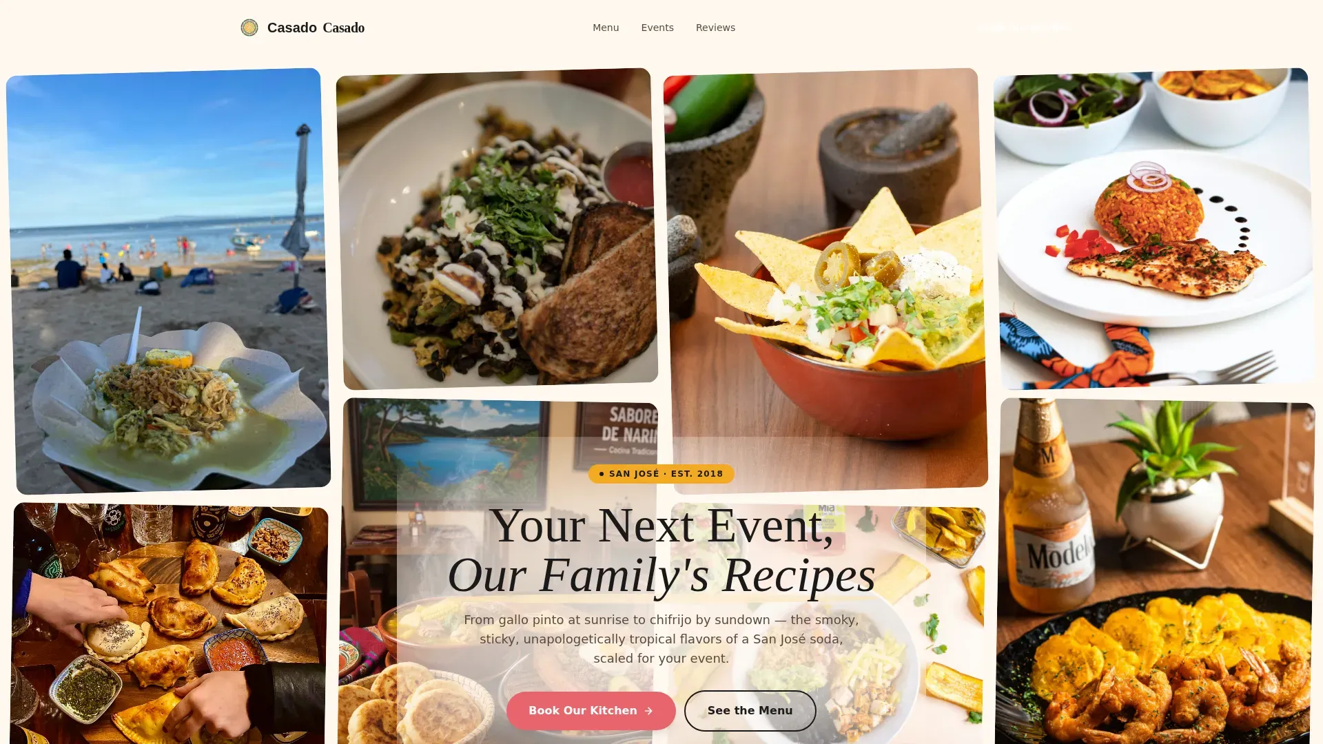
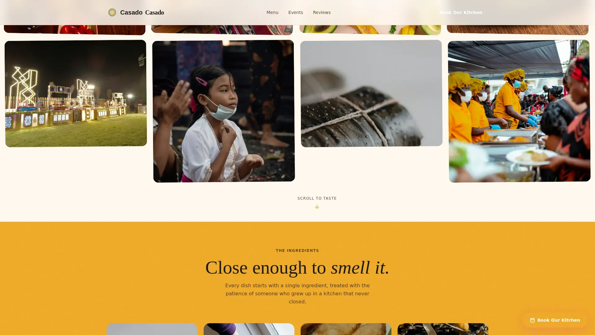
The header is a living mosaic of real customer photos, phone-shot and unfiltered. Images load tile by tile, like polaroids being pinned to a corkboard, creating immediate visual energy. A hand-lettered headline, "Your Next Event, Our Family's Recipes," floats over the grid in charred black with a mango-yellow brush stroke underline. This approach uses authentic, high-quality images of tropical dishes and satisfied guests to enhance visual appeal from the first second. No stock photography is included anywhere in the design system.
Taste and Aroma Masonry Grid with Sensory Captions
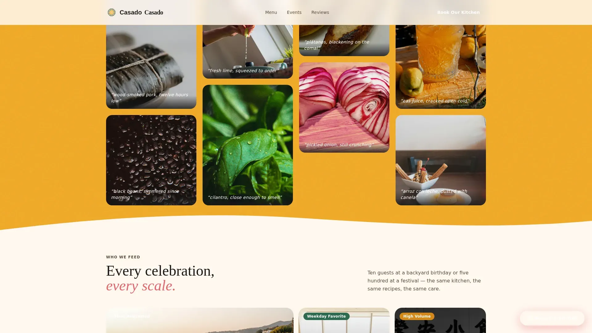
Below the hero, single ingredients appear in tight macro photography: a split-open tamal, steam curling off black beans, a lime squeezed mid-air. Each image tile carries a one-line sensory caption such as "wood-smoked pork, twelve hours low" or "pickled onion, still crunching." As the visitor scrolls, tiles shift from ingredients to composed plates to full table spreads to packed events, widening the lens from a single bite to a full celebration. This scroll-linked narrative is the way the template builds appetite and trust before presenting any form. It is one of the most powerful ways to create desire in the food and beverage category.
Event-Type Bento Grid
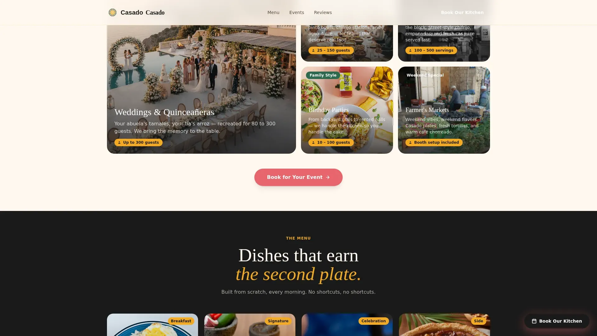
A dedicated "Who We Feed" section uses a bento-style grid to present event categories: weddings, corporate lunches, quinceañeras, birthday parties, and festival booths. Each cell communicates a specific occasion, helping office managers, brides, and festival organizers immediately see themselves in the offer. This section allows visitors to self-identify their event type before they even reach the booking form, which improves form completion rates. Displaying clear service categories is one of the most effective ways catering websites continue to earn clicks from new visitors.
Sticky "Book Our Kitchen" Call to Action
A cas-pink sticky button appears after the second scroll fold and remains visible as the visitor continues down the page. It is prominent, contrasting, and placed above the fold equivalent in scroll-depth terms, matching the recommendation that a contrasting button should appear early and be repeated further down the page. The primary call to action reads "Book Our Kitchen" and opens an inline form without navigating away from the page, keeping the visitor focused on the single objective.
Inline Booking Form with Four Input Types
The inline booking form asks for event date first using a calendar picker, then guest count using a slider from 10 to 500, then event type using a dropdown with five options (wedding, corporate, birthday, festival, other), and finally a free-text field labeled "Tell us what flavors you're craving." This sequence mirrors the way a real conversation with a caterer would unfold. A streamlined contact form for event inquiries asking for event date, guest count, and service type is the most effective layout for catering lead generation, allowing a clean, minimal form to create a higher completion rate.
Green-Framed Testimonial Cards
Testimonial cards are framed in jungle canopy green and include event type, guest count, and occasion details alongside the quote. This level of specificity, such as knowing that a testimonial comes from a 120-person corporate lunch or a wedding reception for 80 guests, adds legitimacy in a way that generic five-star ratings cannot. Curated testimonials with authentic quotes and specific event details are one of the most reliable ways to build credibility on a catering landing page. The testimonial section allows visitors to read real accounts and continue building confidence toward the booking form.
Secondary Menu PDF Email Capture
At the bottom of the page, a secondary path reads "Just Browsing? Grab Our Menu PDF" and captures an email address for nurture. This path exists for visitors who are not ready to book but want to read the full menu and continue evaluating the kitchen. It creates a second conversion opportunity without competing with the primary booking flow. Email marketing remains an effective strategy for catering services to reach out to clients over time, and this capture point is the starting position for that relationship.
Page sections overview
| Section | Purpose |
|---|---|
| UGC Photo Wall Hero | Mosaic of real customer photos with hand-lettered floating headline and sticky call to action |
| Macro Ingredients Grid | Sensory masonry tiles with one-line captions building appetite through scroll |
| Event Types Bento | "Who We Feed" grid presenting wedding, corporate, quinceañera, birthday, and festival categories |
| Menu Masonry Gallery | Composed plates and full table spreads widening the visual lens from a single bite to a crowd |
| Testimonials Section | Jungle-green-framed cards with named quotes, event type, and guest count details |
| Booking Form Inline | Calendar picker, guest slider, event dropdown, and free-text flavor field |
| Footer Horizontal | Horizontal-layout footer with secondary menu PDF email capture path |
Design & branding system
The design follows a Neo-Retro aesthetic that feels handcrafted, warm, and unapologetically tropical. The color system is called Citrus Burst, and every hex value is intentional. The typography pairing of Fraunces for display headings and DM Sans for body text reflects a bold, clean, and modern font approach that communicates both cultural warmth and professional credibility. The overall perception of the brand is that of a real kitchen with real food, not a polished corporate catering company.
- Mango yellow (#F2A922) dominates section backgrounds in alternating bands; cas pink (#E8656C) lands on buttons and price callouts; jungle canopy green (#2D6A4F) frames testimonial cards and garnishes divider illustrations; charred plantain black (#1A1A1A) is used for body text; crema (#FFF8F0) serves as the base, breathing between every dense photo tile so the eye rests before the next wave of color
- Bold Fraunces serif display headings create the handcrafted, era-appropriate Neo-Retro character, while DM Sans body text keeps reading comfortable and clear across all screen sizes
- Warm, saturated, tropical tones contrasted with the crema base create a color palette that evokes freshness and the tropics while allowing the food photography to stay dominant
Mobile & speed optimization
The template is built mobile-first, reflecting the reality that festival organizers, brides, and office managers are most likely browsing on a phone. The masonry grid, bento grid, sticky button, and inline form are all designed to perform on small screens first. Mobile responsiveness is a critical feature for catering landing pages, and many clients book events on the go, making this priority non-negotiable.
- The staggered tile load animation uses Intersection Observer to trigger reveals only when tiles enter the viewport, keeping the initial paint fast and the scroll experience smooth
- The masonry grid and bento grid use CSS grid layouts that reflow cleanly from desktop to tablet to mobile without breaking the visual hierarchy
- High-resolution food photography is paired with a load strategy that keeps the page responsive, supporting the recommendation that images should be managed carefully to keep the experience engaging without sacrificing speed
How this template helps you convert
The page is designed around a single, focused objective: converting event planners into booking inquiries. Every section earns the next click. A high-converting catering landing page template focuses on vibrant imagery, a clear value proposition, and immediate lead generation, and this template follows that structure precisely.
- The page lets sixty real photos do the selling before any form appears. By the time a visitor reaches the booking form, they have scrolled through ingredient macros, composed plates, full table spreads, and packed event photos. The visual journey creates desire and trust, so the form feels like a natural next step rather than an interruption. This is the way appetite-first design converts browsers into bookers.
- The sticky "Book Our Kitchen" button remains visible throughout the scroll, allowing visitors to convert at whatever point they feel ready. The inline form does not navigate away from the page, keeping the visitor in context. The simplified form asks only for essential details like event date, guest count, and event type, which increases completion rates. A secondary email capture at the bottom ensures that even visitors who are not ready to book continue into the nurture funnel.
Other information about this template
This section covers additional context that helps you understand the full scope of the template, its design origins, and how it fits within a broader landscape of catering landing page templates and no-code website builders.
The Casado bold tropical catering landing page template draws its cultural origins from the traditions of the Costa Rican soda, a popular style of casual roadside restaurant found across the city and the wider region. The name "casado" refers to a classic Costa Rican plate of rice, beans, salad, and protein, making it an ideal namesake for a template that carries that same spirit of abundance and authenticity. These origins are baked into every design decision, from the Citrus Burst palette to the hand-lettered headline to the sensory caption style in the masonry tiles.
The template exists within a wider category of catering landing page templates that are designed to create visually appealing and effective websites for catering services. These templates often include features that allow for easy customization to fit the branding of catering businesses. Many catering landing page templates are responsive, ensuring they look good on both desktop and mobile devices, and this template follows those same principles. Catering landing page templates typically emphasize user-friendly navigation to enhance the customer experience, and the stripped-down single-page layout here eliminates navigation distractions to keep the visitor focused on the goal.
No-code website builders allow users to create websites without needing to write code, and this template is built to slot into that kind of workflow. No-code tools can significantly reduce the time and cost associated with website development, allowing a caterer to go from brief to live page far faster than a custom build would allow. No-code platforms often come with pre-designed templates that can be customized to fit specific business needs, and this template is structured with that flexibility in mind. Using no-code website builders can empower non-technical users to create and manage their own websites, and no-code tools can facilitate rapid prototyping and iteration, allowing businesses to quickly test ideas before committing to a final direction. No-code platforms often include features for search engine optimization (SEO), making it easier for users to improve their website's visibility. Many no-code website builders offer integration with third-party services, enhancing functionality without coding.
AI tools can enhance website development by automating repetitive tasks and improving efficiency. AI-driven design tools can help non-technical users create visually appealing websites without extensive coding knowledge. AI can assist in creating landing pages that are optimized for conversions by analyzing user behavior and preferences, and integrating AI in website development can lead to faster deployment times and reduced costs for businesses.
Optimizing for local keywords is essential for catering services to target specific geographic areas, and a template that already reflects the cultural and culinary identity of a specific city and region gives that optimization effort a strong foundation. Catering services can benefit from a strong online presence to attract new clients, and utilizing social media platforms can enhance the visibility of catering services. Creating engaging content can help caterers connect with potential clients online, and building a user-friendly website can improve the online experience for catering clients. Offering online booking options can streamline the process for catering clients, and search engine optimization (SEO) is crucial for catering services to appear in online searches.
The template's visual identity was developed with the art of tropical food presentation in mind. The Neo-Retro era of design thinking, which blends handcrafted warmth with bold saturated color, is the lens through which every section was built. Displaying logos of reputable corporate clients or awards won can enhance trust on a catering landing page, and the testimonial card system is structured to accommodate that kind of social proof. Prominent placement of client testimonials, venue partner logos, and award badges builds credibility on a catering landing page, and the green-framed card layout is designed to hold that content with visual weight.
Key elements of a catering landing page include a striking hero image or video, a "Book Now" call to action, menu highlights, client testimonials, and a concise inquiry form. Video integration involving short, high-quality videos can increase engagement and conversion rates significantly, and the header section is architected to support a looping video tile within the UGC photo wall if the user chooses to incorporate one. A large, vibrant photo or short, looping video showing premium, styled food can evoke emotions and convey the tropical atmosphere, and the photo wall grid structure creates a natural container for that kind of asset. The way the page sequences from ingredients to plates to events to the booking form mirrors a video-like narrative that guides the visitor from curiosity to commitment.
The template is also a strong starting point for catering businesses thinking about their broader online marketing strategy. Email marketing can be an effective strategy for catering services to reach out to clients, and the secondary menu PDF capture at the page bottom is the first touchpoint in that email relationship. Search engine optimization, social media visibility, and a user-friendly website all continue to play a role after the page goes live.
The following additional context points are useful for buyers evaluating this template:
- The template uses Fraunces as the display serif and DM Sans as the body typeface, both loaded via standard font delivery methods
- The page layout uses seven defined sections plus a footer, all of which are listed in the page sections overview table above
- The masonry grid supports a variable number of photo tiles, allowing the kitchen to add or remove images as the photo library grows
- The booking form fields (calendar, slider, dropdown, free-text) are pre-labeled and pre-structured, reducing setup time for the caterer
- The crema base color (#FFF8F0) and alternating mango-yellow section bands create a natural visual rhythm that guides the eye down the page without requiring any additional design decisions from the user
- The template is scoped as a single landing page, not a multi-page website, keeping the build lean and the objective clear
- Templates in this category published for food and beverage niches with strong cultural identity tend to perform well when the photography is authentic and specific to the actual kitchen and dishes being served
The art direction, cultural origins, and Neo-Retro era aesthetic of this template make it a standout among catering landing page templates targeting tropical cuisine and Latin American food businesses. The popular combination of a UGC-first header, sensory scroll narrative, and a focused inline booking form is designed to continue working for the caterer long after launch, building a pipeline of event inquiries through every season.
Theme
Neo-Retro
Creative direction
Taste & Aroma
Color system
Citrus Burst
Style
Masonry/Pinterest
Direction
Event Registration
Page Sections
UGC Photo Wall with Staggered Tile Animation
Taste and Aroma Scroll Narrative
Sticky Book Our Kitchen Call to Action
Four-field Inline Booking Form
Green-framed Testimonial Cards
Secondary Menu PDF Email Capture
Related questions
Can I use this template without coding experience?
What event types does the booking form support?
Does the template perform well on mobile devices?
How does the secondary email capture path work?
Can I add a video to the UGC photo wall header?



