E-Commerce Marketing Agency Client Lead Website Template
Catalog is an asymmetric 60/40 landing page template built for e-commerce marketing agencies. It pairs a collage-style hero with manifesto-driven scroll sections, a three-step progressive lead form, and an Electric Indigo color system. The layout is designed to turn skeptical DTC founders and brand managers into booked clients.
by Rocket studio
Quick summary
Catalog is a single-page template for e-commerce marketing agencies that need to convert high-intent visitors into partnership inquiries. It uses an asymmetric 60/40 grid, a confrontational manifesto scroll flow, and a three-step progressive form. The visual identity is bold, backlit, and built around proof, not promises.
Who this template is for
This template is built for agencies that work at the intersection of creative direction and conversion performance. If your clients are brand managers watching return on ad spend decay, or founders stuck at a revenue ceiling, this page speaks their language directly.
- E-commerce marketing agencies pitching DTC founders and Shopify brand managers
- Agency teams targeting chief marketing officers at legacy retailers with stagnant digital storefronts
- Creative shops that want their landing page to feel like a brief, not a brochure
What problem this template solves
Most agency landing pages describe what they do without proving they understand the client's pain. Visitors leave without taking action because nothing on the page earns their trust fast enough.
- Generic agency pages fail to signal that they understand specific revenue bottlenecks or product page problems
- Long contact forms create friction before a prospect is convinced
- Scattered visual identities undercut the credibility that conversion-focused agencies need to project
What you get with this template
You get a fully structured, single-page layout that guides a visitor from diagnosis to conviction to a booked inquiry. Every section is purposeful and ordered to tighten the argument with each scroll.
- An asymmetric 60/40 grid with a collage-style header, manifesto scroll sections, and conversion-pink call-to-action placements
- A three-step progressive lead form collecting store URL, monthly revenue band, and one open-ended qualifier question
- A secondary conversion path linking to an anonymized teardown library, with email capture on entry
Feature list
This template ships with a set of layout and content decisions that work together as a system. Each feature below is directly drawn from the page structure described in the brief.
Collage Header Composition
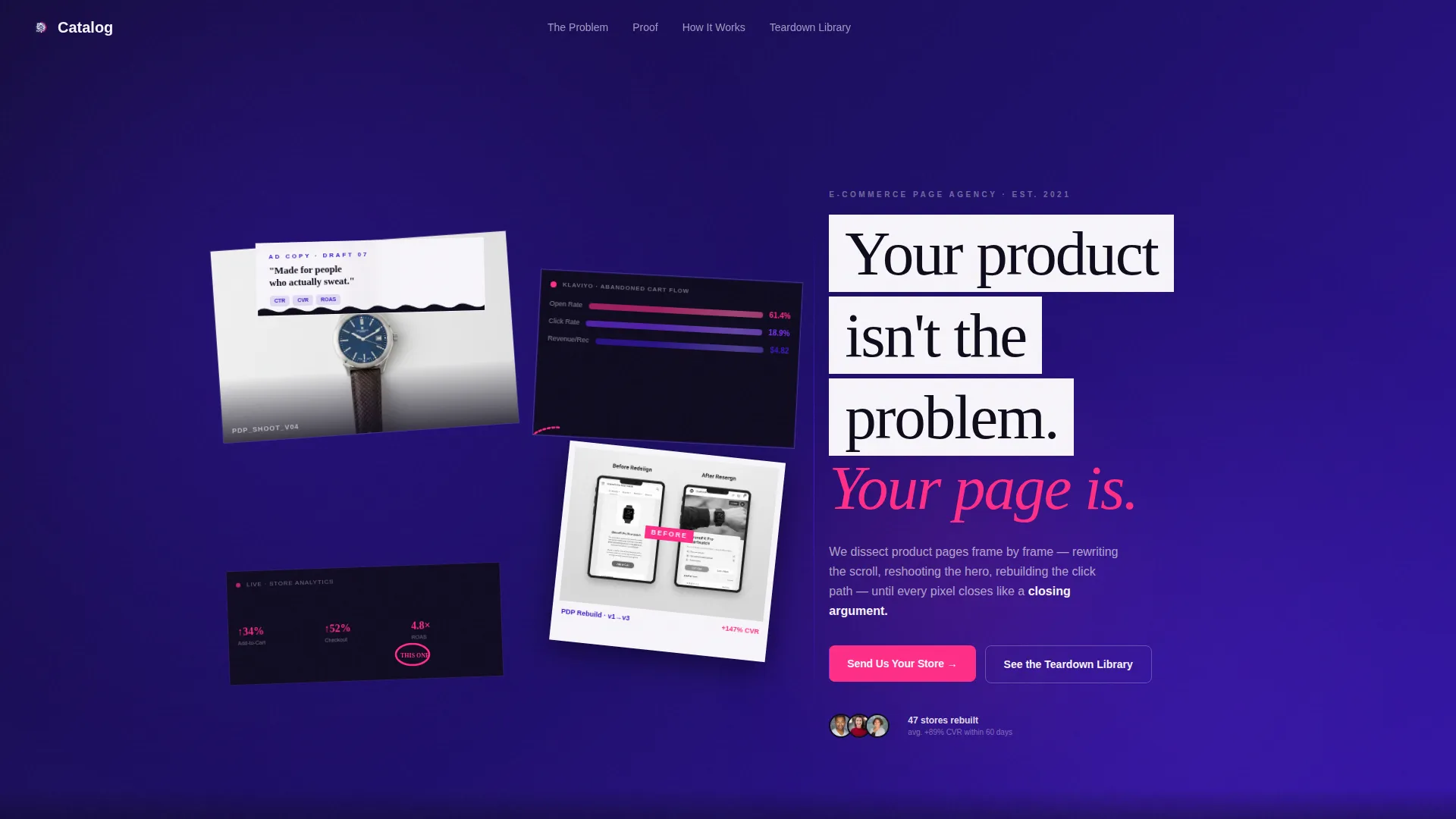
The 60-column header is built as a scrapbook of campaign assets. Overlapping frames, slight rotations, a polaroid-style before/after panel, and torn ad copy strips make the opening section feel like a working creative director's desk rather than a polished agency homepage.
Manifesto Scroll Sections
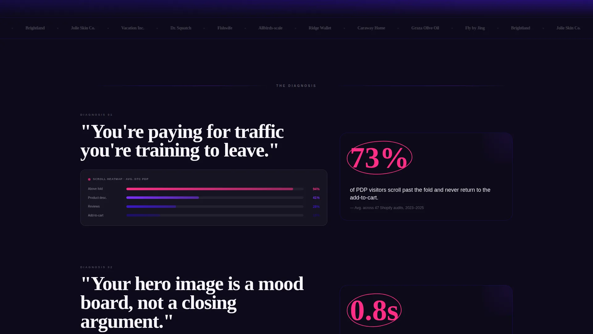
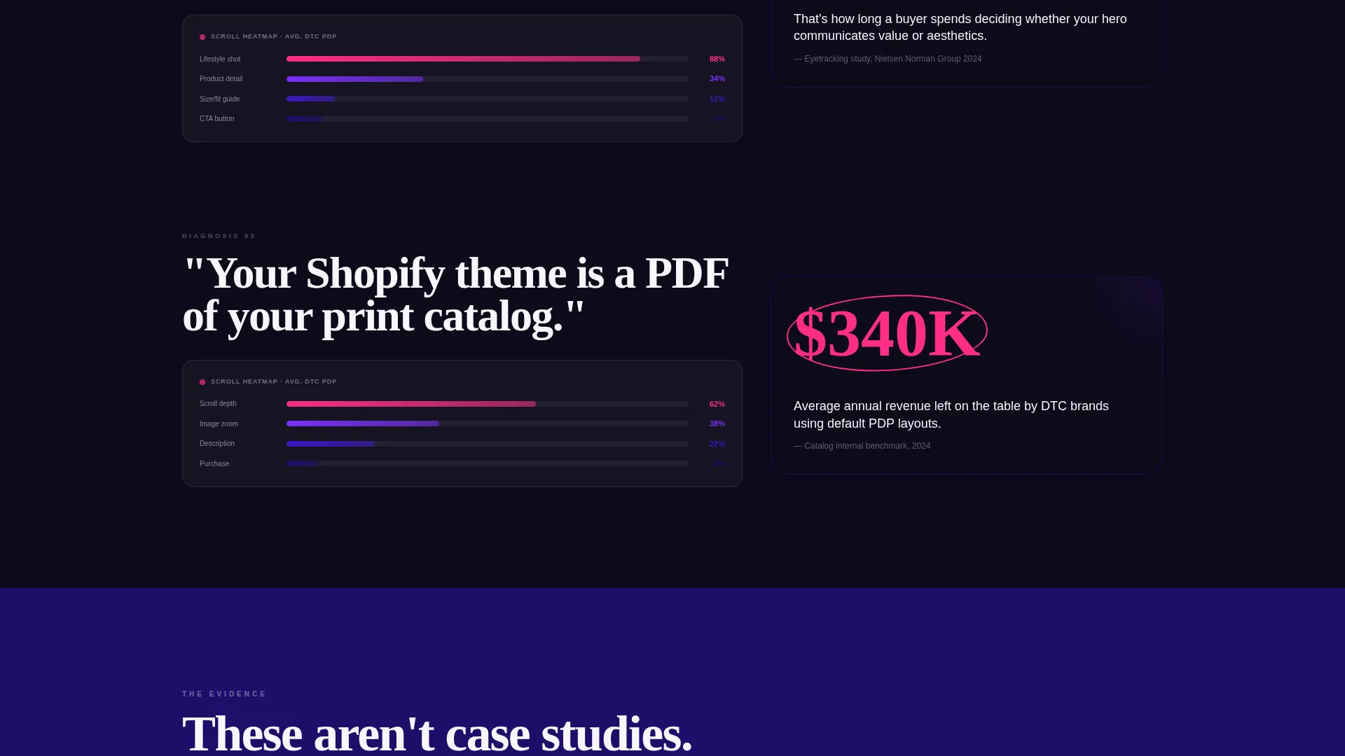
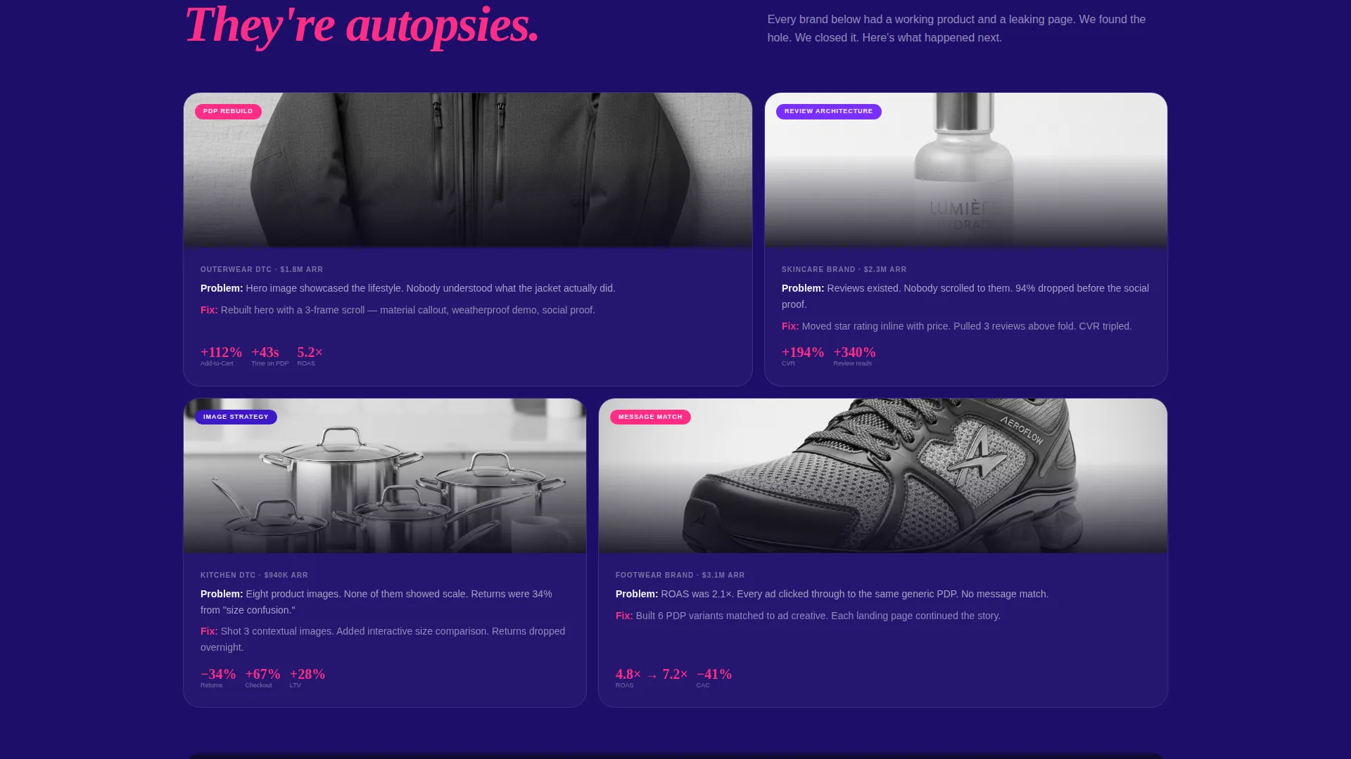
Each scroll section opens with a bold, confrontational declaration in the 60-column. The 40-column then reveals supporting evidence such as a heatmap screen recording, a conversion lift figure, or a side-by-side page teardown. The tone escalates from diagnosis to proof across every section.
Three-Step Progressive Lead Form
The primary contact form is split into three low-friction steps. Step one asks for a store URL. Step two presents a monthly revenue band selector. Step three asks a single open field: "What's broken and you know it?" There is no phone number field and no company size dropdown.
Fixed Navigation Call to Action
The primary call-to-action button labeled "Send Us Your Store" appears first after the third manifesto block. It then locks into the navigation bar on scroll so it stays visible without interrupting the reading experience.
Secondary Teardown Library Path
A second conversion path offers a "See the Teardown Library" link for visitors not yet ready to submit their store. The library is gated by email capture on entry, giving the agency a second lead touchpoint from the same page.
Electric Indigo Color System
The page uses four precisely assigned colors. Deep screen-glow indigo anchors backgrounds and section dividers. Charged violet activates hover states and interactive user interface elements. Bleached studio white provides breathing room between dense sections. Conversion pink is reserved exclusively for calls to action and key proof points.
Page sections overview
| Section | Purpose |
|---|---|
| Collage Hero Header | Opens with scrapbook campaign assets and a manifesto headline |
| Manifesto Block One | Delivers first confrontational declaration with supporting evidence column |
| Manifesto Block Two | Escalates the argument with heatmap or conversion lift proof |
| Manifesto Block Three | Closes the diagnosis phase before the primary call to action appears |
| Primary call to action Block | Introduces the "Send Us Your Store" three-step progressive form |
| Teardown Library Path | Offers a secondary email-gated link to anonymized case studies |
| Fixed Navigation Bar | Keeps the primary call to action persistent after the visitor begins scrolling |
Design & branding system
The visual identity follows a Lens and Frame theme. The overall feel is a retouching monitor at 2 AM: saturated, backlit, and intentional. Every color in the palette has a single assigned role and is never used outside it.
- Deep screen-glow indigo (#3D17C6) for backgrounds and section dividers, charged violet (#7B2FFF) for hover states, bleached studio white (#F7F5FA) for spacing, and conversion pink (#FF2D87) for calls to action and proof points only
- Oversized serif typography carries the manifesto headlines in the 40-column, while tracked-out display type appears in the collage header as torn ad copy strips
- The asymmetric 60/40 grid creates deliberate visual tension between the evidence-heavy left column and the statement-making right column
Mobile & speed optimization
The asymmetric grid and collage composition are built to restack cleanly on smaller screens. The manifesto sections remain readable and punchy at any viewport width.
- The 60/40 column structure collapses to a single-column flow on mobile without losing the escalating argument sequence
- The three-step progressive form is designed to reduce input friction, which is especially important on mobile where long forms cause drop-off
- Lightweight layout decisions and minimal decorative overhead keep page rendering snappy across devices
How this template helps you convert
The entire page is structured as a closing argument. Each section earns the next click rather than asking for it prematurely.
- The manifesto scroll builds conviction progressively, moving the visitor from recognizing their problem to believing you are the specific agency that can fix it, before any form appears.
- The three-step lead form reduces commitment anxiety by starting with the lowest-friction input, a store URL, and only asking qualifying questions once the visitor is already engaged.
- The teardown library secondary path captures visitors who are not ready to submit their store yet, turning a potential exit into a second lead touchpoint via email.
Other information about this template
This template is part of the Catalog collection, which pairs strong creative direction with conversion-focused layout thinking. It is well suited for agencies building a differentiated positioning in the e-commerce performance space.
- The page is designed as a single-page landing experience with no internal navigation links that lead away from the conversion flow
- The collage header and manifesto structure make this template a strong fit for agencies whose work spans product page redesign, paid social, and email performance
- Agencies using tools like Klaviyo for client email flows or running campaigns on Shopify storefronts will find the page language and visual references directly relevant to their prospect conversations
Theme
Lens & Frame
Creative direction
Manifesto
Color system
Electric Indigo
Style
Asymmetric Grid (60/40)
Direction
Partnership/B2B
Page Sections
Collage Scrapbook Header
Manifesto-driven Scroll Flow
Three-step Progressive Lead Form
Fixed Navigation Call to Action
Email-gated Teardown Library
Electric Indigo Color System
Related questions
Who is this landing page template designed for?
What does the three-step lead form include?
Can I adapt this template for a specific e-commerce service focus?
What is the secondary conversion path on this page?
What makes the visual style distinct from a standard agency template?



