Recruiting & Staffing Agency Specialist Professional Website Template
Catalyst is a single-column landing page built for executive search firms that operate at speed. It leads with oversized proof metrics, punchy case fragments, and a conversion flow designed to earn the click before the visitor reaches the call to action. The layout suits firms placing C-suite and VP-level talent for Series B founders, private equity operators, and boards.
by Rocket studio
Quick summary
Catalyst is a single-column flow landing page for executive search firms. It opens with a bold photo-and-text header, then builds trust through stat-first content blocks and short proof fragments. The design uses a deep teal and signal green palette that feels clinical and urgent. Every scroll stop is engineered to accelerate toward one action: starting a search.
Who this template is for
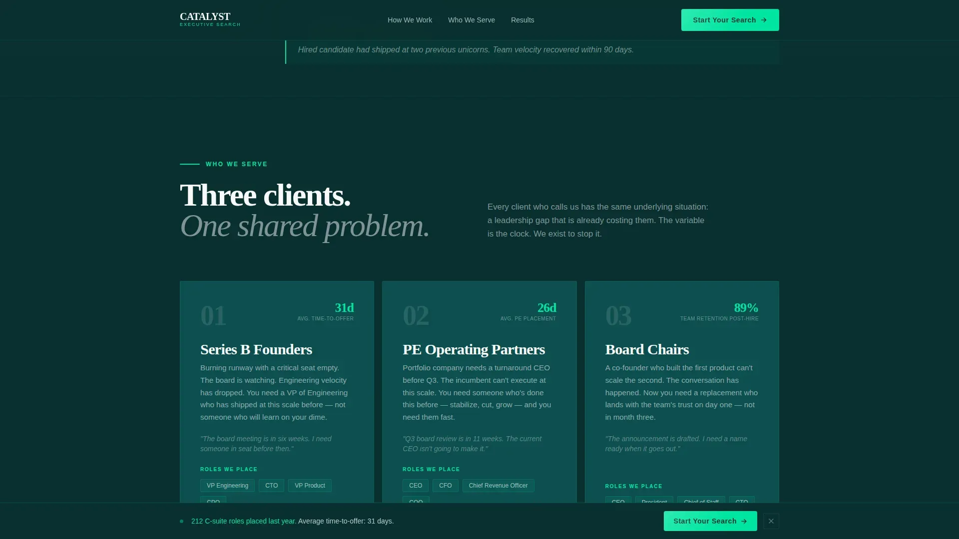
This template is built for specialized executive search firms that place senior leaders quickly and want their page to reflect that speed and precision. It speaks directly to the urgency that high-stakes hiring clients feel.
- Series B founders who need a critical leadership seat filled before runway runs out
- Private equity operating partners who must install a turnaround chief executive before a quarterly deadline
- Board chairs quietly managing a co-founder transition that cannot be handled by a generalist recruiter
What problem this template solves
Most recruiting agency pages bury their proof. They lead with a mission statement, ask for trust they have not yet earned, and let the call to action arrive before the visitor is convinced. Catalyst flips that order entirely.
- Clients arrive skeptical and leave with concrete evidence of speed and placement success
- The stats-first layout removes doubt before the ask is ever made
- The page rhythm mirrors the firm's own pace, so visitors feel the capability rather than just reading about it
What you get with this template
You get a fully structured single-column landing page that front-loads credibility and drives toward one clear conversion point. Every section has a defined job and a defined position in the scroll sequence.
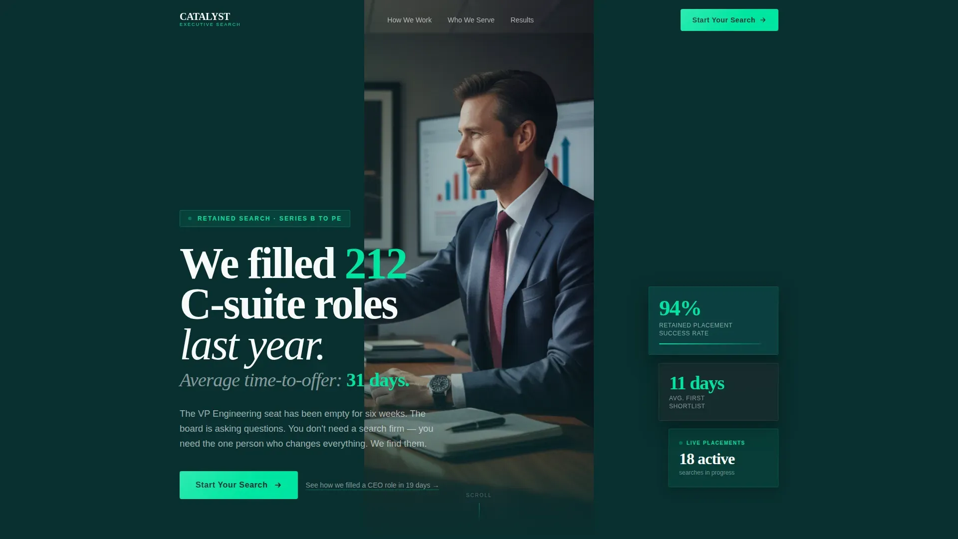
- A half-page photo-and-text header with left-weighted typography and a high-grain conference photograph
- Oversized stat blocks in signal green, each followed by a short case fragment that proves the number
- A sticky bottom call-to-action bar and a full-width conversion section before the footer
Feature list
This template is built around five deliberate design and layout decisions. Each one serves the goal of converting a skeptical, time-pressured buyer.
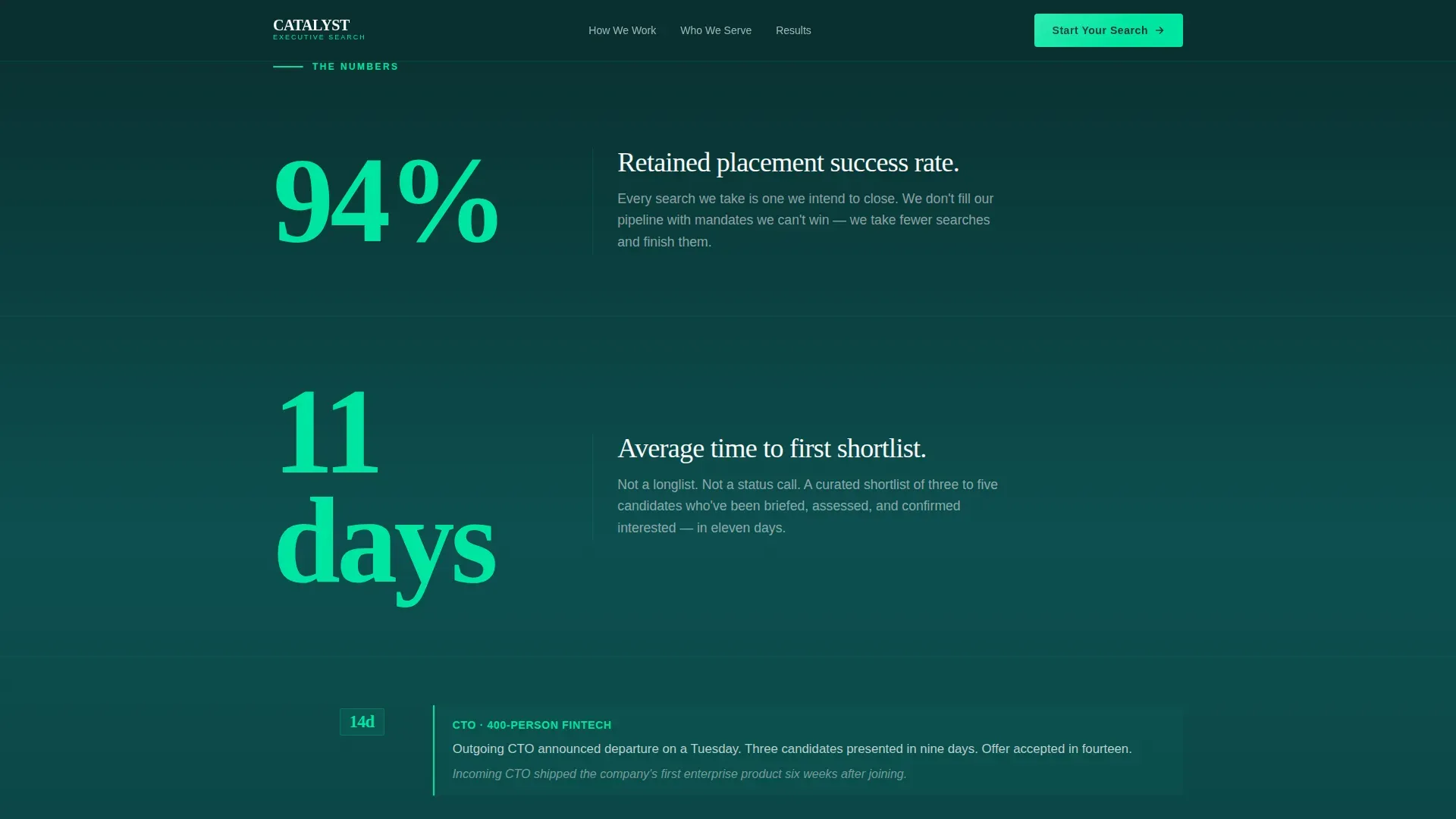
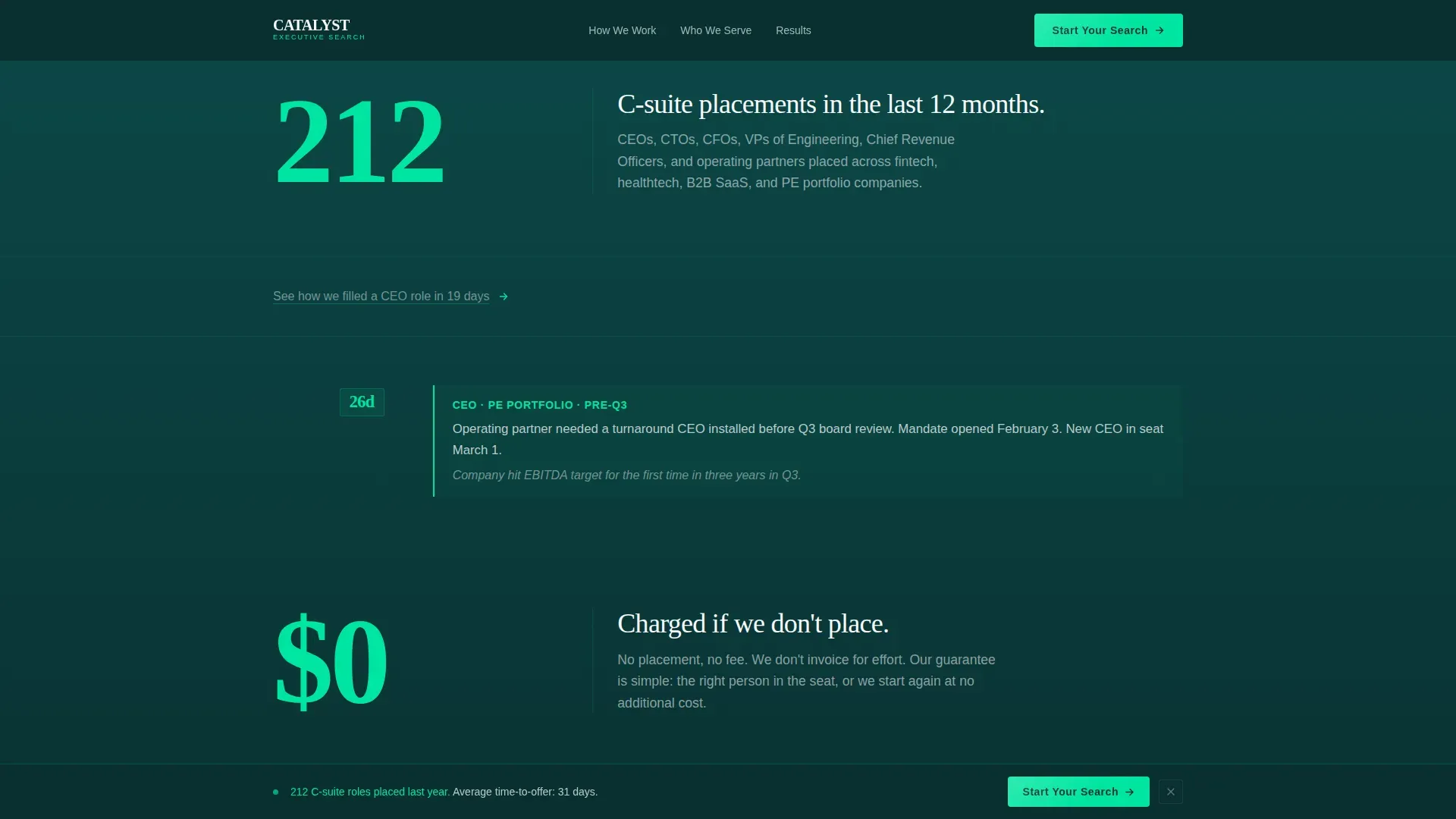
Stats-First Impact Layout
Every scroll stop opens with a single oversized number before any sentence arrives. The number renders in signal green against gunmetal, larger and bolder than the paragraph beneath it. The visual hierarchy tells visitors what matters before they read a single word.
Short Case Fragment Blocks
Between stat sections, the template includes brief proof fragments rather than full case studies. A fragment like "Replaced outgoing chief technology officer at a 400-person fintech. Three candidates presented in nine days. Offer accepted in fourteen." delivers credibility in under twenty words.
Half-Page Photo and Text Header
The header splits into left-weighted bold typography and a right-side high-grain photograph. The image shows a handshake across a conference table shot from below, using natural office light and shallow depth of field. It reads like a photojournalist caught a real moment.
Click-Through Conversion Flow
The primary call to action, "Start Your Search," first appears as a sticky bottom bar after the second stat block. It reappears as a full-width section before the footer. A secondary curiosity text link threads through mid-page to the same intake destination.
Teal Catalyst Color System
Deep command teal anchors headers and section backgrounds. Signal green fires on key metrics and hover states. Kinetic white opens breathing room between data blocks. Gunmetal grounds body text. Together they create a dark-mode dashboard feel that signals speed and precision.
Page sections overview
| Section | Purpose |
|---|---|
| Hero header | Opens with bold stat headline and high-grain conference photograph |
| First stat block | Delivers lead metric with oversized number and short context line |
| Second stat block | Reinforces speed proof with a second oversized figure |
| Case fragment one | Adds a short real-world placement example after the first two stats |
| Third stat block | Continues the data-proof rhythm with a third key metric |
| Case fragment two | Provides a second brief proof moment to sustain credibility |
| Secondary text link | Curiosity hook that routes mid-page visitors toward the intake page |
| Full-width call to action | Final conversion section with primary call-to-action button before footer |
| Footer area | Closes the page cleanly without distraction |
Design & branding system
The visual identity follows the Startup Velocity theme using the Teal Catalyst color system. The palette is designed to feel like a dark-mode operations dashboard at the exact moment a critical metric turns positive.
- Deep command teal (#0D4F4F) anchors headers and section backgrounds, projecting authority and focus
- Signal green (#00E5A0) fires on all key metrics, hover states, and call-to-action accents to draw the eye precisely where conversion happens
- Kinetic white (#F7FAFA) and gunmetal (#1C2B2D) balance the palette, keeping body text readable and data blocks open
Mobile & speed optimization
The single-column flow structure means the page translates naturally to smaller screens without complex reflow. The layout was designed with mobile scrolling in mind from the start.
- Oversized stat numbers stack cleanly in a single column on any screen width
- The sticky bottom call-to-action bar is built for thumb-reach interaction on mobile devices
- The high-grain photograph in the header is composed to retain its power geometry even when cropped to a portrait frame
How this template helps you convert
The page is structured as a deliberate sequence of proof followed by asks. Each stage removes a layer of buyer hesitation before the call to action appears.
- The stats-first opening front-loads the most compelling evidence so visitors are already persuaded by the time they reach mid-page, reducing friction at the conversion point.
- The sticky call-to-action bar appears precisely after the second stat block, catching visitors at peak confidence without interrupting the proof rhythm before it has built momentum.
- The full-width final call-to-action section gives a second conversion window for visitors who scroll past the sticky bar, ensuring no decision-ready visitor leaves without a clear next step.
Other information about this template
This template is part of the Startup Velocity theme collection and is classified under the HR and Hiring category, specifically within the recruiting and staffing agency subcategory and the executive search firm niche. It carries an intersection match score of 13, indicating strong alignment between the visual system, content strategy, and target use case.
- The template style is Single Column Flow, meaning all sections stack vertically in a linear reading sequence with no sidebar or grid interruptions
- The header concept is Half-Page Photo and Text, a layout that splits visual weight between data-driven typography and photographic evidence
- The creative direction is Stats-First Impact, a proven approach for high-trust professional services that need to demonstrate capability before making an ask
- The landing page direction is Click-Through, meaning the page is optimized for routing qualified visitors to a dedicated intake or contact page rather than collecting leads inline
Theme
Startup Velocity
Creative direction
Stats-First Impact
Color system
Teal Catalyst
Style
Single Column Flow
Direction
Click-Through
Page Sections
Stats-first Impact Scroll Sequence
Short Case Fragment Blocks
Half-page Photo and Text Header
Dual-stage Click-through Call to Action
Teal Catalyst Color System
Related questions
What kind of firm is this landing page designed for?
Can I customize the stat numbers and case fragments?
Who are the target clients shown in the page structure?
What does the secondary text link do?
Does the sticky call-to-action bar work on mobile devices?


