Obesity Care Booking Website Template
Catalyst is a split-screen landing page template built for supervised obesity exercise programs. It pairs clinical authority with genuine human warmth, using a FAQ-driven scroll flow to dismantle fear-based objections one by one. The layout guides post-bariatric patients, corporate wellness referrals, and adults with gym anxiety toward a single goal: booking a 45-minute assessment appointment.
by Rocket studio
Quick summary
Catalyst is a single-page, booking-focused template designed for medically supervised exercise programs serving post-bariatric patients and adults who have avoided conventional gyms. Every section is structured around a real client fear, answered with clinical specificity and human honesty, ending with a clear call to action that feels earned rather than forced.
Who this template is for
This template is built for health and fitness businesses that sit at the intersection of medical credibility and personal dignity. It works best when the program has real certifications and a genuine need to convert cautious, first-time clients.
- Bariatric fitness programs with certified clinical trainers on staff
- Corporate wellness coordinators managing employee fitness stipends and referral pipelines
- Rehabilitation fitness providers seeking to convert physician referrals into scheduled assessments
What problem this template solves
Adults with high body weight or post-surgical histories face a specific kind of dread before trying a new fitness program. Standard gym landing pages do not address that dread. They show stock photography and bullet points. Catalyst replaces that pattern with an honest, structured conversation.
- Equipment anxiety: clients need to know machines will physically support them before they walk in
- Social fear: the worry of being watched, judged, or made to feel out of place in a fitness space
- Medical uncertainty: post-surgical patients need proof that a program is clinically supervised, not just fitness-adjacent
What you get with this template
Catalyst delivers a complete single-page layout structured around five purposeful sections. Each section earns the reader's trust before asking for anything. The booking flow is built directly into the page.
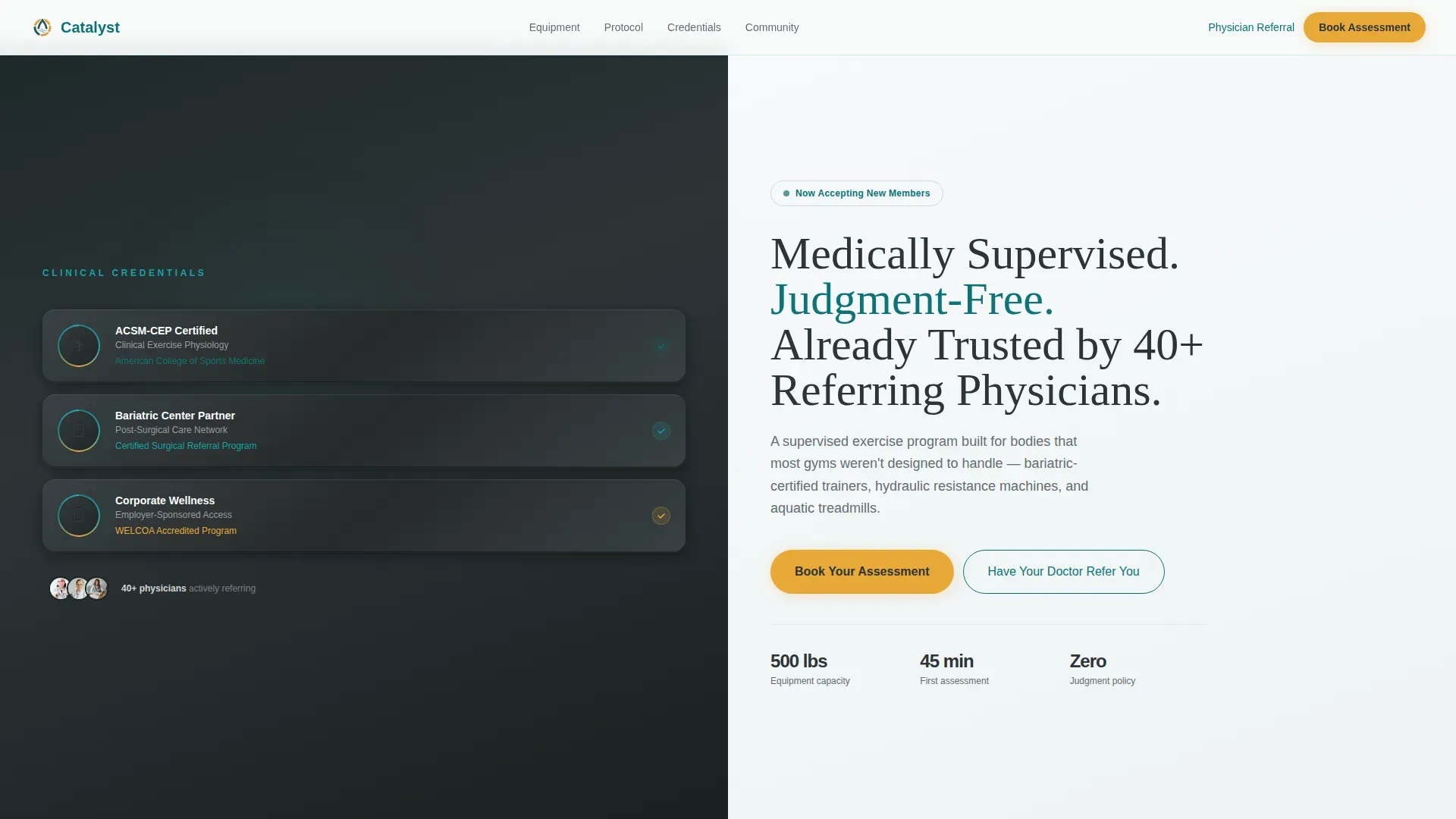
- A split-screen hero with a certification badge wall on the left and a clinical headline on the right
- Four FAQ-driven content panels that escalate from logistical questions to emotional barriers to medical safety
- A two-step booking modal with referral source intake, mobility level selection, surgical history checkboxes, and a calendar widget for 45-minute assessment slots
- A secondary referral path that generates a pre-filled physician referral document in PDF format
Feature list
This section covers the core built-in components and interaction patterns included in the Catalyst template.
Split-Screen Hero with Certification Badge Wall
The hero divides the viewport evenly. The left panel displays three embossed metallic award badge icons: an ACSM Clinical Exercise Program (CEP) certification mark, a bariatric surgery center partnership seal, and a corporate wellness accreditation mark. The right panel holds a single restrained headline in light-weight serif type against clean white.
FAQ-Driven Accordion Scroll Flow
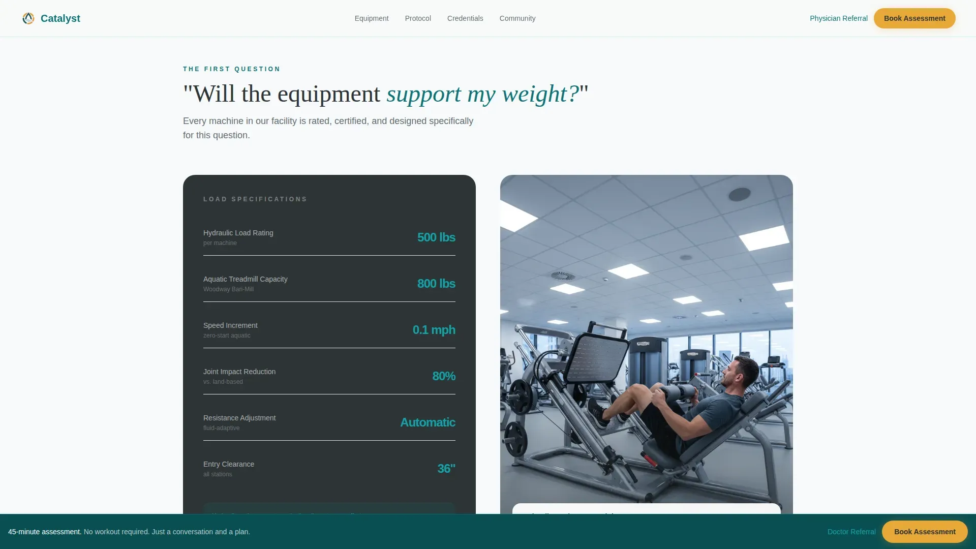
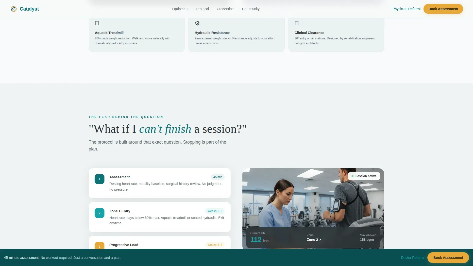
Four FAQ panels unfold as the reader scrolls. Each panel opens with a real client fear phrased as a plain question. The answers escalate in depth and personal tone, moving from equipment load specifications to adaptive session protocols to an unscripted member video mosaic. GSAP-powered scroll reveals and stagger entries animate each panel into view.
Two-Step Booking Modal
The primary call-to-action button opens a focused two-step form. Step one captures referral source, current mobility level in plain language, and optional surgical history via checkbox. Step two shows a live calendar widget with available 45-minute assessment time slots. The modal keeps intake minimal and purposeful.
Fixed Amber Booking Button
After the second FAQ section, an activation amber "Book Your Assessment" button locks to the bottom of the viewport and remains visible throughout the rest of the scroll. This persistent placement means the conversion action is always one tap away without interrupting the reading flow.
Physician Referral PDF Generator
A secondary conversion path labeled "Have Your Doctor Refer You" triggers a pre-filled referral document in PDF format. This component serves the physician and employer referral pipeline without requiring users to navigate away from the page.
Real Member Video Mosaic
The final FAQ panel answers "Will anyone there look like me?" with an unscripted video mosaic of real program members. This replaces stock photography with authentic social proof and closes the emotional arc of the scroll experience.
Page sections overview
| Section | Purpose |
|---|---|
| Split-screen hero | Establish clinical authority with badge wall and restrained headline |
| FAQ panel one | Address equipment weight capacity with hydraulic machine specs and load data |
| FAQ panel two | Explain adaptive session protocol and heart-rate monitoring for incomplete sessions |
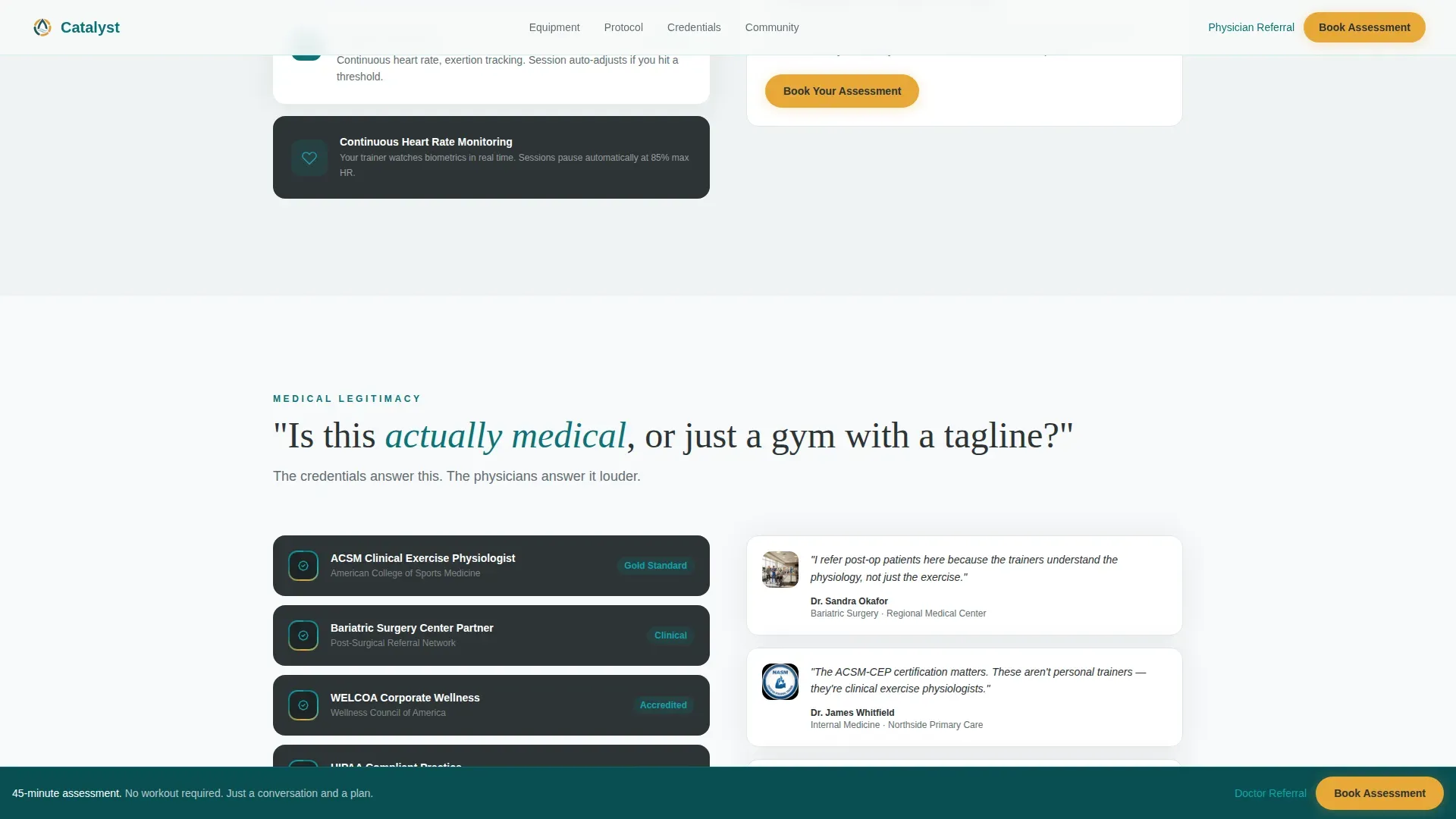
| FAQ panel three | Validate medical legitimacy with physician credential wall and 40+ referral count |
| FAQ panel four | Dissolve social fear with real member video mosaic and booking call to action |
| Linear footer | Close with a single-row footer pattern |
Design & branding system
The visual identity follows a Corporate Precision theme. The palette reads like a rehabilitation clinic with a considered brand presence: sterile enough to signal medical seriousness, warm enough to feel welcoming.
- Primary color: deep clinical teal (#0D7377) anchors headers, section dividers, and key typographic elements
- Supporting palette: charcoal scrub gray (#2D3436) for body text and structural elements, clean medical white (#F7F9FA) for open backgrounds, and activation amber (#E8A838) reserved exclusively for buttons and progress indicators
- Typography pairing: Fraunces serif for display headlines and DM Sans for body copy and user interface elements
Mobile & speed optimization
Catalyst is built desktop-first to serve the corporate referral path, where HR coordinators and physicians review the page on larger screens. The layout is fully mobile-responsive for self-referred clients arriving on phones.
- Static sections use server-rendered components to reduce initial load weight
- Interactive elements including the booking modal and FAQ accordions run as client components, keeping heavy JavaScript isolated from the core page render
- The split-screen layout reflows gracefully to a single-column stack on smaller viewports
How this template helps you convert
Every design and content decision in Catalyst points toward one outcome: a booked 45-minute assessment. The conversion strategy is built into the page structure itself, not added on top of it.
- The FAQ scroll flow removes every major objection before the booking prompt appears, so the reader arrives at the call to action already reassured rather than still skeptical.
- The fixed amber button makes the booking action available at every scroll depth after the second FAQ, reducing friction for readers who are ready to act before reaching the end.
- The two-step form collects only the information needed to prepare for an assessment, keeping the commitment feel low while giving the program what it needs to deliver a personalized first session.
Other information about this template
Catalyst is a purpose-built template for obesity care and bariatric fitness programs that need to convert a cautious, medically informed audience. It is not a general fitness template with a reskin.
- The template is designed for the obesity exercise program niche, where trust-building is the primary conversion lever, not excitement or aspiration
- The corporate wellness referral path and physician PDF generator make it suitable for B2B2C programs that receive clients through employer stipends or clinical referrals
- The design system avoids stock photography of idealized athletic bodies entirely, relying instead on badge authority and real member content to build credibility
- The amber call-to-action color is used nowhere else in the layout, ensuring every interactive prompt is immediately distinguishable from informational content
Theme
Corporate Precision
Creative direction
FAQ-Driven
Color system
Teal Catalyst
Style
Split Screen (50/50)
Direction
Booking/Scheduling
Page Sections
Split-screen Hero with Badge Authority Wall
FAQ Accordion Scroll with GSAP Animations
Two-step Booking Modal with Calendar
Persistent Fixed Booking Button
Physician Referral PDF Generator
Real Member Video Mosaic
Related questions
What type of fitness business is this template designed for?
Does the template include the booking form and calendar widget?
Can physicians send referrals directly through the page?
Is this template suitable for a corporate wellness program?
How many sections does the Catalyst landing page include?



