D2C Pre-Seed Brand Landing Page Template
Catalyst is a single-page comparison table landing page built for D2C pre-seed founders who need to prove their brand before spending on ads. It combines a live brand audit flow, an interactive stage selector, and an expandable comparison table into one dark, teal-charged experience that turns visitors into signed-up users before they ever enter a credit card.
by Rocket studio
Quick summary
Catalyst is a conversion-focused landing page template for direct-to-consumer pre-seed startups. It combines a dynamic comparison table, a stage-based interactive explorer, and a freemium audit funnel into one dark, teal-charged page. Solo founders and early teams use it to validate their brand story and move toward their first fundable pitch.
Who this template is for
This template is built for early-stage founders who have a product but not yet a proven brand. It speaks directly to the people who are building before the money arrives.
- Solo founders bootstrapping from home, working on a Shopify password page and a rough logo
- Two-person co-founder teams splitting decisions over shared documents and spreadsheets
- First-time direct-to-consumer operators who need to demonstrate brand viability before raising capital
What problem this template solves
Most pre-seed founders burn time and money validating assumptions that a well-structured brand audit could surface in minutes. The gap between "I have a product" and "I have a fundable brand" is invisible until it costs you.
- Founders lack a fast, visual way to show investors what their brand system looks like end to end
- Manual comparison of tools and approaches wastes hours that early teams do not have
- Generic landing pages fail to communicate the urgency and specificity that pre-seed D2C startups actually face
What you get with this template
You get a fully designed single-page layout that puts the product experience front and center before asking for a signup. Every section is built around the pre-seed founder's decision journey.
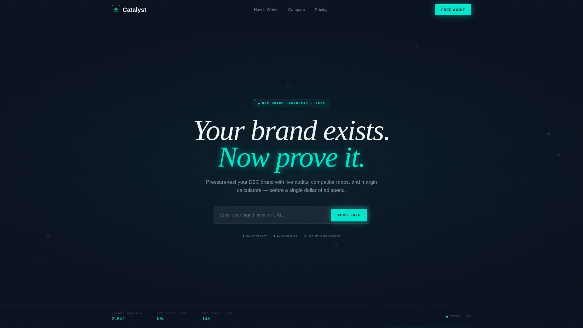
- A dark full-bleed animated header with a teal particle constellation and a materializing headline
- An interactive stage selector that reconfigures the comparison table and case studies based on the visitor's current phase
- A progressive freemium conversion funnel that starts with a brand name or URL and earns the email address second
Feature list
This template ships with purpose-built components that make a D2C startup landing page feel alive, not static.
Animated Particle Header
The header fills the full viewport with a pitch-black background. A teal particle constellation slowly resolves into the outline of a D2C brand ecosystem, including a storefront, supply chain, social feed, and unit economics dashboard, all connected by luminous threads. The particles drift and pulse, responding subtly to cursor movement. After two beats, a hot-white headline materializes: "Your brand exists. Now prove it."
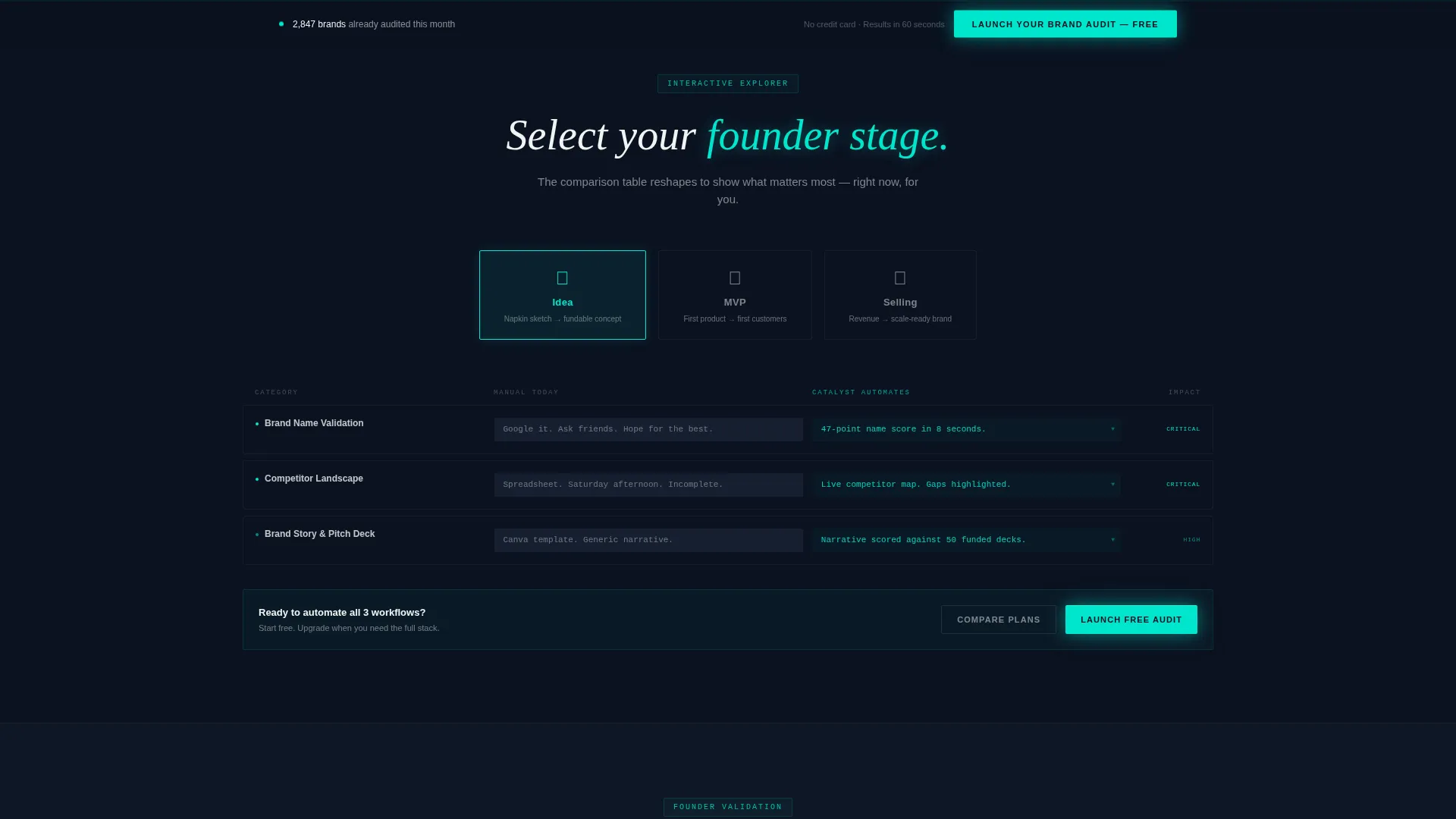
Interactive Stage Selector
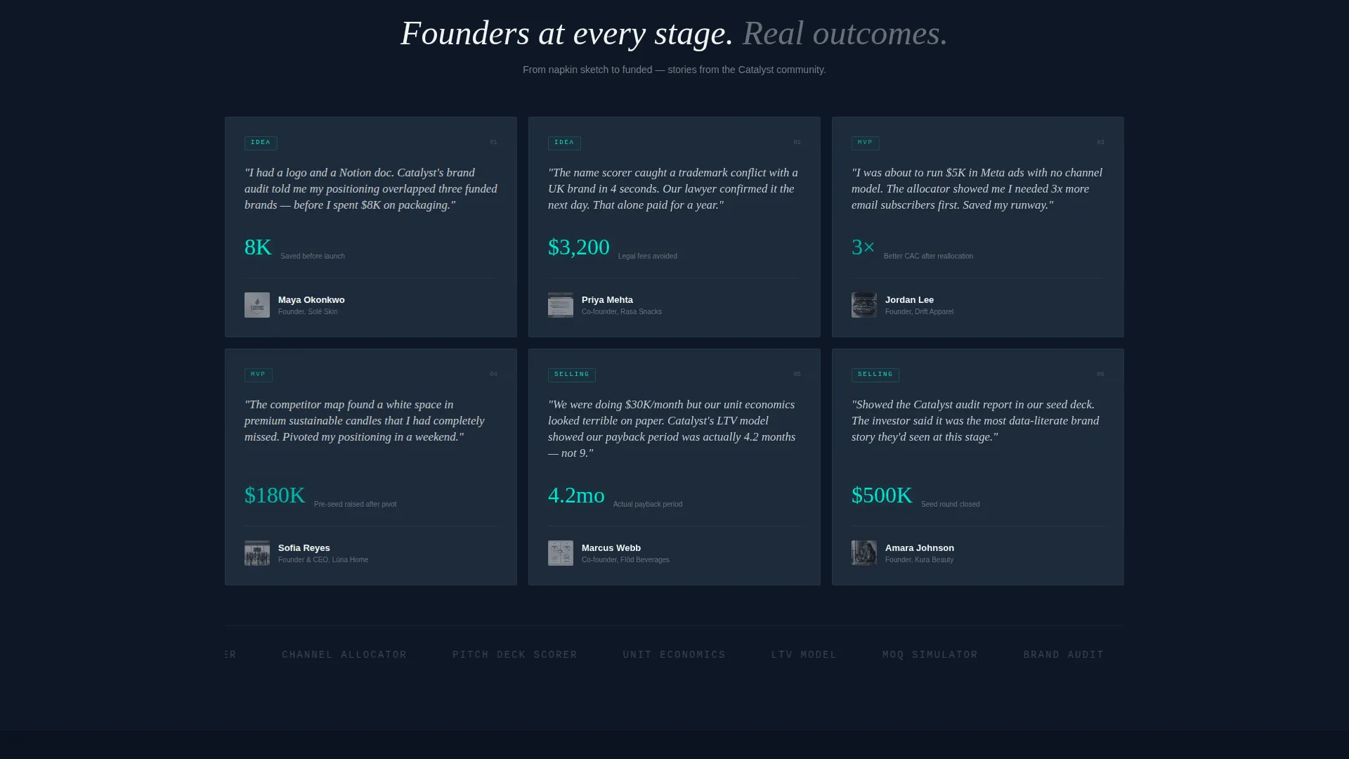
Visitors choose their current stage: Idea, MVP, or Selling. The entire page responds immediately. The comparison table reconfigures its columns, feature rows reorder by relevance, and case studies swap to founders at that same stage. This keeps every visitor inside a version of the page that reflects their exact situation.
Live Comparison Table
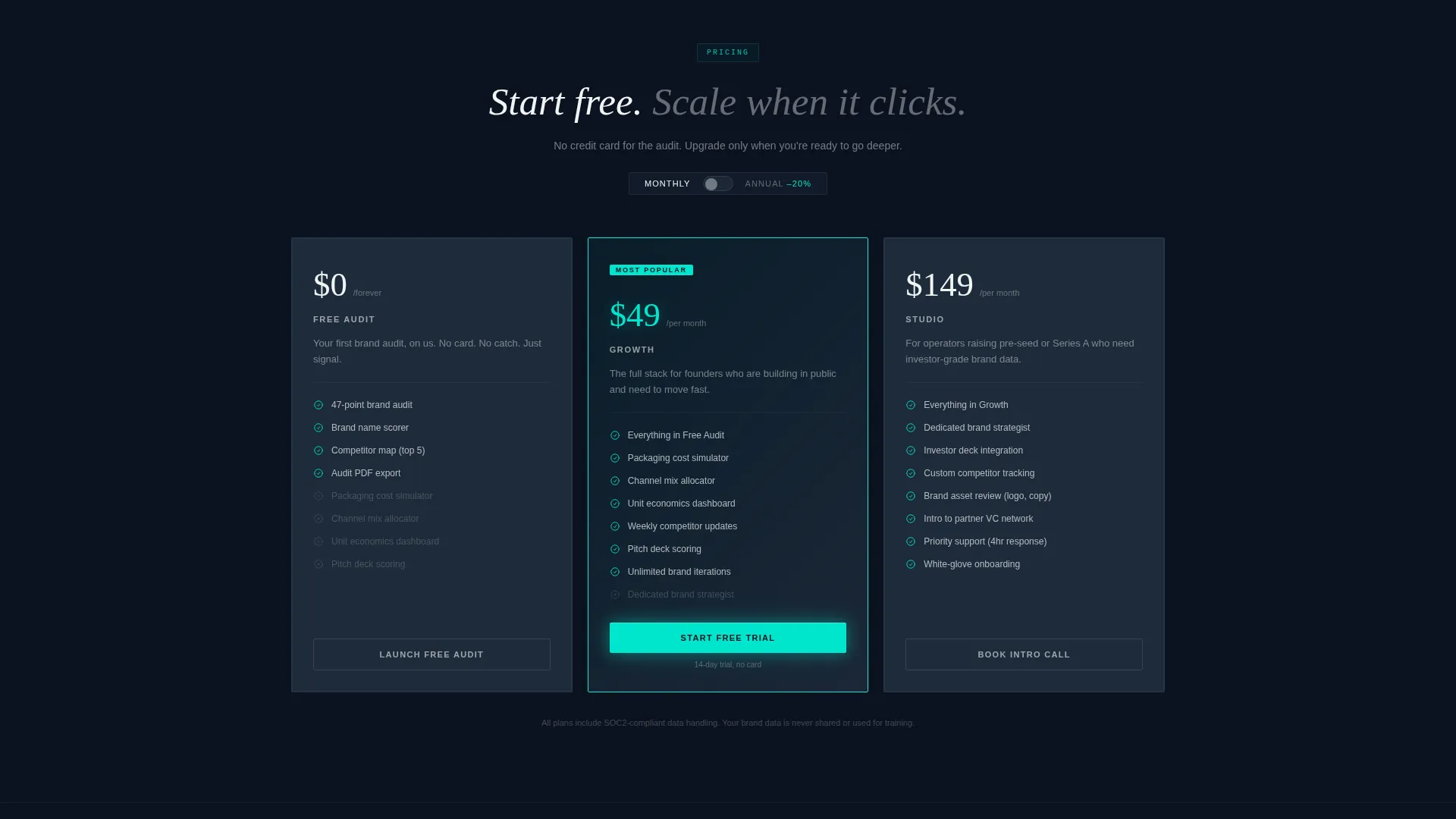
The comparison table contrasts what a founder does manually today against what the platform automates. The left column uses slate backgrounds and monospaced type. The right column uses teal highlights with inline micro-animations showing brand audits running, competitor maps populating, and margin calculators ticking. A secondary call-to-action, "Compare Plans," sits mid-table for spreadsheet-minded founders who want to self-qualify into paid tiers.
Expandable Table Row Demos
Each row in the comparison table is clickable. Expanding a row opens a mini interactive demo inside the table cell itself. Included demos are a live brand-name scorer, a packaging cost simulator, and a channel-mix allocator. Visitors can use the product in three meaningful ways before the signup form ever appears.
Progressive Freemium Funnel
The primary call-to-action is "Launch Your Brand Audit, Free" in a teal-glow button fixed to the bottom bar after the first scroll. The form uses two steps. Step one asks only for a brand name or URL and instantly triggers a live audit loading preview. Step two asks for an email address and stage selection. No credit card is required at any point.
Fixed Bottom Conversion Bar
After the first scroll interaction, a persistent bottom bar appears with the primary call-to-action button. It stays visible as the visitor explores the comparison table and expandable demos. This keeps the conversion path accessible without interrupting the exploratory experience.
Page sections overview
| Section | Purpose |
|---|---|
| Animated header viewport | Introduces brand and headline with particle animation |
| Stage selector bar | Lets visitor configure the page to their current phase |
| Live comparison table | Contrasts manual work versus. platform automation side by side |
| Expandable row demos | Delivers product interaction inside each table row |
| Mid-table plan comparison | Helps self-qualifying founders explore paid tiers |
| Progressive signup form | Collects brand name first, then email in a two-step flow |
| Fixed bottom call to action bar | Keeps primary conversion action visible throughout scroll |
Design & branding system
The visual identity follows a Startup Velocity theme built around the Teal Catalyst color system. Every color decision reinforces the feeling of potential energy about to become motion.
- Deep mission-control black (#0B1120) as the page base, muted slate (#1E2A3A) for card surfaces and table rows, electric teal (#00E5CC) for all interactive highlights and glow effects, and hot white (#F0F5F3) for body text
- Monospaced typography in the left comparison column creates a terminal-screen aesthetic that contrasts cleanly with the teal-highlighted right column
- Particle animations and inline micro-animations are purposeful, not decorative, each one tied to a specific product concept like an audit running or a cost calculator ticking
Mobile & speed optimization
The template is structured to keep the interactive experience functional and readable on smaller screens. The dark palette and high-contrast text ensure legibility across devices.
- The stage selector, comparison table, and expandable row demos are all designed to work within a single-column mobile layout without losing context
- The fixed bottom call-to-action bar adapts to mobile viewport constraints so the primary conversion action remains accessible on any screen size
How this template helps you convert
Catalyst is engineered around a principle: let the visitor use the product before asking for anything. Every layout decision supports that goal.
- The stage selector personalizes the page instantly, so founders feel seen rather than sold to, which reduces early bounce and builds trust before any form appears.
- The expandable table demos give the visitor three real product interactions, a brand-name scorer, a packaging cost simulator, and a channel-mix allocator, before the signup form ever requests an email address.
- The two-step progressive form starts with just a brand name or URL and shows a live audit loading preview immediately, creating a moment of product value that makes the second step feel natural rather than intrusive.
Other information about this template
Catalyst fits into a growing category of interactive startup tools that treat the landing page itself as a product demo. A few additional details worth knowing before you decide.
- The template style is a comparison table layout, which makes it especially useful for founders who need to articulate the before-and-after story of their brand-building process
- The freemium and trial conversion direction means the page is optimized for no-credit-card signups, a pattern well suited to pre-seed audiences who are evaluating tools carefully
- The dark full-bleed header with glow concept is a deliberate design choice tied to the Startup Velocity theme, not a decorative option
- This template is part of the Highvoltage template collection, which focuses on high-energy, conversion-forward layouts for startup and launch categories
- Founders who are preparing a pitch deck or brand audit presentation will find the comparison table structure useful for internal alignment as well as external conversion
Theme
Startup Velocity
Creative direction
Interactive Explorer
Color system
Teal Catalyst
Style
Comparison Table
Direction
Freemium/Trial
Page Sections
Animated Particle Header
Interactive Stage Selector
Live Expandable Comparison Table
Progressive Two-step Freemium Form
Fixed Bottom Conversion Bar
Related questions
Do I need design or coding skills to use this template?
Can I change the stage options in the interactive selector?
Is this template suitable for a brand that is already generating revenue?
How does the two-step form work without a credit card?
What makes this different from a standard startup landing page template?



