HR Advisory | Free Website Template | Rocket
Catalyst is a split-screen landing page template built for a one-person HR technology advisory firm. It guides Series A founders, CTOs, and operations leads through choosing their first human resources information system, applicant tracking system, and payroll stack. The page centers on a five-step stack audit quiz that delivers a personalized recommendation, with no email gate until the final step.
by Rocket studio
Quick summary
Catalyst is a focused, single-page advisory template designed to convert frustrated startup operators into booked advisory clients. The hero leads with an oversized search input that mirrors the visitor's exact pain. A five-step progressive quiz replaces a traditional lead form, so every interaction builds trust before asking for an email address.
Who this template is for
This template was built for one specific kind of business: a solo advisor who helps early-stage companies untangle their HR technology choices before those choices become expensive regrets.
- Series A startup CTOs who have just crossed employee twenty and know spreadsheets will not survive another sprint
- Operations leads duct-taping together disconnected tools and first-time Vice Presidents of People who need a defensible recommendation before their next board meeting
What problem this template solves
Startup operators waste weeks evaluating HR tools with no structured framework. A wrong vendor choice at this stage locks in months of migration pain and depletes engineering goodwill. A generic advisory website does not communicate urgency or demonstrate expertise quickly enough.
- Visitors land on a page that feels like every other consultant site, skip the form, and move on without converting
- The advisor has no scalable way to pre-qualify leads or show their diagnostic thinking before the first call
What you get with this template
You get a desktop-first, split-screen landing page with a dark terminal aesthetic on the left panel and a clean whiteboard-white content area on the right. The layout is built around a five-step progressive assessment quiz that acts as the primary conversion mechanism.
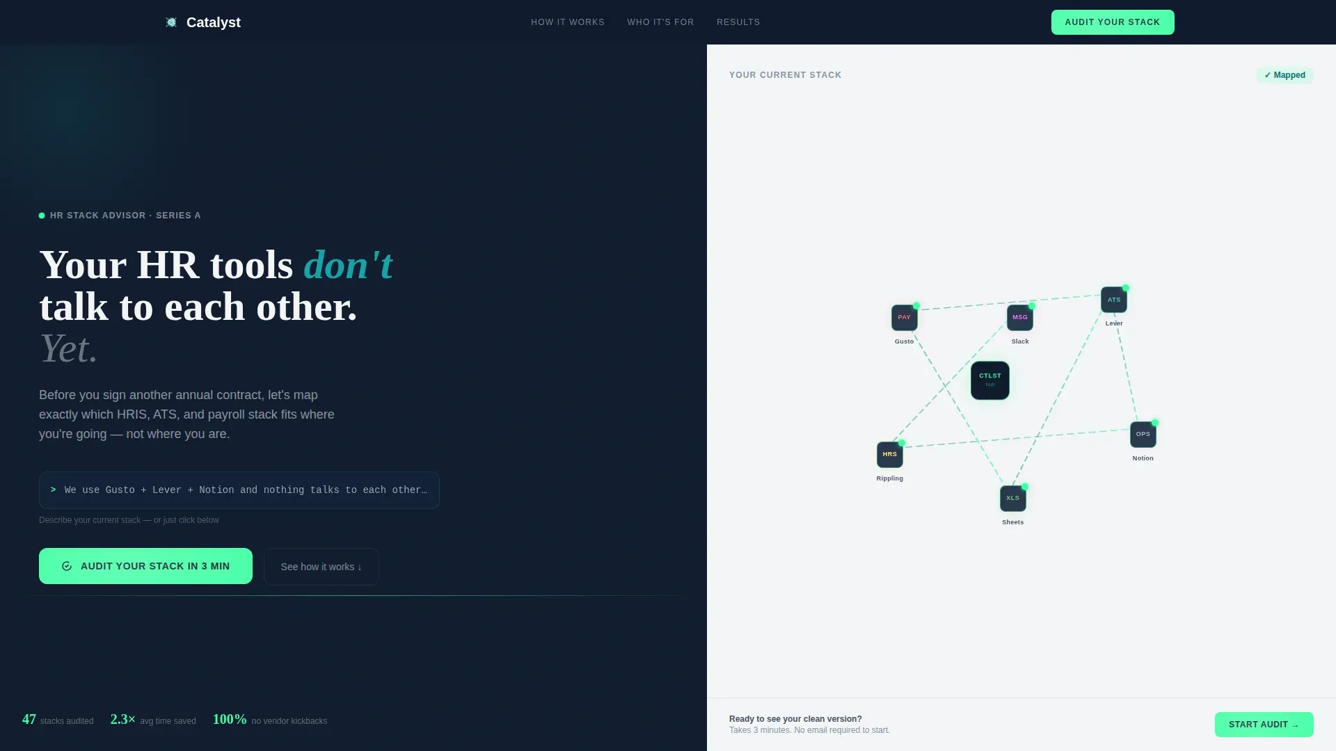
- A hero section with an oversized ghost-text search input and an animated stack-audit diagram showing disconnected tool logos forming connection lines
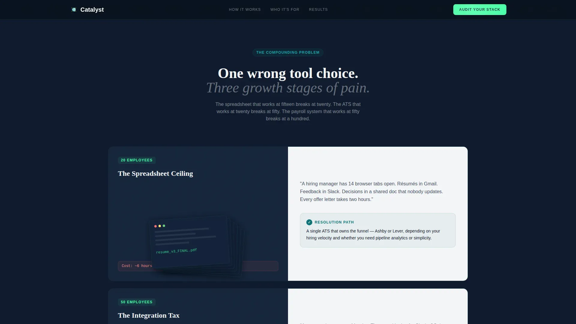
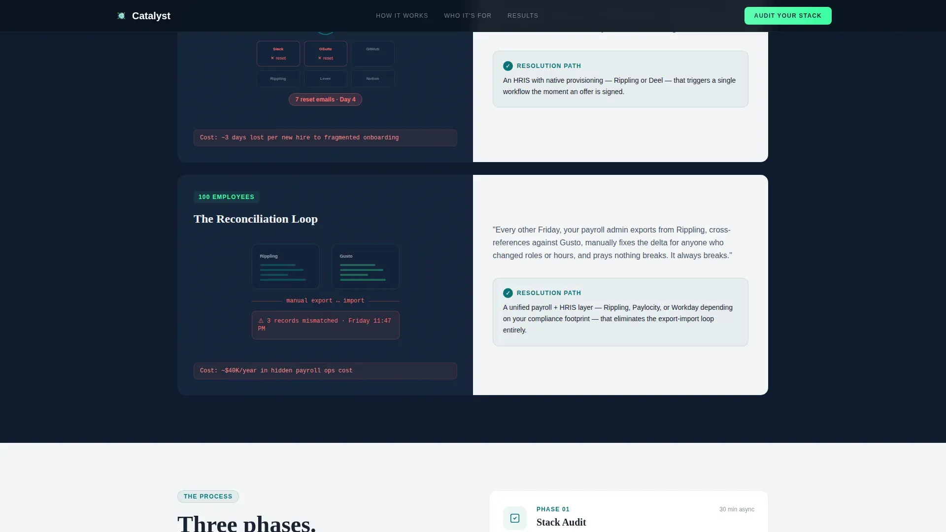
- Three pain escalation sections that scroll from individual frustration to organizational risk at twenty, fifty, and one hundred employees
- A three-phase advisory process section (Audit, Map, Recommend), role-specific testimonial blocks, and a persistent quiz call-to-action anchored to the right panel
Feature list
The template delivers a focused set of interactive and layout features that work together to qualify visitors and move them toward a completed audit.
Split-Screen Hero with Search Input
The hero divides the viewport fifty-fifty. The left panel sits on a midnight background and centers an oversized input field with ghost text that reads like a visitor's own frustrated thought. The right panel shows a clean, animated diagram of common HR tools slowly drawing connection lines between each other.
Five-Step Progressive Stack Audit Quiz
The quiz opens from the persistent "Audit Your Stack in 3 Minutes" button. It walks visitors through five steps: headcount range via a slider, tools currently in use via a multi-select logo grid, biggest daily frustration via a single-select with specific visceral options, hiring velocity over the next two quarters, and budget comfort zone. No email is requested until step five, where a preview of the personalized stack-fit score is revealed.
Pain Escalation Scroll Sections
Three scroll sections split the screen between a human moment on the left and a technology solution map on the right. The narrative escalates from one person's daily friction to the compounding organizational cost of a wrong tool choice across a growing team, building urgency without relying on scare tactics.
Animated SVG Connection Diagram
The right panel of the hero features an animated SVG where tool logos begin disconnected and slowly draw visible connection lines between each other. This visual makes the core value proposition immediate and concrete without any stock photography or headshots.
Role-Specific Social Proof Blocks
The testimonial section features outcome-focused quotes organized by role: CTO, Operations Lead, and Vice President of People. Each block references concrete results such as time saved, integrations replaced, and onboarding hours reduced, giving each visitor type a relevant proof point.
Persistent Quiz Call-to-Action
The "Audit Your Stack in 3 Minutes" button stays anchored to the right panel as visitors scroll. This persistent placement means the primary conversion action is always one click away, regardless of where a visitor is in the page narrative.
Page sections overview
| Section | Purpose |
|---|---|
| Split-Screen Hero | Surface the pain statement via a search input and animated diagram |
| Pain Escalation Scroll | Show compounding cost of wrong tools at 20, 50, and 100 employees |
| How It Works | Walk through the three-phase Audit, Map, Recommend process |
| Social Proof | Deliver role-specific outcomes from CTOs, ops leads, and People VPs |
| Stack Assessment Quiz | Run the five-step progressive quiz modal with a gated final step |
| Footer | Single-row linear layout with essential links and contact context |
Design & branding system
The visual identity follows a terminal-and-dashboard aesthetic that feels deliberately functional. Dark left panels anchor the data and problem side of each split. Clean right panels hold the resolution and action elements. The color system earns its name from the moment a build finally passes at 2 a.m.
- Colors: deep command-line teal (#0D7377) for headlines and progress indicators, midnight product-screen (#0F1B2D) for left panel backgrounds, bright catalyst green (#3DFFA2) for buttons and active quiz states, and warm whiteboard white (#F4F5F7) for right panel content areas
- Typography: Fraunces serif display font for headlines, DM Sans for body copy and user interface elements across the quiz and navigation
Mobile & speed optimization
The template is built desktop-first, reflecting the reality that Series A CTOs and operations leads typically review advisory content on laptops during working hours. The architecture separates static and interactive concerns to keep the experience snappy.
- Server Components handle all static sections including hero copy, pain escalation content, the advisory process section, and social proof blocks
- Client Components manage the quiz modal, slider interactions, multi-select grid, progress indicator, and all SVG connection-line animations
How this template helps you convert
The conversion strategy is built around the quiz itself. Rather than asking for an email address upfront, the template earns trust through each progressive question before revealing value and requesting contact details.
- The hero search input makes visitors feel immediately understood by displaying the exact frustration they typed into Google, reducing bounce before the first scroll
- The five-step quiz pre-qualifies every lead and makes the email gate feel like a fair trade, because the visitor has already seen a preview of their personalized stack-fit score before entering their address
Other information about this template
This template was designed as part of the Startup Velocity theme collection, which is built specifically for B2B advisory and consulting businesses targeting early-stage technology companies. A few additional details worth noting:
- The template style is Split Screen (50/50), making it well-suited for businesses that need to hold two ideas in parallel: the problem on one side and the solution on the other
- The header concept is a Search Box, chosen specifically because it mirrors the behavior of a frustrated operator searching for answers, creating immediate emotional resonance on arrival
- The creative direction is Team and People, meaning visual storytelling focuses on the visitor's own growing company rather than on the advisor's credentials
- The quiz direction (labeled as the landing page direction in the design system) is a Quiz and Assessment format, which is recognized as one of the higher-converting lead capture patterns for B2B advisory services
- The Teal Catalyst color system is a named palette within the Startup Velocity theme, pairing a dark terminal feel with a single bright confirmation green that signals progress and resolution
- Animation complexity is set to high, covering SVG path drawing, scan-line effects, staggered section reveals, quiz step transitions, and connection-line animations
Theme
Startup Velocity
Creative direction
Team & People
Color system
Teal Catalyst
Style
Split Screen (50/50)
Direction
Quiz/Assessment
Page Sections
Split-screen Hero with Search Input
Five-step Progressive Stack Audit Quiz
Pain Escalation Scroll Sections
Role-specific Social Proof Blocks
Persistent Quiz Call-to-action Button
Animated SVG Connection Diagram
Related questions
Who is this landing page template designed for?
Does the quiz collect email addresses upfront?
What sections are included in this template?
What makes this template different from a standard lead-capture page?
What animation and interactivity does this template include?


