Climate Policy Research Institute Landing Page
Catalyst is a masonry-style climate policy landing page built for research institutes that translate peer-reviewed science into legislation. It opens with a UGC photo wall mosaic, unfolds an origin story timeline, and moves visitors through impact data cards toward a clear call to action: downloading the annual impact report or starting a partnership inquiry.
by Rocket studio
Quick summary
Catalyst is a single-page masonry layout designed for a climate action research and policy institute. It blends field photography with hard data, guides visitors through the institute's founding story and measurable outcomes, and closes with two clear conversion paths: downloading the 2024 Impact Brief and exploring a partnership inquiry.
Who this template is for
This template is built for organizations that do serious climate work and need a page that communicates credibility without feeling corporate or cold. It suits institutes where the audience arrives informed and expects evidence, not marketing language.
- Municipal sustainability directors and foundation program officers reviewing potential partners
- Congressional staffers and policy researchers who need quick access to evidence briefs
- Climate advocacy organizations ready to show funders and collaborators a body of real work
What problem this template solves
Most nonprofit and research institute pages bury their impact behind dense text or generic mission statements. Catalyst is designed around a different premise: the page itself must earn trust before asking for a click.
- Visitors leave before they reach the call to action because early sections do not build enough context
- Data and field story are usually kept separate, making outcomes feel abstract rather than grounded
- Partnership inquiries from qualified audiences go unrealized because the conversion path is unclear or too early
What you get with this template
You get a fully structured, single-page layout that moves visitors through narrative, evidence, and action in a deliberate sequence. Every section has a defined purpose and a designed relationship to the sections around it.
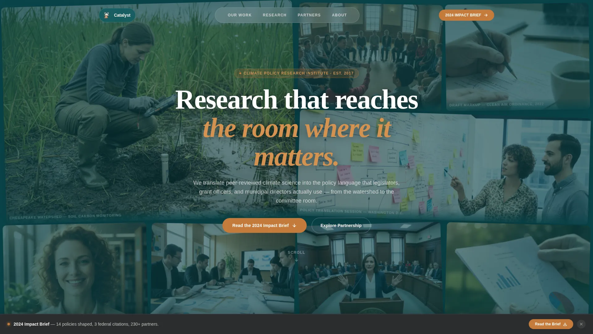
- A UGC photo wall hero with staggered polaroid-settle animation and a headline surfacing in the negative space
- An origin story timeline section, masonry impact data cards with field photography, and a partner network map visualization
- Two conversion paths: a primary clay-button call to action for the impact report and a secondary link toward a partnership inquiry page
Feature list
A paragraph on features: each of the following components was designed to serve a specific function in moving a skeptical, time-pressured policy audience from first impression to meaningful action.
Staggered UGC Photo Wall Hero
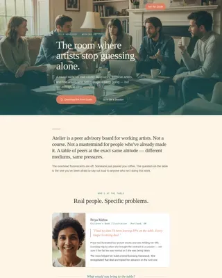
The header is a living mosaic of real photographs that loads as staggered polaroid tiles settling into place. A single editorial headline emerges in the negative space between images, grounding the page in real fieldwork before a word of copy is read.
Origin Story Timeline
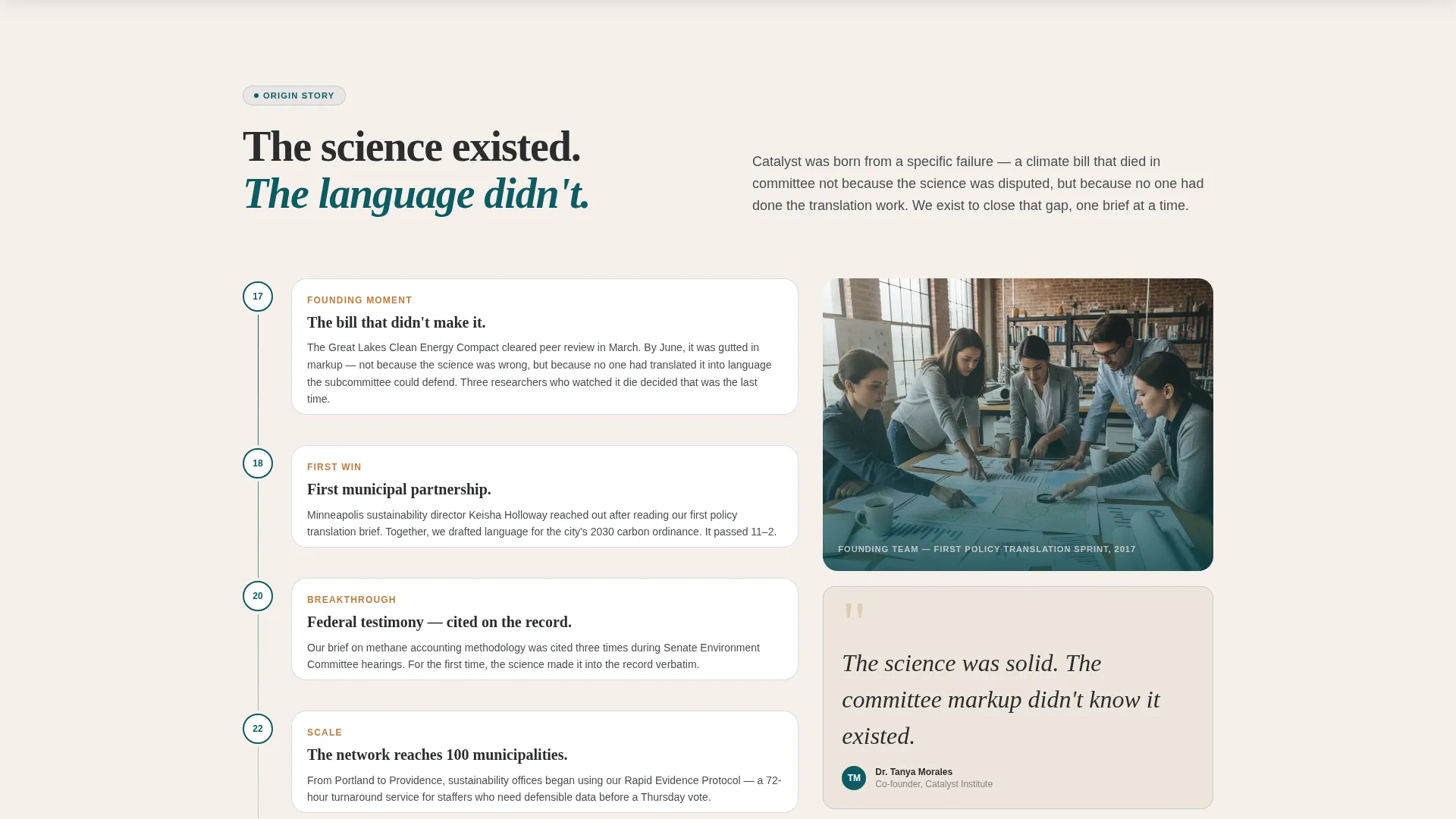
A scroll-driven narrative section unfolds the institute's founding moment, tracing a specific failed climate bill forward through early partnerships and first policy wins. The rhythm alternates between intimate photographs and hard outcome data to build accumulated trust.
Masonry Impact Data Cards
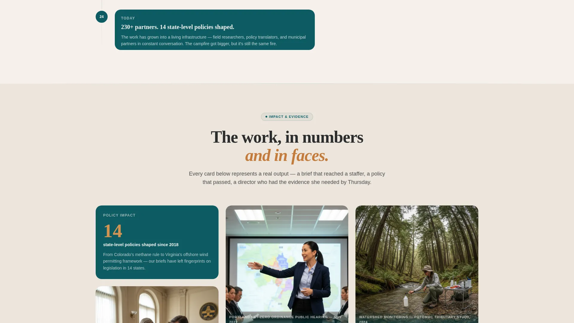
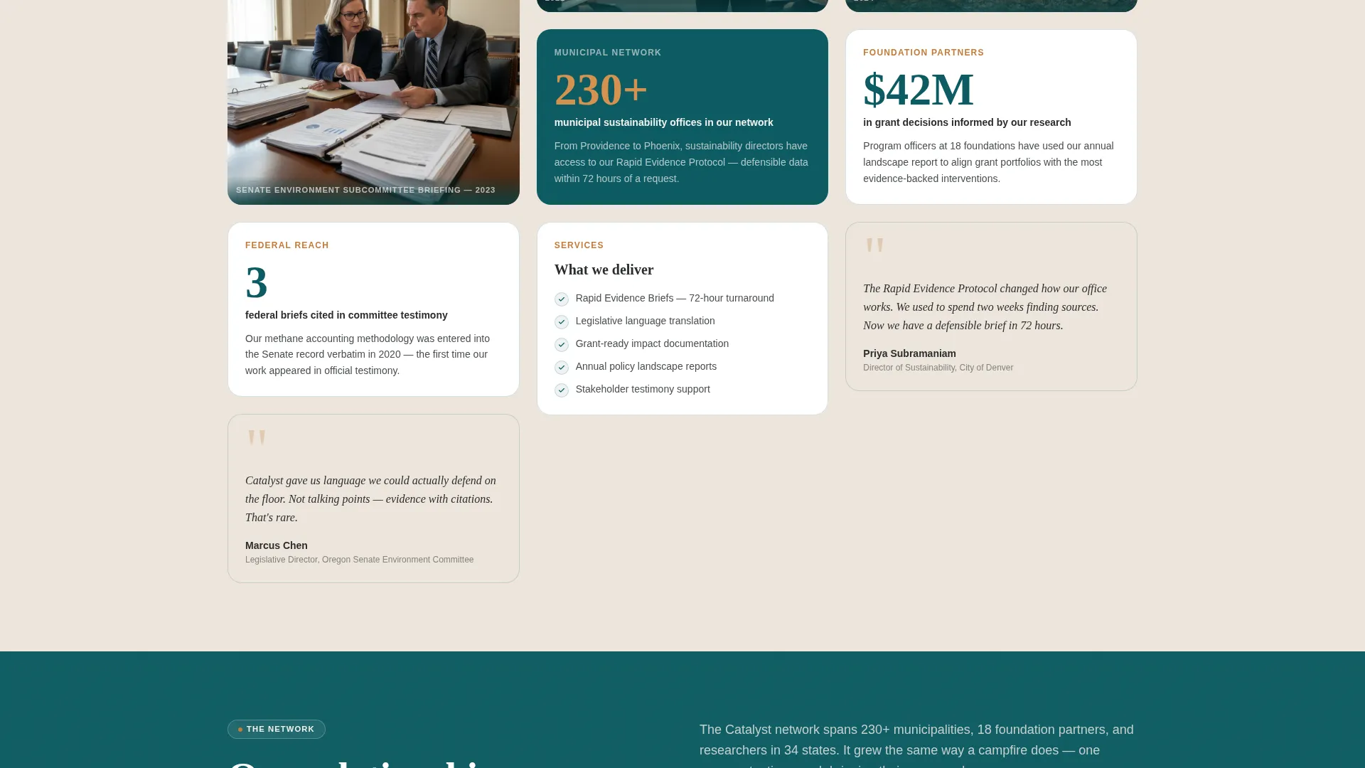
Data callouts are embedded directly inside the masonry grid alongside field photography. Figures like "14 state-level policies shaped," "230+ municipal partners," and "3 federal briefs cited in committee testimony" appear as styled cards rather than isolated statistics.
Partner Network Map
A visual expansion of the institute's partner network renders as orbit-style animated nodes. The map communicates scale and geographic reach in a way a bullet list of names cannot.
Persistent Bottom Call to Action Bar
After a visitor scrolls past the network map, a bottom bar locks into place and keeps the primary call to action visible. The bar surfaces the "Read the 2024 Impact Brief" prompt without interrupting reading flow.
FAQ Accordion
A collapsible FAQ section lets visitors quickly answer remaining questions about the institute's work and partnership process without leaving the page.
Page sections overview
| Section | Purpose |
|---|---|
| Hero Photo Wall | Opens with real fieldwork imagery and the core editorial headline |
| Origin Story Timeline | Narrates the founding moment and traces early policy wins chronologically |
| Impact Data Cards | Shows specific measurable outcomes interleaved with field photography |
| Partner Network Map | Visualizes the breadth of 230+ municipal and organizational partnerships |
| Call to Action Section | Directs visitors to the impact report download and partnership inquiry path |
| Footer | Closes the page with a linear single-row navigation and contact links |
Design & branding system
The visual identity follows a Community Hearth theme. The palette feels like a community center built from reclaimed wood and river stone: grounded, warm, and serious without being sterile.
- Deep watershed teal (#0D5C63) anchors section backgrounds and card borders; sun-warmed clay (#C47B3A) activates on hover states, active links, and data callouts
- Soft linen white (#F5F0EB) breathes between masonry tiles to prevent density from becoming clutter; charcoal fieldstone (#2B2D2E) is used for body text
- Fraunces handles editorial headlines for warmth and weight; DM Sans carries body copy for clarity and legibility at desk-reading sizes
Mobile & speed optimization
The template is designed desktop-first, reflecting the reality that municipal directors, foundation officers, and congressional staffers typically engage this kind of content at a desk. A solid mobile fallback ensures the page remains usable for secondary audiences on smaller screens.
- Scroll-triggered animations use client-side components while static structural sections use server components for reliable initial load
- Staggered polaroid animations and blur-based scroll reveals are scoped to client components, keeping non-animated content lightweight and immediately readable
- The masonry grid adapts to narrower viewports so photography and data cards remain legible without horizontal overflow
How this template helps you convert
Catalyst is designed around earned conversion: the call to action appears only after the visitor has moved through enough evidence to make clicking feel like a natural next step.
- The origin timeline and data cards build a case through specific outcomes before any download prompt appears, so the impact report request lands after trust is already established.
- The persistent bottom bar reintroduces the primary call to action at the moment a visitor has absorbed the network map, keeping the prompt present without disrupting reading.
- A secondary partnership inquiry path is held open throughout for foundation officers and municipal offices who are ready to act before reaching the bottom of the page.
Other information about this template
This template sits at the intersection of nonprofit storytelling and policy communication design. It is suited for any organization that needs to demonstrate rigorous, relationship-built credibility to a professional audience.
- The template is categorized under Community and Nonprofit with a Climate Action Research and Policy Institute niche focus
- The Teal Catalyst color system and Community Hearth theme are purpose-built for this intersection, not adapted from a general-purpose palette
- The masonry and Pinterest-style layout structure supports a high density of mixed content types (photography, data, narrative text) without visual chaos
- The click-through landing page direction means every design decision points toward two defined exits: the impact report and the partnership inquiry
Theme
Community Hearth
Creative direction
Origin Story
Color system
Teal Catalyst
Style
Masonry/Pinterest
Direction
Click-Through
Page Sections
UGC Photo Wall with Polaroid Animation
Scroll-driven Origin Story Timeline
Embedded Impact Data Cards
Orbit-style Partner Network Map
Persistent Scroll-triggered Call to Action Bar
FAQ Accordion Section
Related questions
Who is this landing page template built for?
Can I adapt the origin story timeline to fit my organization's history?
What are the two main conversion paths in this template?
Does the template include the photography shown in the design?
Is this template suitable for a desktop-first audience?