Education Access Fundraising Landing Page Template
Catalyst is a single-column education access fundraising landing page built for community event organizers. It guides PTA leaders, corporate volunteers, and student fundraisers through a stepped event registration flow. The design uses a nature-inspired teal and goldenrod palette, scroll-triggered photo animations, and a live impact ticker to connect every neighborhood run or ride directly to a student's scholarship.
by Rocket studio
Quick summary
Catalyst is a single-column fundraising landing page that turns community events into scholarship dollars for first-generation college students. It combines a scroll-animated photo mosaic, a student story video, illustrated event format cards, and a stepped registration form. The result is a page that moves visitors emotionally and then guides them straight into action.
Who this template is for
This template is built for people who already care about education access and need a focused, trustworthy page to channel that energy into real events. It works for organizers who are comfortable coordinating logistics but want a polished digital presence without building from scratch.
- PTA presidents and school staff planning spring fun runs or charity walk events
- Corporate social responsibility coordinators building team volunteer days tied to a cause
- College students who received financial aid and now fundraise to pay it forward
What problem this template solves
Most nonprofit fundraising pages ask for a donation and stop there. They do not explain the journey from a community 5K to a student's graduation day. Catalyst closes that gap by making the cause visible at every scroll point.
- Visitors struggle to connect a registration click with a real student outcome
- Generic event sign-up forms lose momentum before the organizer commits
- Cause-driven pages often lack the social proof that makes a new organizer trust the platform
What you get with this template
You get a complete, single-column landing page flow designed around one goal: getting a community organizer to register an event. Every section earns the next click before asking for anything.
- A UGC photo mosaic header with a row-by-row color bloom animation triggered by scroll
- A student story video section, four illustrated event format cards, a live impact ticker, and a split-moment visual connecting a runner to a graduating student
- A stepped registration modal that collects event type, location and date, and organizer contact details in three clean stages
Feature list
This template includes purpose-built components that reflect the full arc of a fundraising event, from emotional entry point to committed registration.
Scroll-Activated Photo Mosaic
The header tiles real participant photos edge to edge with no gaps. Each row starts slightly desaturated and blooms into full color as the visitor scrolls down, creating a living, progressive reveal that draws attention without interrupting flow.
Student Story Video Embed
A dedicated section holds a 90-second video story from a scholarship recipient. Narrative copy surrounds the embed to frame the why before the visitor reaches any ask. This section anchors the emotional core of the page.
Illustrated Event Format Cards
Four trail-map-style cards represent the available event formats: Walk, Run, Ride, and Give. Each card is illustrated rather than photographic, giving the section a warm, hand-crafted feel that matches the nature-inspired design direction.
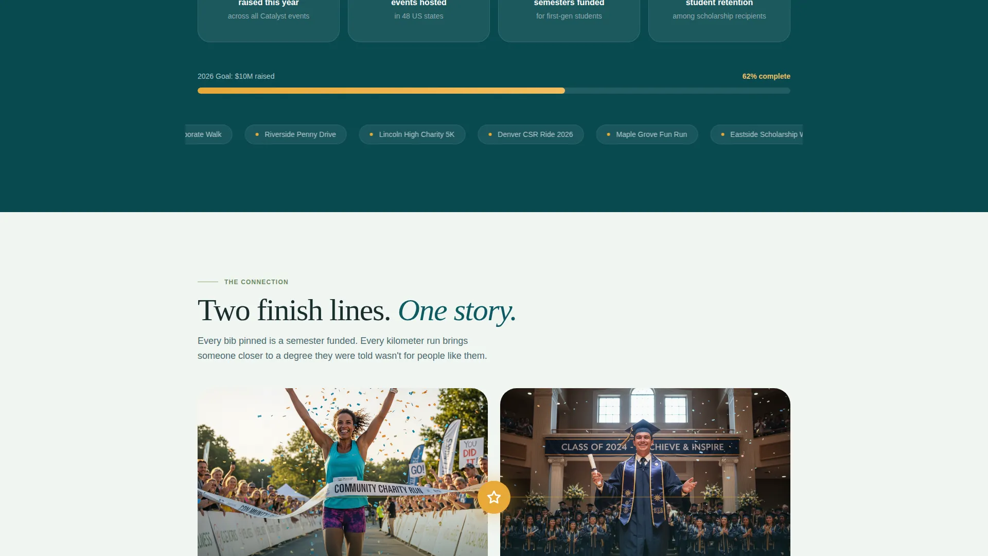
Live Impact Ticker
Animated count-up numbers display dollars raised, events hosted, and semesters funded in real time. A smaller dynamic counter directly below the primary call to action reads "Events like yours have funded 4,211 semesters and counting," reinforcing trust at the exact moment of decision.
Stepped Registration Form
The primary registration flow opens as a modal with three sequential steps: event type selection, zip code and preferred date entry, and organizer name and email. A secondary path labeled "Join an Existing Event" sits beneath in sage green for participants searching by location.
Sticky Call-to-Action Bar
The "Start Your Event" button in goldenrod appears first after the student video and then pins to the bottom of the viewport throughout the scroll. It stays visible without being disruptive, so the organizer can commit at any point on the page.
Page sections overview
| Section | Purpose |
|---|---|
| UGC Photo Wall | Open with real participant faces and animated color reveal |
| Student Story Video | Establish the emotional why before any registration ask |
| Event Format Cards | Show the four ways a community can fundraise |
| Live Impact Ticker | Build trust with animated counters for dollars and semesters |
| Split Moment Visual | Connect a finish-line runner to a graduating student visually |
| Stepped Registration Form | Collect event details in three focused, low-friction steps |
| Minimal Footer | Close the page with a clean horizontal flow layout |
Design & branding system
The visual identity follows a nature-inspired trail-at-dawn theme. The palette and type choices feel organic and movement-forward without sacrificing legibility or warmth.
- Colors: deep forest teal (#0D5C63) as the primary anchor, sun-warmed sage (#87A878) for secondary surfaces, morning fog (#F0F5F2) across open backgrounds, and bright goldenrod (#E8A838) reserved exclusively for buttons and progress indicators
- Typography: Fraunces serif for hero headlines and emotional statements, DM Sans for body copy and all interface elements
- The animated golden SVG line connecting the split-moment visual uses the goldenrod accent to carry the eye from the runner image to the graduation stage image
Mobile & speed optimization
This template is built mobile-first because event organizers often open links on their phones at school events or volunteer briefings. Every interactive element is designed to work cleanly at small screen sizes.
- The stepped registration modal, sticky call-to-action bar, and live ticker are built as client-side components while static sections use server-side rendering
- The photo mosaic bloom uses IntersectionObserver so the scroll animation triggers only when each row enters the viewport, avoiding unnecessary processing on load
How this template helps you convert
The page earns the registration click by showing the direct line between a community event and a student's outcome. Every section reduces friction and builds the next layer of trust.
- The scroll arc mirrors the emotional shape of a fundraising event: the page opens with the why, moves through the how, builds with social proof, and lands on the payoff before presenting the form
- The sticky "Start Your Event" button stays available throughout the scroll, so an organizer who is ready early does not have to hunt for the next step
- The dynamic counter below the call to action ties the individual organizer's decision to a proven, numbered outcome, making the click feel meaningful rather than speculative
Other information about this template
Catalyst is designed as a single-column flow landing page, which keeps the visitor's attention locked on one path from top to bottom. There are no sidebars, competing menus, or destination links that pull attention away from the registration goal.
- The template is localized for English-language audiences in the United States, using USD currency formatting and MM/DD/YYYY date inputs in the registration form
- The footer follows a minimal horizontal flow layout, keeping the close of the page clean and consistent with the movement-forward design direction
- The UGC photo wall concept is designed to display real event photography, not stock imagery, so every face shown represents someone who actually participated


Theme
Nature-Inspired
Creative direction
Movement & Cause
Color system
Teal Catalyst
Style
Single Column Flow
Direction
Event Registration
Page Sections
Scroll-activated Photo Mosaic Header
Student Story Video Section
Illustrated Event Format Cards
Live Impact Ticker with Dynamic Counter
Stepped Three-stage Registration Modal
Sticky Goldenrod Call-to-action Bar
Related questions
Who is the primary audience for this landing page template?
Can I customize the event formats shown on the page?
How does the stepped registration form work?
What makes this design feel different from a standard donation page?
Is this template suitable for mobile users?


