Multiple Sclerosis Care Advanced Professional Website Template
Catalyst is a single-column landing page template built for adaptive multiple sclerosis exercise programs. It guides visitors through a Problem→Solution Arc, names the real challenges of exercising with MS, then presents structured programming grounded in fatigue-graded protocols and nervous system variability. The page drives enrollment clicks without collecting form data on-page.
by Rocket studio
Quick summary
Catalyst is a click-through landing page template designed for multiple sclerosis exercise programs. It opens with a bold Stacked Type Tower hero, moves through a stark problem stack that names fatigue walls and Uhthoff's phenomenon by name, then pivots to a solution reveal. Every scroll feels deliberate. Every section earns the next click.
Who this template is for
This template is built for practitioners and program creators who serve people living with multiple sclerosis. It works equally well for clinical referral pathways and direct patient enrollment.
- Adaptive fitness professionals building structured movement programs for MS patients
- Health and wellness program creators targeting recently diagnosed individuals who need a clear exercise roadmap
- Neurologists and clinical teams looking for a credible referral page when patients ask what exercise actually looks like with MS
What problem this template solves
People diagnosed with multiple sclerosis are often told to "stay active" with no practical guidance. Generic fitness pages ignore thermoregulation failure, spasticity, and the energy envelope entirely. This template fills that gap by giving the program a page that speaks the visitor's exact lived experience before offering a single solution.
- No roadmap for newly diagnosed patients who want to exercise but don't know how to start safely
- Long-term MS warriors managing spasticity and fatigue erosion who need programming that respects their nervous system variability
- Neurologists with no credible exercise referral to offer patients who ask for structured movement support
What you get with this template
You get a fully structured single-column landing page that follows a Problem→Solution Arc from top to bottom. The layout is purposeful: tension builds in the problem stack, then resolves in the solution reveal, finishing with a credibility section that supports the final enrollment click.
- A Stacked Type Tower hero section with no imagery, relying entirely on bold typographic hierarchy to earn the scroll
- A three-placement call-to-action system using coral button styling, each labeled "See the Program Inside," positioned after the problem stack, after the solution reveal, and after the credibility section
- Scroll-triggered reveal animations with stagger and blur-in transitions, hover states, and scroll-linked section transitions across the full page
Feature list
Stacked Type Tower Hero
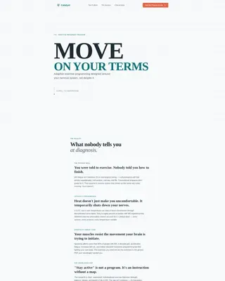
The hero uses no imagery. Three typographic lines stack vertically: "MOVE" in large neurological charcoal, "ON YOUR TERMS" in teal at half the size, then a single body-weight sentence beneath. The vertical rhythm creates authority before a single photo appears.
Problem Stack with White-Space Blocks
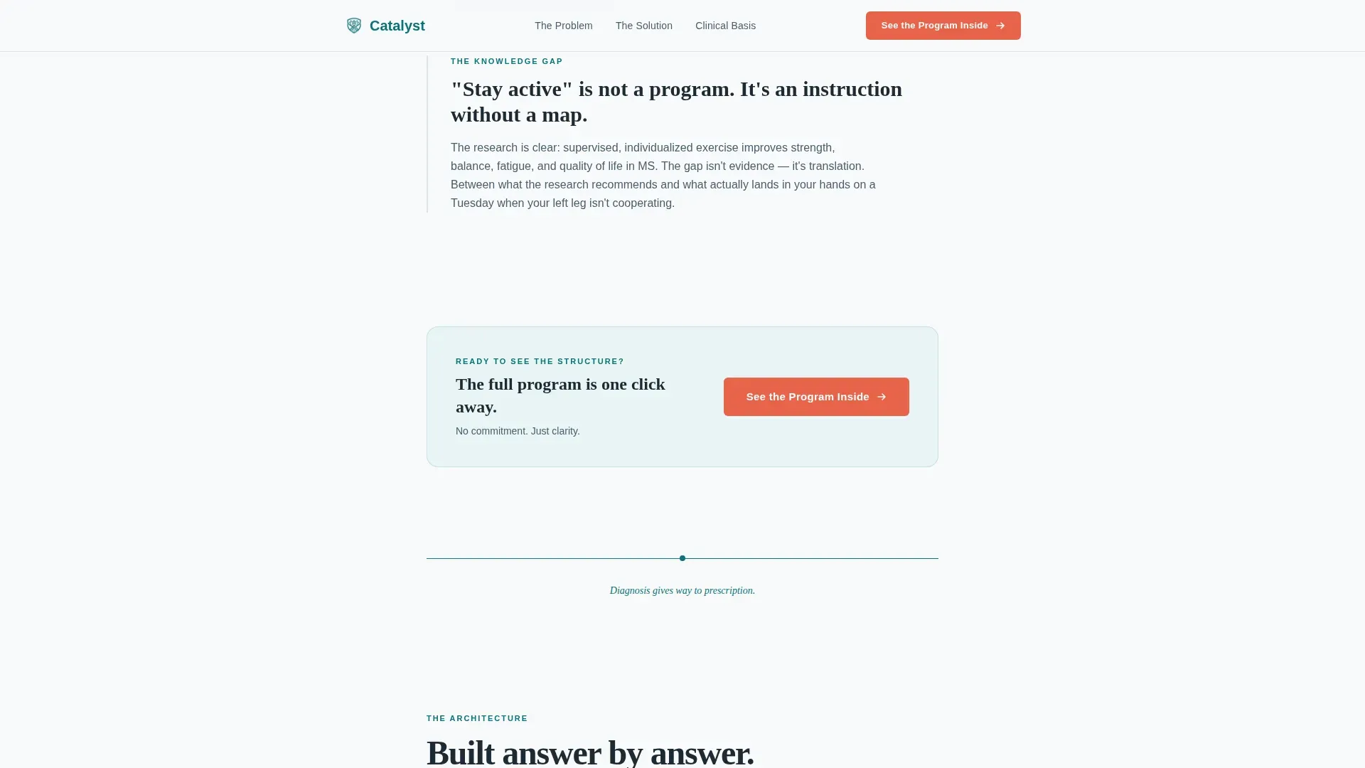
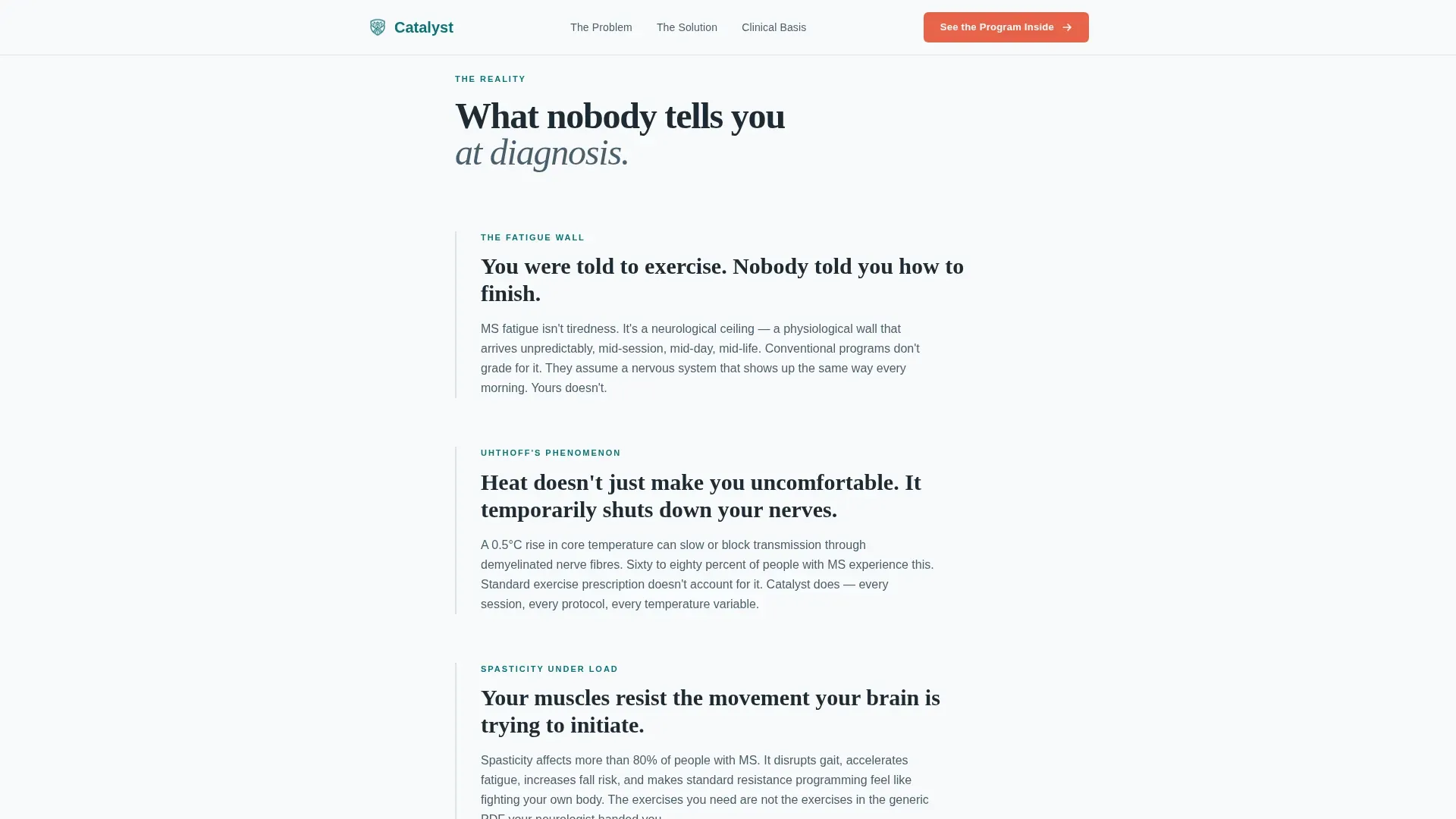
Each pain point, fatigue walls, thermoregulation failure, Uhthoff's phenomenon, and the knowledge gap, occupies its own isolated text block against open white space. A single teal dividing line separates the problem section from the solution reveal below it.
Fatigue-Graded Solution Reveal
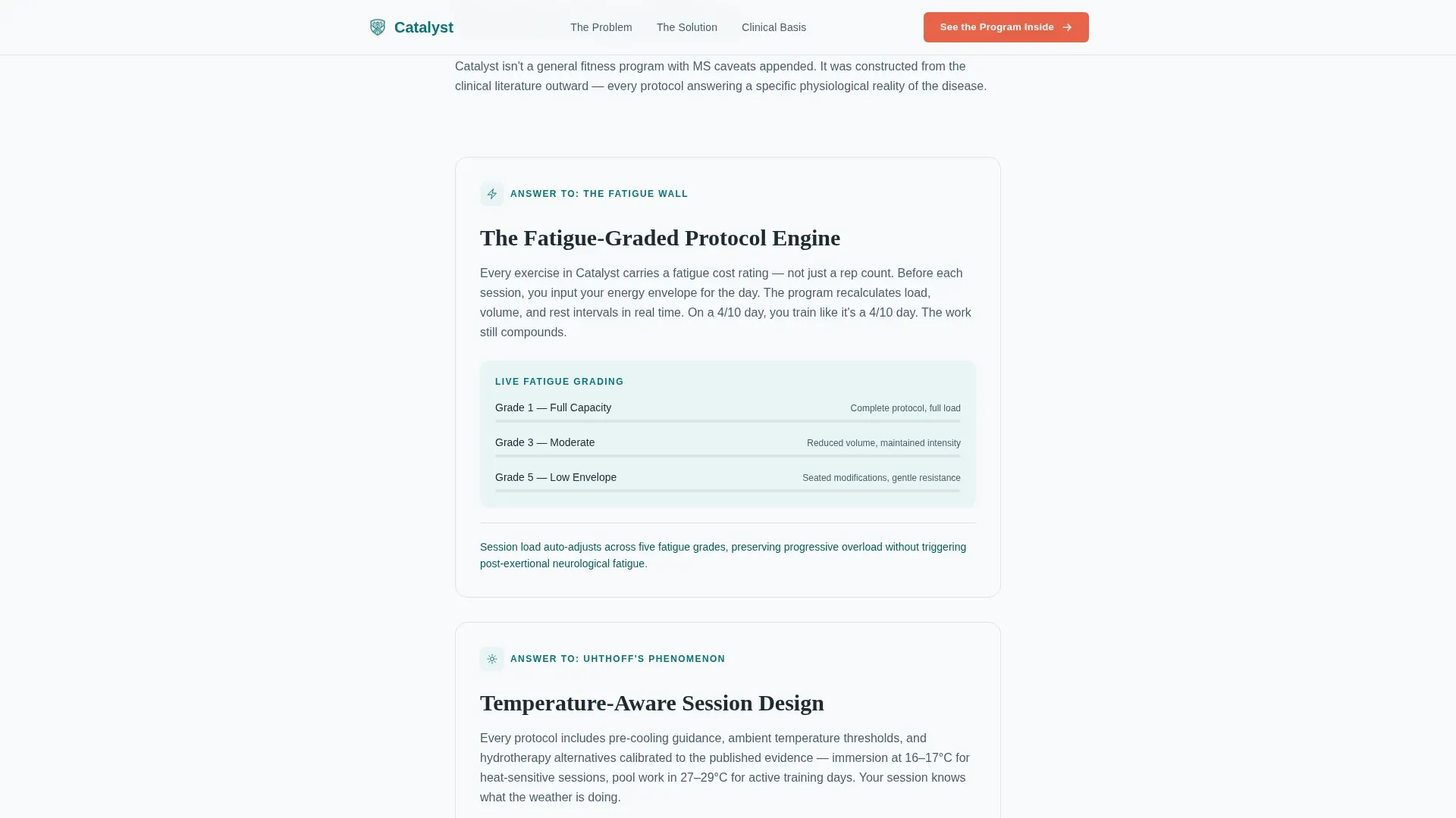
Below the dividing line, solution sections directly answer each pain point raised above. The adaptive engine, fatigue-graded protocols, and session modification logic are each presented in their own block. The scroll feels like a diagnosis giving way to a prescription.
Three-Placement Call-to-Action System
The primary call-to-action button reads "See the Program Inside" and appears at three strategic scroll positions. There is no form on this page. Every click carries the visitor to the full program breakdown where enrollment commitment happens.
Credibility Section with Clinical Advisory References
A dedicated section presents clinical advisory names and peer-reviewed methodology references. This section supports the final call-to-action placement and gives neurologists and skeptical patients the evidence anchor they need before clicking.
Scroll-Triggered Animation System
The page uses medium-intensity scroll-triggered reveals, stagger effects, and blur-in transitions. Hover states are active across interactive elements. Scroll-linked section transitions connect each content block into a continuous, intentional reading experience.
Page sections overview
| Section | Purpose |
|---|---|
| Hero Type Tower | Establishes authority with bold stacked typography and the core program declaration |
| Problem Stack | Names fatigue walls, Uhthoff's phenomenon, and the knowledge gap in specific, isolated text blocks |
| Teal Dividing Line | Marks the emotional pivot from problem tension to solution structure |
| Solution Reveal | Presents the adaptive engine, fatigue-graded protocols, and session modification logic |
| First call to action Placement | Drives the enrollment click after the problem stack builds recognition |
| Second call to action Placement | Reinforces the click after the full solution reveal |
| Credibility Section | Displays clinical advisory names and peer-reviewed methodology references |
| Final call to action Anchor | Bottom-of-page enrollment call-to-action with coral button styling |
| Footer | Linear single-row footer with essential navigation links |
Design & branding system
The visual identity follows a Corporate Precision theme with Scandinavian clinical warmth. The palette is sterile enough to earn health trust but warm enough to avoid feeling like a waiting room.
- Color system uses clinical deep teal (#0D7377) as the primary brand anchor, neurological charcoal (#1E2A33) for body text and dividers, clean-room white (#F7F9FA) for open backgrounds, and reaction-bright coral (#E8634A) reserved exclusively for call-to-action buttons and progress indicators
- Typography pairs Fraunces serif display for headlines with DM Sans for body text, creating a contrast between clinical authority and readable clarity
- The overall aesthetic feels like a rehabilitation clinic designed with precision, every visual decision engineered to signal structure and safety without announcing itself
Mobile & speed optimization
The template is built desktop-first with full mobile responsiveness across all section types. The single-column flow adapts cleanly to smaller screens without restructuring the content hierarchy.
- Server Components power all static sections, keeping JavaScript usage minimal across the page
- Scroll-triggered animations and blur-in transitions are applied at medium intensity, balanced to remain smooth across devices without overloading the rendering pipeline
- The single-column layout means no grid reflows or complex breakpoint logic, supporting a consistent reading experience from desktop to mobile
How this template helps you convert
This template converts by earning recognition before making any offer. Visitors feel seen in the problem section, which lowers resistance before the solution is ever introduced.
- The Problem→Solution Arc structure mirrors the visitor's internal journey, building honest tension in the problem stack and then resolving it directly with the adaptive exercise programming sections, so the call-to-action feels like a natural next step rather than a sales push
- The three-placement call-to-action system keeps the enrollment click available at every key emotional inflection point without repeating the same pressure loop, giving visitors the option to act as soon as they are ready
- The credibility section with clinical advisory names and methodology references addresses the skepticism of both patients and neurologists, making the final call-to-action the most trusted click on the page
Other information about this template
This template is suited for the health and medical category, specifically within the multiple sclerosis care subcategory and the multiple sclerosis exercise program niche. It carries an intersection match score of 13, reflecting strong alignment between the template's design system and the target use case.
- The Teal Catalyst color system and Corporate Precision theme were selected specifically for this niche, signaling clinical credibility without sterile coldness
- The Click-Through landing page direction means no form fields appear on the page; all commitment happens on a separate program enrollment page that this template links to
- The footer uses a Pattern 1 Linear Single-Row layout, keeping the bottom of the page clean and uncluttered
- Localization is set to English (US) with no currency display, making the template neutral for programs at various pricing stages
- The template ID reference is 699fd5b060b9b40014653b14 and it is classified under the Single Column Flow template style
Theme
Corporate Precision
Creative direction
Problem→Solution Arc
Color system
Teal Catalyst
Style
Single Column Flow
Direction
Click-Through
Page Sections
Stacked Type Tower Hero
Problem Stack with Isolated Text Blocks
Fatigue-graded Solution Reveal
Three-placement Call to Action System
Clinical Credibility Section
Scroll-triggered Animation System
Related questions
Who is this landing page template designed for?
Does this template include a sign-up form?
Can I customize the color system and typography?
What animations does this template include?
Is this template suitable for a neurologist referral page?



