Renewable Energy Components Cost Calculator Website Template
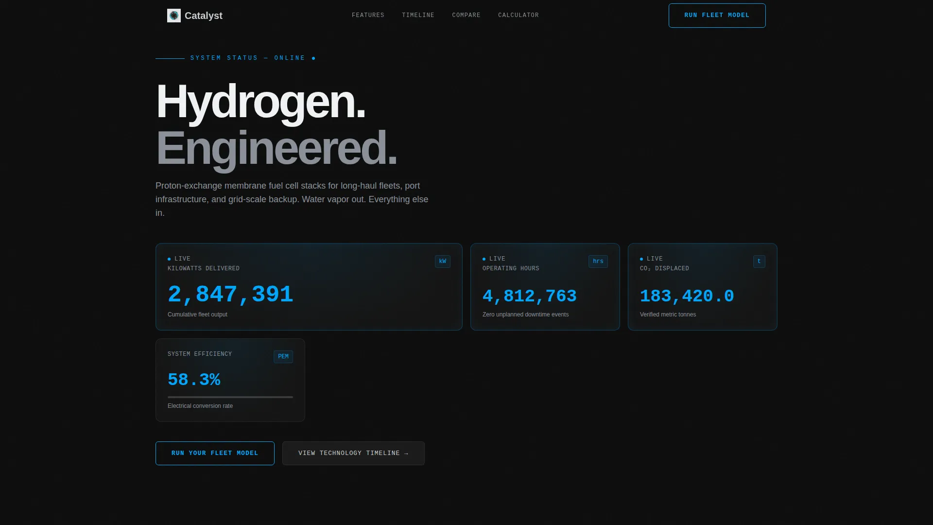
Catalyst is a Hub & Spoke anchor-nav landing page built for a precision hydrogen fuel cell manufacturer. It opens with an animated Stats/Metrics cockpit showing live performance data, then guides visitors through a Timeline Progression from lab to grid scale. The primary conversion path is a fleet cost calculator, backed by a gated PDF comparison brief. Built on a Dashboard Pro theme with a Carbon Fiber palette.
by Rocket studio
Quick summary
Catalyst is a single-page, anchor-nav landing page designed for a precision hydrogen fuel cell maker. The page opens with a full-width live-metrics dashboard, then walks visitors through four technology eras, from a 2019 lab start to 2025 grid-scale deployment. Every section builds a data-driven case that ends at a fleet cost calculator and a gated comparison brief download.
Who this template is for
This template is built for precision engineering firms in the renewable energy components space. It speaks directly to the decision-makers who evaluate fuel cell technology against diesel and battery alternatives before committing capital.
- Fleet procurement managers running total-cost-of-ownership models for long-haul truck fleets
- Port authority engineers operating under active emissions mandates
- Energy directors at data centers who require high-uptime backup power without diesel
What problem this template solves
Industrial buyers of hydrogen fuel cell systems need more than a brochure. They arrive with hard questions about cost, reliability, and emissions performance, and they will not convert on vague claims.
- Generic pages bury performance data instead of leading with it, losing the technical buyer immediately
- No comparison context leaves procurement managers without the side-by-side evidence they need to justify a purchase
- Long contact forms create friction before the visitor has seen enough proof to act
What you get with this template
This template delivers a fully structured, single-page layout designed around proof and progression. Every section earns its place before asking the visitor to do anything.
- An animated Stats/Metrics cockpit header showing kilowatts delivered, operating hours, carbon dioxide displaced, and system efficiency
- A Timeline Progression spoke rail guiding visitors through four technology eras with escalating performance data and shrinking cost-per-kilowatt figures
- An inline fleet cost calculator and a two-field gated PDF download as the dual conversion endpoints
Feature list
This template is built around functional design choices that do the selling before the call to action appears.
Animated Metrics Dashboard Header
The full-width header renders live-style performance data as a moving cockpit display. Kilowatts delivered climb in real time, operating hours tick forward, carbon dioxide displaced accumulates in tonnes, and system efficiency holds at 58.3%. Numbers are set in a monospaced typeface at headline scale against carbon black, with hydrogen-arc blue pulsing behind each figure.
Hub and Spoke Anchor Navigation
A horizontal spoke rail pins to the top of the page on scroll. It is labeled with four timeline nodes: "2019 → Lab," "2021 → Prototype," "2023 → Fleet Deployment," and "2025 → Grid Scale." Visitors can jump directly to any era or scroll through in sequence as the technology narrative unfolds.
Timeline Progression Sections
Each spoke section presents the fuel cell technology at a specific development stage. Power output escalates, cost-per-kilowatt shrinks, and use cases expand from era to era. Scrolling through the page feels like watching a technology mature, with each era's dashboard metrics visibly outpacing the last.
Organic Comparison Tables
Between timeline eras, comparison tables appear in context. They evaluate hydrogen fuel cells against diesel and battery alternatives across cost, emissions, and operational factors. Columns where fuel cells lead are highlighted in aluminum white; columns where they trail are shown honestly in graphite gray.
Fleet Cost Calculator
The primary conversion tool lets visitors input their fleet size, daily route miles, and current fuel type. The calculator returns a side-by-side cost and emissions projection. It functions as a personalized closing argument, making the data feel specific to the visitor's own operation.
Two-Field PDF Gate
The secondary conversion path offers a downloadable full comparison brief. It requires only a company email address and fleet size, keeping friction minimal. The gate captures qualified lead data without demanding excessive form fields.
Page sections overview
| Section | Purpose |
|---|---|
| Metrics Cockpit Header | Open with animated live performance data as the visual hero |
| Anchor Spoke Rail | Pin timeline navigation to the top for persistent era access |
| 2019 Lab Era | Introduce the technology at its research and development origin |
| 2021 Prototype Era | Show early hardware milestones and initial power output figures |
| 2023 Fleet Deployment | Present commercial truck and port crane use cases with real metrics |
| 2025 Grid Scale | Demonstrate backup grid and data center capability at full scale |
| Comparison Tables | Contrast hydrogen, diesel, and battery options between era sections |
| Fleet Cost Calculator | Let visitors model their own cost and emissions side-by-side |
| PDF Download Gate | Offer a gated comparison brief behind a two-field form |
Design & branding system
The visual identity follows a Dashboard Pro theme built on a Carbon Fiber color system. Every design choice prioritizes function over decoration, keeping the interface feeling like precision instrument hardware.
- Core palette: deep carbon black (#0D0D0D) for backgrounds, woven graphite mid-tone (#3A3A3A) for surface layers, machined aluminum (#C8CDD0) for typography and table highlights
- Hydrogen-arc blue (#00A6FB) appears exclusively on live data points, active navigation states, and call-to-action borders, ensuring every instance of color carries functional meaning
- A monospaced typeface at headline scale carries all metric figures, reinforcing the instrument-panel aesthetic across the header and timeline sections
Mobile & speed optimization
The template is structured with a lean single-page layout that keeps load performance strong across devices. The anchor navigation and data-forward sections are designed to reflow cleanly at smaller breakpoints.
- The Stats/Metrics cockpit scales to mobile viewports without losing the animated dashboard reading experience
- The anchor spoke rail collapses into a compact navigation format on smaller screens, keeping timeline access intact
- The fleet cost calculator and the two-field PDF gate are both lightweight form elements that work efficiently on touch interfaces
How this template helps you convert
The page is built on a Comparison/Versus conversion strategy. Every structural decision moves a skeptical industrial buyer from curiosity to confidence before presenting a call to action.
- The animated metrics header opens with proof rather than a promise, establishing technical credibility in the first viewport before any claim is made in words.
- The Timeline Progression builds cumulative momentum, showing measurable progress across four eras so that by the time the visitor reaches the calculator, the trajectory is already established.
- The fleet cost calculator makes the value proposition personal, turning general fuel cell performance data into a projection specific to the visitor's own fleet size and route profile.
Other information about this template
This template sits at the intersection of Manufacturing & Industrial and Renewable Energy Components, targeting a niche audience that evaluates technology on engineering evidence, not marketing language.
- The page structure supports use cases including long-haul trucking fleets, port crane electrification, and data center backup power systems
- The Carbon Fiber color system and Dashboard Pro theme are designed to communicate precision and durability to technically sophisticated buyers
- The honest comparison table treatment, showing both strengths and trade-offs in context, reinforces credibility with procurement and engineering audiences who distrust one-sided presentations
- The dual conversion paths, one frictionless calculator and one minimal gate, accommodate both immediate evaluators and researchers building internal business cases



Theme
Dashboard Pro
Creative direction
Timeline Progression
Color system
Carbon Fiber
Style
Hub & Spoke (Anchor Nav)
Direction
Comparison/Versus
Page Sections
Animated Live Metrics Dashboard
Hub and Spoke Anchor Navigation
Four-era Timeline Progression
Contextual Comparison Tables
Fleet Cost Calculator
Two-field Gated Comparison Brief
Related questions
Who is this landing page template designed for?
Can the timeline sections be adapted to different company histories?
How does the fleet cost calculator work within the page?
What does the gated PDF download require from visitors?
Is this template suitable for a data center or grid power audience?