Allergy & Immunology Education Website Template
Catalyst is a food allergy clinic landing page template built around transparency and education. It features a side-by-side testing comparison table, a gated Allergy Testing Guide lead capture form, a step-by-step process walkthrough, and a symptom checker call to action. The Medical Clarity design system uses clinical teal, sterile white, and warning amber to build immediate trust with patients and referring physicians alike.
by Rocket studio
Quick summary
Catalyst is a single-page landing page template designed for food allergy clinics. It walks visitors through the clinic's testing methodology with full transparency, using a comparison table layout, a downloadable guide lead capture, and a symptom checker path. The design feels clinical and trustworthy without being cold or intimidating.
Who this template is for
This template is built for allergy and immunology clinics that want to educate prospective patients before the first appointment. It works especially well for practices that offer multiple testing methods and want to explain the differences clearly.
- Food allergy clinics offering blood panel, skin prick, or oral food challenge testing
- Clinics targeting parents of children with known or suspected food allergies
- Practices seeking referrals from gastroenterologists and primary care physicians
What problem this template solves
Patients searching for food allergy testing are often overwhelmed. They encounter jargon-heavy pages that hide the process behind vague calls to action, leaving them uncertain which test they need or whether the clinic is right for them.
- Visitors cannot easily compare testing methods before committing to an appointment
- Parents and adults with chronic undiagnosed symptoms need clear guidance, not generic health copy
- Clinics lose qualified leads because the page never earns trust before asking for contact details
What you get with this template
The template delivers a fully structured, single-page layout that moves visitors from curiosity to confident action. Every section is designed to give real clinical information first, so the lead capture feels earned rather than forced.
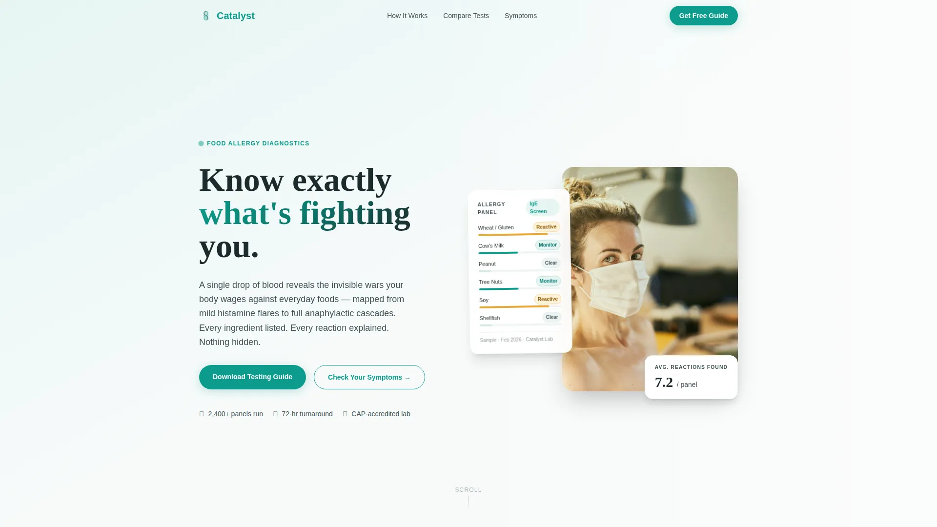
- A hero section with a portrait-centered header and a translucent allergy panel overlay
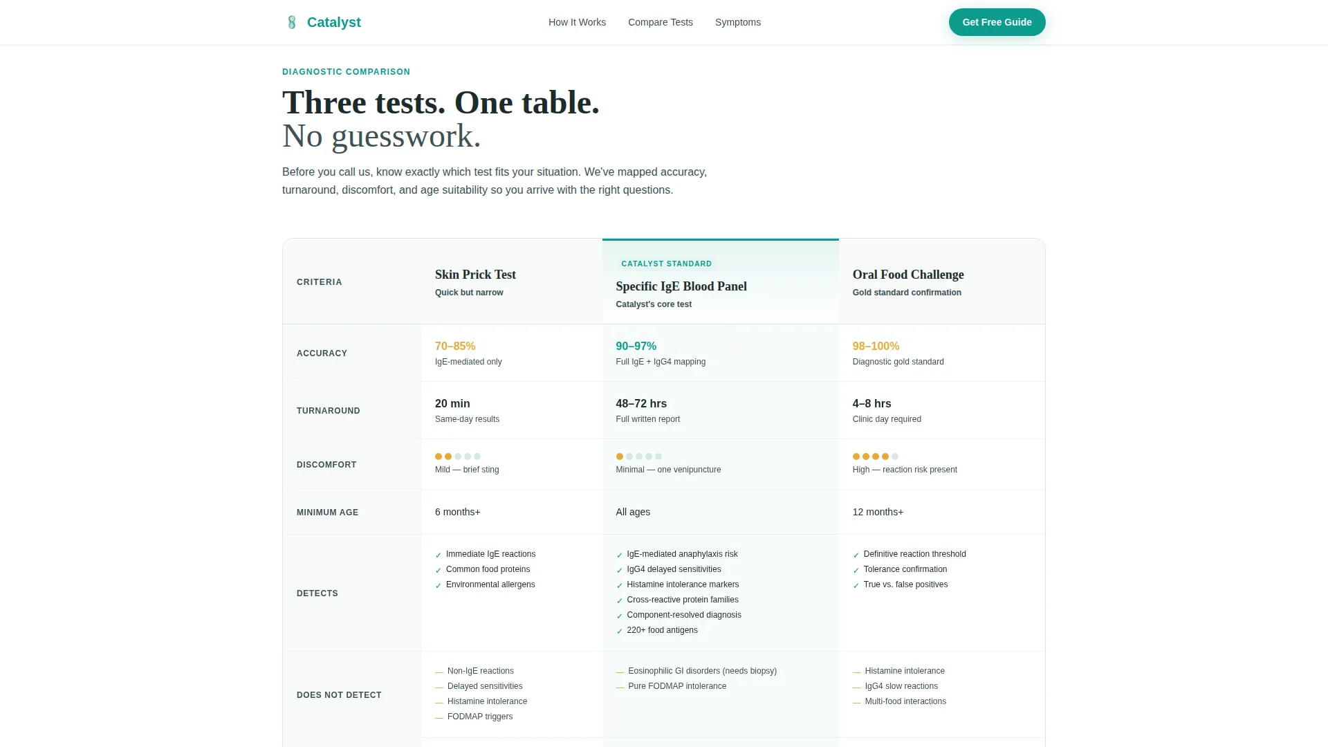
- A side-by-side comparison table covering skin prick test, blood panel, and oral food challenge
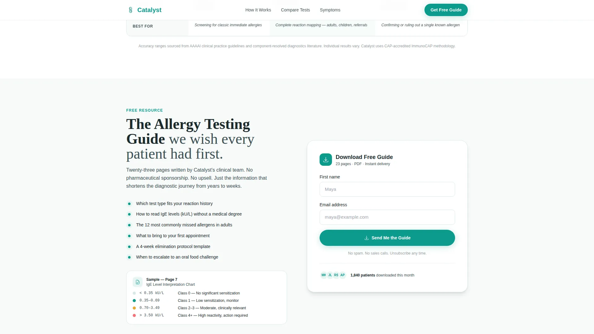
- A gated lead capture form for the downloadable Allergy Testing Guide, plus a secondary symptom checker call to action
Feature list
This template is built around five purposeful components that serve both educational and conversion goals.
Side-by-Side Testing Comparison Table
The comparison table places three testing methods next to each other across four columns: accuracy, turnaround time, discomfort level, and age suitability. Visitors can identify the right test for their situation before they ever make contact. The table supports a toggle interaction so users can filter or focus on specific columns.
Portrait-Centered Hero with Allergy Panel Overlay
The hero features a single patient portrait shot from the collarbone up against a teal-to-white gradient. A translucent allergy panel showing IgE levels, food categories, and color-coded markers drifts beside the portrait. The headline "Know exactly what's fighting you" fades in below with a scroll reveal animation.
Gated Lead Capture Form
Positioned directly after the comparison table, the lead capture form requests a first name and email address in exchange for the downloadable Allergy Testing Guide. Placement is intentional: the form appears at peak curiosity, after the visitor has already received genuine clinical value from the comparison section.
Step-by-Step Testing Process Walkthrough
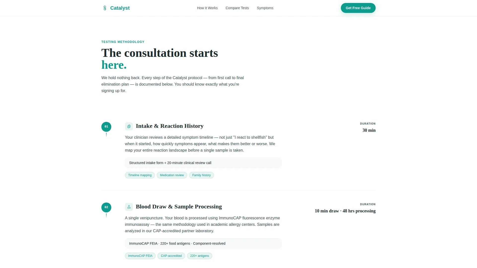
A dedicated process section walks through each stage of the clinic's methodology: intake, sample processing, result delivery, and follow-up elimination planning. Each step is presented as a discrete, readable block so visitors understand exactly what to expect before booking.
Symptom Checker Call to Action
A secondary conversion path links to an interactive questionnaire that scores reaction severity and recommends a specific test type. This gives visitors who are not yet ready to download the guide a lower-commitment way to engage with the clinic's expertise.
Page sections overview
| Section | Purpose |
|---|---|
| Hero Portrait Header | Introduce clinic identity and headline |
| Testing Comparison Table | Compare three allergy test methods |
| Lead Capture Form | Gate the Allergy Testing Guide download |
| Testing Process Walkthrough | Explain step-by-step clinic methodology |
| Symptom Checker Call to Action | Offer interactive severity scoring path |
| Social Proof Block | Build trust with patient outcomes and stats |
| Footer Linear Row | Provide navigation and contact links |
Design & branding system
The template uses a Medical Clarity visual theme. Every color in the palette serves a diagnostic function rather than a decorative one, making the page feel like a freshly unwrapped test kit.
- Clinical teal (#0D9B8C) is the primary action color used for buttons, links, and key indicators
- Sterile white (#F7FAFA) covers open backgrounds to keep the layout clean and readable
- Deep charcoal (#1C2B2D) is used for all body text, and warning amber (#E8A838) marks allergen flags and urgency cues
- Display headings use Fraunces for authority and warmth; body copy uses DM Sans for clinical clarity
Mobile & speed optimization
The template is built desktop-first with strong mobile adaptation so it reads clearly on any screen size. Scroll reveal animations and parallax effects are set to medium intensity, keeping the experience engaging without slowing down the initial load.
- Static sections use server-side rendering to ensure fast first-paint performance
- Comparison table columns reflow cleanly on smaller screens so no data is hidden on mobile
- Animations include table fade-ins and a parallax portrait effect, both optimized to avoid layout shifts
How this template helps you convert
The page is structured to earn trust before it asks for anything, which makes both conversion paths more effective.
- The comparison table gives visitors genuine clinical value upfront, so by the time they reach the lead capture form they already trust the clinic's expertise and are motivated to download the guide.
- The symptom checker call to action provides a second, lower-commitment entry point for visitors who are still in research mode, keeping them engaged with the clinic rather than bouncing to a competitor.
Other information about this template
This template is part of the Catalyst design system and uses the Teal Catalyst color system throughout. It is suited for clinics in the allergy and immunology space that want a content and resource hub format rather than a traditional appointment-booking page.
- Template style is Comparison Table, making it suitable for practices that need to differentiate multiple service offerings side by side
- The creative direction is Transparent Process, meaning each scroll section peels back another layer of the clinic's methodology
- The landing page direction is Content and Resource hub, prioritizing education and lead capture over direct appointment scheduling
- Localization is set for English, United States dollar pricing, and United States date format
Theme
Medical Clarity
Creative direction
Transparent Process
Color system
Teal Catalyst
Style
Comparison Table
Direction
Content/Resource
Page Sections
Side-by-side Testing Comparison Table
Portrait-centered Hero Section
Gated Allergy Testing Guide Form
Step-by-step Process Walkthrough
Symptom Checker Call to Action
Social Proof and Clinic Stats Block
Related questions
Who is this landing page template designed for?
What testing methods does the comparison table cover?
How does the lead capture section work?
Can the symptom checker be used as a standalone conversion path?
What typography and colors does this template use?



