Education Research Nonprofit Landing Page Template
Catalyst is a landing page template built for education research nonprofits. It uses a zigzag WHY/WHAT narrative to move visitors from documented classroom crisis to peer-reviewed solution. The design channels a scholarly, after-hours library feeling through serif type, deep teal, and gold accents. Two conversion paths capture both ready-to-download researchers and casual subscribers.
by Rocket studio
Quick summary
Catalyst is a single-page template for education research nonprofits. It pairs a manifesto-style hero with a scroll-driven zigzag layout that alternates human-problem statistics with specific study responses. Visitors can download research papers through a gated modal or subscribe to a monthly digest. The palette and typography evoke a trusted, well-worn academic text.
Who this template is for
This template is built for organizations that produce or distribute peer-reviewed classroom research and need to reach multiple audiences in one place. It works especially well for nonprofits whose credibility lives in published data, not brand recognition.
- Education research nonprofits publishing peer-reviewed studies for classroom practitioners
- Organizations targeting district superintendents, graduate students, and working teachers simultaneously
- Nonprofit teams that want to grow a research-download list and a newsletter subscriber base at once
What problem this template solves
Most education nonprofits present research the way academic journals do: behind density, jargon, and institutional walls. Visitors who arrive with genuine urgency, a first-year teacher at 11 p.m. or a superintendent building a budget case, leave without the evidence they came for. This template solves the gap between research production and research delivery.
- Credibility is hard to establish quickly; the template leads with outcome data and pull quotes before asking for contact information
- Multiple audiences have different motivations; the zigzag structure speaks to both the emotional and the rational visitor in the same scroll
- Conversion usually fails when the value is withheld; the template gives enough away that downloading feels like continuing, not surrendering
What you get with this template
You get a fully structured landing page with distinct, purpose-built sections that guide visitors from awareness to action. Every section has a clear job, and the layout is designed to build trust progressively rather than front-loading a pitch.
- A manifesto hero with a teal rule, large serif type, and a pulsing gold scroll arrow
- A scroll-linked word-reveal mission statement section and two zigzag WHY/WHAT research pairs
- A key findings showcase, a dual-path access section with a download modal and newsletter form, and a linear single-row footer
Feature list
Catalyst includes purpose-built components drawn directly from the project brief. Each one serves the page's core goal: turning a skeptical visitor into a confident research downloader.
Manifesto Hero with Scroll Trigger
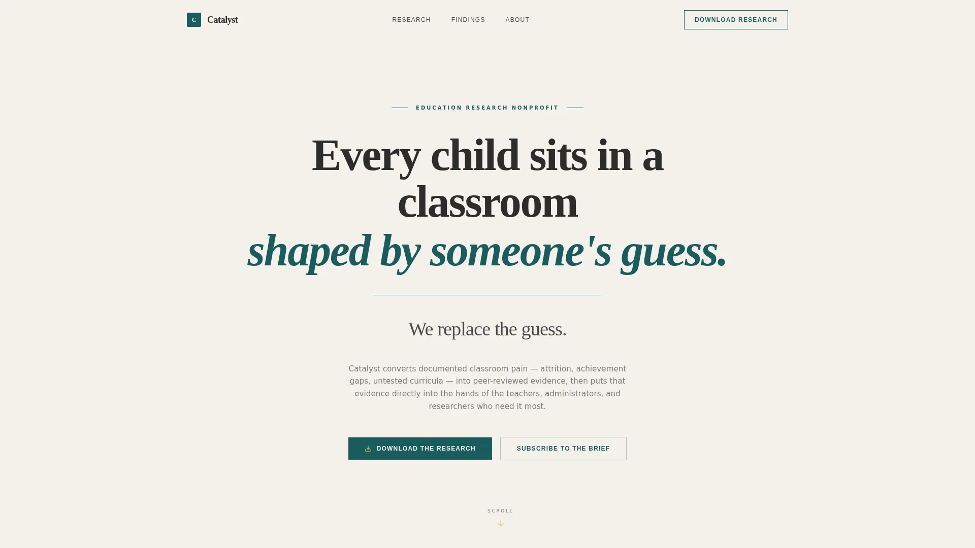
The hero fills the full viewport with large, unhurried serif type set against chalk dust white. A thin teal rule sits beneath the headline. A single gold arrow pulses downward, inviting the scroll. No image, no animation beyond that heartbeat cue.
Scroll-Linked Word Reveal
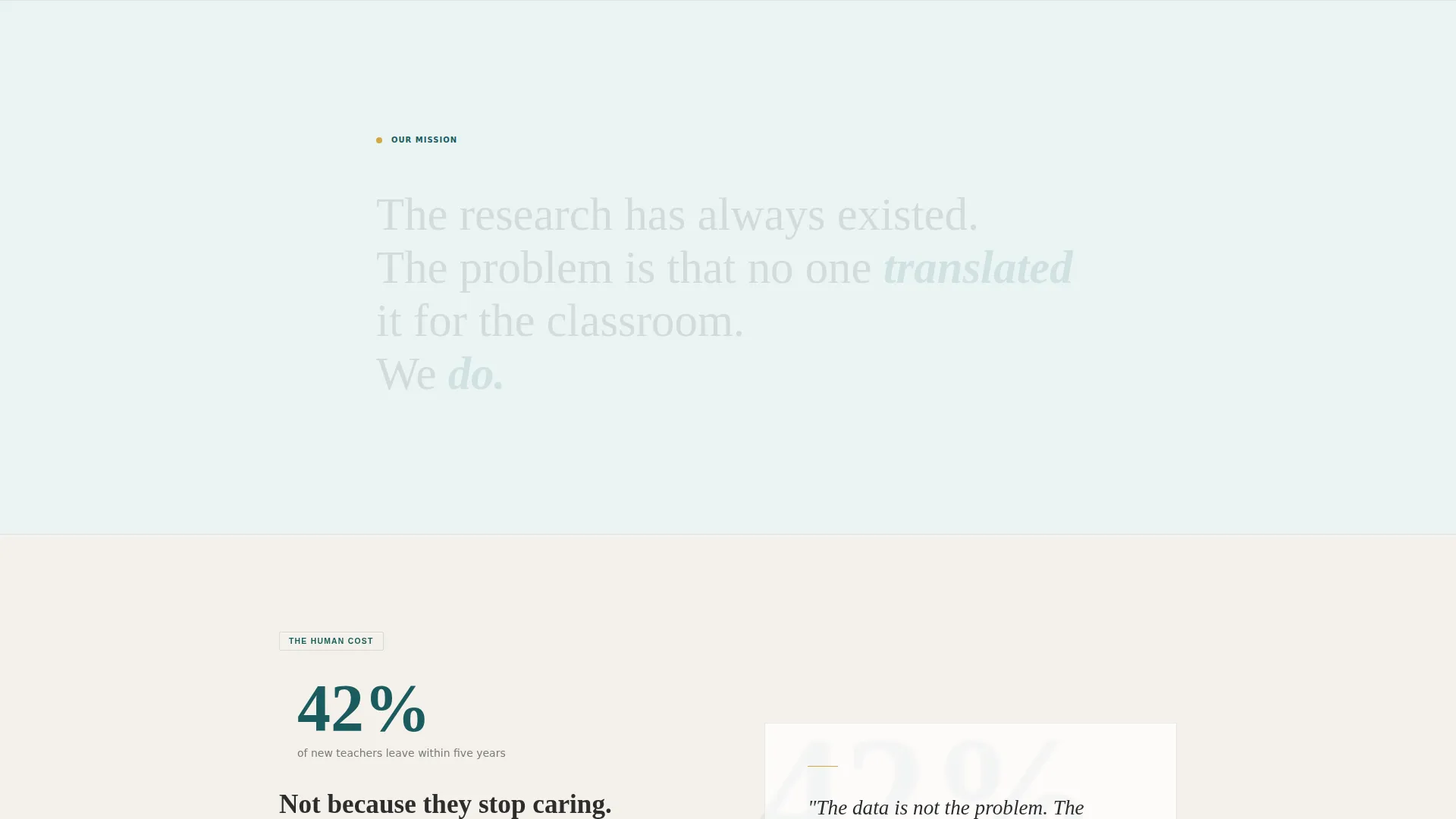
As the visitor scrolls into the mission statement section, words appear one by one in sequence. The effect reinforces the weight of the language and keeps the visitor reading rather than skimming past the core purpose.
Zigzag WHY/WHAT Research Pairs
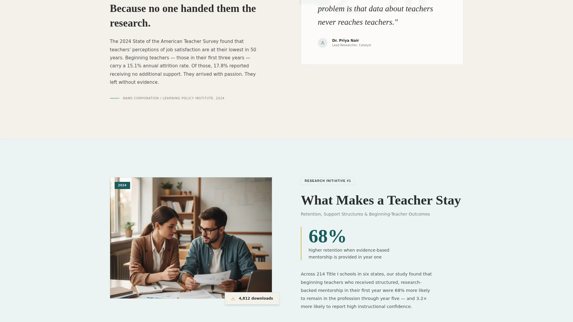
Two alternating pairs present a crisis statistic on one side and a specific research initiative on the other. Each pair includes a published paper thumbnail and a download count. The rhythm builds from broad problem to granular, documented solution.
Key Findings Showcase
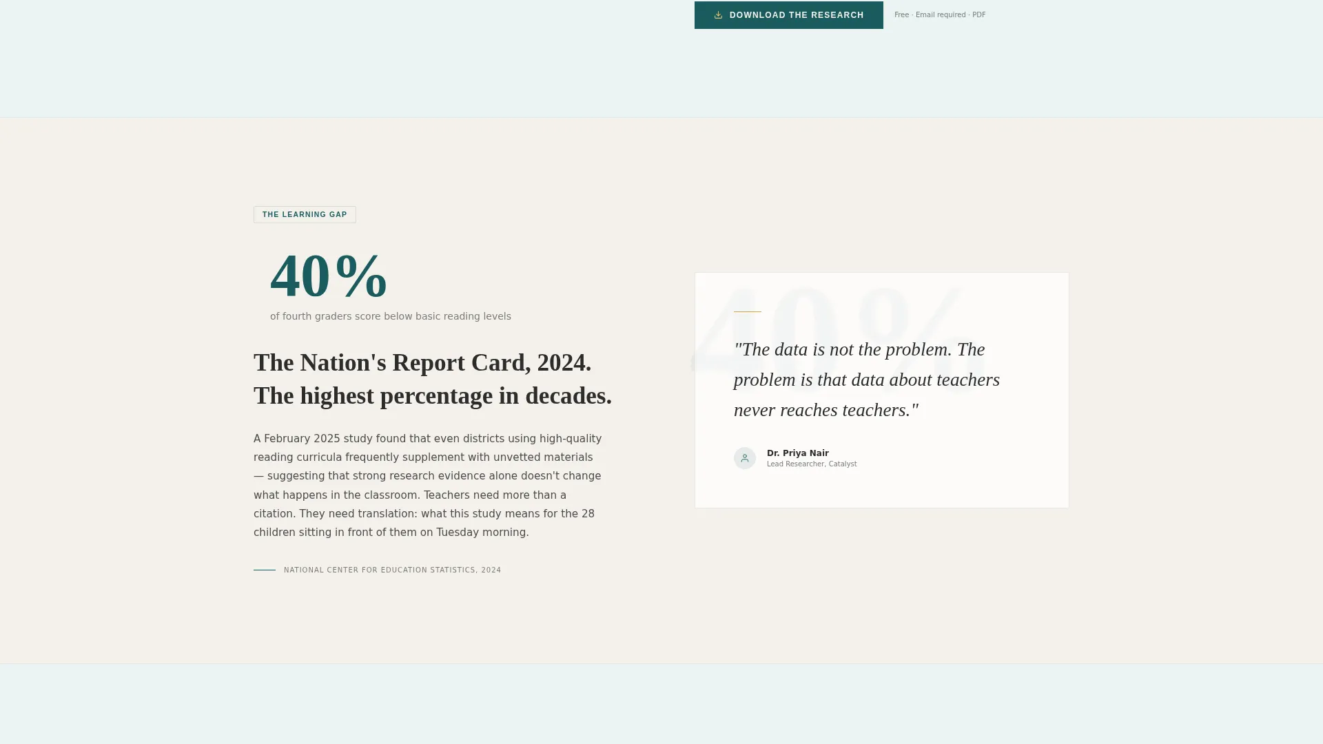
Pull quotes from peer-reviewed studies appear alongside large-type outcome percentages. Visitors receive substantive insight before any gate. This section earns the download click by showing the research at work first.
Dual-Path Access Section
The primary call to action, "Download the Research," opens a modal requiring only an email address and a role selector with four options: teacher, administrator, researcher, or policymaker. A secondary "Subscribe to the Brief" path captures visitors who are not yet ready to browse the full library.
Staggered Micro-Interactions
Hover states activate on links and download icons in gold. Staggered fade-ins accompany zigzag content as it enters the viewport. Accordion hover states add tactile feedback to interactive elements throughout the page.
Page sections overview
| Section | Purpose |
|---|---|
| Manifesto Hero | Establishes mission with serif type and a teal rule |
| Word Reveal | Animates the mission statement on scroll |
| Research Zigzag Pair 1 | Pairs a teacher-retention crisis stat with a study response |
| Research Zigzag Pair 2 | Pairs a second documented problem with a research initiative |
| Key Findings Showcase | Displays pull quotes and large outcome percentages |
| Access Call to Action | Hosts the download modal and newsletter subscription form |
| Single-Row Footer | Provides navigation and organizational links |
Design & branding system
The visual identity follows a Healing Space theme built around the Teal Catalyst color system. The overall feeling is a well-loved hardcover textbook: teal cloth spine, cream pages warmed with age, and gold foil on chapter titles. Typography pairs Fraunces, a variable serif display face, with DM Sans for body copy.
- Colors: deep classroom chalkboard teal (#1A5C5E) for primary elements, chalk dust white (#F4F1EB) and faint teal wash (#EAF4F4) for alternating backgrounds, warm lamplight gold (#D4A843) reserved for interactive moments only, and grounding graphite (#2C2C2C) for body text
- Typography: Fraunces handles all display headings and pull quotes; DM Sans carries body paragraphs, labels, and form fields for clean, readable contrast
- Gold appears exclusively on hover states, download icons, and progress indicators, functioning like a highlighter dragged across the one sentence that matters
Mobile & speed optimization
The page is designed desktop-first, reflecting the primary audiences of superintendents and researchers who work on larger screens. Strong mobile support is built in for the late-night teacher scrolling on a phone, with layout and type scaling that keeps the reading experience intact at any screen size.
- Scroll-linked animations and staggered fade-ins are handled client-side; static sections use server components to keep initial load light
- The download modal is touch-friendly, with a simple two-field form (email and role selector) that works cleanly on small screens
- Typography scales and line lengths adjust so the serif display headings remain legible and unhurried on mobile viewports
How this template helps you convert
Catalyst is built around a content-first conversion philosophy. The page gives away substantive research value before asking for anything in return. That sequence builds the trust needed to make contact-information exchange feel worthwhile.
- The zigzag structure and key findings showcase deliver real insight upfront, so visitors arrive at the download call to action already convinced the research is worth having
- Two distinct conversion paths, the download modal and the newsletter subscription, capture visitors at different levels of readiness without forcing a single decision
Other information about this template
This template is tailored for the education research nonprofit niche within the broader Community and Nonprofit category. It sits at the intersection of Education and Literacy Nonprofit work and content-resource distribution strategy. A few additional details worth noting:
- The creative direction is Vision and Mission: the scroll narrative moves from documented urgency to specific response, tightening the case with every section
- The header concept is a Quote/Manifesto, meaning the hero leads with language and breathing room rather than imagery or video
- The landing page direction is Content/Resource distribution, optimized for gated PDF downloads and digest subscriptions rather than service inquiries or donations
- The theme is Healing Space, which informs the calm, library-after-hours atmosphere of the color palette and typographic choices
- The template style is Zigzag/Alternating, a layout approach well suited to organizations that need to address both emotional and rational visitors in a single scroll
- Role segmentation at the download gate (teacher, administrator, researcher, policymaker) allows the organization to understand its audience without adding friction
Theme
Healing Space
Creative direction
Vision & Mission
Color system
Teal Catalyst
Style
Zigzag/Alternating
Direction
Content/Resource
Page Sections
Manifesto Hero with Teal Rule
Scroll-linked Word Reveal
Zigzag Why/what Research Layout
Key Findings Showcase
Dual-path Access Section
Gold Micro-interaction System
Related questions
Who is this landing page template designed for?
How does the research download gate work?
Does the template support multiple audience types at once?
What animation and interactivity is included?
Can I use this template without a design background?