PCOS Telehealth Landing Page Template
Catalyst is a single-page PCOS telehealth landing page template built for virtual clinics serving women who want specialist-level care. It uses FAQ-driven comparison tables, a warm split-screen header, and a repeating call-to-action flow to convert research-literate visitors into booked intake calls. The design blends clinical credibility with a soft, welcoming visual identity.
by Rocket studio
Quick summary
Catalyst is a polycystic ovary syndrome (PCOS) telehealth landing page template. It answers the clinical questions women are already asking, then proves expertise through interactive comparison tables before asking for a calendar slot. The warm teal-and-blush design feels trustworthy and human, not sterile.
Who this template is for
This template is built for virtual women's health clinics that specialize in PCOS care. It suits practices offering endocrinology, registered dietitian services, and mental health support in one coordinated model.
- PCOS-focused telehealth providers targeting women frustrated with generic general practitioner care
- Virtual specialty clinics that want to lead with clinical evidence before asking for a booking
- Healthcare marketers building a direct-to-consumer scheduling flow for a specialist women's health service
What problem this template solves
Women with PCOS often arrive at a provider's page already exhausted from years of dismissal and self-research. A generic clinic page that leads with pricing or a contact form loses them immediately. This template earns trust first by meeting visitors inside the questions they are already asking.
- It replaces vague "we care about you" copy with specific clinical FAQ sections and side-by-side comparison tables
- It removes friction by placing the primary call-to-action after each answered question, not just at the top
- It gives research-literate visitors a reason to stay by showing the difference between standard care and a specialist-led PCOS intake model
What you get with this template
The template delivers a fully structured single-page layout ready to adapt to a real PCOS telehealth brand. Every section has a defined purpose, and the visual hierarchy guides visitors from curiosity to booking with minimal friction.
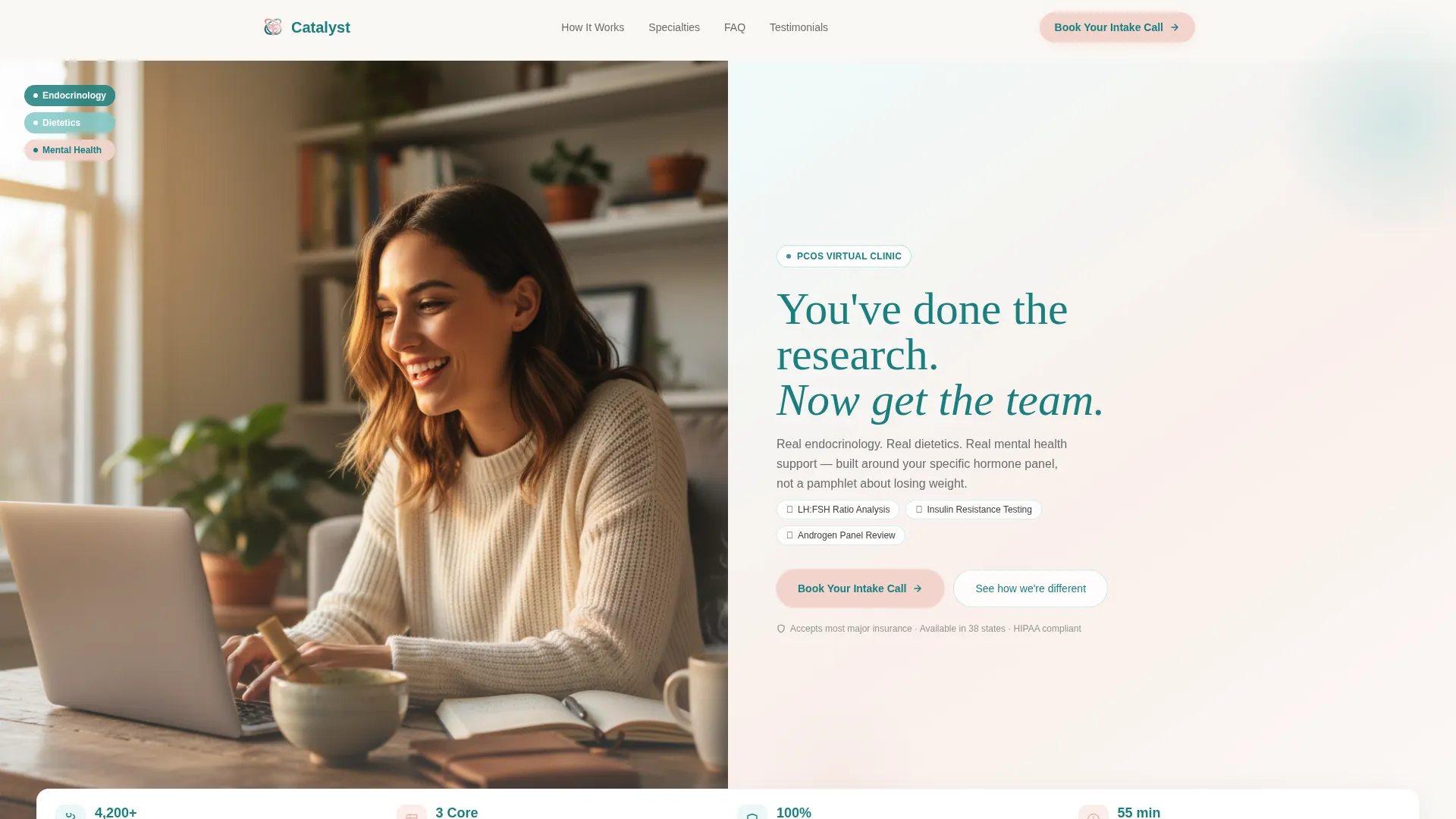
- A cinematic half-page hero with a headline, three-specialty stack, and floating social proof stats
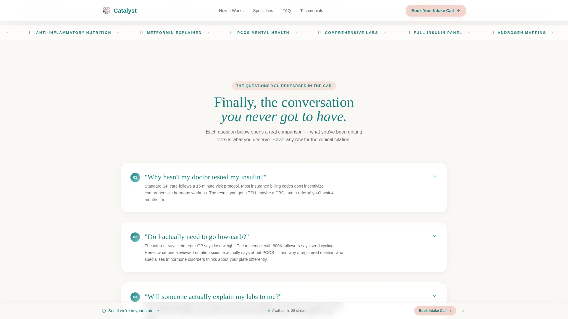
- Three FAQ-driven sections, each paired with an interactive comparison table and a blush call-to-action block
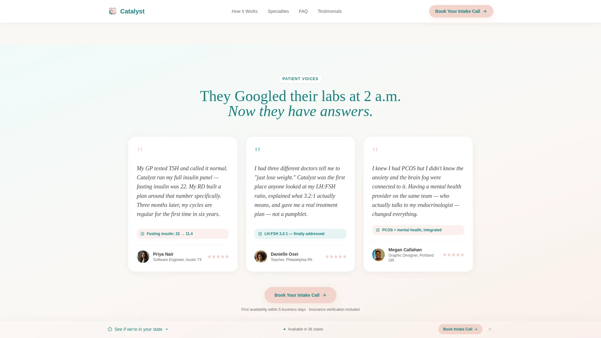
- A testimonials section, a sticky secondary navigation bar, and a linear single-row footer
Feature list
This template includes the following built-in capabilities based on the source brief.
FAQ-Driven Comparison Tables
Each of the three FAQ sections opens with a real clinical question and resolves into a structured comparison table. Tables compare general practitioner visits against the specialist intake model across dimensions like tests ordered, session time, and follow-up cadence. Hover tooltips on individual table rows reveal clinical citation callouts, giving the content a layer of evidence without cluttering the layout.
Half-Page Hero with Split Layout
The header divides into two halves. The left side holds a warm-toned lifestyle photograph of a woman mid-laugh during a video consultation, styled with personal details like a journal and a half-drunk matcha. The right side carries the headline in deep teal over a blush-to-seafoam gradient, with a quiet three-line specialty stack beneath it.
Repeating Click-Through Call-to-Action
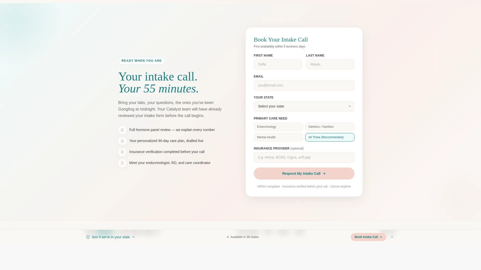
The primary call-to-action button, labeled "Book Your Intake Call," appears first below the hero comparison table and repeats after every FAQ section. Each button is styled in blush with deep teal text and routes visitors to a dedicated booking page that includes an insurance verification step and a state selector.
Sticky Secondary Navigation Bar
A persistent bottom bar labeled "See If We're In Your State" floats across the screen for visitors who are not yet ready to commit to a booking. It provides a low-friction secondary path without interrupting the primary scroll experience.
Scroll-Reveal and Spotlight Animations
Table rows animate with a spotlight hover effect that draws attention to each comparison point as the visitor interacts. Sections reveal on scroll using medium-intensity animations, keeping the page dynamic without feeling overwhelming on a mobile screen.
Testimonials Section with Clinical Detail
Three testimonials appear with specific language tied to lab results and real outcomes, not generic praise. This section reinforces the clinical credibility established by the comparison tables and gives social proof a concrete, believable quality.
Page sections overview
| Section | Purpose |
|---|---|
| Hero split header | Establish emotional connection and introduce the three specialties |
| Floating stats bar | Reinforce credibility with patient and session metrics |
| FAQ section one | Answer "Why hasn't my doctor tested my insulin?" with a GP versus specialist table |
| FAQ section two | Answer "Do I actually need to go low-carb?" with a nutrition approach comparison |
| FAQ section three | Answer "Will someone actually explain my labs?" with a care model comparison |
| Testimonials block | Provide specific clinical-outcome social proof from three patients |
| Sticky bottom bar | Offer a secondary path for visitors checking state availability |
| Linear footer | Close with a single-row pattern linking essential pages |
Design & branding system
The Teal Catalyst color system grounds the page in clinical trust while the soft gradient palette keeps it warm and approachable. Typography pairs a serif headline font with a clean sans-serif body font to balance authority and readability.
- Deep teal (#1A7F7E) is used for headers, navigation, and call-to-action text; seafoam (#7EC8C8) washes section backgrounds in gentle gradient sweeps from cool to warm
- Warm blush (#F2D4CC) highlights callout cards, comparison table rows, and call-to-action buttons; soft charcoal (#3D3D3D) carries all body text
- Fraunces serif is used for headlines to evoke warmth and authority; DM Sans handles body copy for clean on-screen legibility
Mobile & speed optimization
The template is designed with a mobile-first approach, recognizing that the target audience often searches for PCOS answers late at night on a phone. Layout choices, animation intensity, and interactive components are all scoped with small-screen usability in mind.
- Comparison tables are structured to reflow cleanly on narrow viewports without losing their column logic
- Scroll-reveal animations use medium intensity, keeping them visible on mobile without causing layout shift or sluggish rendering
- Static sections use server components while interactive elements such as tooltips, accordion FAQs, and the sticky bar use client-side rendering for a balanced performance approach
How this template helps you convert
The page is architected around a trust-first conversion model. Visitors arrive skeptical and research-literate. The template earns the click by answering clinical questions with evidence before it ever asks for a calendar slot.
- Each FAQ section resolves a real objection with a specific comparison table, moving visitors from doubt to informed confidence before the call-to-action appears
- The repeating "Book Your Intake Call" button after each answered question creates multiple low-pressure moments to convert rather than relying on a single hero click
- The sticky bottom bar captures visitors who are still deciding, offering a secondary action that keeps them engaged with the brand without requiring immediate commitment
Other information about this template
This template is built specifically for the United States market. Pricing, booking flows, and geographic references are scoped to USD and English-language audiences. The dedicated booking page linked from the call-to-action includes an insurance verification step and a state selector, supporting the localized service model described in the brief.
- The template style is a Comparison Table layout, making it particularly well suited for services that need to differentiate from generic alternatives
- The creative direction is FAQ-Driven, meaning every scroll section is structured around a question the visitor is already asking rather than a feature the provider wants to promote
- The landing page direction is Click-Through, routing all primary conversions to a separate scheduling flow rather than handling bookings inline
Theme
Soft Gradient
Creative direction
FAQ-Driven
Color system
Teal Catalyst
Style
Comparison Table
Direction
Click-Through
Page Sections
Faq-driven Comparison Tables
Half-page Split Hero
Repeating Click-through Call to Action
Sticky Secondary Navigation Bar
Scroll-reveal and Spotlight Animations
Clinical Testimonials Section
Related questions
What kind of clinic is this template designed for?
Can I customize the FAQ questions and comparison tables?
Does the template include a booking page?
Who is the primary audience for this landing page?
Is this template suitable for mobile users?



