Rheumatologist Advanced Booking Website Template
Catalyst is a comparison table landing page built for rheumatologist provider directories. It gives autoimmune patients a sortable, expandable provider list showing insurance panels, subspecialties, next available dates, ratings, and distance. Everything is visible before any login. The inline booking widget and guided symptom quiz turn an overwhelming referral into a confirmed first appointment.
by Rocket studio
Quick summary
Catalyst is a single-page rheumatologist directory template built around radical transparency. Patients see every data point they need before they fill in a single field. A sortable comparison table, expandable provider rows, an inline booking widget, and a symptom-narrowing quiz work together to move a frightened referral-holder toward a confirmed appointment with confidence.
Who this template is for
This template is built for healthcare directory operators and patient-matching platforms that connect autoimmune patients with board-certified rheumatologists. It is the right fit if your service already maintains real provider data and you need a front-end that presents it honestly and efficiently.
- Directory operators matching patients to rheumatologists who accept specific insurance plans
- Patient advocacy platforms serving people newly diagnosed with lupus, rheumatoid arthritis, or vasculitis
- Healthcare startups converting referral-stage patients into booked specialist appointments
What problem this template solves
A patient holding a referral slip and facing a list of fifty provider names has no reliable way to know who accepts her insurance, who has an opening this month, or who specializes in her condition. Generic directory pages bury this information behind logins or make patients call each office individually. Catalyst puts every critical data point on the screen the moment the page loads.
- Patients cannot quickly filter providers by insurance panel, subspecialty, or current availability
- Referral-stage patients lack context about credentials, wait times, and real patient experiences
- Generic booking flows ask for personal information before showing any useful provider detail
What you get with this template
You get a fully structured, interaction-rich landing page that guides a visitor from arrival to booked appointment without friction. Every section has a specific job, and no section asks for commitment before delivering value first.
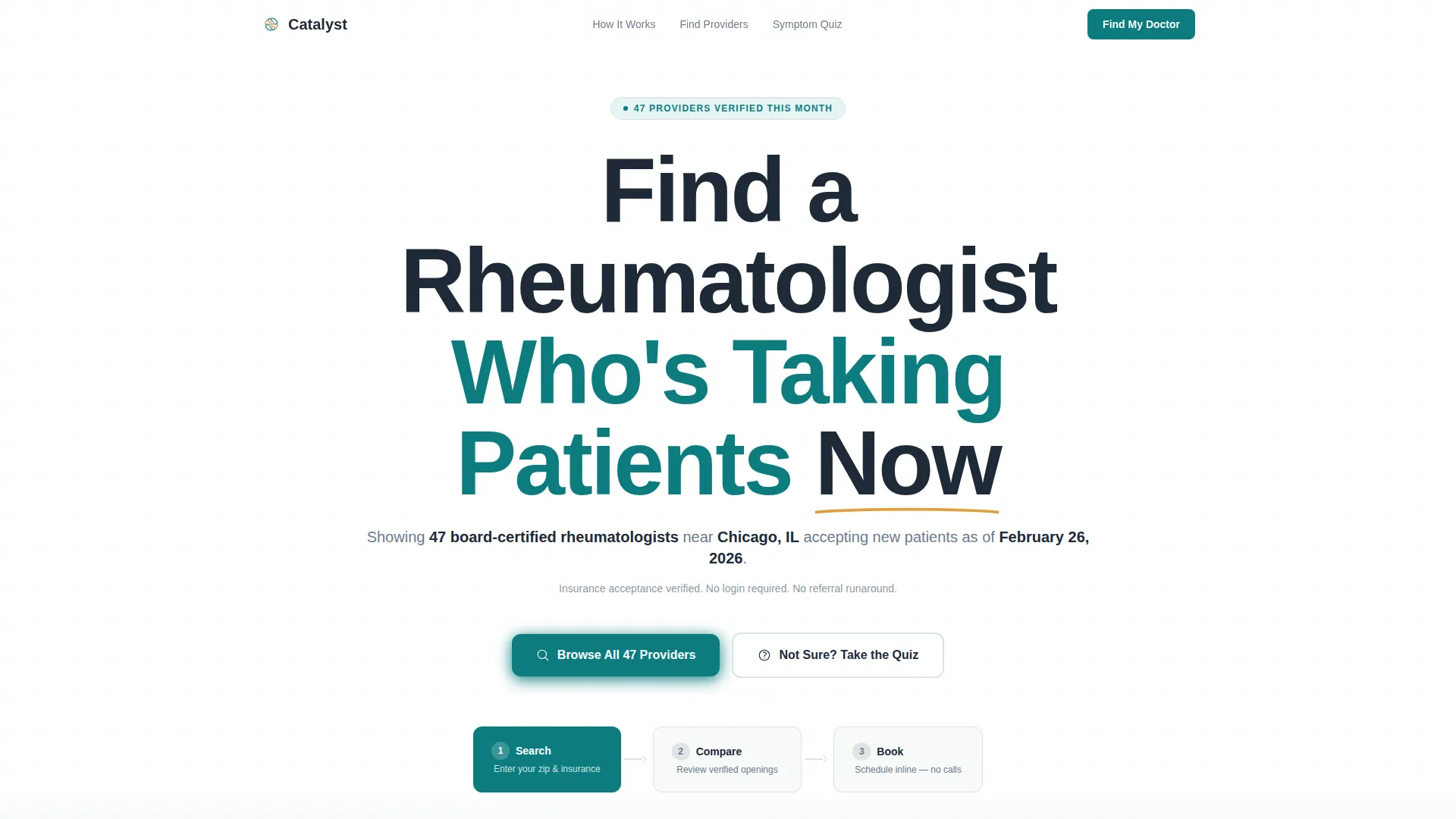
- A giant centered hero headline with live specificity data including detected city, provider count, and today's date
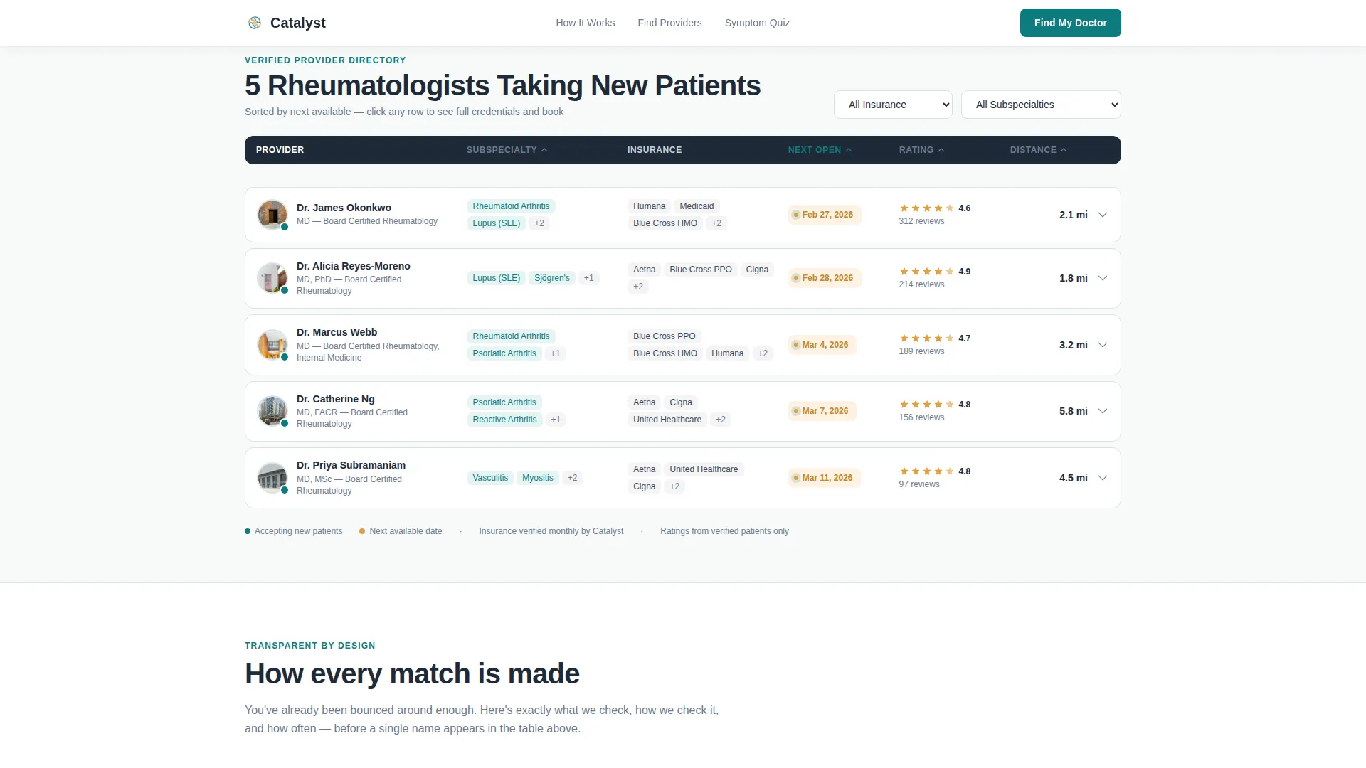
- A sortable and expandable comparison table showing subspecialty, insurance, next opening, rating, and distance
- An inline scheduling widget and a guided three-question symptom quiz as dual conversion paths
Feature list
A focused summary of the template's core capabilities, each grounded in what the brief describes.
Sortable Provider Comparison Table
The main table lists providers with six sortable columns: name, subspecialty, insurance panels accepted, next available appointment date, patient rating, and distance from the visitor's zip code. Each column header is clickable to re-sort the list instantly.
Expandable Provider Row Detail
Clicking any table row expands it to reveal a deeper profile. This includes credentials, hospital affiliations, average wait time, and three anonymized patient quotes. No login is required to read any of this information.
Inline Appointment Booking Widget
Each expanded provider row includes a "Book First Visit" call-to-action button styled in warm amber. Clicking it opens an inline scheduling widget that collects insurance carrier, preferred date range, and whether the visit is for a new or existing diagnosis.
Guided Symptom Quiz Path
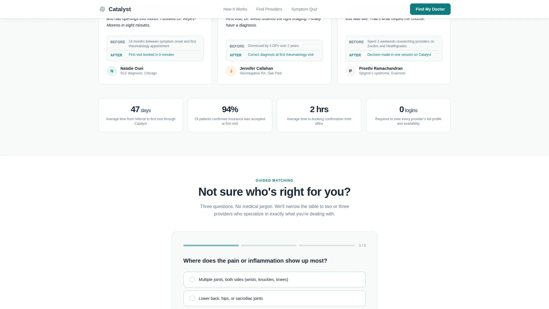
A secondary conversion path at the bottom of the page invites visitors who are still undecided. A three-question quiz narrows the full provider table down to two or three recommended matches based on symptom and condition input.
Three-Step Process Rail
Just below the hero headline, a horizontal rail shows the three-step journey: Search, Compare, and Book. The first step is shown as active and highlighted in teal on page load, giving visitors an immediate sense of where they are in the process.
Transparent Matching Methodology Section
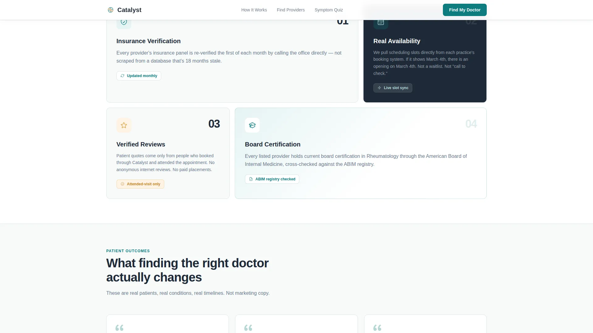
A dedicated section explains how the directory match works, covering insurance verification and availability syncing. This section builds trust by showing the logic behind the results rather than treating it as a black box.
Page sections overview
| Section | Purpose |
|---|---|
| Hero Headline | Anchor attention with specificity: city, provider count, date |
| Process Step Rail | Orient the visitor with a Search, Compare, Book sequence |
| Comparison Table | Let patients sort and scan providers by key decision criteria |
| Expandable Row Detail | Reveal credentials, affiliations, wait times, and patient quotes |
| Inline Booking Widget | Capture appointment intent without leaving the page |
| How Matching Works | Explain insurance verification and availability sync clearly |
| Patient Social Proof | Build trust with condition-specific, wait-time-contextualized quotes |
| Guided Quiz Entry | Help undecided visitors narrow down to two or three providers |
| Page Footer | Horizontal flow footer with supporting links and information |
Design & branding system
The visual identity follows a Corporate Precision theme. The palette balances clinical clarity with human warmth, so the page feels organized and trustworthy without feeling cold or intimidating.
- Primary action color is clinical teal (#0D7C7F) used for interactive elements, active states, and key highlights; body text and table headers use deep charcoal (#1E2A38); backgrounds use soft antiseptic white (#F7FAFA)
- Warm catalyst amber (#E09F3E) is reserved exclusively for availability badges, star ratings, and the booking button, creating an unmistakable visual signal for actionable moments
- Typography uses Manrope, a clean sans-serif, with heavy weights for the hero headline and medium weights for body text to keep the page readable and scannable at every level
Mobile & speed optimization
The template is designed desktop-first to support its table-heavy layout, with full mobile responsiveness built in so the experience holds up on any screen size. Interactive components use a split rendering approach to keep static content fast while client-side components handle table interactivity.
- The comparison table adapts to smaller screens so patients on mobile can still sort, expand, and book without losing key data columns
- FadeUp reveal animations and expand/collapse row transitions are set at a medium intensity, keeping the page lively without slowing down the browsing experience
- The quiz modal and inline booking widget are optimized for touch input so the full conversion flow works on a phone held in one hand
How this template helps you convert
Catalyst earns the click by showing everything before asking for anything. The conversion architecture is built on trust, not pressure.
- The hero section establishes credibility in the first three seconds by displaying real specificity data such as provider count, city, and date, so the visitor knows immediately that the directory is current and relevant to them.
- The comparison table removes the fear of making a wrong choice by putting insurance compatibility, subspecialty, and next available date side by side, giving the visitor enough information to self-select before any form is presented.
- The dual conversion paths, a direct booking widget on each provider row and a symptom quiz for undecided visitors, mean no visitor leaves without a next step that matches their readiness level.
Other information about this template
Catalyst is part of a broader template family designed for Health and Medical use cases. It is built within the Teal Catalyst color system and follows the Corporate Precision theme and Transparent Process creative direction. A few additional details worth knowing:
- The template style is a Comparison Table layout, making it well suited for any rheumatologist provider directory or specialist-matching platform that needs to present multiple options side by side
- The header concept is Giant Headline Centered, a deliberate choice that communicates confidence and specificity without relying on photography or illustration
- The landing page direction is Booking and Scheduling, meaning every design and copy decision points toward a confirmed appointment as the single most important outcome
- The footer uses a horizontal flow pattern that keeps the page clean and avoids heavy navigation that would distract from the booking goal
- Patient social proof is designed to include condition context and wait-time information rather than generic star reviews, making testimonials more credible to a medically informed audience
Theme
Corporate Precision
Creative direction
Transparent Process
Color system
Teal Catalyst
Style
Comparison Table
Direction
Booking/Scheduling
Page Sections
Sortable Provider Comparison Table
Expandable Provider Row Profiles
Inline Appointment Booking Widget
Guided Symptom Narrowing Quiz
Live Hero Specificity Data
Transparent Matching Methodology
Related questions
Does this template require a login to view provider details?
Can visitors sort the provider table by insurance or subspecialty?
What does the inline booking widget collect from the patient?
Who is the three-question symptom quiz designed for?
Is this template suitable for a rheumatologist directory that is just launching?



