Supply Chain & Procurement Professional Website Template
Categorize is a category management consulting landing page template built for precision-focused retail and supply chain professionals. It uses side-by-side comparison tables to show the gap between standard practice and expert methodology, a dark navy visual identity, and two targeted calls to action that convert high-intent visitors before they leave the page.
by Rocket studio
Quick summary
Categorize is a single-page landing page template for category management consultancies. It leads with a bold headline, floats live-style KPI chips, and walks visitors through four discipline-specific comparison tables. Each table quietly builds the case for a methodology consultation, ending in a primary call to action and a lightweight email capture for lower-intent visitors.
Who this template is for
This template is built for consultancies that work at the intersection of retail strategy and supplier portfolio management. If your work involves planogram restructuring, SKU-level analysis, or aisle rebuilds under a deadline, this page was designed around your pitch.
- Category management consultants presenting to VP-level category directors at grocery and mass-merchant retailers
- CPG brand managers defending shelf space in quarterly supplier reviews
- Procurement leads at regional chains who need to restructure an aisle quickly after losing a key supplier
What problem this template solves
Most consulting landing pages bury the methodology behind vague value propositions. Visitors with a real, urgent category problem need to see the difference between what they are currently doing and what a specialist can deliver. They need that gap to be undeniable before they click anything.
- Generic service pages fail to show the specific delta between a standard approach and a sharper one
- High-intent retail and CPG buyers do not respond to soft selling or abstract promises
- Consultancies lose credibility when their page does not match the precision they claim to deliver in the boardroom
What you get with this template
This template delivers a complete, single-page layout structured like a strategy presentation that builds conviction with every scroll. The design and content architecture work together to move a qualified visitor from skeptical to ready.
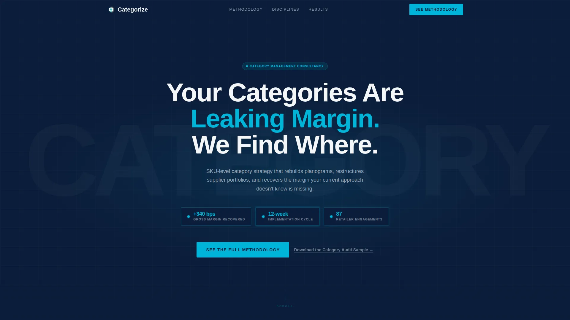
- A dark full-bleed navy header with a centered headline, a soft teal glow effect, and three floating KPI chips displaying gross margin impact, implementation timeline, and retailer engagement count
- Four discipline-specific comparison table sections covering Assortment Rationalization, Shelf Strategy, Supplier Negotiation Architecture, and Promotional Return on Investment Modeling
- A primary call to action anchored after the second comparison table, a sticky bottom bar call to action that activates after sixty percent scroll depth, and a secondary email-capture link for lighter-intent visitors
Feature list
This section describes the core functional and visual components built into the template.
Dark Full-Bleed Header with KPI Chips
The header opens on a deep navy field with a soft teal glow centered behind the headline. Three floating KPI chips display key proof points in a live-dashboard style. No photography or illustration is used. The authority comes entirely from restraint and precision.
Discipline Comparison Tables
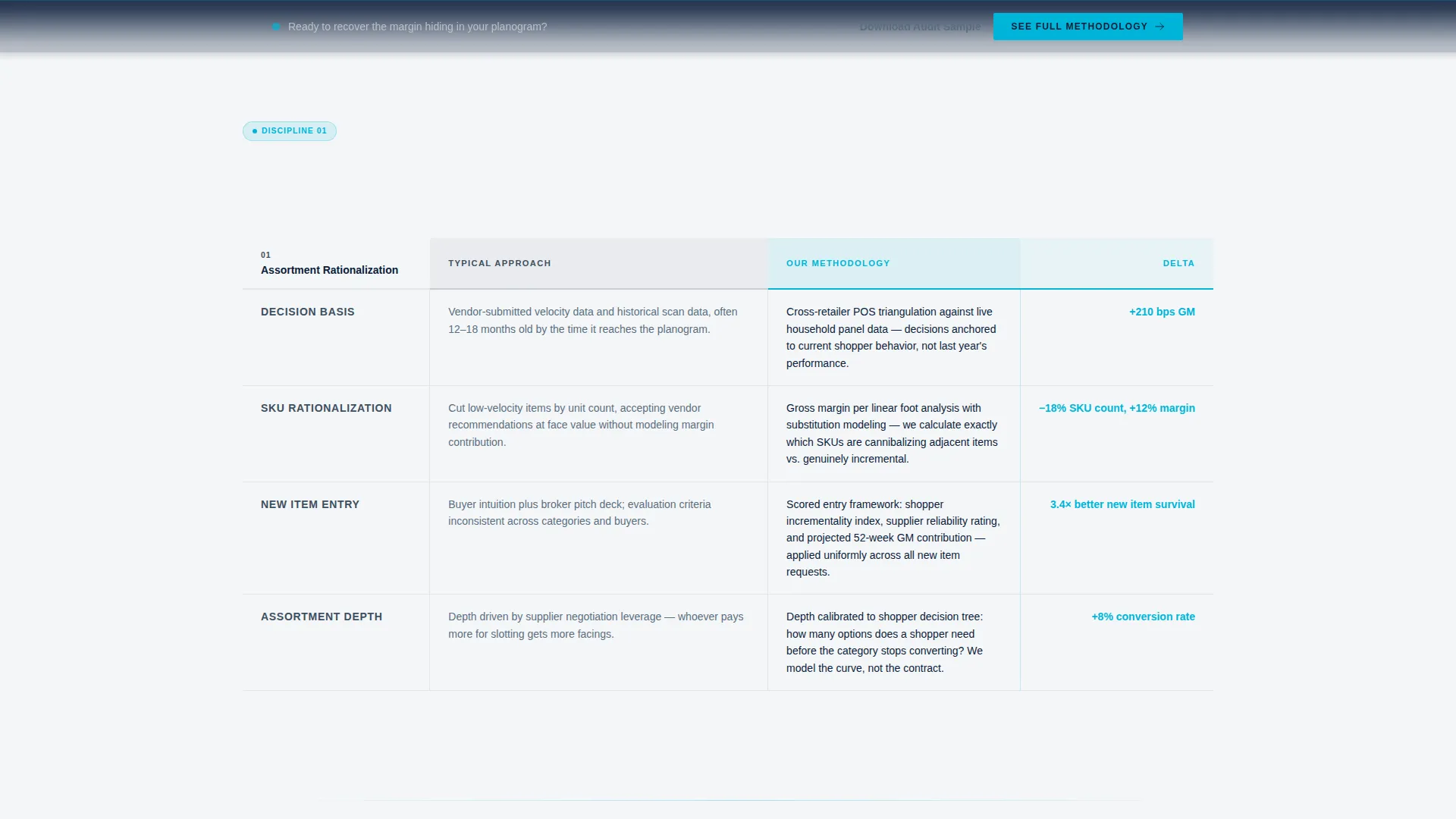
Four structured comparison tables each cover a distinct consulting discipline. Every table has a "Typical Approach" column and an "Our Methodology" column, with delta metrics highlighted in teal. The rows function as quiet proof points, making the methodology case before the call to action ever appears.
Attributed Consultant Quotes
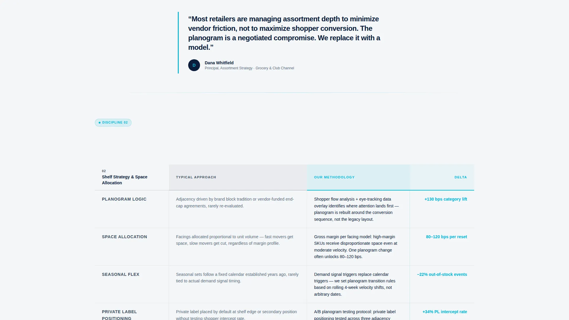
Between each comparison table, a brief attributed quote from a named senior consultant with title and specialty adds human credibility. This keeps the scroll feeling like a curated expert presentation rather than a sales funnel.
Anchored Primary call to action
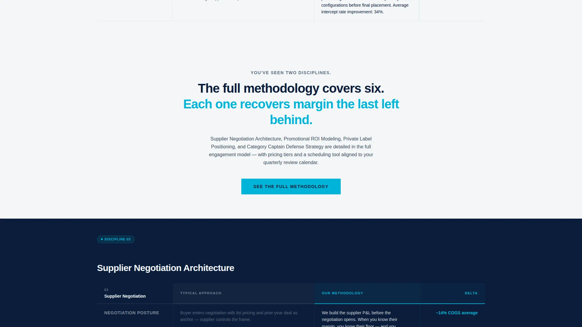
The primary call to action, labeled "See the Full Methodology," is placed after the second comparison table and repeats in a sticky bottom bar once scroll depth passes sixty percent. This placement earns the click rather than demanding it early.
Secondary Email Capture
A lightweight secondary text link, "Download the Category Audit Sample," is included for visitors who are not yet ready to book a consultation. It requires only a single email field, keeping the friction low and the lead pipeline active.
Corporate Precision Visual System
The full color palette, Navy Authority, is applied consistently across all sections. Boardroom navy dominates backgrounds, gunmetal carries body text, presentation-white opens space in data-heavy zones, and teal fires only on interactive states, table highlights, and calls to action.
Page sections overview
| Section | Purpose |
|---|---|
| Dark Navy Header | Establishes authority with headline, teal glow, and three KPI chips |
| Assortment Rationalization Table | Compares typical versus expert SKU-level approach with delta metrics |
| Consultant Quote Block | Adds human credibility between comparison sections |
| Shelf Strategy Table | Shows planogram and shelf-space methodology gap |
| Consultant Quote Block | Reinforces expertise with a second attributed senior perspective |
| Primary call to action Block | Anchors "See the Full Methodology" after the second table |
| Supplier Negotiation Table | Details negotiation architecture difference and margin outcomes |
| Consultant Quote Block | Continues the expert panel narrative with a third voice |
| Promotional ROI Table | Compares promotional modeling approaches and measurable lift |
| Secondary Email Capture | Captures lighter-intent visitors with a single-field audit download |
| Sticky Bottom Bar | Repeats primary call to action after sixty percent scroll depth |
Design & branding system
The template uses a Navy Authority color system that communicates boardroom-level confidence. Every color choice is intentional and restrained, giving the page the feel of a senior partner's desk rather than a marketing website.
- Navy (#0B1D3A) dominates section backgrounds and dividers; gunmetal (#3D4F5F) carries body text and secondary headers; presentation-white (#F4F6F8) creates breathing room in table-heavy areas
- Teal (#00B4D8) is reserved exclusively for interactive states, comparison table delta highlights, KPI chip accents, and call to action buttons, so it always signals action
- The overall aesthetic is Corporate Precision: no photography, no decorative illustration, pure structure and type
Mobile & speed optimization
The template is designed to remain readable and functional at smaller screen sizes, preserving the comparison table logic that drives conversions on any device.
- Comparison tables are structured to stack or scroll horizontally on narrow screens without losing the column contrast that makes them effective
- The sticky bottom bar call to action is positioned to remain accessible on mobile without obscuring primary content
- Typography scales cleanly across breakpoints, keeping the data-forward layout sharp on both desktop and handheld viewing
How this template helps you convert
Every layout and copy decision in this template is built to move a qualified visitor toward one of two actions: booking a methodology consultation or downloading an audit sample. Conversion is earned through evidence, not pressure.
- The comparison tables do the convincing before the call to action appears. By the time a visitor reaches "See the Full Methodology," they have already seen four disciplines, multiple delta metrics, and attributed expert perspectives that validate the offer.
- The two-path call to action structure captures visitors at both ends of the intent spectrum. High-intent visitors click through to the detailed engagement model and scheduling tool. Lower-intent visitors enter the pipeline through the email-gated audit sample download.
Other information about this template
This template is part of a broader library of professionally themed landing page templates designed for consulting, advisory, and B2B service businesses. It was built specifically for the category management consulting niche within supply chain and procurement services.
- The template style is a Comparison Table layout, which is well suited to professional services businesses where methodology differentiation is the primary sales argument
- The Creative Direction follows an Expert Panel approach, sequencing consultant voices and discipline tables to simulate a strategy presentation scroll
- The header concept, Dark Full-Bleed plus Glow, is a high-contrast, data-forward design pattern that performs well for senior professional audiences who expect precision over decoration
- The landing page direction is Click-Through, meaning the page is optimized to route qualified visitors to a deeper engagement model page rather than to capture all conversions on the same page
- This template is categorized under Professional Services, with a subcategory of Supply Chain and Procurement and a niche focus on Category Management Consulting
Theme
Corporate Precision
Creative direction
Expert Panel
Color system
Navy Authority
Style
Comparison Table
Direction
Click-Through
Page Sections
Dark Full-bleed Header with KPI Chips
Four Discipline Comparison Tables
Attributed Expert Panel Quotes
Anchored and Sticky Call to Action Placement
Secondary Email Capture Module
Navy Authority Color System
Related questions
Who is the intended audience for this landing page template?
Can I update the comparison table rows to reflect my own methodology?
What are the two conversion paths built into this template?
Does this template include real consultant quotes or placeholder content?
Can I use this template if my consultancy covers fewer than four category disciplines?



