Policy Consultancy Comparison Table Landing Page
Caucus is a single-page landing page template built for government and public affairs consultancies. It opens with animated data counters, unfolds as a series of FAQ-driven comparison tables, and closes every section with a clear call to action. The design uses an authoritative Cloud Canvas palette to position your firm as the calmest, most prepared voice in the room.
by Rocket studio
Quick summary
Caucus is a click-through landing page template for policy and regulatory consultancies. It leads with live-style data storytelling, then walks visitors through side-by-side comparison tables that answer real compliance questions. The Cloud Canvas color system and monospaced typography give it the weight of an official briefing document, while every section ends with a direct path to booking a consultation.
Who this template is for
This template is built for firms and practitioners who turn regulatory complexity into plain-language strategy. If your clients need answers before the next board meeting, this page speaks their language.
- Compliance consultancies advising mid-size manufacturers on environmental and agency rules
- Public affairs firms that brief trade association boards under tight deadlines
- Nonprofit advisors who decode appropriations language ahead of grant season
What problem this template solves
Most policy consultancy pages lead with credentials and end with a contact form. Visitors leave no smarter than when they arrived. Caucus flips that dynamic by answering real questions on the page itself, so the consultancy proves its value before the visitor ever clicks a button.
- Visitors struggle to understand how new rules differ from old ones without expert context
- Generic agency pages fail to demonstrate depth quickly enough for time-pressed compliance officers
- No clear next step pushes qualified visitors toward a booking rather than a slow email thread
What you get with this template
You get a fully structured, single-page layout designed around the exact workflow of a policy briefing. Every section has a job, and nothing is decorative filler.
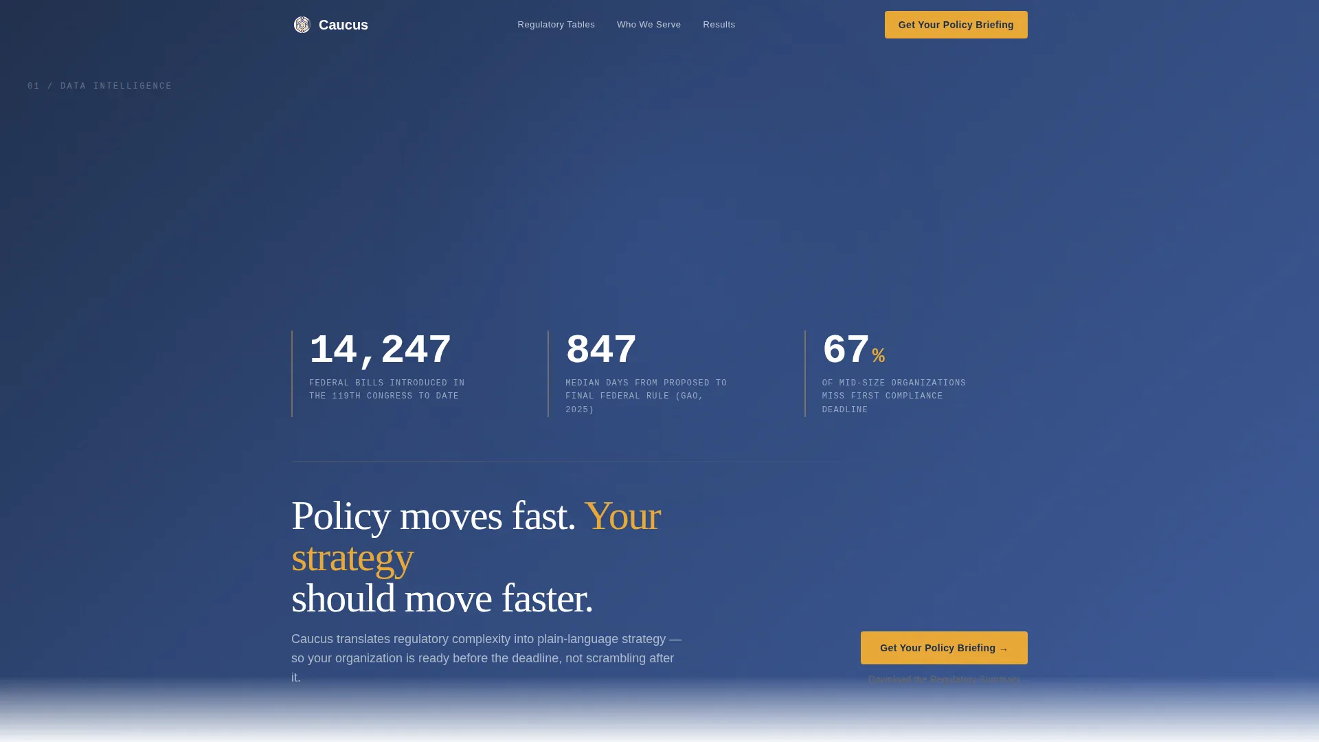
- An animated data counter header that opens with three regulation-relevant statistics
- Multiple comparison table sections, each anchored by a real compliance question and a "Get Your Policy Briefing" call to action
- A secondary text-link capture point for visitors who want a downloadable regulatory summary before committing to a call
Feature list
A paragraph introduces the full feature set: Caucus packages six purposeful components into one cohesive landing page that earns visitor trust before asking for their time.
Animated Statistics Header
The header opens with three counters that tick through real policy data, bills introduced this session, average days to final rule, and the percentage of organizations unprepared for compliance deadlines. Each number rises into view against a dark policy-blue field using a subtle animation, then resolves into the headline: "Policy moves fast. Your strategy should move faster." The data is the visual; no stock photography is used anywhere on the page.
FAQ-Driven Comparison Tables
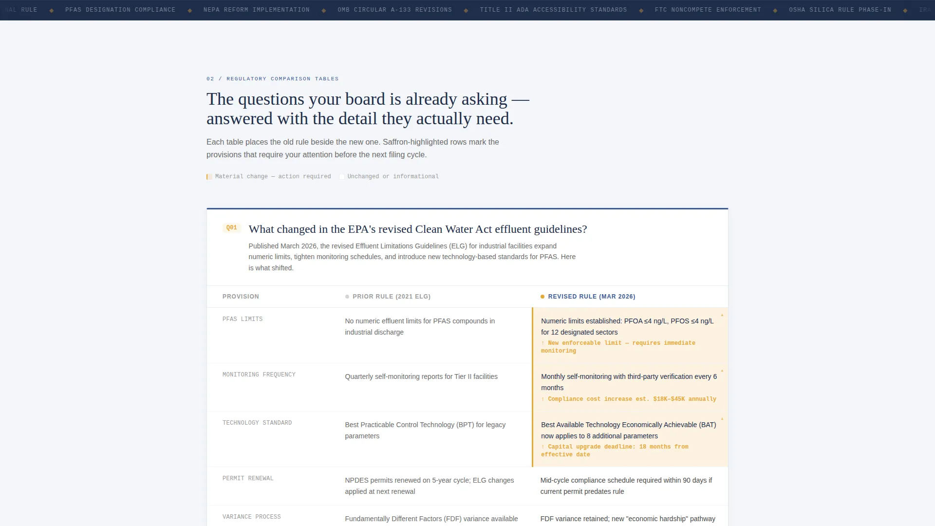
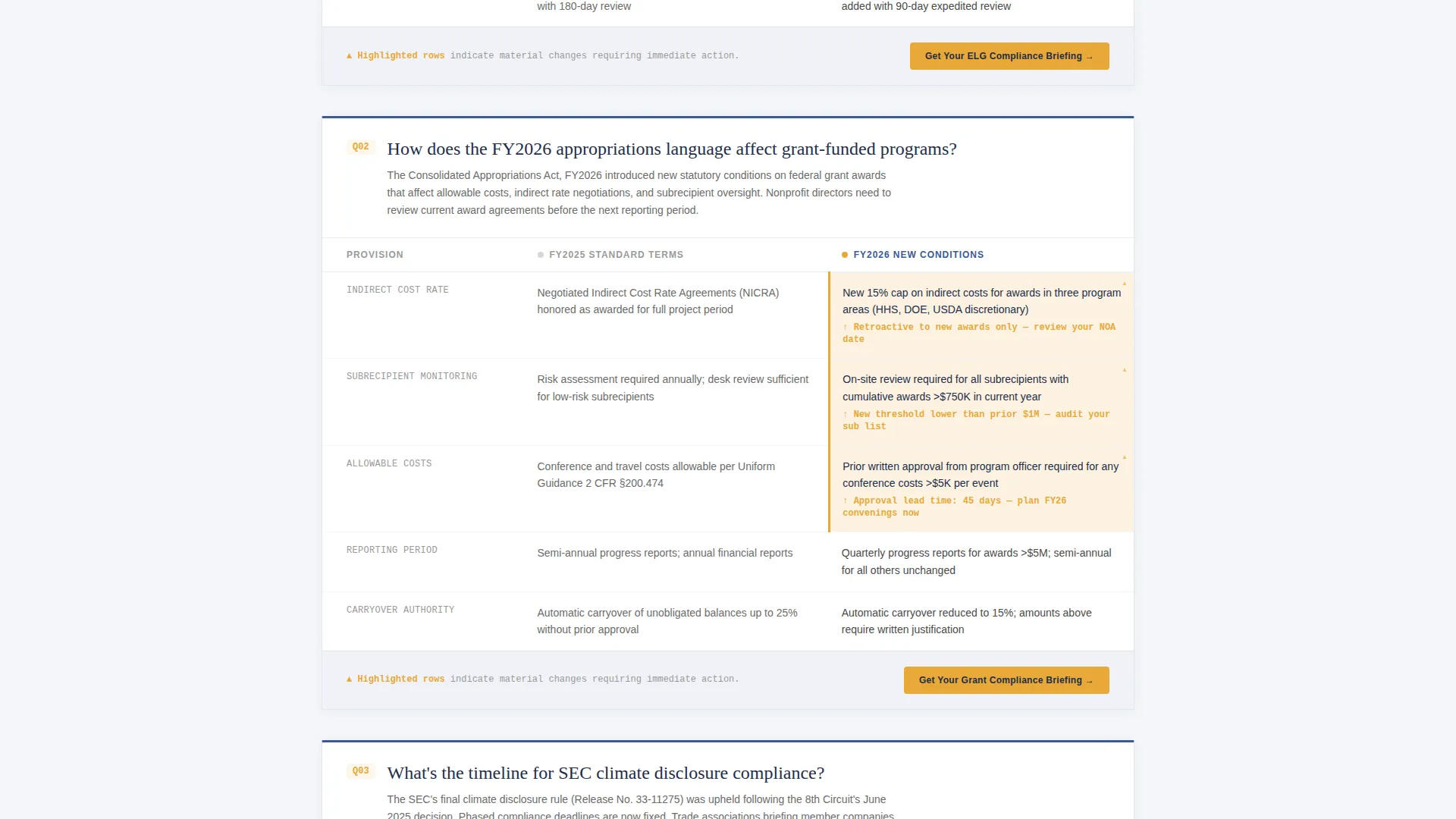
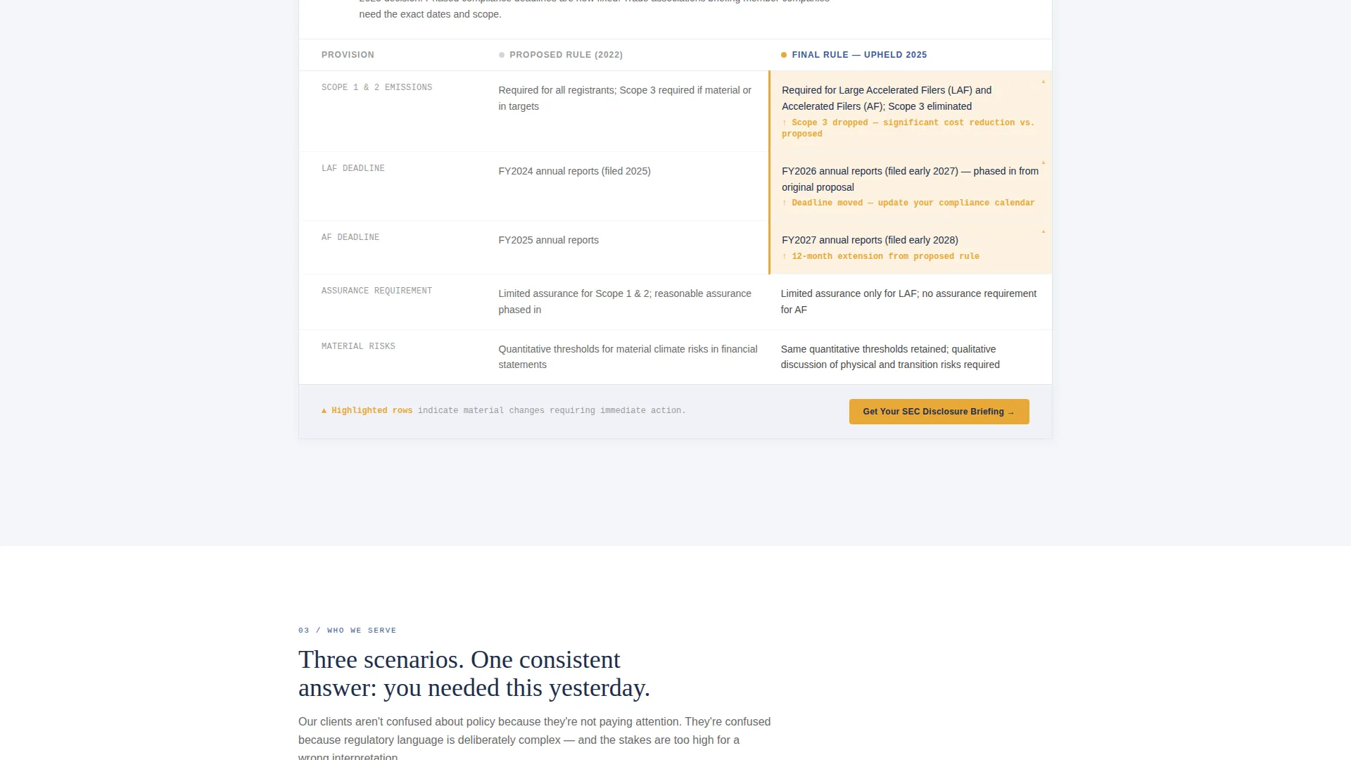
The core of the page is a scroll-through series of real compliance questions. Each question, such as "What changed in the latest rule?" or "What's the timeline?", is answered with a side-by-side table that places the previous regulation beside the current one. Saffron-highlighted cells mark the critical differences so visitors can spot what matters in seconds.
Dual Call-to-Action System
The primary call to action, "Get Your Policy Briefing," appears first in the header and then repeats as an anchor button at the bottom of every comparison table. A secondary text link, "Download the Regulatory Summary," sits beside it to capture email addresses from visitors who are not yet ready to book a call. There is no form on this page; both paths lead off-page to their respective tools.
Monospaced Policy Typography
Headers and data figures use large monospaced type that evokes the visual language of a Congressional Budget Office score sheet. Body text is set in pencil graphite for maximum readability without harshness. The typographic system reinforces the consultancy's authority at a glance.
Cloud Canvas Color System
The palette is built around soft cumulus white as the primary background, policy-blue for headers and table borders, and muted saffron reserved strictly for highlights, active states, and call-to-action elements. The combination feels like a well-organized policy memo printed on heavy stock, trustworthy and precise without being cold.
Educational Guide Layout Flow
The page is structured as an education before a sale. Each section answers a question, builds context, and earns the next scroll. By the time a visitor reaches the final call to action, they have already received enough value to understand how many questions they still need answered, which is exactly what motivates the click.
Page sections overview
| Section | Purpose |
|---|---|
| Animated Stats Header | Opens with live-style counters and the primary headline |
| Primary call to action Block | First "Get Your Policy Briefing" button placement |
| Comparison Table One | Answers first compliance question with old-versus-new table |
| Comparison Table Two | Answers second compliance question with highlighted changes |
| Comparison Table Three | Answers third compliance question with saffron-marked differences |
| Section call to action Anchors | Repeats primary call to action below each comparison table |
| Secondary Text Link | "Download the Regulatory Summary" capture point |
| Bottom call to action Section | Final call to action closing the page |
Design & branding system
The visual identity follows an Educational Guide theme built on the Cloud Canvas color system. Every color choice is deliberate and restrained, giving the page the authority of a formal policy document without the stiffness of government typography.
- Soft cumulus white (#F4F6F9) as the primary background, policy-blue (#3B5998) for headers and table borders, pencil graphite (#4A4A4A) for body text, and muted saffron (#E8A838) for highlights and calls to action
- Monospaced typography for all headline figures and data counters, reinforcing the memo-and-scoresheet visual language
- No stock photography anywhere on the page; data visualizations and structured tables carry the full visual weight
Mobile & speed optimization
The layout is designed to remain clear and functional at any screen width. Comparison tables and the animated header are structured to reflow cleanly on smaller displays so mobile visitors get the same authoritative experience as desktop readers.
- Comparison tables are built to stack or scroll horizontally on narrow screens without losing the saffron-highlighted difference cells
- The repeating call-to-action structure ensures the booking path is always visible, whether a visitor reads three sections or all of them
How this template helps you convert
Caucus converts by educating first and asking second. The page earns the click rather than demanding it, which is exactly the right approach for a sophisticated B2B audience that can spot a thin pitch instantly.
- The animated statistics hook creates immediate relevance by surfacing numbers your target audience already cares about, pulling them into the content before the headline even loads.
- Each FAQ-driven comparison table answers a real question and demonstrates expertise in the same motion, so the visitor's confidence in your firm grows with every scroll.
- The dual call-to-action system captures visitors at two different levels of readiness: those ready to book a call and those who need one more proof point before committing.
Other information about this template
This template is suited to any professional services context where trust and demonstrated expertise must do the heavy lifting before a sale is made. A few additional details worth knowing before you build with Caucus:
- The page is designed as a click-through landing page with no on-page forms; all lead capture happens off-page through a scheduling tool or email capture linked to the secondary text action
- The comparison table format is flexible enough to serve different regulatory topics, so the same template structure can be reused for separate practice areas or client segments
- The FAQ-driven scroll structure means the page can be updated seasonally as new rules are introduced, keeping the content relevant without redesigning the layout
Theme
Educational Guide
Creative direction
FAQ-Driven
Color system
Cloud Canvas
Style
Comparison Table
Direction
Click-Through
Page Sections
Animated Statistics Header
Faq-driven Comparison Tables
Dual Call-to-action System
Monospaced Policy Typography
Cloud Canvas Color System
Educational Guide Layout Flow
Related questions
Who is this landing page template built for?
Does this template include a contact form?
Can I use the comparison tables for different regulatory topics?
What makes the animated header different from a standard hero section?
Is this a single page or a multi-page template?



