Garden Wedding Booking Website Template
Gather is a luxe minimal garden wedding caterer landing page template built for catering businesses ready to turn browsers into booked consultations. The page uses a masonry scroll timeline, collage-style hero, and a two-step booking form to guide couples from first impression to reserved date. Soft Mist colors, editorial typography, and cinematic food imagery give the catering landing page its quiet authority.
by Rocket studio
Quick summary
Gather is a single-page catering landing page template designed for garden wedding caterers who want their website to feel as polished as the tables they set. The template uses a masonry layout, a collage hero, and a scroll-driven Day-in-the-Life timeline to move couples from curiosity to commitment. Every section earns the booking click before it asks for one.
Who this template is for
This landing page template was built with a specific audience in mind. It speaks directly to catering businesses that serve the high-end wedding market and want their website to reflect the same care they put into every plate.
- Boutique garden wedding caterers ready to move beyond generic website templates and create a booking-focused online presence
- Engaged couples researching caterers who need a wedding website that earns trust before asking for commitment
- Professional wedding planners looking for a caterer whose landing page communicates reliability, craft, and responsiveness across all mobile devices
What problem this template solves
Couples planning weddings are overwhelmed. They are managing spreadsheets, coordinating dietary restrictions, scrolling through Pinterest boards, and comparing dozens of vendors at once. A generic catering website that leads with a menu PDF and a contact form does not earn their attention. This landing page template solves that directly.
- It replaces static menu lists with a scroll experience that describes the experience and ingredients, letting the food and the day speak before any commitment is asked
- It gives potential clients a single, clear path: browse the Day-in-the-Life timeline, build appetite and trust, then click one prominent call-to-action to reserve a date
- It captures leads through two entry points, a booking form for ready couples and a seasonal menu download for those still browsing, reducing pressure while keeping conversion rates high
What you get with this template
This template delivers a fully structured catering landing page with every section planned, styled, and ready for you to customize. You do not need advanced technical skills to make it yours. The drag and drop editing approach means you can swap images, update text, and adjust brand colors in just a few clicks.
- A six-section masonry landing page including a collage hero, Day-in-the-Life scroll timeline, food showcase, testimonial section, two-step booking form, and a minimal single-row footer
- A complete Soft Mist color system with sage, linen white, muted blush, and tarnished gold applied across every component, giving the page a consistent visual style without extra design work
- DM Serif Display headings paired with Plus Jakarta Sans body text, delivering clean typography and visual appeal that match a luxury editorial standard
Feature list
This landing page template includes purpose-built features that work together to showcase craft, build trust, and guide visitors toward booking. Each feature was chosen to serve the specific needs of a garden wedding caterer landing page.
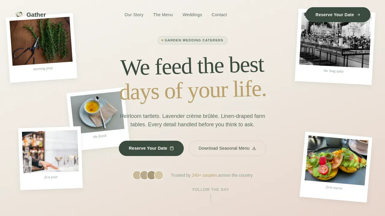
Collage Hero with Rotated Serif Headline
The hero image section uses a collage and scrapbook composition of overlapping polaroid-style photographs arranged at gentle angles across the full viewport. Images show rosemary being stripped by hand, a long wisteria-canopied table, a champagne pour, and a torn handwritten menu card. A single serif main headline sits among the photographs, slightly rotated, creating immediate visual appeal and emotional connection. This is not a standard wide-angle hero image slot; it is a curated editorial moment that sets the tone for every section that follows.
Day-in-the-Life Masonry Timeline
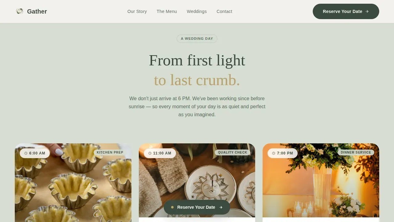
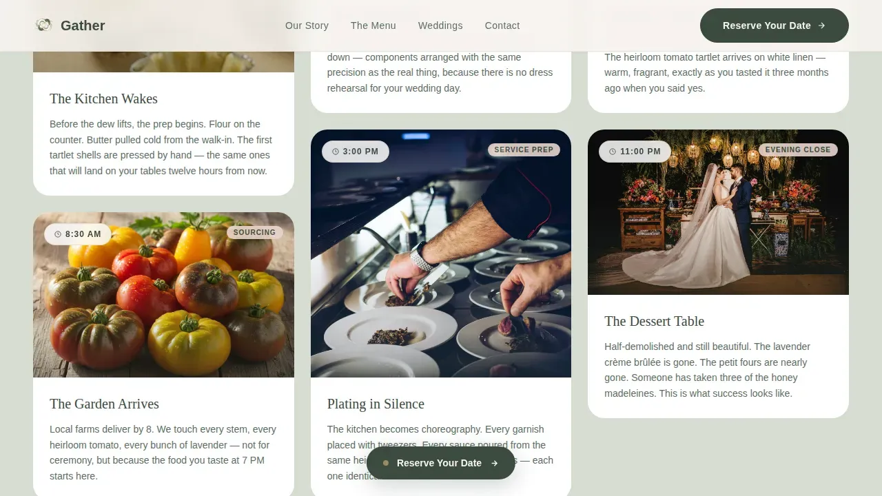
The scroll experience is organized as a timeline from 6 AM to 11 PM, with each masonry section acting as a chapter in a wedding day. Visitors move through kitchen prep at dawn, tasting setup at midday, plating in the afternoon, first course service at dinner, and a half-demolished dessert table at midnight. This structure lets stunning visuals do the storytelling. Potential customers are not reading a service list; they are watching a caterer move through the day with quiet precision. The timeline builds trust through craft without naming it, which is a unique approach that outperforms feature-list formats on conversion rates.
Two-Step Booking Form with Calendar
The primary call-to-action on this catering landing page is Reserve Your Date. It appears first after the third scroll chapter and is pinned softly at the bottom of every section thereafter. Clicking opens a two-step modal: step one asks for wedding date, estimated guest count, and venue type from a short list of garden, estate, vineyard, or private home; step two offers a preferred tasting appointment slot from an embedded calendar. The opt-in form asks only for essential information to minimize friction and maximize conversions. This focused, single-path approach is an effective landing page strategy that reduces decision fatigue.
Seasonal Menu Download Opt-In
A secondary capture path allows couples still in research mode to download a seasonal menu without committing to a booking call. This opt in form captures the email address of potential clients who are not yet ready to reserve but remain warm leads. Keeping two capture paths on one catering landing page means you can generate leads at every stage of the planning journey, from early inspiration browsing through to final vendor selection.
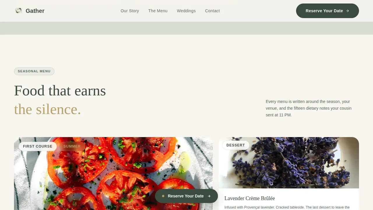
Asymmetric Food Showcase Section
The Table section uses an asymmetric bento-style grid to feature signature dishes with high quality images rather than text descriptions alone. Each dish card pairs a photograph with a short compelling description of experience and ingredients, following the best practice of storytelling over listing. Visitors can see plated heirloom tomato tartlets, lavender crème brûlée, and other signature items presented with the same care as the wedding day itself. The section gives food the center stage it deserves without cluttering the clean layout.
Social Proof Testimonial Block
The Couples' Words section features client testimonials paired with named couples, specific dishes, wedding venue types, and concrete guest counts. This level of detail in social proof builds credibility with potential customers in a way that generic five-star ratings cannot. A garden wedding with 120 guests at a vineyard estate carries far more weight than an anonymous review. The section includes two to three concise testimonials styled with event photos, following the proven format that builds trust on any catering landing page.
Page sections overview
| Section | Purpose |
|---|---|
| Hero Collage | Establish emotional tone with editorial polaroid composition and rotated serif headline |
| Day-in-the-Life Timeline | Scroll-driven masonry chapters from 6 AM to 11 PM building craft-based trust |
| The Table Showcase | Asymmetric food grid featuring high quality images and ingredient-led dish descriptions |
| Couples' Words | Client testimonials with named couples, specific dishes, and venue details as social proof |
| Reserve Your Date | Two-step booking form plus seasonal menu download opt in form for lead capture |
| Footer Row | Linear single-row footer with minimal navigation and contact details |
Design & branding system
The overall design of this catering landing page is rooted in the Soft Mist color system, a palette that feels like pressing dried flowers between the pages of a heavy Italian sketchbook. The color scheme balances restraint with warmth across every component and section on the page.
- The color scheme uses barely-there sage (#D6DDD1), warm linen white (#F7F4EF), and muted blush (#E8D5CC) as the three core tones, with tarnished gold (#B9A06B) reserved for hover states and accent type so that it appears only when touched, like candlelight catching a ring
- Typography pairs DM Serif Display for headings with Plus Jakarta Sans for body text, giving the page elegant, modern sans-serif headings alongside clean serif-influenced body copy; this clean typography combination avoids generic website design choices while staying highly readable
- Backgrounds alternate between linen white and sage sections to create ample white space and visual rhythm; deep eucalyptus (#3B4A3F) anchors all text for strong contrast without harshness, and the tarnished gold accent reinforces brand colors across interactive elements
Mobile & speed optimization
This catering landing page template is built with a responsive design that adapts cleanly from desktop to mobile devices. The masonry layout collapses to a single column on smaller screens, keeping the Day-in-the-Life timeline readable and the booking form usable without pinching or horizontal scrolling. Given that the majority of couples will browse and book via mobile devices, mobile friendly design is not optional for a catering landing page in this market.
- The responsive design ensures that the collage hero, masonry timeline, food showcase, and booking modal all reformat gracefully for mobile users on any smartphone or tablet
- High quality images are compressed to support fast load times, following best practice guidance that pages should load in under two seconds to retain mobile traffic
- Interactive elements including the polaroid float animation, scroll-reveal stagger, parallax masonry sections, and form step transition are handled with performance in mind, keeping the page engaging without sacrificing usability on mobile devices
How this template helps you convert
The Gather catering landing page template is structured to increase conversions by earning trust before asking for anything. Every design and content decision follows the principle that visitors should feel invited, not sold to.
- The page leads with the hero image and a single main headline rather than a list of services, establishing the value proposition immediately while giving high quality images and stunning visuals room to breathe; a single prominent call-to-action then appears after the third chapter, reducing clutter and keeping focus on one clear next step to improve conversion rates
- The Day-in-the-Life masonry timeline acts as the page's primary social proof engine, showing the caterer's craft through a narrative sequence rather than claims; this unique approach means potential customers arrive at the booking section already emotionally invested, which directly supports more leads and better conversion rates
- The two-step booking form paired with the seasonal menu download opt in form creates a dual-path capture system; couples ready to book take the direct path while those still gathering inspiration take the softer email path, so the page can capture leads and generate leads simultaneously without overwhelming any visitor
Other information about this template
This section covers additional context about how the Gather template fits into the broader landscape of wedding catering websites and what makes it a practical choice for caterers ready to build a professional online presence.
- The gather luxe minimal garden wedding caterer landing page template is one of the few website templates purpose-built around a Day-in-the-Life creative direction, making it genuinely different from standard catering layouts that lead with price grids or lengthy service menus
- The template's website design draws inspiration from editorial garden aesthetics, where the wedding theme, the table settings, the food plating, and the overall page design all feel like chapters of the same story; a cohesive look from the first scroll to the footer helps establish brand authority
- A wedding website should feel like an online extension of printed invitations, setting the stage for the wedding's aesthetic; Gather achieves this by carrying the Soft Mist color palette and serif-led typography through every touchpoint, so the landing page feels like wedding stationery brought to life on screen
- Wedding websites have become an essential online hub for couples to keep invited guests informed and stay organized; while Gather focuses on the caterer's booking funnel, the design language is consistent with what the best wedding website templates deliver for communication and trust
- The template supports the kind of unique style that helps a caterer stand out; summer weddings, garden estates, vineyards, and even a tropical destination event all work within this layout because the structure is venue-agnostic while the aesthetic is unmistakably elevated
- Many users who work through the drag and drop customization process find that swapping placeholder images, updating brand colors, and editing body copy requires no specialist technical skills; the user friendly interface makes the design process approachable for business owners who want a stunning landing page without hiring a developer
- For caterers who also handle other events such as corporate garden parties, milestone celebrations, or rehearsal dinners, the page structure and wedding party sections can be adapted with light copy edits to showcase a broader offering
- The template includes interactive elements across its animations and form flow, including polaroid float on load, scroll-reveal stagger through the masonry timeline, and the form step transition inside the booking modal; these premium features add a layer of polish that generic website templates rarely offer
- Platforms such as Showit offer templates with airy and refined designs for high-end wedding creatives, and Wix's Catering Company template provides parallax scrolling with built-in menu features; Gather sits alongside these as an eye catching template option purpose-built for the garden wedding catering niche with a more focused booking structure
- A well-chosen wedding website template can avoid a cookie-cutter aesthetic; Gather does this by centering narrative scroll over static pages, giving caterers a visually distinctive presence that stands apart from standard catering landing page designs
- The page is also set up for caterers who want to share photos from real weddings directly in the masonry grid; the ability to upload photos into the polaroid-style hero and the Day-in-the-Life chapters means authentic imagery, not stock photography, drives the emotional connection with potential clients
- Incorporating a consistent color palette into the overall design ties together various elements of the wedding plan, from wedding stationery through to the digital booking experience; the Soft Mist system built into this template makes that cohesive look achievable from day one
Theme
Luxe Minimal
Creative direction
Day-in-the-Life
Color system
Soft Mist
Style
Masonry/Pinterest
Direction
Booking/Scheduling
Page Sections
Collage Hero with Rotated Headline
Day-in-the-life Masonry Timeline
Two-step Booking Form with Calendar
Seasonal Menu Download Capture
Asymmetric Food Showcase Grid
Named-couple Testimonial Block
Related questions
Can I customize the colors and fonts in this template?
How does the two-step booking form work?
Is this catering landing page template mobile friendly?
Can I upload my own wedding photos into the hero and timeline?
Does this template work for venue types beyond garden weddings?