Specialist LGBTQ+ Organization Blog & Content Website Template
Commune - Keep the Door Open is an editorial landing page template built for queer arts organizations that run free, neighborhood-rooted programming. It combines a zine-style visual identity with a structured donation flow, a volunteer path, and street-level storytelling sections. The result feels less like a website and more like a warm storefront window into a living community.
by Rocket studio
Quick summary
The Commune - Keep the Door Open queer arts landing page template is a single-page editorial build for community-centered arts organizations. It is focused on earning recurring monthly donations by making every visitor feel like a neighbor before asking them to give. Six distinct section windows carry the story from a handwritten neighbor testimonial all the way to a tangible-outcome donation form and a volunteer sign-up path.
Who this template is for
This template was designed for organizations where art and civic life are inseparable. If your work is deeply rooted in a specific block, neighborhood, or city, this layout speaks that language fluently.
- Queer-led or queer-affirming arts and performance spaces that offer free, open-door programming to the public
- Nonprofit community groups showcasing work by queer artists, trans artists, and non-binary makers whose stories deserve a permanent place in the civic record
- Fundraising coordinators and community leaders who need a donation page that earns trust through story before it asks for money
What problem this template solves
Most people building a fundraising page for a queer arts organization face the same tension: the work is intimate and local, but donation pages tend to feel generic and transactional. Visitors arrive, scan a headline, and leave without ever understanding what the space actually means to the people who gather there.
- It skips the cold pitch and instead builds a picture of the community through accumulated stories, photography, program moments, and named neighbor voices before any donation ask appears
- It addresses the challenge of showcasing diverse queer art and trans art to new visitors who have never been through the physical door
- It gives people who cannot give money a clear second path through a structured volunteer form, so no one who wants to support the work is turned away
What you get with this template
You get a complete editorial landing page that scrolls like a walk down the block. Every section is a different window into the organization's life. The collection of built-in sections, forms, and design details is ready to fill with your own content.
- A hero section built around a testimonial card, a donation form with four preset amounts tied to tangible outcomes and a monthly recurring default toggle, and a volunteer capture form with name, skill, and availability fields
- Six fully styled editorial sections including a bento photo essay layout, a two-column interview excerpt, a broadsheet-style calendar, and a hand-drawn-style partner venue map
- A fixed "Keep the Door Open" call-to-action bar that follows the visitor on scroll, plus a footer in an arc-split layout with tagline and essential links
Feature list
The template ships with a focused set of purpose-built features. Each one exists to serve the specific idea that a queer arts fundraising page must feel earned, not forced.
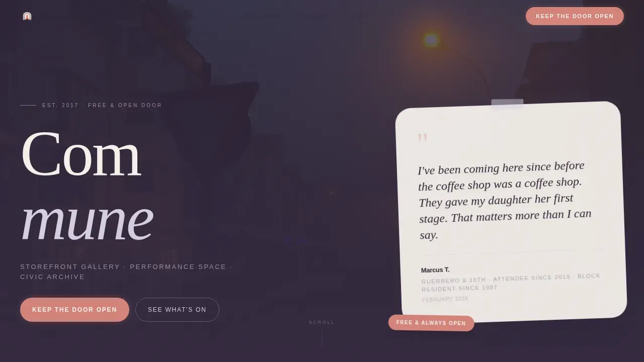
Testimonial Card Hero Section
The header is built around a single handwritten-style quote from a named neighbor. It floats over a soft-focus photograph of the actual block. The quote carries a cross street, a memory, a dateline, and the person's relationship to the space. No logo dominates. The voice of the community leads.
Tangible Outcome Donation Form
The donation form offers four preset amounts, each tied to a specific real-world result. A custom amount field sits alongside them. Monthly recurring giving is set as the default toggle so visitors are guided toward sustained support from the moment they arrive at the form. An optional "Your block or neighborhood" line adds a sense of local belonging to the act of giving.
Volunteer Capture Path
A secondary conversion path captures the name, skill, and availability of people who want to give time instead of money. This matters because queer artists and community members who cannot contribute financially still want to help build community. The form is clean, brief, and welcoming.
Fixed Scroll Call-to-Action Bar
A persistent bottom bar reading "Keep the Door Open" stays visible as the visitor scrolls through every section. It appears first after the third section and remains present through the footer. The coral accent color used on this bar is the same one reserved for donation buttons and pull quotes throughout the page, creating a consistent visual thread.
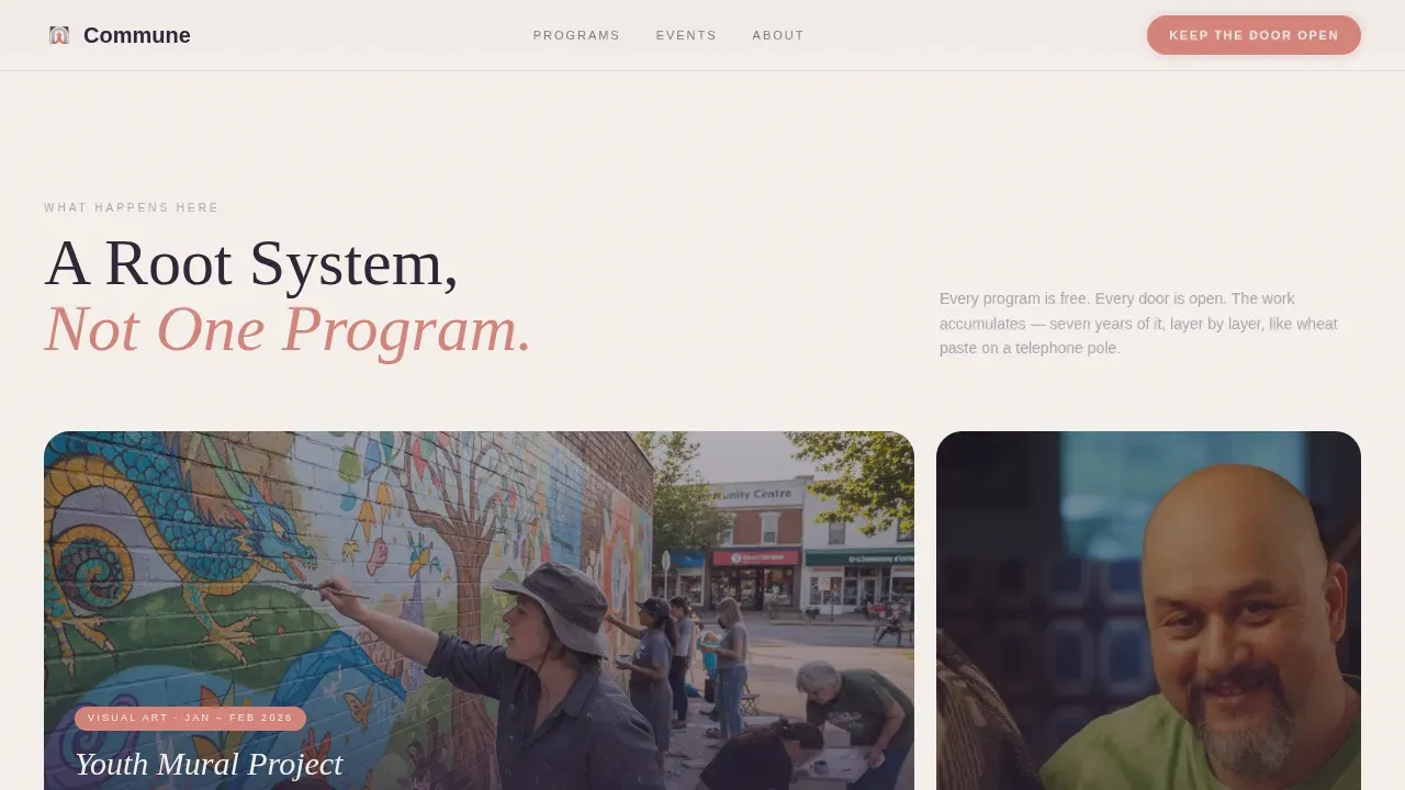
Editorial Bento Photo Essay Layout
The programs section uses an asymmetric bento grid to display photography from the youth mural project, elder oral history sessions, and open mic nights. This layout lets the artwork and the people creating art speak at different scales simultaneously. The rhythm alternates between image-heavy spreads and quiet typographic passages throughout the page.
Broadsheet Calendar and Venue Map
An annual event calendar styled like a page torn from a broadsheet newspaper gives visitors a clear, chronological view of upcoming programs, workshops, and exhibition dates. A hand-drawn-style map of partner venues within ten blocks extends the sense of a neighborhood network rather than a single isolated space.
Page sections overview
| Section | Purpose |
|---|---|
| Hero Testimonial Card | Opens with a named neighbor quote floating over a foggy block photograph |
| Programs Bento Grid | Photo essay showcasing the youth mural, oral histories, and open mic |
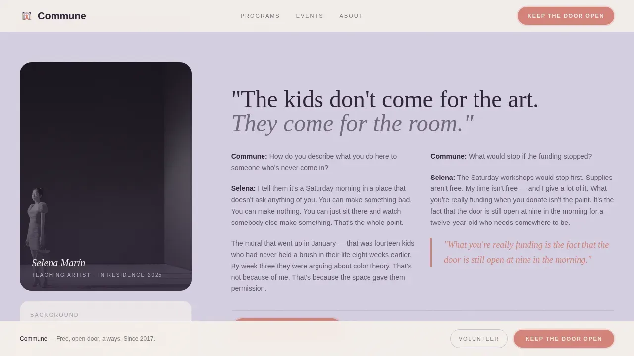
| Teaching Artist Interview | Two-column editorial excerpt with the first donation call-to-action bar |
| Calendar and Map | Broadsheet event calendar and hand-drawn partner venue map |
| Donation and Volunteer | Preset donation form with monthly toggle and volunteer sign-up path |
| Arc Split Footer | Tagline left, essential links right, closing the page at street level |
Design & branding system
The visual identity follows a Civic Service theme through a Soft Mist color system. The palette feels like a zine photocopied on off-white paper and left on a café counter: intimate, lo-fi, and deliberately unhurried. Every color choice and type pairing was made to create an environment where queer community life feels honored rather than packaged.
- Colors alternate between newsprint cream (#F5F0EB) and fog-morning lavender (#D5CFE1) as section backgrounds, with sidewalk warm gray (#A8A3B3) for body text, near-black plum (#2E2438) for headlines, and muted coral (#D4837A) reserved strictly for donation buttons and pull quotes
- Typography pairs Fraunces serif headlines with DM Sans body text, landing with the weight of fresh ink on cheap stock and giving every story and artwork caption its own quiet authority
- Animations run at medium intensity: fade-in-up staggered entrances, a marquee scroll strip, and hover grain effects add texture without overwhelming the content
Mobile & speed optimization
The template is built with equal priority given to desktop editorial spread feel and mobile on-the-block discovery. A visitor finding Commune through a street-level share on their phone gets the same warm, unhurried experience as someone at a desk.
- Static sections use Server Components so the core story, photography, and program information load fast without waiting for interactivity
- Interactive elements including the donation form, the volunteer form, and the fixed call-to-action bar use Client Components, keeping dynamic behavior isolated and efficient
- The layout reflows cleanly from wide editorial spreads on desktop to a single-column scroll on mobile, preserving the section-by-section neighborhood walk rhythm at every screen size
How this template helps you convert
The page is designed to earn the gift before it asks for it. Conversion is built through accumulation, not pressure. By the time a visitor reaches the donation form, they have already walked through six sections of real community life.
- The testimonial card hero, the photo essay, and the interview excerpt build a genuine sense of belonging and place before the first donation call-to-action appears, so the ask feels like an invitation rather than an interruption
- The donation form links each preset amount to a tangible outcome tied to real programs, making it easy for any person to picture exactly what their contribution does in the world
- The fixed scroll bar keeps the primary action visible without being aggressive, and the volunteer path ensures that everyone who feels inspired to help can find a way to do so, whether or not money is part of it
Other information about this template
This template sits inside a broader conversation about what it means to create inclusive spaces for queer people online. The queer community has historically had to fight for visibility in public life, and a landing page is a form of public life. The design choices here reflect a year-round commitment to that visibility, not a seasonal gesture. The following context helps frame the template's place in the wider ecosystem of queer arts resources.
- Queer street art serves as a powerful medium for expression and visibility, and this template treats the street itself as part of the story by referencing real block geography in the hero and map sections
- The landing page uses gender-neutral language throughout and avoids gendered titles in all form fields, following best practice for inclusive spaces where trans people, non-binary individuals, and queer folks of every identity feel safe and recognized
- Imagery guidance built into the template brief calls for showcasing elders, trans and non-binary individuals, and people of color in active, joyful situations rather than stereotypes, because art can normalize and humanize the human experience of queer life
- The Handmade Arcade is an example of the kind of community event this template can support: a gathering where queer artists find community, connect with friends, share artwork, and build a broader group of collaborators and supporters
- Institutions like the Leslie-Lohman Museum of Gay and Lesbian Art demonstrate how dedicated spaces for gay and queer history create lasting civic resources that future generations can explore and build on
- Artists like Noah Griggs, who writes, paints, and creates zines through Stet Studio, and p1nkstar, who has received awards for showcasing trans artists in Texas and creating inclusive spaces, represent the kind of artist-led culture this template is built to support and celebrate
- The template's gold leaf-adjacent palette detail, the near-black plum headline color reading like fresh ink, speaks to the tradition of handmade print culture that has always been central to queer communication and activism
- Pronouns for team members can be listed openly in the footer or team sections, normalizing identity expression and building trust with every visitor who arrives wondering whether this is truly a safe space for them
- The December programming calendar slot and other chronological event listings are structured to help as many people as possible find upcoming workshops, readings, and the annual event that anchors the organization's public presence each year
- Community leaders who want to talk about the organization on Facebook or other platforms will find that the open-graph metadata fields in this template are built to create a clear, proud first impression when the page is shared
- Education is woven into the template's DNA: the youth workshop section, the oral history archive framing, and the teaching artist interview all exist to communicate that this space treats education as inseparable from the art it produces
- The template supports a collection of social proof elements including named testimonials, program outcome statements, and partner venue networks, giving any university student, graduate school researcher, or first-time visitor the context they need to understand why this work matters

Theme
Civic Service
Creative direction
Local & Neighborhood
Color system
Soft Mist
Style
Editorial/Magazine
Direction
Donation/Fundraising
Page Sections
Testimonial Card Hero with Neighbor Voice
Tangible Outcome Donation Form
Volunteer Sign-up Path
Fixed Scroll Call-to-action Bar
Editorial Bento Photo Essay and Interview Layout
Broadsheet Calendar and Partner Venue Map
Related questions
Can I use this template for a queer arts organization that runs both in-person and online programs?
Does the donation form support custom amounts and recurring giving?
How does the volunteer form work?
Is this template right for a smaller neighborhood arts group, not just a large organization?
Can I adapt the color system and typography for my own organization's brand?


