Curated Spirits Subscription Landing Page Template
Cellar is a modular card-grid landing page built for a curated wine and spirits subscription. It pairs a Neo-Retro sunset palette with interactive flip cards, a tiered upgrade path, and an animated tasting-note section. The result is a page that feels less like a sales pitch and more like opening a beautifully packed box.
by Rocket studio
Quick summary
Cellar is a single-page subscription landing page designed for curious drinkers already inside your ecosystem. It leads with a cinematic app mockup hero, moves through interactive card rows, and drives upgrades with a persistent bottom bar. The tone is warm and editorial. The design is Neo-Retro sunset.
Who this template is for
This template is built for direct-to-consumer spirits and wine subscription brands that sell on discovery and delight. If your audience has outgrown grocery store shelves and wants provenance with their pour, this page speaks their language.
- Subscription box founders looking to convert existing members to a higher tier
- Small-batch wine, amaro, and spirits brands selling through a curated monthly model
- Creative operators who want a page that feels more like a gift reveal than a checkout flow
What problem this template solves
Most subscription upsell pages rely on comparison tables and discount banners. That approach works for software. It rarely works for something people drink slowly, share with guests, and talk about for weeks. This template solves the gap between what the product feels like and what the page looks like.
- Visitors who are already subscribers need a reason to upgrade, not a reason to sign up
- Generic layouts fail to communicate taste, curation, and scarcity in a single scroll
- The page needs to earn the click through specificity and atmosphere, not pressure
What you get with this template
You get a fully structured modular card-grid landing page ready to adapt to your brand. Every section is purposeful, sequenced for engagement, and designed around the emotional arc of opening something curated just for you.
- A hero section with a device mockup layout, editorial bottle photography slots, and a headline fade-in
- Three interactive flip-card rows revealing past box contents, a taste profile quiz game, and animated tasting note cards
- A persistent upgrade bar, a tiered comparison card, and a secondary gifting prompt with recipient field and handwritten-note toggle
Feature list
This template is built around a set of specific components drawn directly from the Cellar brief. Each one serves the subscription upsell experience.
App Preview Hero Section
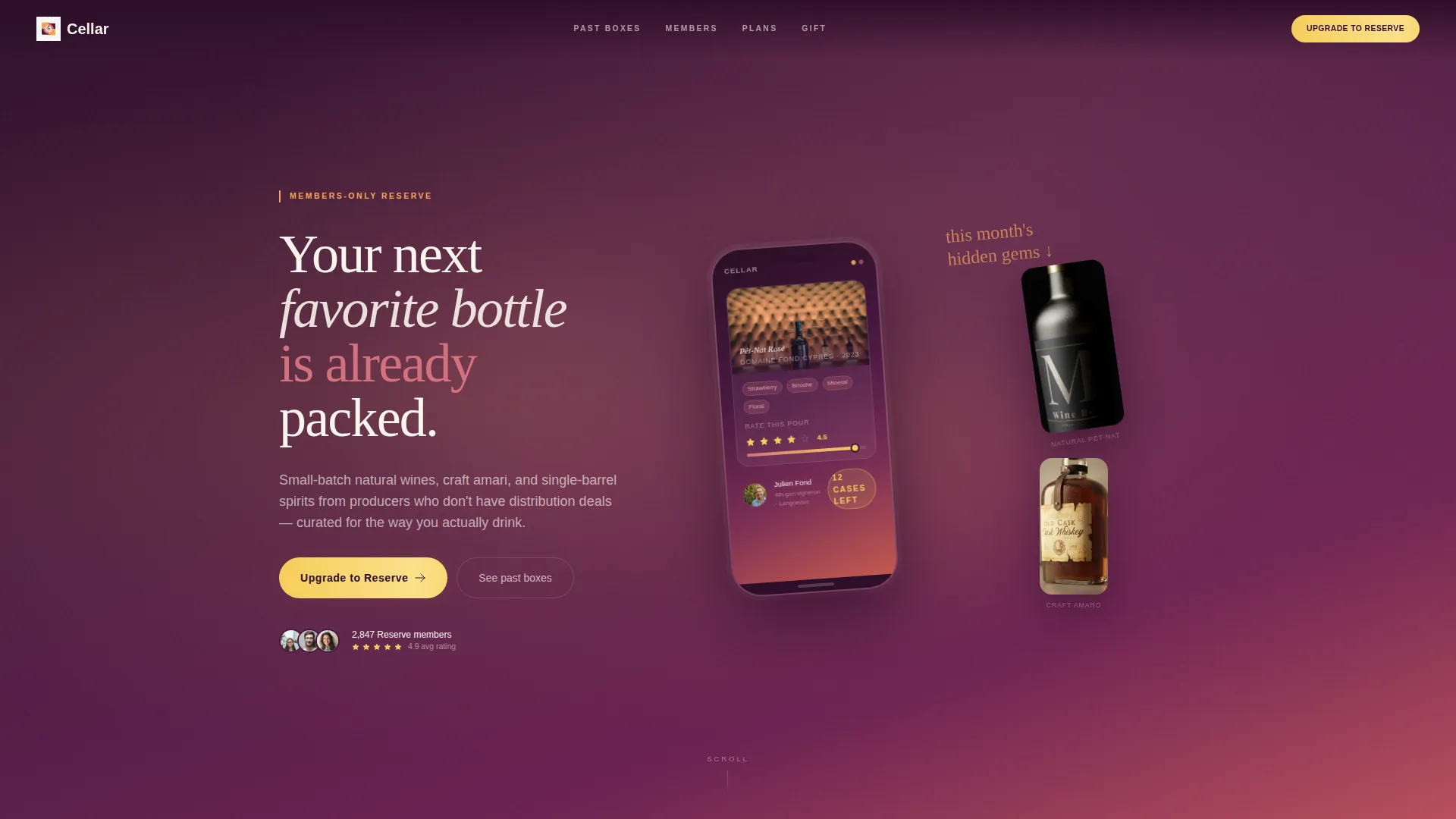
The header features a hero-width device mockup showing the Cellar app mid-unboxing. The screen displays a tasting card with a flavor wheel, a producer portrait, and a "Rate This Pour" slider. The phone tilts slightly against a plum-to-apricot gradient, flanked by editorial bottle photography.
Interactive Flip Card Grid
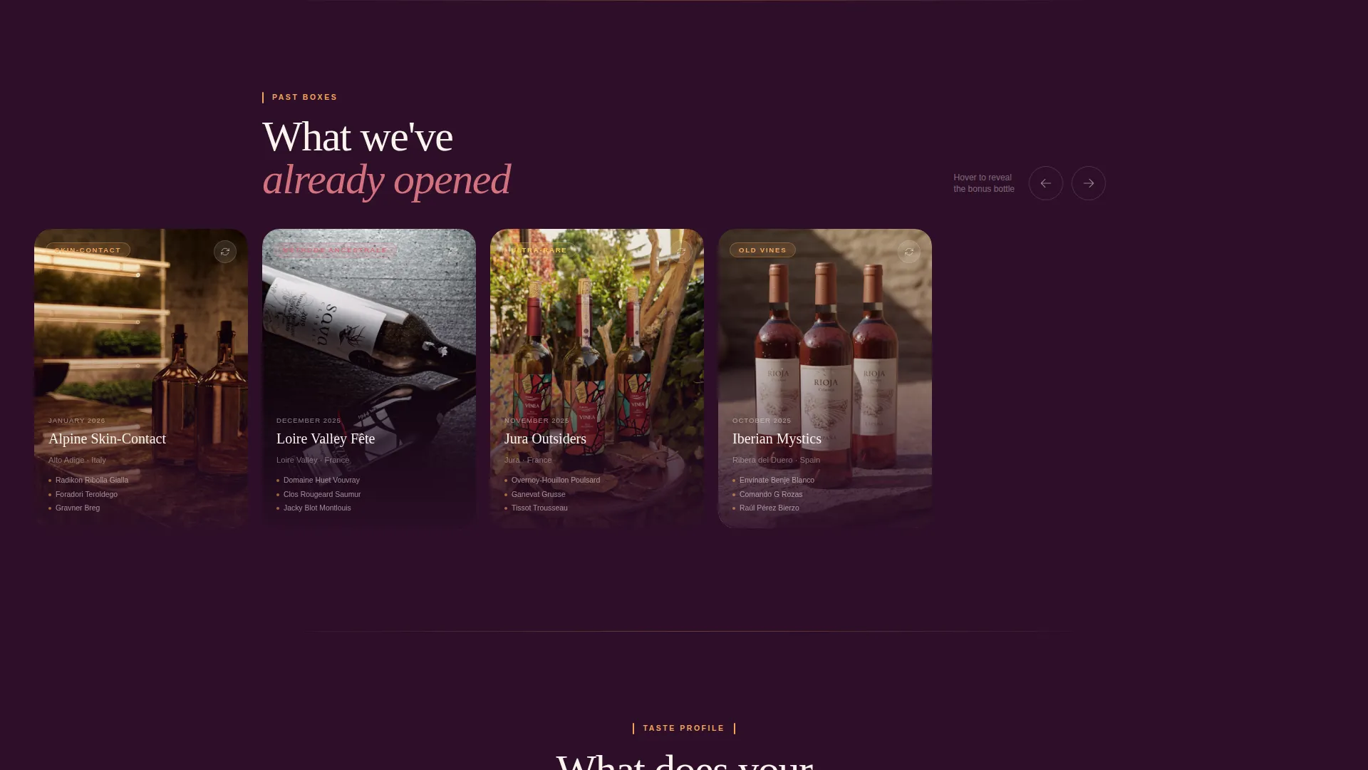
Three past-box cards sit in the first card row. Each card flips on hover to reveal the hidden bonus bottle from that month. The interaction replaces a static product list with a moment of discovery.
Taste Profile Quiz Module
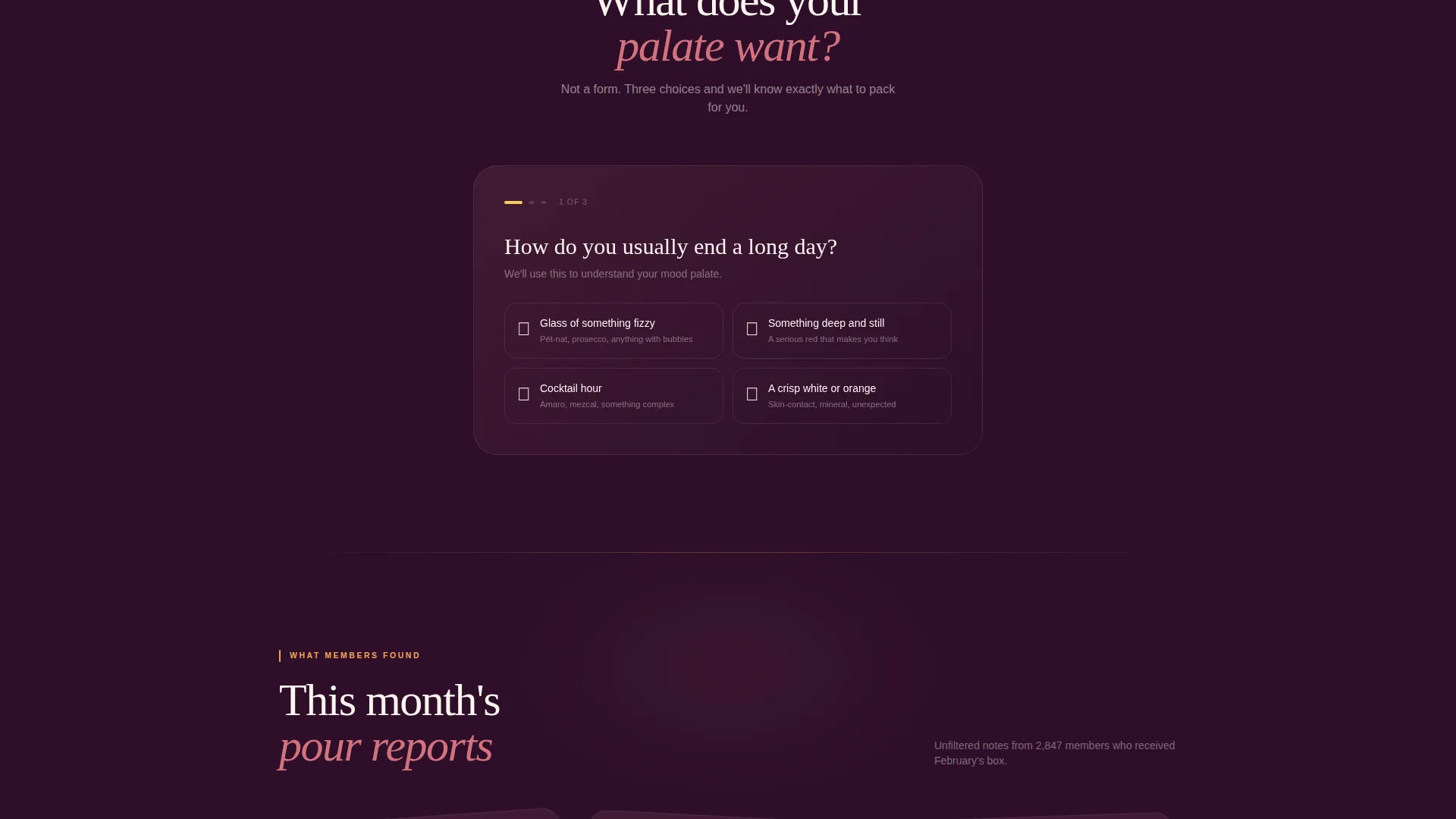
The second card row presents a taste profile quiz styled as an interactive mini-game rather than a form. Visitors engage with their preferences through a game-like flow, making the experience feel personal before any upgrade ask appears.
Animated Tasting Notes Section
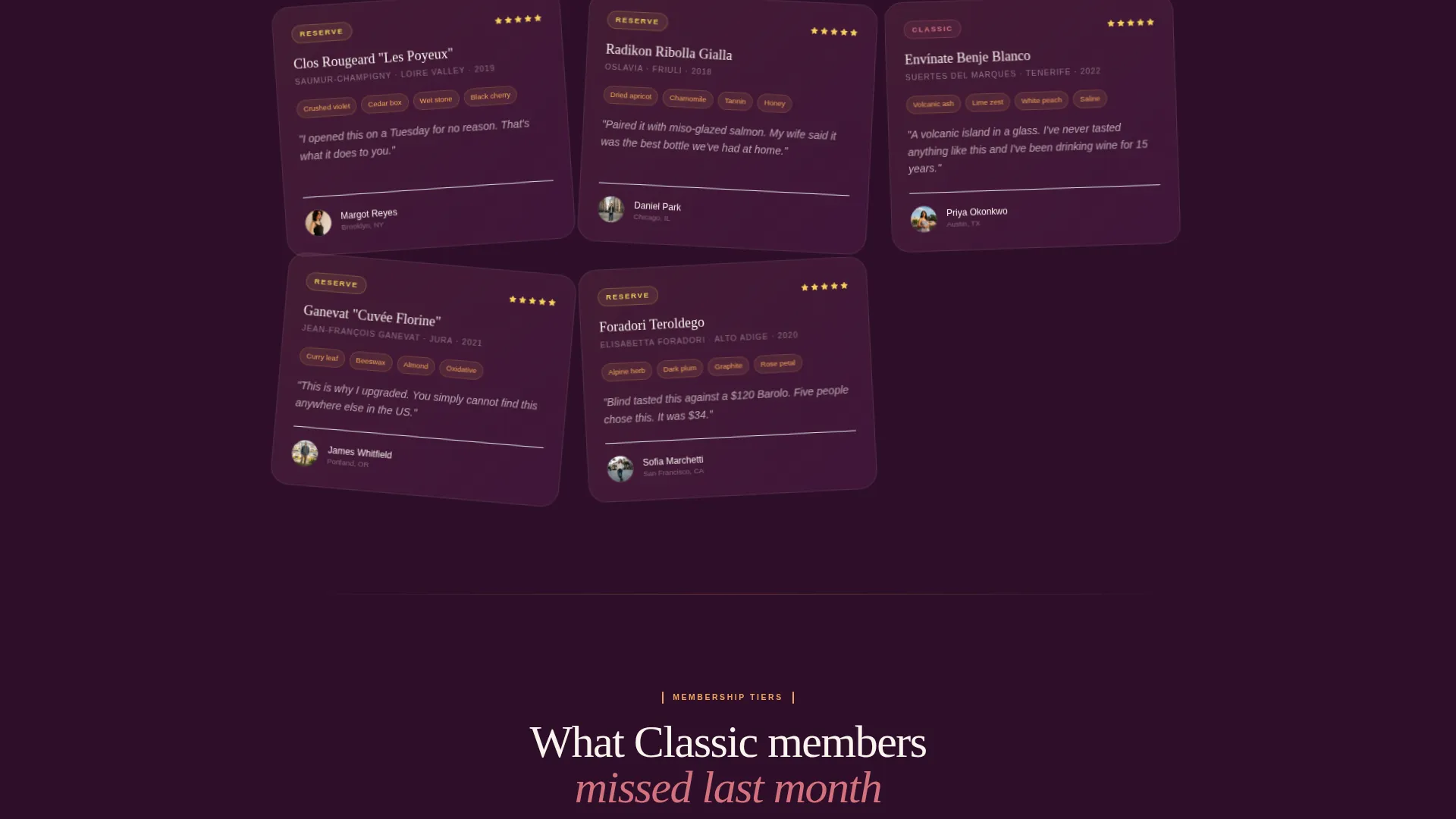
A "What Members Found This Month" section deals out tasting notes like playing cards. Cards are staggered and animated on scroll, giving the section a rhythm that reads as editorial rather than promotional.
Tiered Upgrade Comparison Card
A side-by-side comparison card shows Classic (3 bottles) versus Reserve (5 bottles plus an allocated spirit and a tasting journal). The card surfaces exactly what Reserve members received last month that Classic members missed, using scarcity and specificity to do the persuasion.
Persistent Upgrade Bottom Bar
After the second card row, a sticky bottom bar appears with the primary call to action: "Upgrade to Reserve." It stays visible during the rest of the scroll, keeping the conversion prompt present without interrupting the content experience.
Page sections overview
| Section | Purpose |
|---|---|
| Hero device mockup | Introduces the app and sets editorial tone |
| Past box cards | Flip interaction reveals hidden bonus bottles |
| Taste profile quiz | Mini-game engages visitors with their preferences |
| Tasting notes grid | Animated cards surface member discoveries |
| Upgrade comparison card | Side-by-side Classic versus. Reserve breakdown |
| Persistent bottom bar | Keeps "Upgrade to Reserve" visible during scroll |
| Gift a Box prompt | Captures impulse gifting with recipient email field |
Design & branding system
The visual identity follows a Neo-Retro theme built on a four-color sunset gradient. The palette feels like the last forty minutes of golden hour seen through a half-empty glass of orange wine: nostalgic in its warmth, sharp in its contrast.
- Deep plum (#4A1942) anchors backgrounds and navigation; rosé blush (#D4727E) washes across card surfaces; warm apricot (#F2A65A) handles body text highlights and dividers
- Saffron gold (#F7CE5B) is reserved exclusively for calls to action and badge elements, making every clickable moment visually distinct
- Typography pairs vintage label aesthetics with app-era crispness, creating a look that feels both collected and current
Mobile & speed optimization
The modular card grid is structured to reflow cleanly across screen sizes. Card rows that flip or animate on desktop translate to tap-friendly interactions on mobile, preserving the discover-and-delight rhythm on smaller screens.
- Each card module is independently sized so the grid adapts without collapsing the visual hierarchy
- The persistent bottom upgrade bar is designed to sit above mobile navigation zones, keeping the call to action accessible without obstructing content
- Editorial photography slots use defined aspect ratios so bottle images remain well-framed at any viewport width
How this template helps you convert
This page is built around a single conversion goal: getting an existing subscriber to upgrade to Reserve. Every design and content decision supports that outcome without feeling transactional.
- The interactive sections (flip cards, quiz, animated tasting notes) build desire and personal connection before the upgrade ask ever appears, so the visitor arrives at the comparison card already invested
- The persistent bottom bar keeps "Upgrade to Reserve" visible after the second card row, reducing friction without interrupting the editorial experience
- The "Gift a Box" secondary call to action captures a separate, high-intent action: impulse gifting, which converts visitors who are not ready to upgrade themselves but want to share the experience
Other information about this template
Cellar is categorized under Retail and E-Commerce, specifically within the Subscription Box and Direct-to-Consumer subcategory. It is a single landing page, not a multi-page site. The template is designed for operators who want a page that leads with atmosphere and earns the upgrade click through editorial confidence rather than aggressive discounting.
- The "Gift a Box" module includes a recipient email input and an optional handwritten-note toggle, covering impulse gifting in a single lightweight interaction
- The page rhythm follows a deliberate gift-game-gift sequence: each scroll reveal alternates between content that feels like receiving something and content that invites participation
- This template is well-suited to brands in the natural wine, craft amaro, and single-barrel spirits space where provenance storytelling and curation are core to the value proposition
Theme
Soft Gradient
Creative direction
Seasonal/Moment
Color system
Ink & Paper
Style
Bento Grid
Direction
Quiz/Assessment
Page Sections
App Preview Hero with Device Mockup
Hover-to-flip Past Box Cards
Taste Profile Quiz Mini-game
Animated Tasting Notes Card Deck
Classic Versus. Reserve Comparison Card
Persistent Upgrade Bottom Bar
Related questions
Is this template designed for new visitors or existing subscribers?
What does the taste profile quiz section actually include?
Can I adapt this template for a single product instead of a subscription tier?
Does the gifting feature include a checkout or payment flow?
How is the color palette structured across the template?



