Basement Renovation Pricing Website Template
Cellar is a split-screen landing page template built for basement interior designers. It leads with stamped amber metrics, walks visitors through a problem-to-solution scroll, and closes with three fixed-price design packages and a frictionless inline purchase form. The Agrarian Root visual theme pairs deep charcoal with warm amber to turn cold concrete into a compelling sales story.
by Rocket studio
Quick summary
Cellar is a single-page template designed for a basement renovation design practice. It opens with oversized amber stats, moves through a pain-to-resolution scroll arc, and lands on three purchasable design packages. The layout is a 50/50 split screen on desktop, stacking cleanly on mobile. Every section pushes one clear idea: unused basement space is a liability, and this designer fixes that.
Who this template is for
This template is built for a basement interior design practice that sells directly to homeowners. It works best when the business offers fixed-price packages and wants buyers to commit without a consultation call first.
- Suburban homeowners who need a basement finished before a specific life event
- Remote workers who have run out of usable rooms upstairs and are eyeing the space below
- Design practices that want a direct-to-consumer sales page with no booking gatekeeping
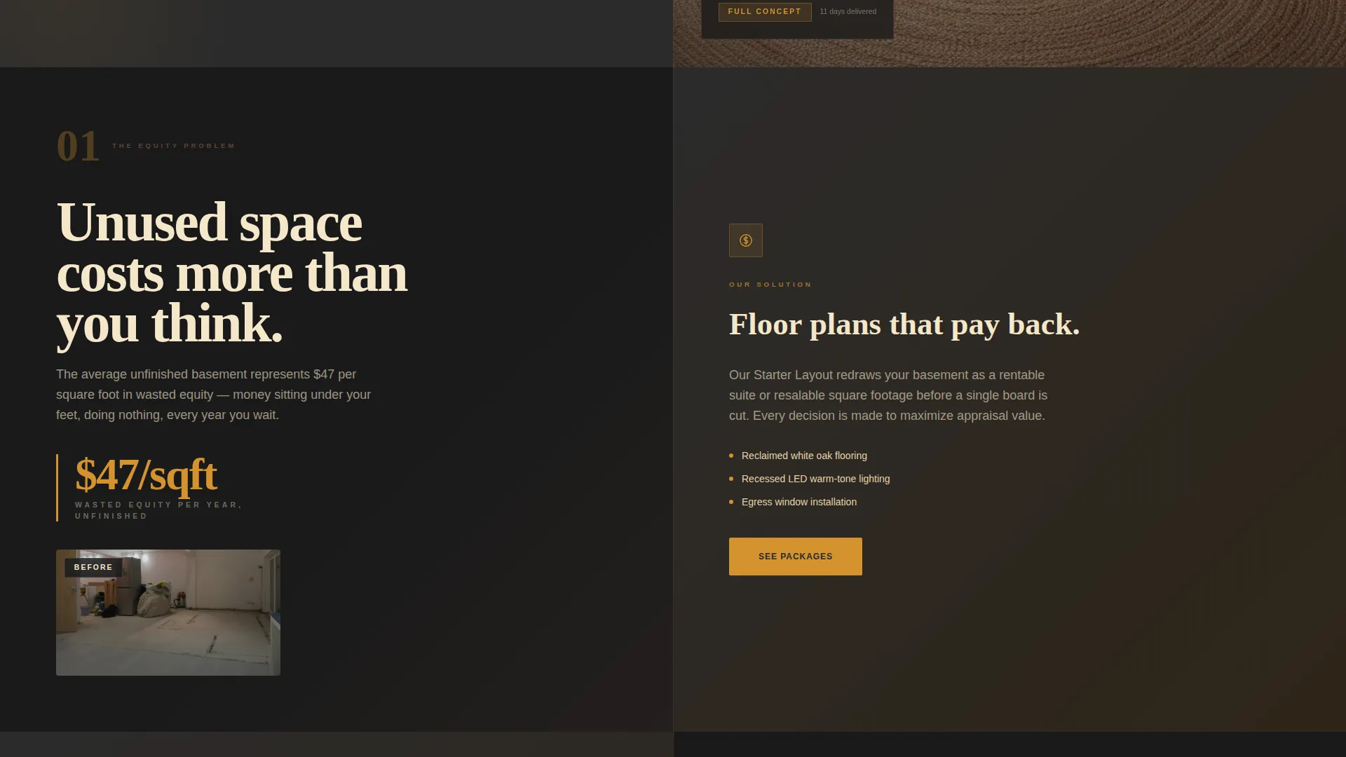
What problem this template solves
Unfinished basements sit idle while homeowners feel stuck between knowing they need to act and not knowing where to start. Most renovation pages bury the offer behind long consultation flows. Cellar removes that friction.
- Visitors arrive with vague anxiety about wasted square footage and leave with a clear package choice
- The Problem-to-Solution Arc addresses specific objections like moisture, low ceilings, and code compliance before the visitor even reaches the pricing section
- The inline purchase form lets a buyer pick a package, pay a deposit, and receive a scheduling link without a phone call
What you get with this template
Cellar delivers a complete single-page sales layout structured around emotional storytelling and direct purchase. Every section has a defined role, and the design system is fully specified so customization stays consistent.
- A hero split screen with amber stats on charcoal and a warm finished-basement photograph
- A scrolling Problem-to-Solution Arc with before-and-after panels covering moisture, ceiling height, lighting, and code compliance
- Three amber-bordered package cards with an inline form collecting zip code, square footage, package selection, and email
Feature list
This template is built around a defined set of functional sections and interactive components drawn directly from the project brief.
Split-Screen Stats Hero
The hero opens as a 50/50 panel. The left side stacks three oversized amber numerals in a heavy slab serif: 1,200-plus basements transformed, an average 38 percent home value increase, and a 14-day design turnaround. The right side holds a single warm overhead photograph of a finished reading nook. The contrast between hard data and lived warmth is immediate.
Problem-to-Solution Scroll Arc
Each scroll section below the fold pairs one basement problem with one specific solution on the opposite panel. Problems escalate from cosmetic discomfort to financial loss to structural risk. Solutions answer with material choices, techniques, and before-and-after visuals. The arc ends in a project gallery that feels like resolution.
Fixed-Price Package Cards
Three amber-bordered cards present the Starter Layout, Full Concept, and Turnkey Build packages. Each card lists square footage ranges and deliverables plainly. An amber "Claim Your Package" call-to-action button sits below each card and repeats as a floating button on mobile.
Inline Purchase Form
The purchase form sits directly on the page without redirecting the visitor. It collects four inputs in sequence: zip code, basement square footage, package selection, and email. No consultation is required. After submission, the buyer receives a scheduling link within the hour.
Basement Quiz Path
A secondary path below the package cards reads "Not sure which fits?" and links to a three-question basement quiz. The quiz recommends one of the three tiers based on the visitor's answers. It serves buyers who need guidance without adding friction to the main purchase flow.
Scroll Reveal Animations
Sections animate into view as the visitor scrolls. Split panels use hover interactions, and the floating call-to-action button appears on mobile as the user moves through the page. Animation intensity is set to medium, keeping the experience engaging without slowing the reading flow.
Page sections overview
| Section | Purpose |
|---|---|
| Hero Stats Split | Open with proof numerals and a warm finished-room photograph |
| Problem Panel | Show raw basement pain and the equity cost of inaction |
| Solution Panels | Resolve moisture, ceiling, lighting, and compliance objections |
| Before/After Gallery | Deliver visual proof and emotional resolution |
| Package Cards | Present three fixed-price tiers with clear deliverables |
| Inline Purchase Form | Collect buyer details and convert without a consultation |
| Basement Quiz Link | Guide undecided visitors to the right package tier |
| Footer | Close the page with minimal developer-style pattern |
Design & branding system
Cellar follows an Agrarian Root theme. The palette reads like a farmhouse kitchen at dusk: cast iron warmth, reclaimed timber, and a single pendant bulb throwing amber circles across rough oak. Every color has a fixed role and nothing drifts toward pure white.
- Charcoal (#2B2B2B) anchors full-bleed background sections; amber (#D4922E) lights up every button, hover state, and price tag
- Timber brown (#5C4033) handles subheadings and divider lines; wheat cream (#F5E6CA) gives body text room to breathe
- Typography pairs Fraunces, a stamped slab serif, for display numerals and headings with DM Sans for all body copy
Mobile & speed optimization
The template is built desktop-first as a split-screen layout, but every section stacks gracefully on smaller screens. The floating call-to-action button appears on mobile so the purchase path is never more than a tap away.
- Split panels collapse to single-column stacks on mobile without losing the problem-solution pairing
- Static sections use server components while the inline form and quiz run as client components, keeping the interactive parts lean
- Scroll reveal animations and split-panel hover effects are scoped to medium intensity so they do not interrupt reading on slower connections
How this template helps you convert
Cellar is built around one outcome: turning a hesitant homeowner into a paying design client before they close the tab.
- The hero leads with credibility numerals before asking for anything, so trust is established in the first scroll
- The Problem-to-Solution Arc mirrors the visitor's actual anxiety and resolves each objection with a specific material or technique answer
- The inline purchase form removes the consultation bottleneck entirely, letting the buyer choose a package and pay a deposit in a single sitting
Other information about this template
Cellar is categorized under Construction and Home, specifically the Basement Renovation subcategory, and is optimized for a Basement Interior Designer niche. The localization is set for the United States market using USD pricing and imperial measurements such as square footage. The footer follows a minimal developer-style pattern referenced in the project brief as Pattern 8. The intersection match score for this template's niche and category alignment is 13, indicating a tightly focused use case.
- Template style: Split Screen, 50/50 desktop layout
- Color system: Charcoal and Amber with Timber and Wheat supporting roles
- Creative direction: Problem-to-Solution Arc with Direct Sales landing page direction
- Header concept: Stats and Metrics panel with stamped slab numerals


Theme
Agrarian Root
Creative direction
Problem→Solution Arc
Color system
Charcoal & Amber
Style
Split Screen (50/50)
Direction
Direct Sales
Page Sections
Split-screen Stats Hero
Problem-to-solution Scroll Arc
Fixed-price Package Cards
Inline Purchase Form
Basement Quiz Recommendation Path
Scroll Reveal and Hover Animations
Related questions
Can I change the three package names and pricing?
Does the inline form connect to a payment processor or booking tool?
What happens when a visitor clicks the 'Not sure which fits?' link?
Is this template suitable for a contractor who does not use fixed pricing?
How does the page handle the split-screen layout on phones?


