Exclusive Beer Box Landing Page Template
Crate is a neo-retro craft beer subscription landing page template built for breweries, beer curators, and subscription box businesses. It pairs a warm Warm Stone color system with modular beer card design, a user-generated photo wall hero, a scrolling testimonial ticker, and a three-tier plan selector to move curious craft beer drinkers confidently into checkout.
by Rocket studio
Quick summary
Crate is a single-page click-through landing page template designed for craft beer subscription businesses. It showcases hand-picked bottles through sensory beer card grids, real subscriber photos, and a retro-warm visual identity. The design guides visitors from their first scroll to a pre-loaded checkout, with zero friction and maximum craving.
Who this template is for
This template is built for anyone running or launching a craft beer subscription box. It speaks directly to the people behind curated beer experiences and the businesses that want to share them with a wider audience.
- Craft brewery owners and independent beer curators launching a monthly subscription box
- Direct-to-consumer beer brands wanting a dedicated landing page that drives checkout conversions
- Creative teams at bars, pubs, or bottle shops ready to build a recurring-revenue subscription offer
What problem this template solves
Selling a craft beer subscription online is harder than it sounds. A generic e-commerce page cannot evoke the smell of a freshly opened crate, the weight of cold bottles wrapped in shredded paper, or the quiet ritual of pouring something new on a Friday evening. Visitors leave before they believe.
- No tactile storytelling: most beer subscription pages list SKUs instead of making visitors taste through the screen
- Weak conversion flow: visitors who cannot picture the experience rarely click through to checkout
- Missing social proof: without real subscriber voices and photos, trust is hard to build quickly
What you get with this template
Crate delivers a fully designed, modular landing page template built specifically for the craft beer subscription niche. Every section is purpose-built to create craving, earn trust, and carry visitors into a pre-loaded checkout without hesitation.
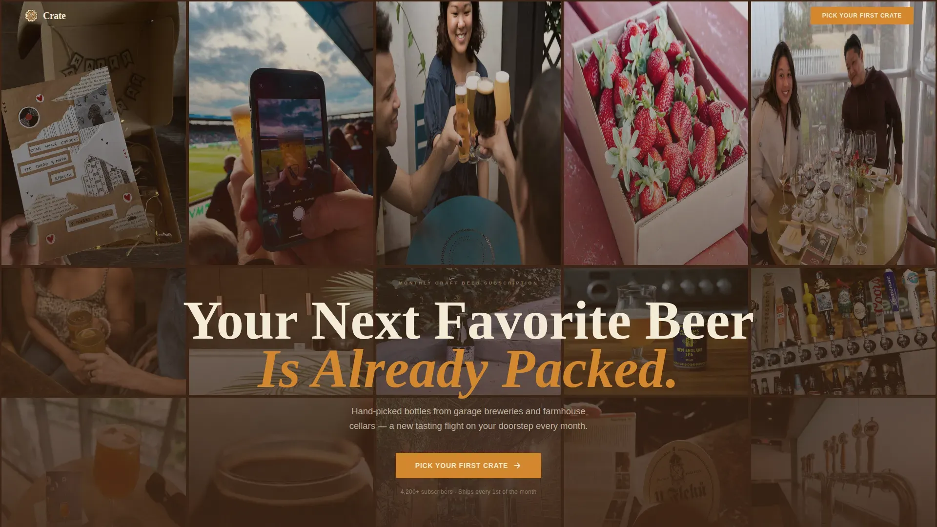
- A masonry user-generated content photo wall hero with a bold retro headline and a high-contrast sticky call-to-action button
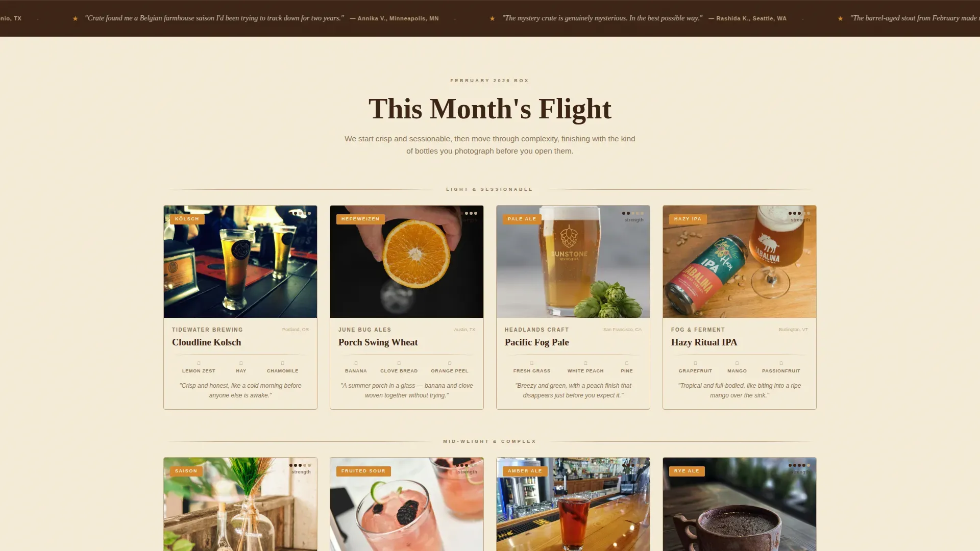
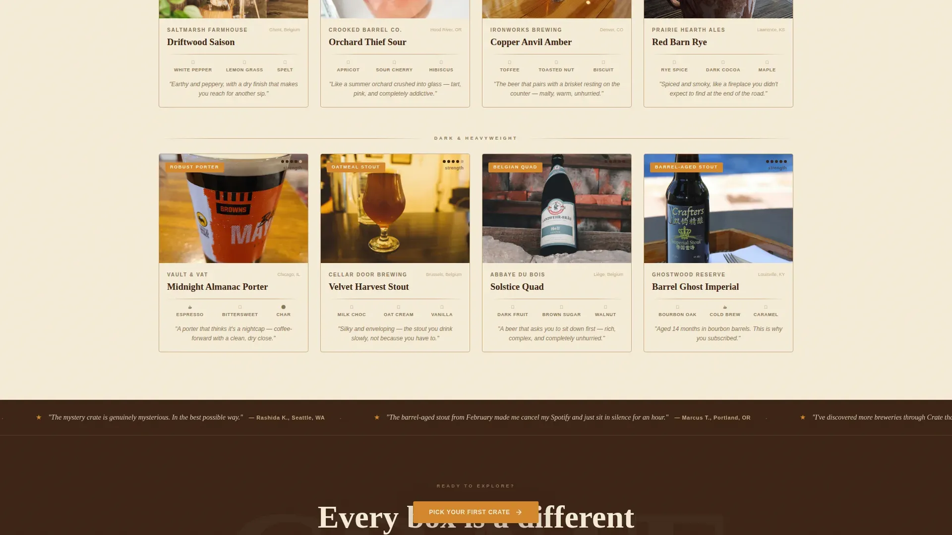
- A 12-card sensory beer card grid organized as a visual tasting flight, moving from light sessionables to dark, complex bottles
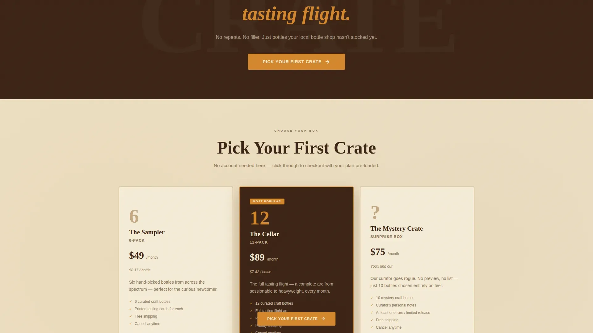
- A three-option plan selector (6-pack, 12-pack, Mystery Crate) paired with a full-width call-to-action break and a rotating testimonial ticker strip
Feature list
This template is built around six core design and conversion features, each grounded in the brief and ready to work the moment you drop in your content.
Masonry UGC Photo Wall Hero
The hero fills the viewport edge to edge with a masonry grid of warm, slightly grainy subscriber snapshots. A bold retro-set headline sits centered over the mosaic, emphasizing exclusivity and nostalgia. A high-contrast sticky call-to-action button fades in as the hero scrolls away, keeping the primary action always reachable.
Modular Sensory Beer Card Grid
Twelve beer cards are arranged across three rows, pacing the visitor's palate from crisp, light sessionables to rich, complex bottles. Each card features a close-cropped bottle shot, three illustrated aroma-note icons, and a one-line tasting sentence. The grid itself acts as a curated tasting flight, building craving row by row.
Rotating Testimonial Ticker Strip
A marquee-style ticker strip slides quietly beneath the card grid, sharing one-sentence reviews attributed to a first name and city. Testimonials showcase real subscriber voices, building authenticity around quality and the ritual of monthly unboxing. The format keeps social proof visible without interrupting the scroll.
Three-Tier Plan Selector
The plan selector presents three clear subscription options: a 6-pack, a 12-pack, and a Mystery Crate. Each tier displays its inclusions and price so visitors can compare and choose with confidence. Clicking a plan routes directly to a pre-loaded checkout with no account creation required on this page.
Full-Width Call-to-Action Interstitial
A bold, full-width "Pick Your First Crate" break appears mid-page between card rows. It resets the visitor's attention and re-states the primary action at the moment craving peaks. The section is designed to capture decision-ready visitors before they reach the plan selector.
GSAP ScrollTrigger Animations
Card reveals, hero photo parallax, and the sticky call-to-action fade-in are all driven by GSAP ScrollTrigger. Hover states fire on beer cards and plan selector options in hoppy amber. The marquee ticker runs continuously, keeping the page feeling alive without demanding interaction.
Page sections overview
| Section | Purpose |
|---|---|
| Hero Photo Wall | Fills viewport with warm subscriber photos and bold retro headline |
| Sticky Call-to-Action | Keeps primary action reachable after hero scrolls away |
| Beer Card Grid | Showcases 12 sensory beer portraits as a light-to-dark tasting flight |
| Testimonial Ticker | Shares rotating one-liner subscriber reviews with name and city |
| Full-Width call to action Break | Mid-page interstitial to recapture decision-ready visitors |
| Plan Selector | Three-tier subscription cards with prices and inclusions |
| Closing call to action | Final call-to-action paired with plan selector before footer |
| Footer | Horizontal flow pattern with links and social media references |
Design & branding system
Crate uses a Warm Stone color system that feels like a craft beer label designed in 1974 but printed yesterday. Every color, typeface, and texture choice is intentional, evoking the tactile warmth of kraft paper, letterpress ink, and a single copper foil detail catching the light. Vintage-inspired typefaces are paired with a modern, bold color palette to blend nostalgia with clarity.
- Colors: sandstone tan (#C4A882) section backgrounds, deep malt brown (#3B2314) body text and card borders, cream ale off-white (#F5ECD7) card faces, and hoppy amber (#D4872C) for buttons, badges, and hover states
- Fonts: Fraunces serif display paired with DM Sans body text, combining the warmth of letterpress with the legibility of modern sans-serif
- Visual texture: earthy tones run through every layer, from card face materials to section background treatment, reinforcing the analog, hand-crafted essence of the brand
Mobile & speed optimization
The template is designed mobile-first because the unboxing ritual lives on a phone screen. Subscribers photograph their bottles, share their haul, and discover the next crate through a 6-inch viewport. The design ensures the full sensory experience works beautifully at every screen size.
- Lazy image loading keeps the masonry photo wall and beer card grid fast on mobile connections, with GPU-accelerated transforms handling animation smoothly
- Native CSS smooth scroll and optimized GSAP animations work together so card reveals and the marquee ticker feel fluid without heavy performance cost
- The sticky call-to-action and plan selector toggle are touch-friendly by design, making it easier for mobile visitors to move from interest to checkout
How this template helps you convert
The entire page is structured as a single, deliberate journey from curiosity to checkout. Every design and copy decision reduces hesitation and builds desire. The conversion logic is layered, not accidental.
- Trust is built at the top: the UGC photo wall hero and testimonial ticker share real subscriber moments, so visitors feel the community before they read a single feature claim. The hero section features warm-toned imagery and vintage-inspired branding that signals quality immediately.
- Craving is constructed through the card grid: as visitors scroll through 12 sensory beer portraits moving from light to dark bottles, desire compounds. The aroma icons and tasting sentences do work that product lists cannot, making each bottle feel personal and worth having.
- The checkout is one clean click: the three-tier plan selector presents each subscription option with clear inclusions and price, then routes the visitor directly to a pre-loaded checkout. No account creation, no extra steps, no hesitation.
Other information about this template
This section covers additional context useful for teams evaluating the template against broader design ecosystems and marketplace options.
- The design system in this template can stand alongside other beer-focused templates in the same marketplace, making it a strong companion for brands that also need menus for bars, wine lists for restaurants, or tap lists for pubs
- Clear subscription tiers are built into the plan selector, similar to Silver and Gold membership structures recommended for beer subscription pages, so pricing and inclusions are always transparent
- The hero section is structured to support a newsletter signup element as a secondary lead-capture option, consistent with best practices for beer subscription landing pages that want to capture leads beyond direct checkout
- Trust badges for featured brewery logos and secure payment icons can be placed within the plan selector and footer sections, reinforcing confidence at the moment of decision
- The membership flexibility model, allowing subscribers to skip months or cancel, can be communicated directly within the plan selector card text
- A three-step visual guide explaining how the subscription works can be added between the hero and the beer card grid, fitting naturally into the modular section layout
- Social media links in the footer connect the brand to community lifestyle content, letting people who are not ready to subscribe follow along and share the brewery's story
- The Crate neo retro craft beer subscription landing page template is built for the brewery and beer subscription vertical, but its modular card grid design and conversion structure can adapt for different types of beverage subscription businesses with minimal restyling
- Teams exploring the broader template marketplace will find that platforms like Envato offer libraries of beer WordPress themes, plugins, and template kits for various brewery contexts, including brewery equipment pages and tap room showcase sites
- For brand identity work alongside this template, tools like Kapwing offer over 1,000 free and customizable beer logo templates, helping breweries and homebrew enthusiasts create professional-looking brand identities. Kapwing's editing tools allow customization of colors, fonts, graphics, and text, and support everything from vintage-inspired designs to modern minimalist logos, making it easier to align a brewery's visual brand before dropping assets into this template
- Users who want to explore the wider market can search thousands of templates for beer-related designs, including free and customizable beer templates suited to bars, pubs, restaurants, and craft brewery showcase pages
Theme
Neo-Retro
Creative direction
Taste & Aroma
Color system
Warm Stone
Style
Card Grid (Modular)
Direction
Click-Through
Page Sections
Masonry UGC Photo Wall Hero
Sensory Beer Card Grid
Rotating Testimonial Ticker
Three-tier Plan Selector
Full-width Call to Action Interstitial
GSAP Scrolltrigger Animations
Related questions
Can I customize the colors and fonts in this template?
Does the plan selector support flexible subscription tiers?
Is this template suitable for a brewery that also sells through bars or restaurants?
How does the testimonial ticker section work?
Can a small craft brewery just starting a subscription use this template?



