Sustainability & Green Business Professional Website Template
Cellulose is a precision-engineered landing page template for sustainable packaging studios. It pairs an engineering blueprint aesthetic with a warm unbleached paper palette to present compostable packaging innovations to CPG brand managers, DTC founders, and sustainability officers. A zigzag section layout, scrollable lifecycle comparison, and gated guide download form drive qualified lead generation.
by Rocket studio
Quick summary
Cellulose is a single-page template built for B2B sustainable packaging studios. It opens with a bold metrics wall, unfolds through alternating content sections, and closes with a gated resource download. The design reads like an annotated engineering schematic, precise, material-honest, and built to earn trust from technically demanding buyers.
Who this template is for
This template is designed for design labs and packaging studios that serve procurement-level buyers. It speaks directly to visitors who need data, not decoration, before they commit to a conversation.
- CPG brand managers and sustainability officers preparing for EU Extended Producer Responsibility (EPR) compliance deadlines
- DTC founders who need packaging that photographs well at unboxing and carries verifiable environmental credentials
- Packaging engineers or agency teams building a lead-generation page around proprietary materials science
What problem this template solves
Sustainable packaging studios often struggle to communicate technical credibility on a single page. Buyers arrive skeptical and need audited numbers, material origins, and lifecycle evidence before they reach out.
- Generic marketing layouts bury the science behind decorative imagery, eroding trust with technical buyers
- No clear content hierarchy means visitors miss the proprietary data that would convince them to download a guide or request a call
- Conversion paths are vague, leaving high-intent visitors without a structured next step tied to their specific volume or compliance need
What you get with this template
You get a fully structured, single-page layout that sequences argument and evidence the way a good technical brief does. Every section earns the next one.
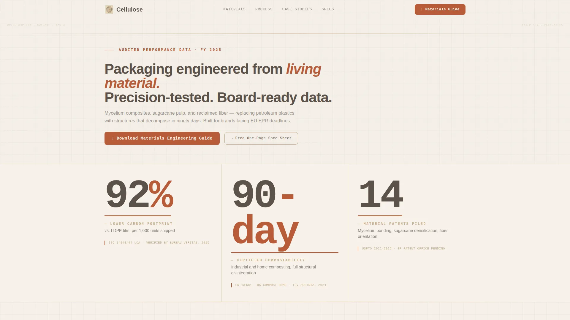
- A full-width hero metrics wall with three typographically bold statistics, terracotta underlines, and blueprint-style annotation footnotes beneath each figure
- A zigzag alternating content flow with three dedicated material sections, a full-width scrollable lifecycle comparison strip, a case study bento block, and a progressive lead-capture form module
- A closing full-width call-to-action block and a sticky side tab that appears after the second scroll section, keeping the download offer present without interrupting reading
Feature list
This template packages several purpose-built components that work together to build argument and capture leads.
Engineering Blueprint Metrics Wall
The hero section presents three headline statistics in a condensed, semi-mono typeface on a calcium white background. Each number carries a thin terracotta underline and a kraft-colored annotation line citing its test standard, so the data reads like a technical instrument readout rather than a marketing claim.
Zigzag Alternating Content Sections
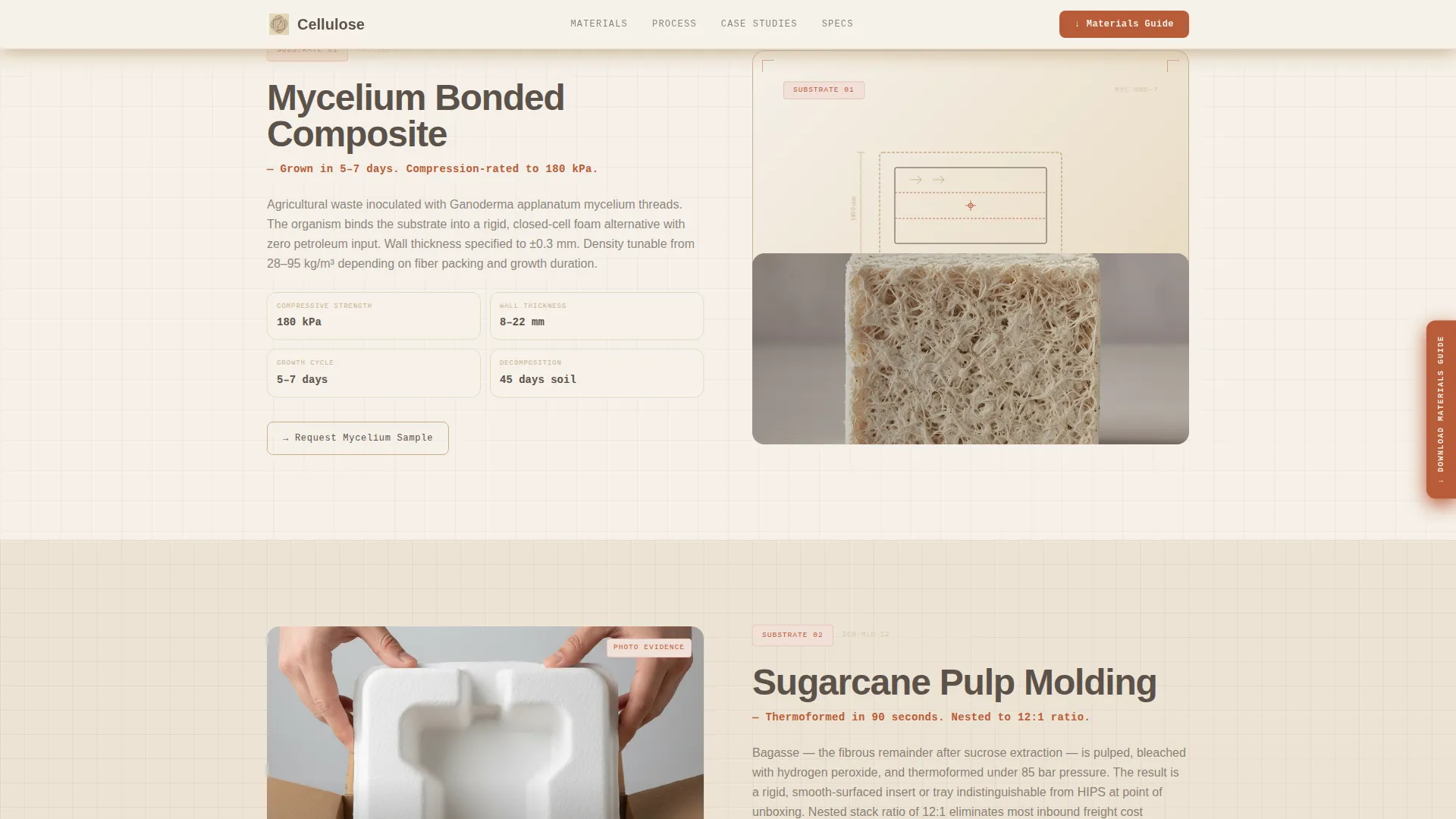
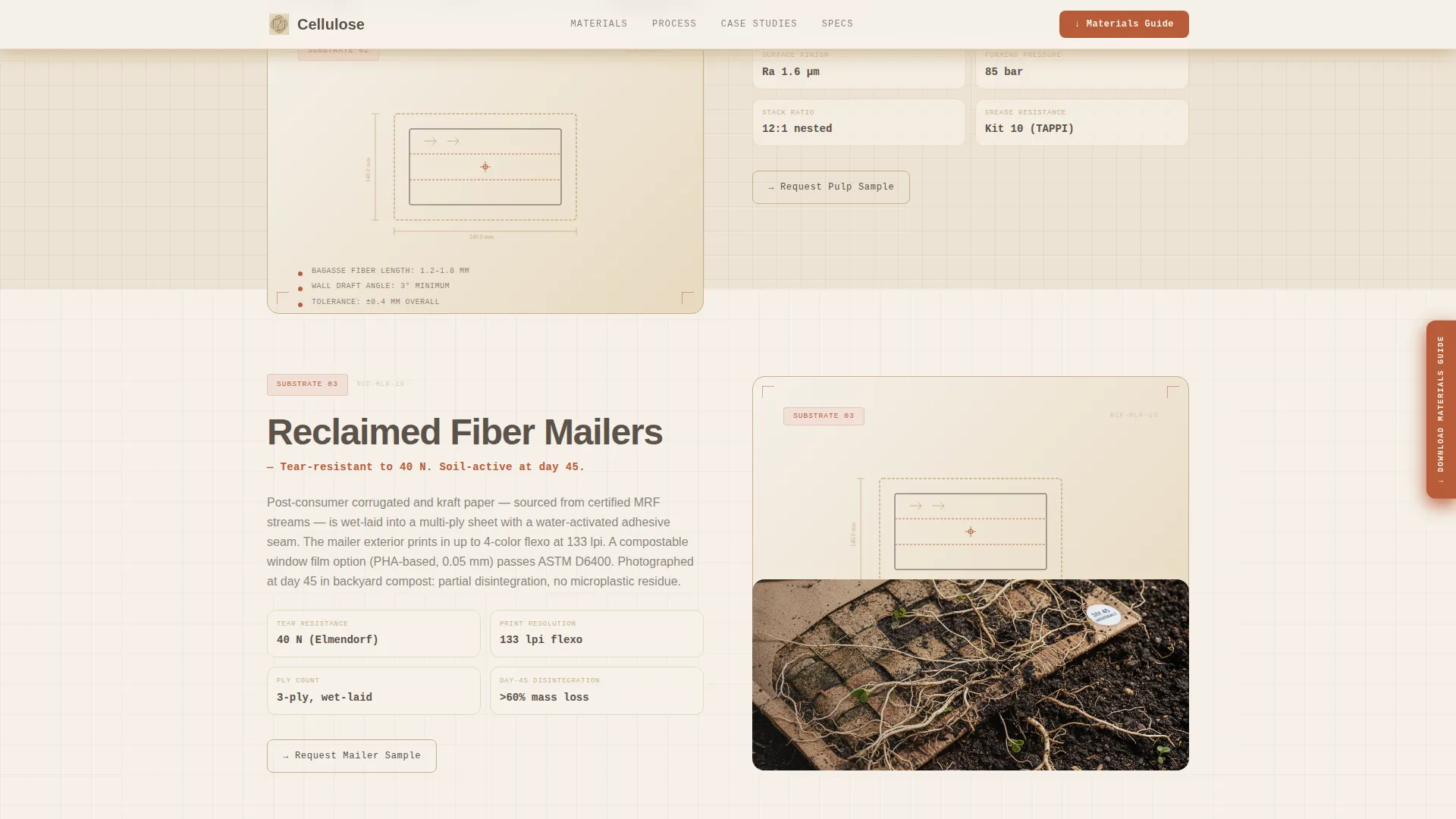
Three material innovation sections alternate between left-image and right-image layouts. Left-image panels display exploded axonometric diagrams with annotated wall thickness, fiber direction, and compression ratings. Right-image panels show in-context photography, grounding the science in physical reality.
Scrollable Lifecycle Comparison Strip
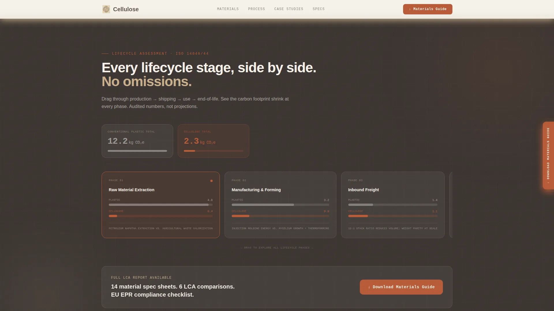
A full-width horizontal section lets visitors drag through four lifecycle phases: production, shipping, use, and end-of-life. The sustainable option's carbon footprint shrinks visibly against conventional plastic at each stage, making the environmental argument concrete and interactive.
Progressive Lead Capture Form
The inline download module reveals fields in sequence. It requests a work email first, then company name, then packaging volume tier (under 100,000 units, 100,000 to 1 million, or 1 million or more) after the email validates. This progressive reveal reduces friction while collecting the segmentation data a sales team needs.
Sticky Side Tab and Ungated Spec Sheet Path
After the second section, a sticky side tab anchors the primary call to action without blocking content. A secondary ungated path offers a one-page spec sheet PDF for lighter-intent visitors, ensuring the page captures leads at two intent levels rather than losing anyone who is not yet ready for the full guide.
Case Study Bento Layout
An asymmetric bento grid presents named brand case studies with audited tonnage and carbon numbers alongside a four-card testimonial grid with company logos and specific metrics. The layout gives social proof visual weight without disrupting the page's technical rhythm.
Page sections overview
| Section | Purpose |
|---|---|
| Hero Metrics Wall | Opens with three bold stats and annotation footnotes to establish immediate technical credibility |
| Mycelium Packaging Zigzag | Alternates diagram and in-context photo to introduce mushroom mycelium innovation |
| Sugarcane Pulp Zigzag | Flips the layout and triggers the sticky download tab after this section loads |
| Lifecycle Comparison Strip | Full-width scrollable timeline comparing sustainable packaging against conventional plastic across all phases |
| Reclaimed Fiber Zigzag | Presents reclaimed fiber mailer innovation with diagram-left, photo-right structure |
| Case Studies Bento | Audited brand results and testimonials in an asymmetric grid |
| Inline Download Module | Progressive form capturing email, company name, and packaging volume tier |
| Closing Call to Action | Full-width block repeating the Materials Engineering Guide download offer |
| Footer | Linear single-row footer closing the page |
Design & branding system
The visual language is rooted in an engineering blueprint aesthetic applied to a warm, material-honest palette. Every color choice references something physical: unbleached paper, raw stone, kiln-fired clay.
- Color system uses four values: unbleached kraft (#C8B08C) for accents and annotations, quarry shadow (#5C524A) for all body text, calciumite white (#F5F0E8) for primary backgrounds, and kiln-fired terracotta (#B85C38) reserved for data callouts, underlines, and hover states
- Backgrounds alternate between calciumite white and kraft across sections, keeping the scroll visually distinct without breaking the material palette
- Typography pairs DM Sans for body copy and interface labels with JetBrains Mono for all statistics, annotations, and numeric readouts, reinforcing the technical instrument feel throughout
Mobile & speed optimization
The template is built desktop-first, reflecting the work context of CPG brand managers and sustainability officers who review packaging decisions on wide screens. Mobile layout remains fully functional as a fallback.
- Interactive components such as the lifecycle comparison timeline and the progressive form are separated as client-side components, while static sections are built as server components to keep initial load light
- Intersection Observer drives staggered section reveals, number counter animations, and hover state transitions, so motion only activates when content enters the viewport rather than all at once
How this template helps you convert
Every structural decision in this template moves technically minded visitors toward one of two download actions.
- The sticky side tab appears after the second zigzag section, keeping the primary call to action visible for the rest of the scroll without requiring the visitor to return to the top of the page.
- The inline download module appears directly after the lifecycle comparison, the most persuasive data section, placing the form at exactly the moment a visitor's conviction is highest.
- The ungated spec sheet path captures visitors who are not ready for the full guide, ensuring that lighter-intent traffic still converts into a known contact rather than a lost session.
Other information about this template
This template is category-matched to the Agriculture and Environment sector, with a specific fit for the Sustainability and Green Business subcategory and the sustainable packaging niche.
- The intersection match score for this template's category, subcategory, and niche combination is 13, indicating a tightly aligned use case
- The spatial and architectural creative direction shapes how sections unfold, with each panel functioning like a room in a materials engineering lab rather than a conventional marketing scroll
- The lp direction is Content and Resource conversion, meaning the page is optimized to deliver enough proprietary evidence during the scroll that downloading the full guide feels like the obvious next step
- All units and compliance references use metric standards and EU regulatory context, making the template directly usable for studios operating in or selling into European markets
- The template ships with a Warm Stone color system that can be adapted by editing four core hex values, keeping rebranding straightforward for studios with their own material palette
Theme
Engineering Blueprint
Creative direction
Spatial & Architectural
Color system
Warm Stone
Style
Zigzag/Alternating
Direction
Content/Resource
Page Sections
Engineering Blueprint Metrics Wall
Zigzag Alternating Content Layout
Scrollable Lifecycle Comparison Strip
Progressive Lead Capture Form
Dual-path Conversion Architecture
Case Study Bento Grid
Related questions
Who is the primary audience this template is built for?
Can this template support two different download offers at once?
What makes the lead capture form different from a standard contact form?
Is this template suitable for a studio working with multiple packaging materials?
Does the lifecycle comparison section require any special setup?