Fence Installation Landing Page Template for São Paulo
Cerca is a split-screen landing page template built for São Paulo fence installation companies. It pairs close-up material photography with downloadable resource guides, uses a dual conversion path to capture leads at every stage, and earns trust through technical content before asking for anything. The layout is clean, direct, and built around turning informed visitors into paying clients.
by Rocket studio
Quick summary
Cerca is a single-page template designed for fence installation businesses operating in São Paulo. It combines cinematic photography, an infinite logo wall, split-screen educational sections, and two distinct conversion paths into one cohesive landing page. The design feels precise and material-forward, the way a well-installed perimeter should feel.
Who this template is for
This template is built for fence installation and perimeter security businesses that serve a mix of residential, commercial, and industrial clients. It works best for companies that want to establish credibility before asking for a quote.
- Fence contractors serving síndicos, construction site managers, and homeowners across São Paulo
- Companies offering chain-link, welded mesh, ornamental iron, and temporary hoarding solutions
- Service providers who want to generate leads through educational content rather than hard-sell copy
What problem this template solves
Most fence company pages look the same: a phone number, a price list, and stock photography. That approach does nothing to separate a skilled contractor from a weekend crew. Cerca solves the trust gap by leading with technical knowledge and visual proof.
- Visitors arrive with no context about fence types, regulations, or soil considerations and leave without converting
- Generic pages give síndicos and construction managers no reason to trust one contractor over another
- There is no structured way to capture leads at different stages of the buying decision
What you get with this template
You get a fully structured single-page layout that handles both the education and the conversion in one scroll. Every section has a clear job, and no section wastes space.
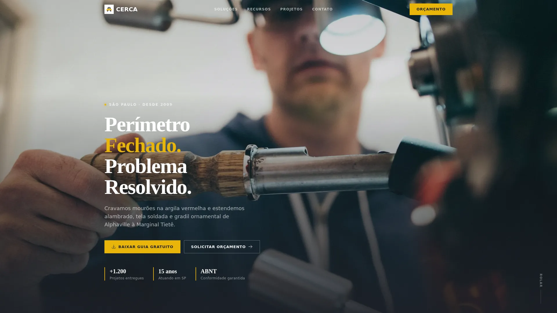
- A dusk-lit, full-bleed header with a cinematic fence photograph and a timed headline fade
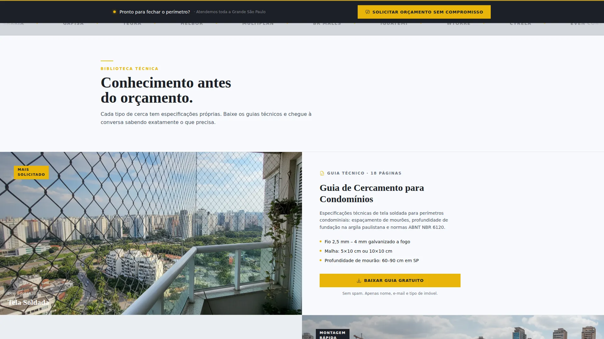
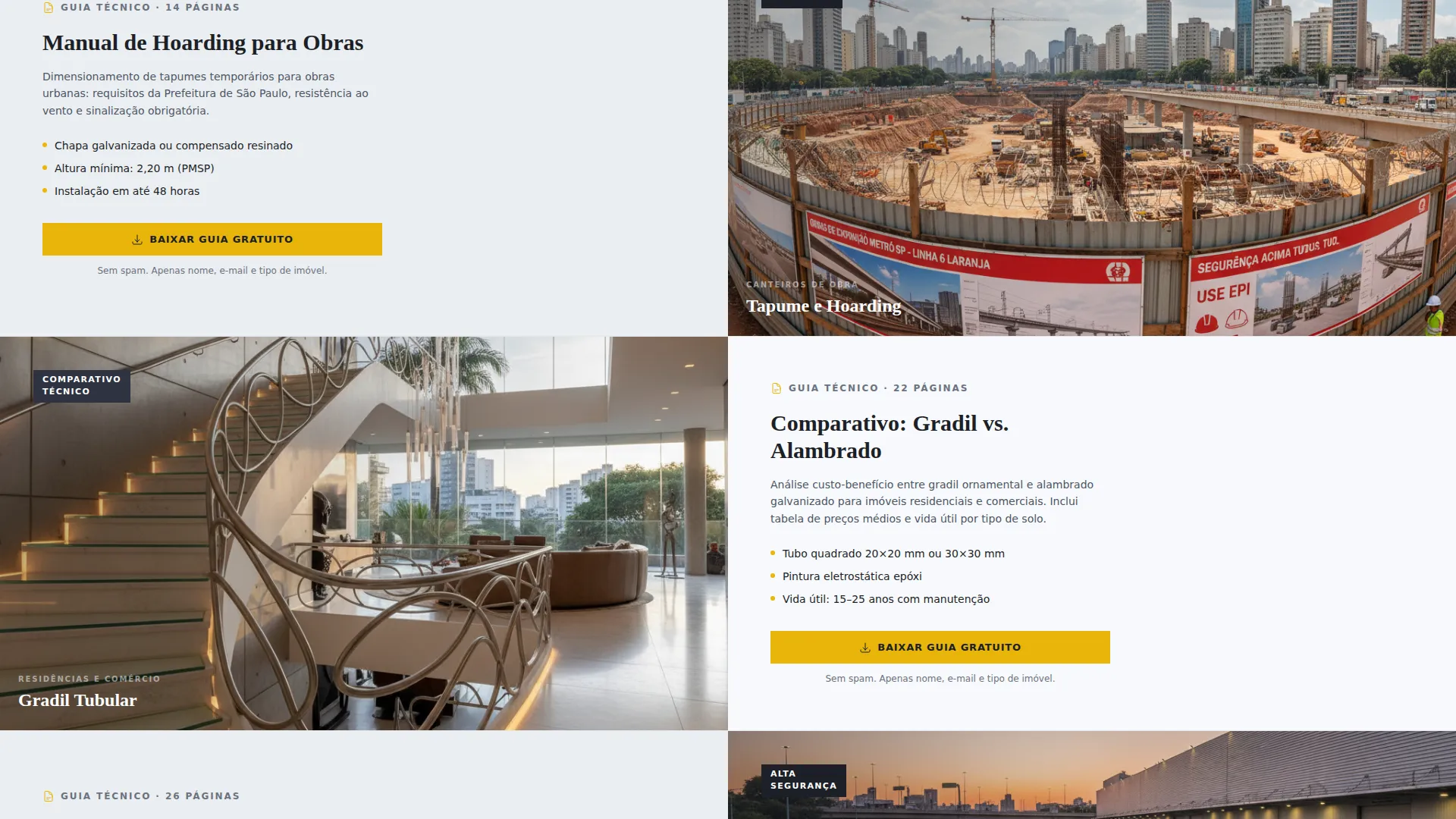
- Split-screen content sections pairing fence-type photography with downloadable PDF resource cards
- A dual conversion system: a modal lead form beside every resource card and a persistent quote-request bar at the bottom of the page
Feature list
This template is built around a set of deliberate design and conversion decisions. Each one serves a specific purpose in the visitor journey.
Cinematic Full-Bleed Header
The header uses a dusk-shot photograph taken at ground level along a fence line, with the galvanized steel catching ambient light and a single LED post lamp creating a halo effect. After two seconds of visual immersion, a stark white headline fades in. The effect is dramatic without being decorative.
Infinite Logo Wall Band
Immediately below the header, a horizontal band of client logos slides on a continuous loop against a zinc gray background. It establishes credibility before any copy is read. The logos represent condominium management companies, construction firms, and commercial clients.
Split-Screen Resource Sections
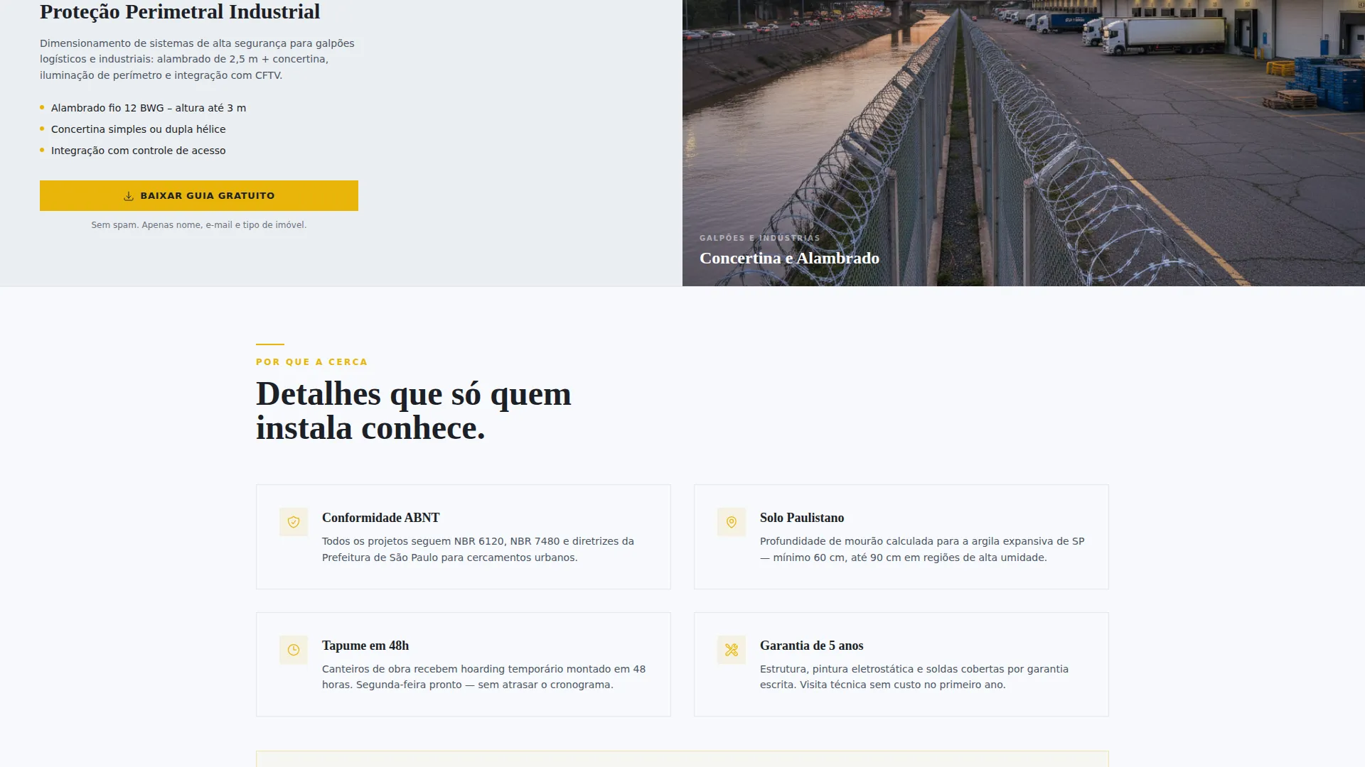
Each scroll section pairs a close-up photograph of a specific fence material on the left with a downloadable PDF guide on the right. The guides cover topics like condominium perimeter planning, construction site hoarding requirements, and a comparison between tubular steel and chain-link. The pairing teaches while it sells.
Slim Lead Capture Modal
Every resource card triggers a focused modal form with exactly three fields: name, email, and property type. Property type options include residential, commercial, construction site, and condominium. The form is intentionally minimal to reduce friction at the point of download.
Persistent Quote Request Bar
A fixed bottom bar stays visible throughout the entire scroll with a secondary call to action for visitors ready to request a quote immediately. It catches high-intent visitors who do not need the educational path before committing.
Before and After Case Study Section
The final split-screen section shows a before state of an open, unsecured lot alongside an after state of the completed perimeter with access control integration. It closes the page with concrete visual proof of the company's work.
Page sections overview
| Section | Purpose |
|---|---|
| Full-Bleed Header | Cinematic hero with timed headline fade |
| Logo Wall Band | Social proof via client logo loop |
| Welded Mesh Split | Pairs mesh photography with PDF guide |
| Concertina Split | Pairs concertina photo with PDF guide |
| Tubular Steel Split | Pairs steel photo with comparison guide |
| Wooden Slat Split | Pairs timber photo with PDF guide |
| Case Study Split | Before and after perimeter proof |
| Persistent Quote Bar | Always-on secondary conversion path |
Design & branding system
The visual identity follows a Service Utility theme built on an Arctic White color system. Every color choice is functional, not decorative, the way materials behave on a real job site.
- Arctic White (#F7F9FC) dominates the background; galvanized zinc gray (#D1D5DB) defines section dividers and secondary panels; deep charcoal (#1C1F26) anchors all body text and structural framing
- Industrial safety yellow (#E8B50A) appears only on calls to action, hover states, and key data callouts, giving it maximum contrast and click-pull
- The overall palette reads like a clean warehouse floor under fluorescent light: no warmth, no ornament, just materials doing their job
Mobile & speed optimization
The split-screen layout is designed to reflow cleanly on smaller screens without losing the pairing logic between photography and resource cards.
- Each split-screen section stacks vertically on mobile so the photograph sits above its matching resource card
- The persistent quote bar remains fixed at the bottom of the screen across all viewport sizes, keeping the secondary conversion path accessible at every scroll depth
- The slim modal form is built for thumb-friendly input with three fields and clearly labeled dropdown options for property type
How this template helps you convert
Cerca earns the conversion rather than demanding it. The page builds trust through technical content before presenting any form or call to action.
- The logo wall and dusk header establish credibility and professionalism in the first three seconds of the visit, before the visitor has read a single word of copy.
- Each split-screen section pairs real material photography with a genuinely useful PDF guide, so downloading feels like getting something valuable rather than entering a sales funnel.
- The persistent quote bar catches high-intent visitors at any point in the scroll, so the page never loses a ready buyer who does not need the full education path.
Other information about this template
Cerca is a focused single-page layout built specifically for the São Paulo fence installation market. A few additional points are worth noting for anyone evaluating this template for their business or client project.
- The template includes technical content callouts covering fence spacing considerations, post depth guidance for São Paulo's red clay soil, and notes on ABNT (Associação Brasileira de Normas Técnicas) compliance, which is the Brazilian national standards body
- The resource guide titles are written in Brazilian Portuguese ("Baixar Guia Gratuito," "Solicitar Orçamento Sem Compromisso") and are designed for a local São Paulo audience
- The page structure supports service providers targeting a range of client types from Alphaville condominiums to industrial yards along the Marginal Tietê corridor
Theme
Editorial Magazine
Creative direction
Testimonial Mosaic
Color system
Arctic White
Style
Comparison Table
Direction
Lead Generation
Page Sections
Cinematic Dusk Header with Timed Fade
Infinite Client Logo Wall
Split-screen Resource Sections
Three-field Lead Capture Modal
Persistent Quote Request Bar
Before and After Case Study Block
Related questions
What kind of business is this template designed for?
How does the lead capture modal work?
Can I replace the PDF guides with my own downloadable content?
Is the template copy written in Portuguese?
Does the persistent quote bar stay visible on mobile?



