Recruitment & Hiring Booking Website Template
Certify is a zigzag landing page built for construction training providers. It opens with a three-card Persona Selector that reshuffles page content for career-changers, individual upskill seekers, and team-training coordinators. Industrial-premium visuals, a sticky "Reserve Your Seat" call to action, and front-loaded outcome stats drive course registrations across every visitor type.
by Rocket studio
Quick summary
Certify is a single-page lead generation template designed for vocational construction training providers. It uses an interactive Persona Selector header, zigzag alternating sections, and front-loaded proof points to move three distinct visitor types toward one clear action: reserving a seat in an upcoming course cohort.
Who this template is for
This template is built for construction training businesses that need to convert multiple visitor types from one page. It speaks equally well to individual learners and organizational buyers without losing either.
- Career-changers who need a fast credentialing path after redundancy or a career pivot
- Human resources and training coordinators at general contractors who need bulk team certifications before a project deadline
- Site supervisors looking to upskill their crew for Occupational Safety and Health Administration (OSHA) compliance or scaffold certification
What problem this template solves
Most training provider pages talk to one type of visitor. Certify solves the mismatch between a diverse audience and a single static page by letting each visitor self-select their context before content even loads below the fold.
- Different visitors arrive with different urgency levels, timelines, and decision criteria
- Generic pages lose individual learners and HR buyers alike because neither feels directly addressed
- Without front-loaded outcomes, visitors scroll without converting and leave before reaching the form
What you get with this template
You get a fully structured, interactive landing page with a clear conversion funnel built in. Every section has a defined role, and the layout alternates between intimate proof and large-scale social credibility on purpose.
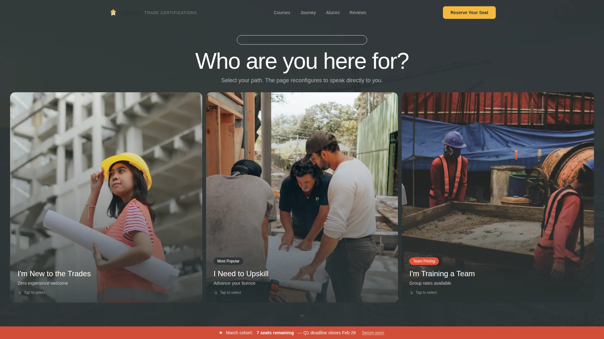
- A Persona Selector header with three identity cards that collapse and reorder page content below
- A zigzag section flow covering outcomes, graduate journey, alumni scale proof, and industry-vertical testimonials
- A two-path lead capture system with a primary "Reserve Your Seat" form and a secondary course catalog download
Feature list
This landing page template comes with several purpose-built components that work together to earn trust and capture leads from the first scroll to the last.
Interactive Persona Selector Header
Three oversized cards sit side by side over a cinematic construction photo. Each card shows a person mid-action and carries a plain-language identity label. Clicking a card collapses the other two and reshuffles the sections below to show tailored course recommendations, timelines, and proof points for that specific visitor type.
Zigzag Alternating Section Layout
Sections alternate between left-heavy and right-heavy layouts throughout the page. This rhythm intentionally moves between intimate single-story content and panoramic scale proof, keeping visitors engaged as they scroll deeper into the page.
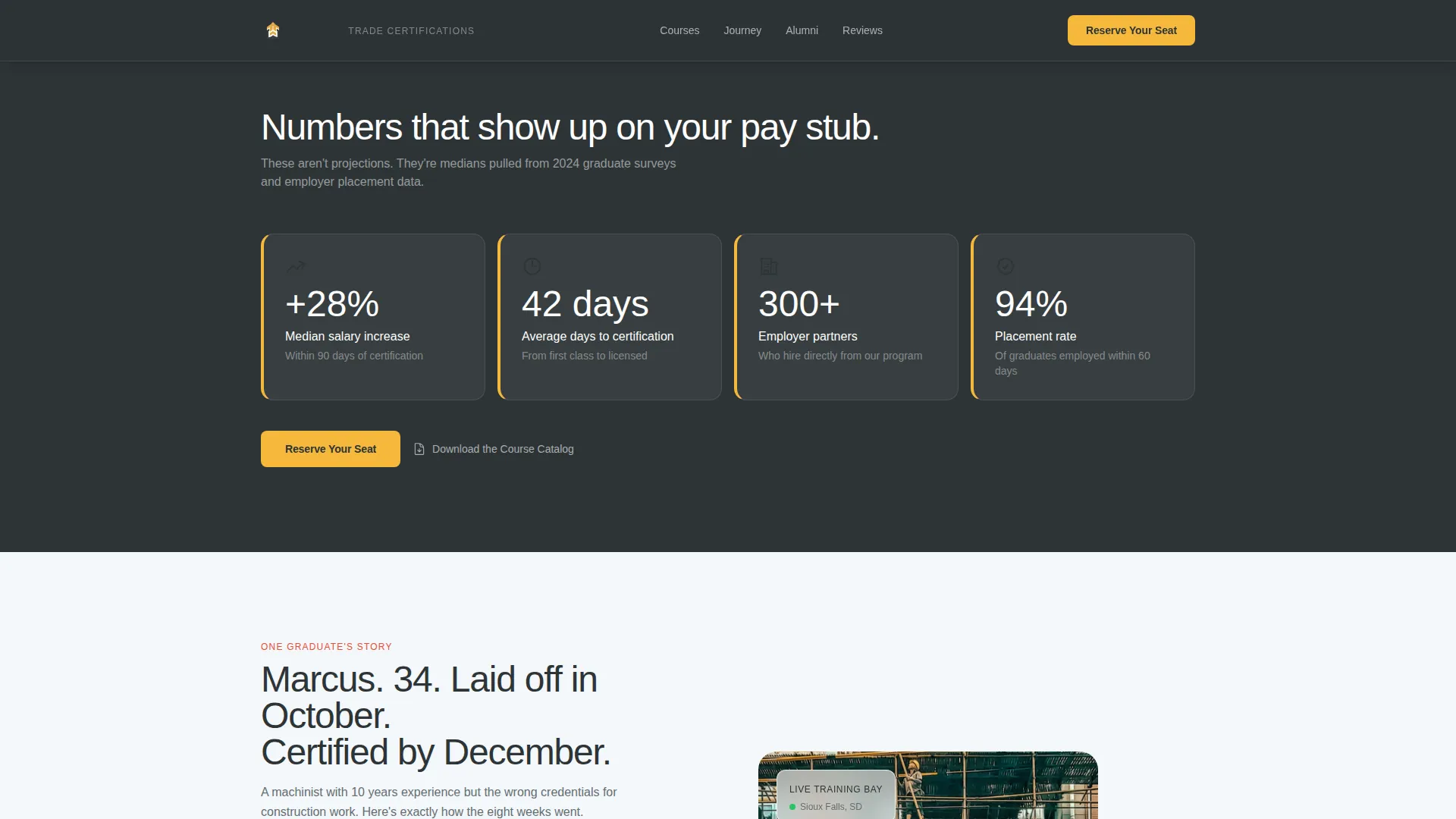
Front-Loaded Outcomes Wall
Median salary increase, days-to-certification, and employer partner count all appear before the first form field. This section anchors the value proposition early and gives every visitor a reason to keep scrolling.
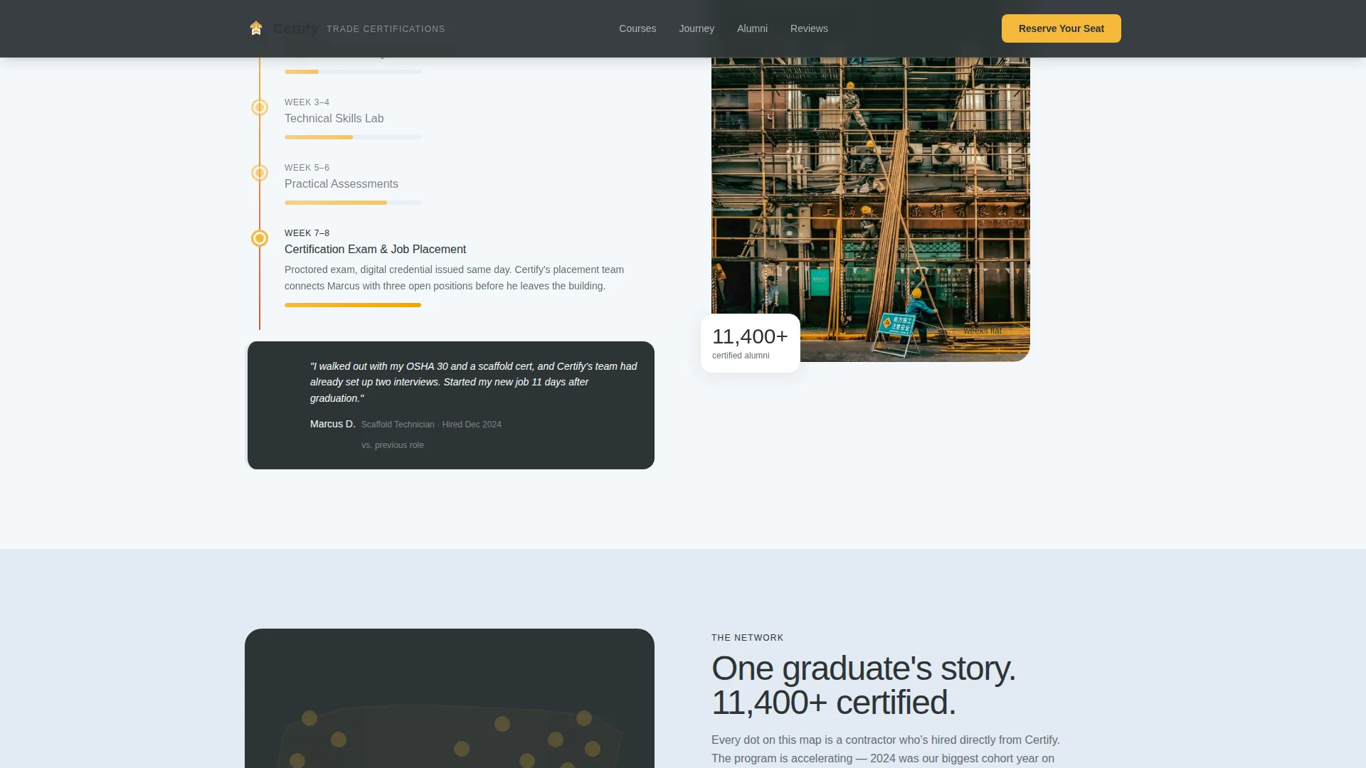
Animated Alumni Counter and Employer Grid
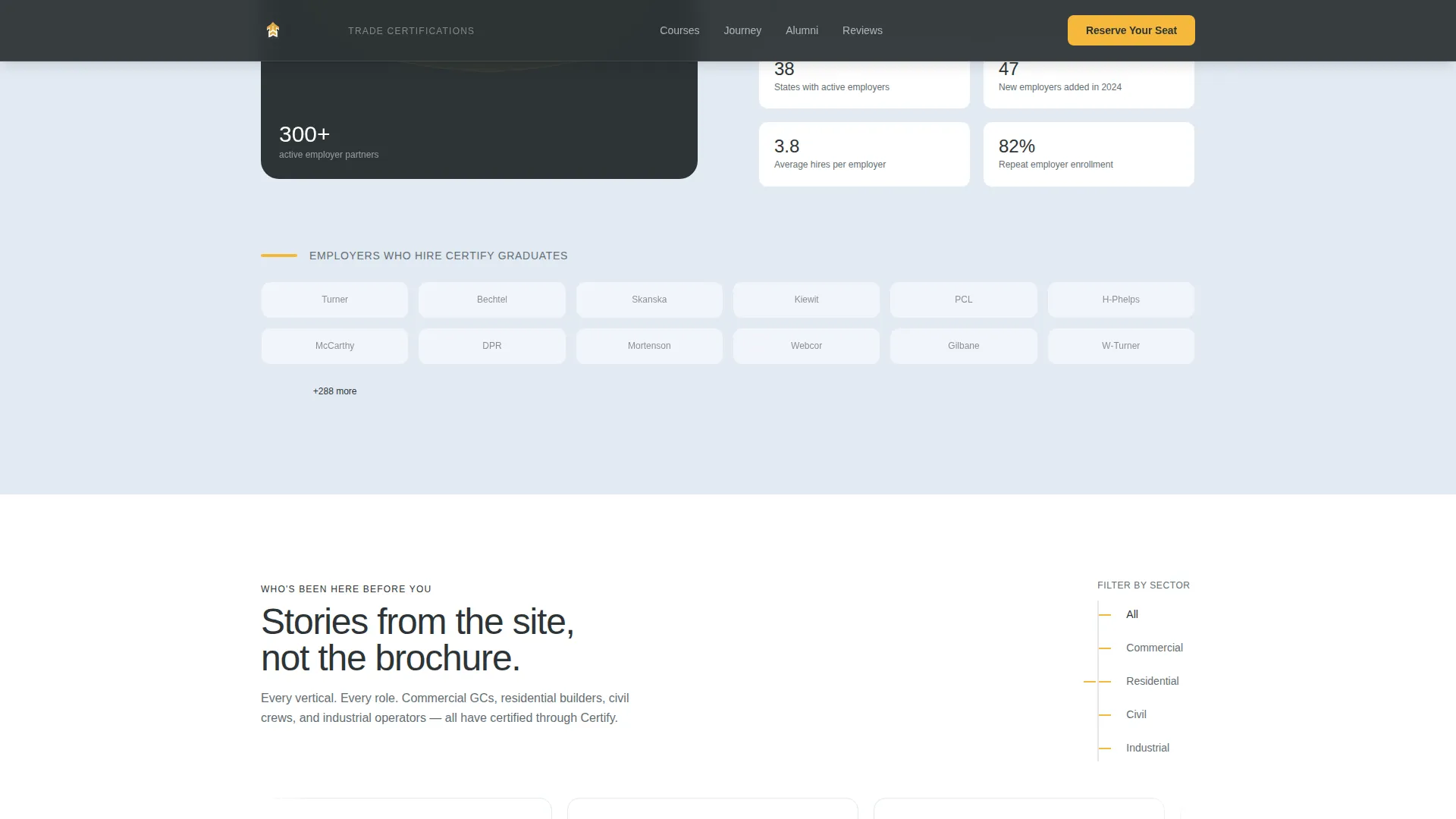
A counter ticks up to 11,400-plus certified alumni while an employer logo grid displays the 300-plus contractor partners who hire from the program. These two elements work together to signal both scale and real-world placement outcomes.
Sequential Three-Step Lead Capture Form
The "Reserve Your Seat" form collects information in three steps: persona type (pre-filled from the header selection), preferred start month via a visual calendar strip, and then name, phone, and an optional company field. Filling in the company field triggers a Team Pricing flag for the admissions team.
Secondary Catalog Download Path
A "Download the Course Catalog" option captures email-only leads who are not yet ready to commit. It offers a forty-page document covering schedules, costs, and financing options, giving hesitant visitors a lower-commitment next step.
Page sections overview
| Section | Purpose |
|---|---|
| Persona Selector Hero | Identify visitor type and reorder content below |
| Outcomes Wall | Front-load salary, timeline, and employer stats |
| Graduate Journey | Show a single trainee's eight-week path |
| Scale Proof | Display alumni counter and employer logo grid |
| Industry Testimonials | Cluster social proof by commercial, residential, civil, and industrial verticals |
| Footer | Single-row linear links and contact information |
Design & branding system
The visual identity runs on an industrial-premium aesthetic that feels like a freshly poured slab at dawn. The color system is purposeful and functional: each shade carries a specific communication role across the page.
- Open-sky white (#F4F7FA) for section backgrounds, rebar charcoal (#2D3436) for headlines and body text, and crane-boom yellow (#F6B93B) for primary accent elements including buttons, progress bars, and stat callouts
- Safety-vest orange (#E55039) is reserved exclusively for urgency cues such as seat-count warnings and deadline badges
- Typography uses DM Sans bold for headlines and Manrope for body text, with high animation including counter tick-ups, persona card collapse transitions, staggered reveals, and scroll-linked effects
Mobile & speed optimization
The template is built with a mobile-first priority, which reflects the reality that many construction industry visitors browse on job-site phones between tasks. The sticky call to action is a deliberate mobile conversion feature.
- The "Reserve Your Seat" button stays fixed on mobile screens throughout the scroll, keeping the primary conversion action always reachable
- Server Components handle static content while Client Components manage the persona logic and animated counter, separating rendering concerns for a cleaner build
- The visual calendar strip and persona card interactions are designed for touch input, not just mouse clicks
How this template helps you convert
The page is structured so that trust builds before commitment is ever asked for. Visitors encounter proof before they encounter a form, and the path to conversion is shortened at every step.
- Outcome stats appear before any form field, so visitors understand the value proposition before they are asked to act
- The Persona Selector pre-fills the first form field automatically, reducing friction and making the form feel personalized rather than generic
- Two conversion paths (seat reservation and catalog download) capture both ready-to-commit and still-researching visitors without forcing either into the wrong funnel
Other information about this template
Certify is tagged under the Human Resources and Hiring category with a Construction Human Resources subcategory, making it well-suited for providers who serve both individual and organizational buyers in the trades sector.
- The template style is Zigzag/Alternating with a Startup Velocity theme, a Cloud Canvas color system, a Network Effect creative direction, and a Persona Selector header concept
- The lead generation direction means every design decision, from sticky buttons to front-loaded stats, serves the goal of capturing qualified course inquiries
- The page is localized for the United States market, using USD pricing references, MM/DD/YYYY date formatting, and OSHA compliance language relevant to American construction sites
Theme
Startup Velocity
Creative direction
Network Effect
Color system
Cloud Canvas
Style
Zigzag/Alternating
Direction
Lead Generation
Page Sections
Interactive Persona Selector Header
Zigzag Alternating Section Flow
Front-loaded Outcomes Wall
Animated Alumni Counter and Employer Grid
Sequential Three-step Lead Form
Secondary Catalog Download Path
Related questions
Can this template handle both individual and team enrollment inquiries?
Does the Persona Selector actually change the content shown on the page?
What does the secondary conversion path offer visitors?
Is the call to action visible throughout the page on mobile devices?
Can the template display testimonials across different construction sectors?


