Expert Healthcare Training | Free Website Template | Rocket
The Rounds trusted healthcare training provider landing page template is a card grid landing page built for hospital compliance training teams. It guides nursing directors, COOs, and residency coordinators through a four-step training pathway using modular card rows, a filterable course grid, outcome dashboard cards, and a coral-accented lead capture form. Clean, clinical, and conversion-ready from the first scroll.
by Rocket studio
Quick summary
Rounds is a healthcare landing page template designed for simulation and compliance training providers serving hospitals, clinics, and health systems. It follows a step-by-step card grid layout that walks every visitor through a structured pathway: needs assessment, course selection, delivery format, and outcome review. The page is built to convert nursing directors, hospital COOs, and residency coordinators into qualified leads.
Who this template is for
This landing page is purpose-built for healthcare training businesses that sell compliance and simulation services to hospital teams. It fits organizations that need to engage multiple buyer roles with one clear, browsable page.
- Nursing directors and chief nursing officers scheduling annual competency check-offs and needing proof of completion
- Hospital COOs and Joint Commission readiness teams tracking compliance metrics across staff members
- Residency coordinators onboarding large cohorts of new physicians and managing professional development timelines
What problem this template solves
Hospital training buyers are busy healthcare professionals with overlapping priorities. A generic website page does not reflect how they think. They need to see a clear process, relevant course categories, and outcome data before they will engage with a vendor. Most medical landing page designs fail to mirror that structured decision-making style.
- Fragmented landing page layouts that bury services behind walls of text, frustrating visitors who need quick answers
- No visible pathway from training need to training solution, forcing buyers to research across multiple pages
- Weak or missing lead capture forms that lose potential patients and prospects at the moment of highest interest
What you get with this template
This template gives you a complete, single-page healthcare landing page that presents your services in a format buyers already recognize. Every section is labeled, every card is purposeful, and the lead capture experience is designed to reduce friction at every point.
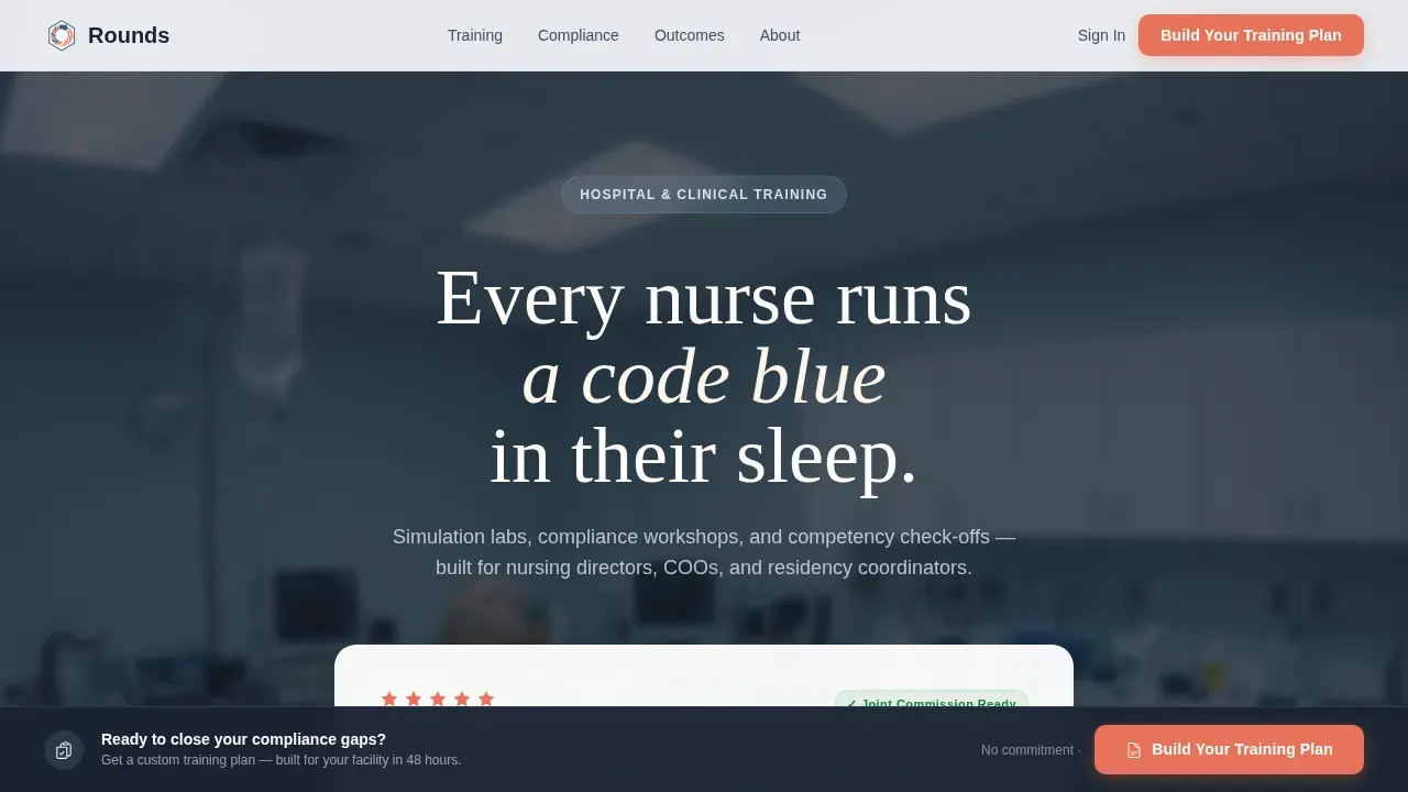
- A hero section with an oversized Chief Nursing Officer testimonial card floating over a blurred simulation lab photo, complete with a five-star competency rating badge
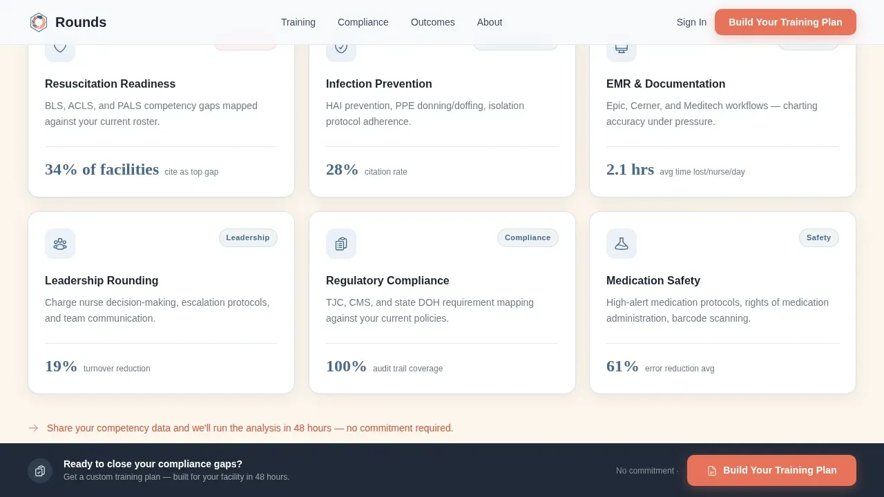
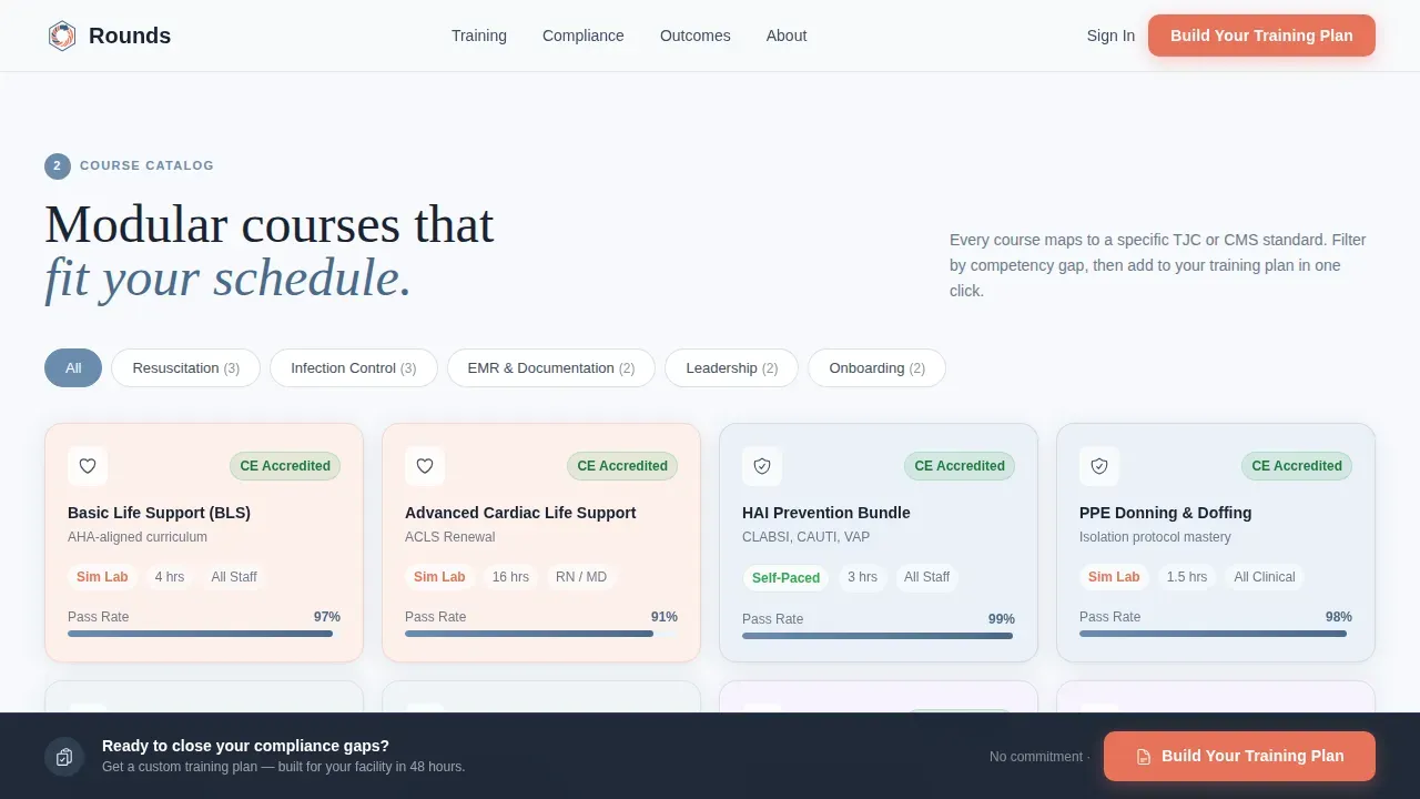
- Four modular card-row steps covering training needs assessment, a filterable course category grid, delivery format cards, and outcome dashboard cards showing pass rates and compliance percentages
- A sticky bottom bar with a coral "Build Your Training Plan" call-to-action button that appears after visitors scroll past Step 2, plus a secondary email capture for a free Joint Commission Readiness Checklist download
Feature list
This landing page template is built around six core capabilities that work together to move healthcare buyers from curiosity to commitment.
Hero Testimonial Card Section
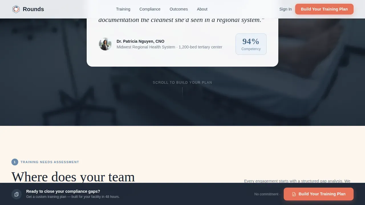
The page opens with an oversized testimonial card centered on the viewport. A Chief Nursing Officer quote anchors the card, with her name and hospital system displayed in small type beneath. A five-star competency rating badge sits in the corner. Behind the card, a softly blurred photo of a simulation mannequin mid-scenario bleeds to the page edges, giving the hero section the visual weight of a proven, trusted healthcare training provider.
Four-Step Modular Card Grid
The page body is organized into four sequential card-row steps. Step 1 presents training needs assessment cards. Step 2 displays a filterable course category grid covering Basic Life Support (BLS), infection control, Electronic Medical Records (EMR) onboarding, and leadership rounding. Step 3 shows delivery format cards for on-site simulation lab, virtual instructor-led training, and self-paced learning management system (LMS) access. Step 4 presents outcome dashboard cards with pass rates, compliance percentages, and Joint Commission readiness indicators.
Filterable Course Category Grid
Step 2 uses a filterable grid so visitors can narrow down course categories by topic. This interactivity helps healthcare providers and training coordinators quickly determine which services apply to their facility. It reduces scroll fatigue and keeps the user focused on relevant offerings rather than scanning an unfiltered list.
Sticky Lead Capture Bar with Progressive Form
After visitors scroll past Step 2, a sticky bottom bar appears with a clear call to action button in pulse-point coral. Clicking it opens a short progressive form that collects facility type, number of staff members to train, top compliance gap from a checkbox list, and a work email address. A secondary path lets visitors download a free resource by entering only their email, capturing leads who are not yet ready for a full consultation.
Shelf-Reveal Scroll Animations
Each step row animates into view as the visitor scrolls, with staggered card entries that give the page the rhythm of a clinical catalog. The animation style is medium-intensity: noticeable enough to guide attention, restrained enough to keep the page feeling professional and calm.
Cloud Canvas Color and Typography System
The page uses a four-color Cloud Canvas palette: soft clinical white (#F7F9FC), muted scrub blue (#6B8CAE), warm chart-paper cream (#FDF6EC), and pulse-point coral (#E8735A). Coral appears only on interactive elements such as call to action buttons and hover states. Fraunces serif handles headlines while DM Sans covers body copy and user interface labels, creating a clean contrast between authority and readability.
Page sections overview
| Section | Purpose |
|---|---|
| Hero Testimonial Card | Establish trust with a CNO quote, five-star badge, and simulation lab backdrop |
| Step 1 Assessment Cards | Present training needs assessment options as a modular card row |
| Step 2 Course Grid | Display filterable course categories for BLS, infection control, EMR, and leadership |
| Step 3 Delivery Formats | Show on-site, virtual, and self-paced training format cards |
| Step 4 Outcome Dashboards | Present pass rate and compliance percentage outcome cards |
| Sticky call to action Bar | Surface the "Build Your Training Plan" coral button after Step 2 scroll |
| Lead Gen Form Modal | Collect facility type, staff count, compliance gap, and work email |
| PDF Download Capture | Capture early-stage leads with a free Joint Commission Readiness Checklist |
| Footer Row | Single-row linear footer with contact and navigation links |
Design & branding system
The visual identity follows a Directory and Discovery theme. The design feels like a well-organized supply room: every card is labeled, every section is within reach, and nothing is buried. Calming colors, including the scrub blue, foster the feelings of trust and health that healthcare buyers expect from a compliance-focused site.
- Four-color Cloud Canvas palette with coral reserved exclusively for calls to action and hover states, keeping interactive moments visually distinct
- Fraunces serif for headlines paired with DM Sans for body and user interface text, producing a confident, readable hierarchy
- Cards float with subtle scrub-blue borders and shallow shadows, high quality images support the hero and course sections, and graphic elements stay minimal to avoid overwhelming users
Mobile & speed optimization
While the template is desktop-first for hospital administrators at workstations, it delivers solid performance on tablets for coordinators who access the page on the go. Mobile optimization ensures that no lead is lost because of a poor experience on smaller screens.
- Responsive layout that adapts card grids and sticky call to action bar for tablet and mobile devices, keeping the lead capture form accessible on any screen size
- User-friendly mobile lead capture form that collects the most important information: facility type, staff count, compliance gap, and work email, without requiring excessive scrolling on mobile devices
How this template helps you convert
A healthcare landing page converts best when it mirrors the buyer's decision process. This template is structured to do exactly that, moving each visitor from awareness to action through a natural, guided sequence.
- The hero testimonial card establishes immediate credibility with a real CNO voice and a five-star badge, giving visitors the trust signal they need before they read another word, so the clear call to action that follows feels earned rather than premature.
- The four-step card grid walks buyers through the same mental pathway they use internally when planning compliance training, which means visitors self-qualify as they scroll and arrive at the lead form already confident in the fit.
- The two-path lead capture system, a full progressive form for ready buyers and a free PDF download for earlier-stage visitors, ensures that every visitor has a desired action that matches where they are in their decision process, maximizing lead volume without pressuring anyone.
Other information about this template
This section covers additional context relevant to healthcare training landing pages and how this template fits within broader best practices for the medical field.
- A healthcare landing page is a dedicated web page built specifically for the healthcare industry to convert visitors into leads or patients. This template follows that definition precisely, with every section serving lead generation rather than general brand awareness.
- The average conversion rate for healthcare landing pages sits around 3.2%, but top performers reach as high as 21.1%. The two-path lead capture approach in this template is designed to push results toward that higher range by reducing friction for both ready and early-stage visitors.
- Healthcare landing page templates simplify the process of creating engaging pages. Using templates helps medical practices quickly build landing pages tailored to specific services and treatments without starting from scratch.
- Accurate, transparent information about services, learning outcomes, and compliance metrics fosters trust among potential patients and prospective buyers. The outcome dashboard cards in Step 4 are designed to surface exactly that kind of important information.
- The best medical landing page examples, including well-known healthcare landing pages from clinics and private hospitals, share common traits: a compelling headline, engaging content, a prominent call-to-action, and trust signals such as testimonials and certifications. This template includes all of those elements by design.
- Effective healthcare landing pages require consistency between the page and any marketing campaigns, social media posts, or ad campaigns that drive traffic to the site. The Cloud Canvas color system and clean typography make it straightforward to match this page to broader marketing materials.
- In 2026, the focus for landing pages is on a mobile-first, minimalistic design that uses calming visuals and compliant technology. This template's restrained palette, whitespace-led layout, and responsive card grid align with that direction.
- The integration of a filterable course grid alongside a progressive lead form reflects current best practices for engaging healthcare professionals who need to determine fit quickly before committing to a conversation.
- Implementing a landing page that includes a Joint Commission Readiness Checklist download gives you a practical tool to drive traffic from search engines and support nurture sequences for leads who are not yet ready to book.
- The rounds trusted healthcare training provider landing page template is one of the few landing page templates built specifically around hospital compliance workflows, making it a practical starting point for any healthcare training business entering or growing in this market.
Theme
Directory & Discovery
Creative direction
Step-by-Step Guide
Color system
Cloud Canvas
Style
Card Grid (Modular)
Direction
Lead Generation
Page Sections
Hero Testimonial Card with Simulation Backdrop
Four-step Modular Card Grid Layout
Filterable Course Category Grid
Sticky Bottom Call to Action Bar
Two-path Progressive Lead Capture
Cloud Canvas Color and Typography System
Related questions
Who is this landing page template best suited for?
Can I customize the course categories in the filterable grid?
Does this template include both a full lead form and a simpler email capture?
Is this a single-page landing page or a multi-page website?
How does the sticky call to action bar appear during scrolling?


