Government Training | Free Website Template | Rocket
A sidebar companion landing page built for government and public sector training providers. It leads with bold statistics, guides visitors through a structured evidence wall, and closes with a targeted lead generation form. The layout is desktop-first, warm in tone, and designed for HR coordinators, department heads, and contracting officers who need real proof before they commit.
by Rocket studio
Quick summary
This landing page template is built for a public sector training firm that serves city halls, federal bureaus, and tribal offices. It opens with a quiet row of agency logos, then builds a cumulative case through bold statistics and named social proof. A persistent sidebar keeps the next step visible at every scroll point, and the lead form qualifies urgency without feeling intrusive.
Who this template is for
This template is made for government and public sector training providers who sell Business-to-Government (B2G) services. Your buyers are professionals inside public agencies, not consumer shoppers, and this layout speaks their language from the first scroll.
- HR and Training Coordinators at state agencies tracking mandatory training hours and completion records
- Department Heads at municipal governments preparing staff for new legislation or policy changes
- Contracting Officers at federal bureaus who need continuing education credits before fiscal year close
What problem this template solves
Government training buyers are skeptical by profession. They need procurement-ready credibility, completion data, and peer proof before a single form gets filled out. Most landing pages fail them by leading with marketing language instead of measurable evidence.
- Procurement-cautious audiences ignore vague claims but respond to specific statistics and named agency references
- HR coordinators and contracting officers work on strict annual calendars and need to see that a vendor understands deadline pressure
- Without a visible, always-present call to action, busy public servants close the tab before they find the form
What you get with this template
You get a fully structured, single-page layout with a persistent sidebar, five content sections, and a dual-path lead generation system. Every section is ordered to build confidence before asking for anything.
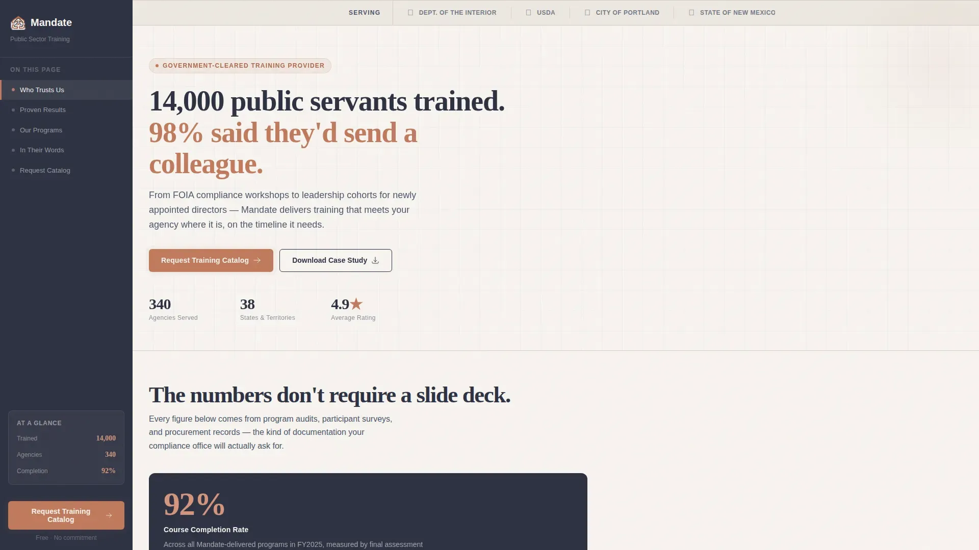
- A sticky sidebar with scroll-linked navigation anchors and a persistent "Request a Training Catalog" call to action in terracotta
- A Stats-First Impact content flow where every section opens with a bold, typographically large statistic before any explanatory copy
- A lead generation form that collects agency name, role, work email, and an optional compliance deadline field, plus a secondary gated PDF download path
Feature list
This template is built around six purposeful components drawn directly from the project brief.
Agency Logo Bar Header
A clean, horizontal band displays the seals and wordmarks of served agencies at the very top of the page. There is no animation or carousel. The row communicates procurement clearance and institutional trust before the visitor reads a single word.
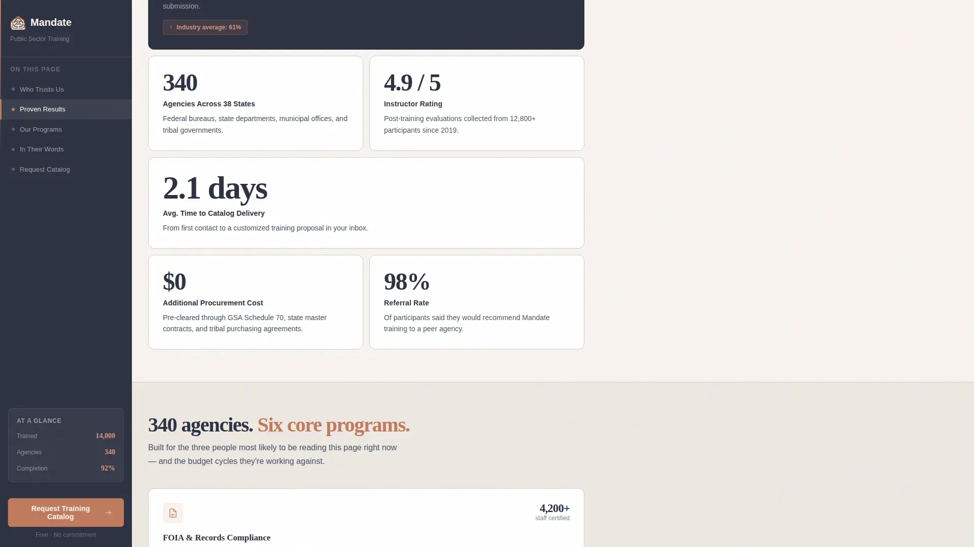
Stats-First Evidence Wall
Each content section opens with a large, typographically bold statistic. The rhythm is deliberate and cumulative. Metrics like a 92% course completion rate versus a 61% industry average, and 340 agencies across 38 states, are presented before any explanatory paragraph follows.
Persistent Sidebar with Scroll Tracking
The sidebar sits in deep charcoal and travels with the visitor throughout the page. It holds navigation anchors that highlight the active section as the user scrolls, and it keeps the primary call to action visible without interrupting the reading flow.
Dual-Path Lead Generation System
The primary path is a catalog request form that asks for agency name, role from a dropdown, work email, and an optional compliance deadline field. The secondary path offers a downloadable PDF case study gated behind just an email address, capturing visitors who need internal approval before committing.
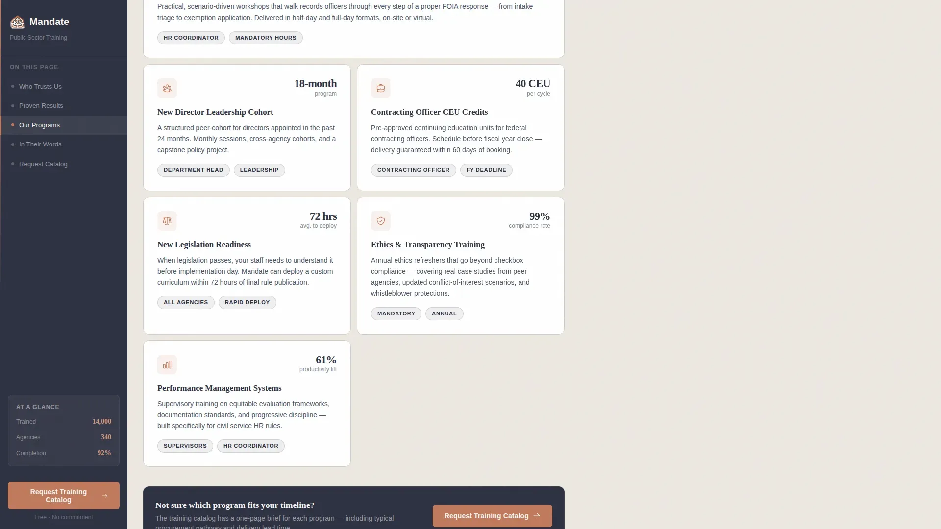
ICP-Specific "Who We Serve" Section
A dedicated section presents training catalog overviews with callout blocks tailored to each audience type. HR coordinators, department heads, and contracting officers each see language and proof points that match their specific role and urgency.
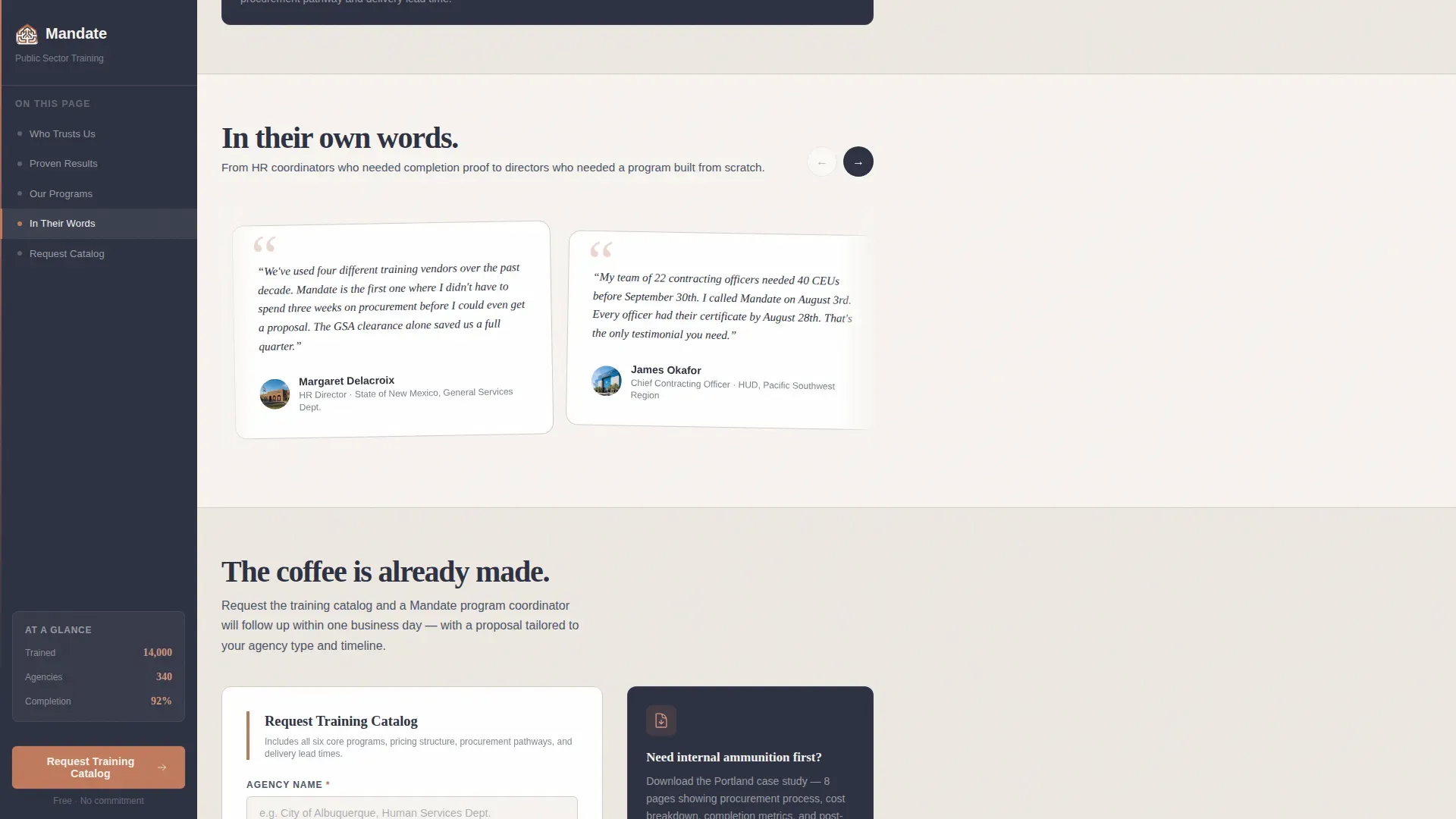
Named Social Proof Cards
Rotating testimonial cards display quotes from named agency representatives with their title and agency shown. This format gives procurement-minded buyers the peer validation they need and reinforces the specificity of the statistics shown earlier in the page.
Page sections overview
| Section | Purpose |
|---|---|
| Agency Logo Bar | Establish procurement trust instantly |
| Stats-First Hero | Lead with hard evidence before pitch |
| Evidence Wall Grid | Build cumulative metric credibility |
| Who We Serve | Match content to each buyer role |
| Mid-Page Form call to action | Capture leads at peak engagement |
| Social Proof Cards | Validate with named agency voices |
| Catalog Request Form | Primary lead generation conversion |
| PDF Download Gate | Secondary path for internal champions |
| Footer Row | Navigation and minimal legal links |
Design & branding system
The visual identity follows a Community Hearth theme using a Cloud Canvas color system. The palette feels like a well-maintained civic building that has been thoughtfully renovated, original character preserved, lighting made warmer.
- Colors: soft warm white (#F7F4F0) for the main content field, steady slate (#4A5568) for body text and navigation, muted terracotta (#C07A5C) for buttons and callout borders, and deep charcoal (#2D3142) for headlines and the sidebar background
- Typography: Fraunces serif for headlines to carry warm authority, Manrope sans-serif for body text to maintain clarity and competence across longer reading sections
Mobile & speed optimization
The template is built desktop-first because government workers primarily engage from office desks, and the sidebar companion layout requires that horizontal real estate. A responsive mobile fallback is included so the page remains usable on smaller screens.
- The sidebar collapses gracefully on mobile so navigation anchors and the call to action remain accessible without overlapping content
- Static sections use server-rendered components for fast initial load, while the sidebar scroll tracker and lead form are handled client-side for interactive accuracy
How this template helps you convert
The page is structured so each scroll rewards the visitor with more specific evidence, moving them naturally toward the form.
- The Stats-First layout frontloads credibility. Visitors see hard numbers before they read a single marketing claim, which reduces skepticism early and keeps procurement-minded buyers engaged through the full page.
- The persistent sidebar removes friction at the moment of decision. The "Request a Training Catalog" button in terracotta is always one glance away, so there is no need to scroll back to the top when a visitor is ready to act.
- The optional compliance deadline field in the form does two jobs at once. It signals that the firm understands government budget calendars, and it helps qualify which leads carry the most immediate urgency.
Other information about this template
This template is a strong fit for training providers who operate in the Business-to-Government space and need a page that earns trust before it asks for anything. A few additional details worth noting:
- The creative direction is labeled Stats-First Impact, meaning the visual hierarchy and section rhythm are explicitly designed to prioritize metrics over marketing language throughout the entire scroll
- The header concept is a Logo Bar, a static row of agency seals and wordmarks designed to communicate existing procurement relationships at a glance
- The template style is Sidebar Companion, which refers to the persistent left-hand panel that tracks reading progress and keeps the primary call to action visible without modal interruptions or pop-up overlays
- The lead generation direction supports two distinct conversion paths so visitors at different stages of internal approval can both be captured in a single page visit
- Animation is set to medium intensity with clipIn reveals on statistics and fadeUp transitions between sections, creating a measured, courtroom-style cadence rather than an energetic marketing feel
- The footer follows a Linear Single-Row pattern, keeping the bottom of the page clean and uncluttered
Theme
Community Hearth
Creative direction
Stats-First Impact
Color system
Cloud Canvas
Style
Sidebar Companion
Direction
Lead Generation
Page Sections
Agency Logo Bar Header
Stats-first Evidence Wall
Persistent Sidebar with Scroll Tracking
Dual-path Lead Generation
Icp-specific Who We Serve Section
Named Social Proof Cards
Related questions
Who is this landing page template designed for?
What makes the sidebar layout useful for this audience?
Can the lead form capture different types of buyers at once?
What is the secondary conversion path on this page?
Is this template suitable for a training firm just entering the government market?


