LEED Consultant Landing Page Template
Certify is a masonry-layout landing page built for Leadership in Energy and Environmental Design (LEED) consulting practices. It pairs a cinematic scroll narrative with a dark, geometric visual identity to turn complex sustainability credentials into a compelling lead generation engine. The "Check Your Credit Gap" scorecard form and a gated LEED-readiness checklist capture both ready-to-talk prospects and early-funnel visitors.
by Rocket studio
Quick summary
Certify is a single-page lead generation template for LEED consulting practices. It uses a masonry grid layout, a dark void-and-violet color system, and a cinematic scroll sequence to guide commercial developers, architecture firms, and campus facility directors toward a credit-gap diagnostic form. The page is desktop-first with full mobile support.
Who this template is for
This template is built for sustainability consultants and LEED advisory practices that serve a business-to-business (B2B) audience. If your work translates complex building documentation into reviewer-approved certification language, this page is designed to represent that expertise with confidence.
- Project managers at mid-size commercial developers tackling their first LEED attempt
- Architecture firms that want a clear sustainability differentiator in competitive proposals
- Campus facility directors working under board mandates to reach net-zero targets by 2030
What problem this template solves
Most LEED consulting practices look indistinguishable online. Their pages bury the real value proposition under generic sustainability stock photos and vague mission statements. Prospective clients arrive uncertain whether the consultant truly understands the credit-by-credit grind or is just another green-branding firm.
- Rejected submissions and misunderstood credits waste real money and schedule time
- Project owners cannot easily tell which consultants have genuine documentation depth
- Early-funnel visitors leave without a low-friction way to self-qualify their project
What you get with this template
You get a complete, structured landing page ready to represent a LEED consulting practice from first scroll to form submission. Every section is pre-built and content-directed, so you spend time customizing rather than rebuilding from scratch.
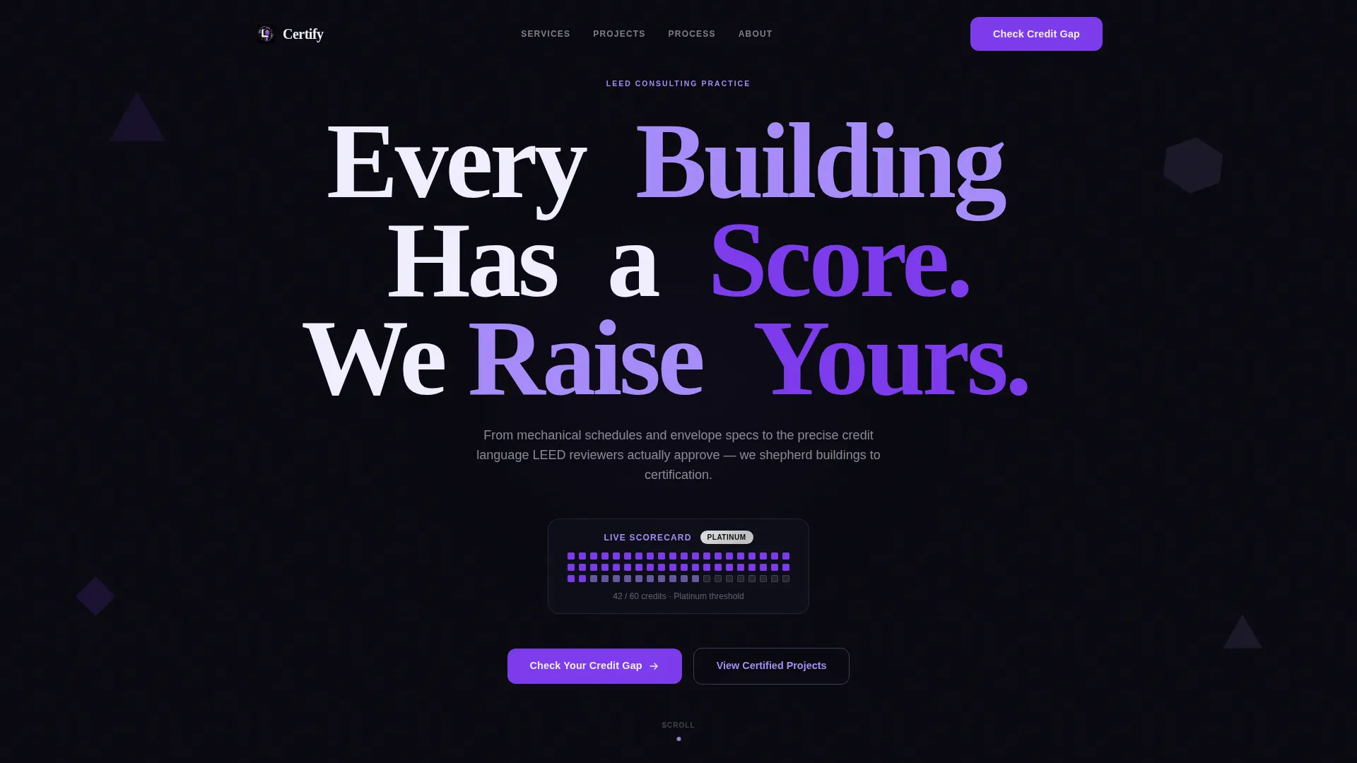
- A giant centered hero headline with a scroll-linked violet-to-iris hue shift on the letterforms
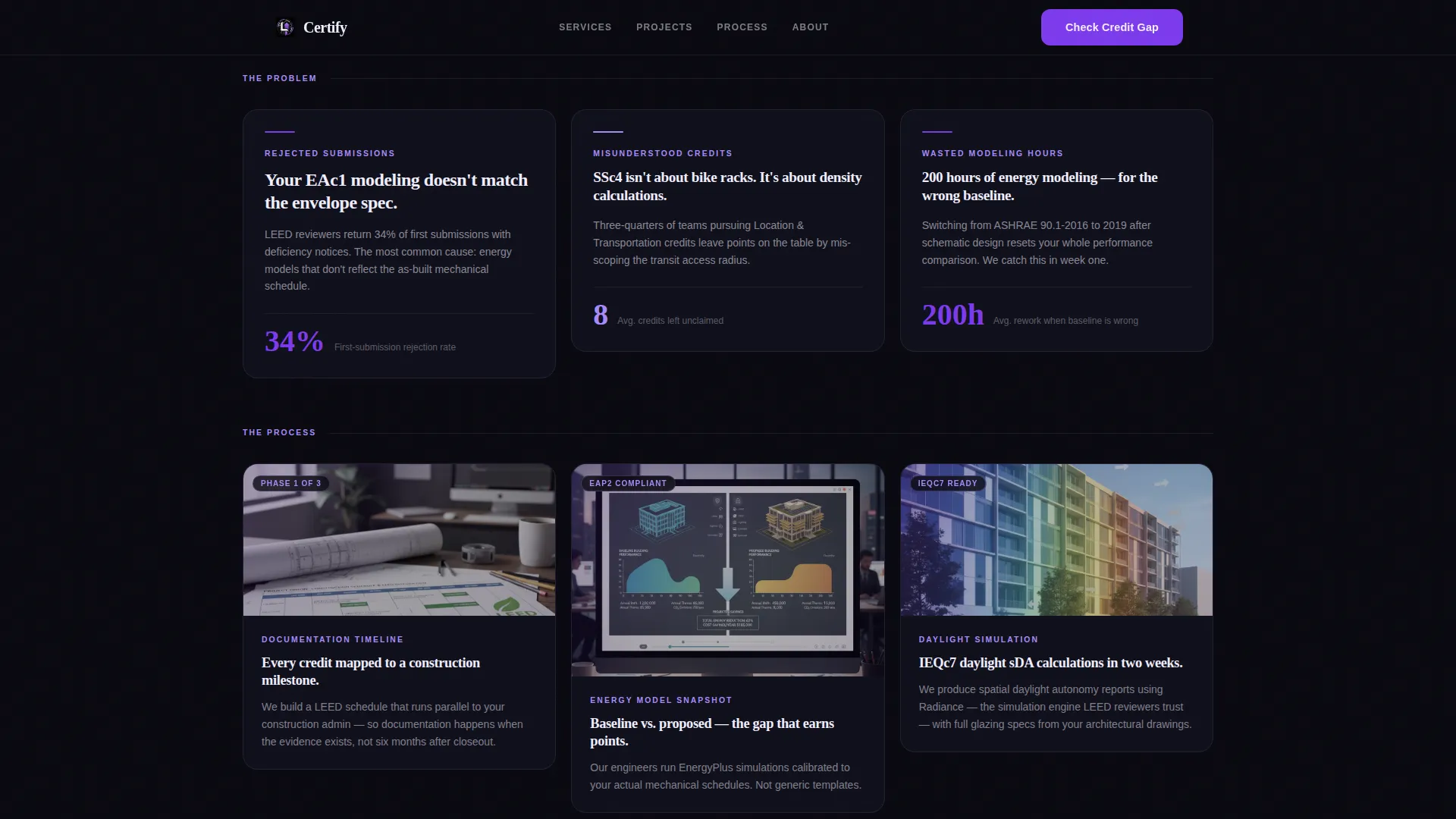
- A three-row masonry grid covering problems, process documentation, and completed project results
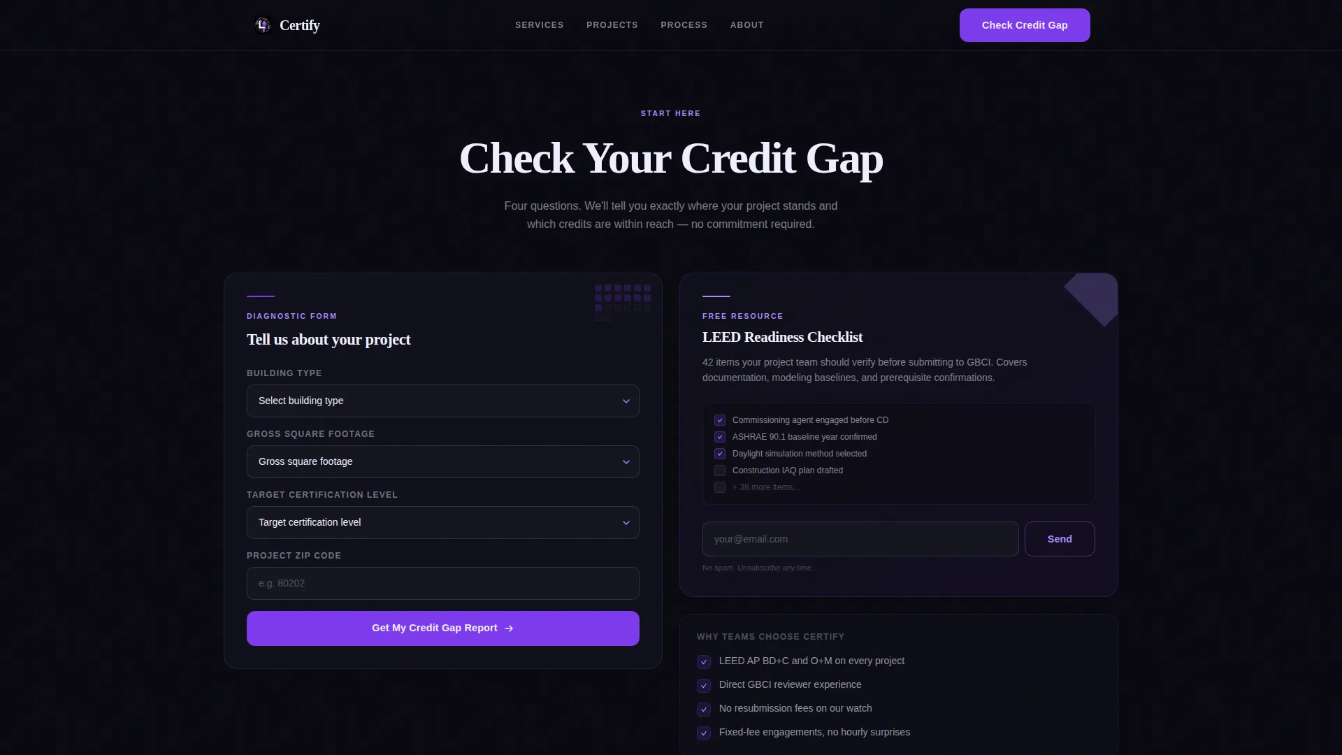
- A dual conversion section with a scorecard-style lead form and a gated LEED-readiness checklist download
Feature list
This template ships with purpose-built components designed specifically for a LEED consulting context. Each feature serves the page's core goal: turning informed visitors into qualified leads.
Cinematic Masonry Grid Layout
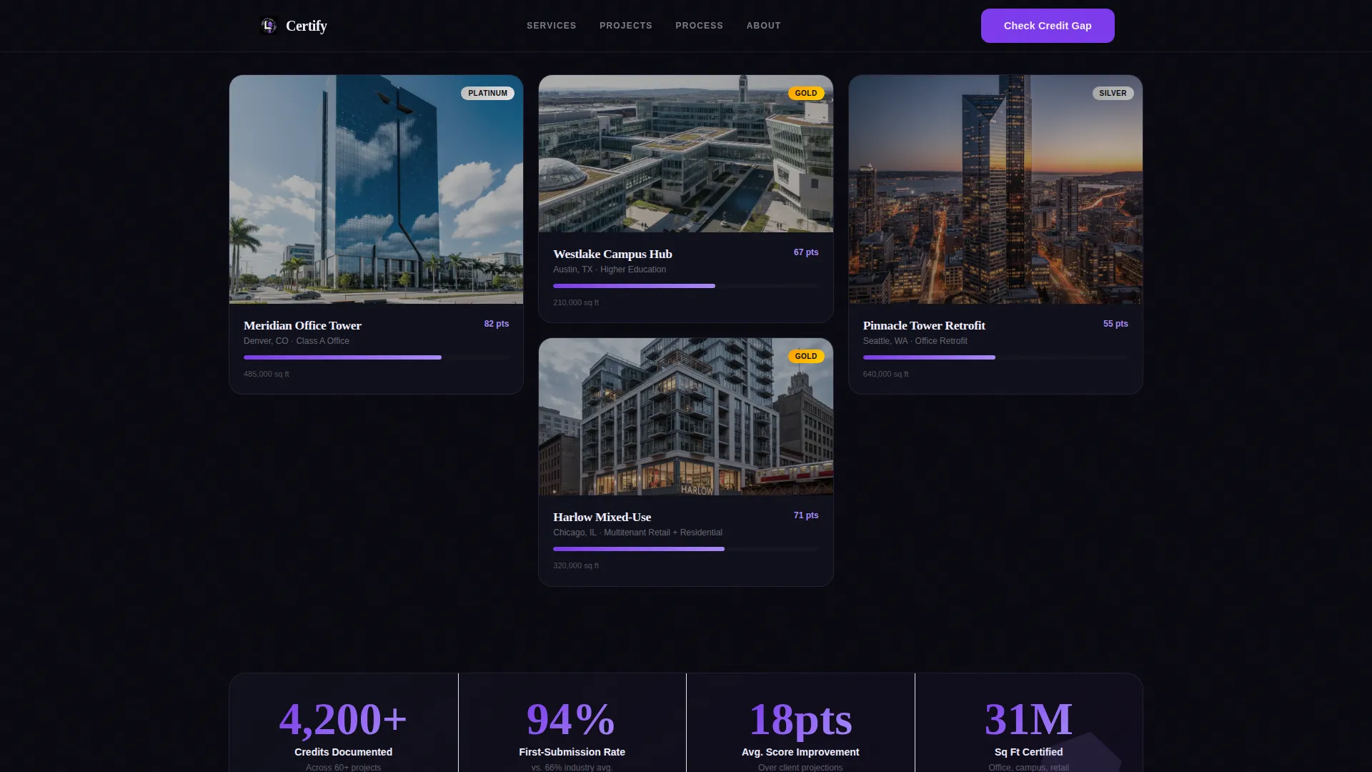
The page unfolds in three distinct masonry rows. The first row surfaces pain points with geometric fragment animations on hover. The second row shows documentation timelines and energy-model thumbnails as looping micro-videos inside their grid cells. The third row presents completed projects with pulsing platinum and gold certification badges overlaid on building photography.
Scroll-Linked Hero Typography
The hero section uses a single oversized headline set in a geometric display typeface. As the visitor scrolls, each letter shifts hue from electric violet to soft iris. No hero image is needed. The typography itself carries the architectural weight of the opening section.
Credit Gap Scorecard Form
The primary conversion element is a lightweight, tab-style form styled as a masonry card. It collects building type, gross square footage range, target certification level, and project zip code. The form feels like adding one more tile to the grid rather than filling out a standard contact form.
Gated LEED-Readiness Checklist
A secondary lead capture path offers a downloadable LEED-readiness checklist in exchange for an email address. This captures early-funnel visitors who are not yet ready to speak with a consultant but are researching the certification process.
Results Row with Social Proof Cards
The third masonry row cascades in completed project cards with client quotes overlaid on building photography. Each photo is cropped through a geometric mask. Certification badge counts and project-scale data reinforce credibility for first-time LEED clients evaluating the practice.
Playful Geometric Visual System
Hover states, progress indicators, and geometric accent shapes rotate between electric violet and soft iris against a void-black card background. The system signals technical authority while looking unlike a standard government compliance document.
Page sections overview
| Section | Purpose |
|---|---|
| Hero Headline | Anchors the brand promise with oversized, scroll-animated typography |
| Problem Masonry Row | Names three specific pain points using geometric fragment hover animations |
| Process Masonry Row | Shows documentation timelines and energy-model micro-video thumbnails |
| Results Masonry Row | Presents completed projects with certification badges and client quotes |
| Credit Gap Form | Qualifies serious leads via a scorecard-style tabbed form |
| Checklist Download | Captures early-funnel leads behind an email gate |
| Footer | Minimal horizontal layout in void black |
Design & branding system
The template uses a Playful Geometric theme anchored in a dark-mode premium palette. The overall feeling is a dark sky punched through with ultraviolet light, serious enough for an engineering audience but visually unexpected enough to signal that sustainability consulting has its own creative identity.
- Colors: void black (#09090F) dominates backgrounds; electric violet (#7C3AED) and soft iris (#A78BFA) rotate across accents, hover states, and badges; geometric white (#F0EEFF) handles headlines and body text
- Typography: Fraunces for display headings, DM Sans for body copy
- Geometric shapes constructed from interlocking triangles and hexagons appear as accent motifs and animation fragments throughout the grid
Mobile & speed optimization
The template is built desktop-first to match the large-screen working habits of architecture and engineering professionals. Full mobile support is included so the page remains usable for any team member reviewing it on a phone or tablet.
- Staggered masonry card reveals use IntersectionObserver so animations trigger only when elements enter the viewport
- All animated transforms are GPU-accelerated, keeping motion smooth without taxing the browser
- Color values are stored as CSS custom properties, making global palette updates fast and consistent
How this template helps you convert
The page is structured to move visitors from awareness to action in a single continuous scroll. Each section builds on the previous one, raising stakes before offering a solution.
- The hero headline immediately frames the core promise, and the problem row validates the visitor's frustration before introducing the process row as evidence of competence.
- The results row shifts authority from claims to proof, using real project badges and client quotes to answer the "have you done this before?" question that every first-time LEED client asks.
- The dual conversion section closes the loop by offering two commitment levels: a full credit-gap diagnostic form for qualified projects and a free checklist download for visitors still in research mode.
Other information about this template
The Certify template is categorized under Architecture and Design, specifically the Sustainable and Green Architecture subcategory, with the LEED Consultant niche as its primary intersection match. It is built for US-based practices using imperial measurements and US zip codes.
- The footer follows a minimal horizontal flow pattern in void black, keeping the focus on the conversion section above it
- Animation intensity is high by design: scroll-linked hue shifts, geometric fragment hovers, staggered cascade reveals, and badge pulse effects are all included as part of the template's core experience
- The template's creative direction is cinematic sequence, meaning content is paced like a narrative rather than presented as a flat brochure
- The header concept is Giant Headline Centered, a single typographic statement that occupies roughly 80 percent of the initial viewport
Theme
Playful Geometric
Creative direction
Cinematic Sequence
Color system
Void & Violet
Style
Masonry/Pinterest
Direction
Lead Generation
Page Sections
Cinematic Masonry Grid
Scroll-linked Hero Typography
Credit Gap Scorecard Form
Gated Checklist Download
Social Proof Results Row
Playful Geometric Visual System
Related questions
Who is this landing page template designed for?
What does the Check Your Credit Gap form collect?
Can this template capture leads from visitors who are not ready to hire yet?
What animation and interaction behaviors are included?
Is this template suitable for a desktop-heavy professional audience?



