Editorial Salon Operations Consultant Landing Page
Chair is an editorial-style landing page template built for beauty and salon operations consultants. It uses a zigzag alternating layout, a Charcoal and Amber color system, and a team-forward photo strategy to show real transformation stories. Two conversion paths, a diagnostic booking form and a gated PDF download, work together to capture leads at every stage of buyer readiness.
by Rocket studio
Quick summary
Chair is a single-page editorial landing page for salon operations consultants. It pairs a bold Half-Page Photo+Text header with alternating before-and-after team sections. The Charcoal and Amber palette gives it the weight of a trade magazine. Two distinct calls to action capture both ready buyers and early-stage prospects.
Who this template is for
This template is designed for consultants who work directly inside salon businesses. It speaks the language of owners who measure success in retention rates and retail tickets, not just client volume.
- Independent beauty entrepreneurs scaling past their second location
- Multi-location salon owners whose margins are thinning
- Spa directors facing costly staff turnover and operational inefficiency
What problem this template solves
Most service consultant pages lead with credentials and close with a contact form. That approach loses the audience before trust is built. This template flips the structure: transformation results come first, and the ask comes after proof.
- Salon owners scroll past generic consultant pages because nothing feels specific to their world
- Decision-makers need to see operational results, not just service lists, before they book
- Early-stage prospects need a lower-friction path than a direct consultation request
What you get with this template
You get a fully structured, single-page layout designed specifically for beauty and salon consulting. Every section is purpose-built to move a skeptical salon owner from curiosity to contact.
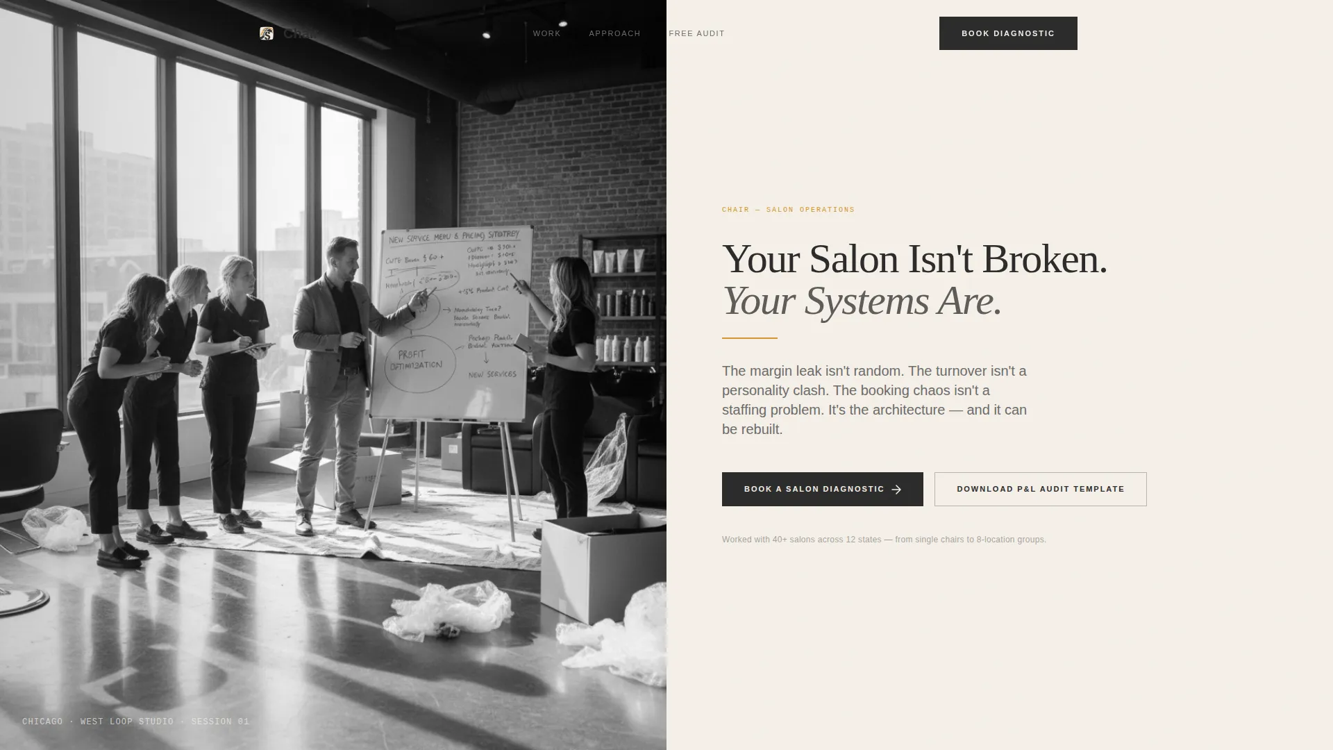
- A Half-Page Photo+Text hero header with a serif headline and amber accent rule
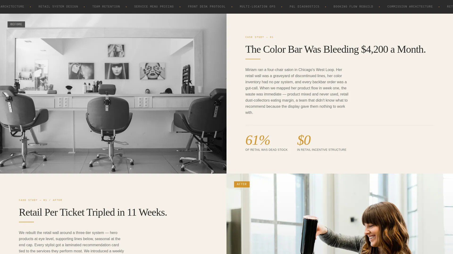
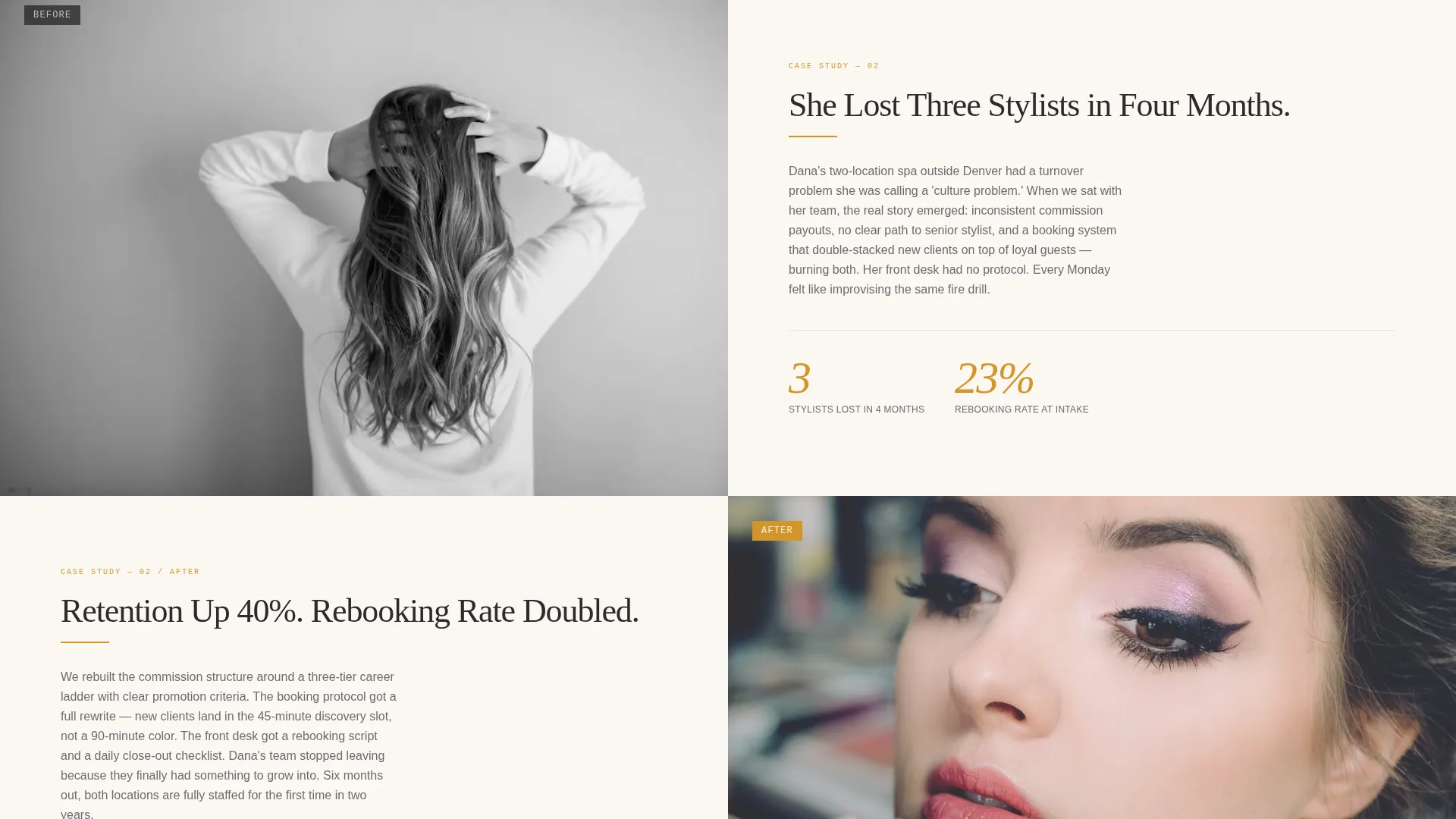
- Zigzag alternating sections with before-and-after team photography and oversized result numerals
- Two conversion paths: a diagnostic booking form and a gated PDF audit download
Feature list
This template is built around a clear editorial rhythm. Each feature serves the conversion goal without interrupting the reading experience.
Half-Page Hero Header
The header splits the viewport into two equal halves. The left side holds a black-and-white editorial portrait of a salon floor mid-transformation. The right side carries a large serif headline, an amber rule, and a three-line magazine-style deck subheading.
Zigzag Alternating Layout
Each content section alternates image and text placement to create a page-turning rhythm. Left-image sections show the before state: cluttered retail walls, chaotic scheduling whiteboards, cramped color bars. Right-image sections reveal the after: composed spaces, operational teams, and the same people transformed.
Oversized Amber Result Numerals
Key transformation metrics are set in oversized amber numerals that land like pull-quotes in a trade feature. Numbers such as retention up 40 percent, rebooking rate doubled, and retail per-ticket tripled are styled to stop the scroll and validate the consultant's impact.
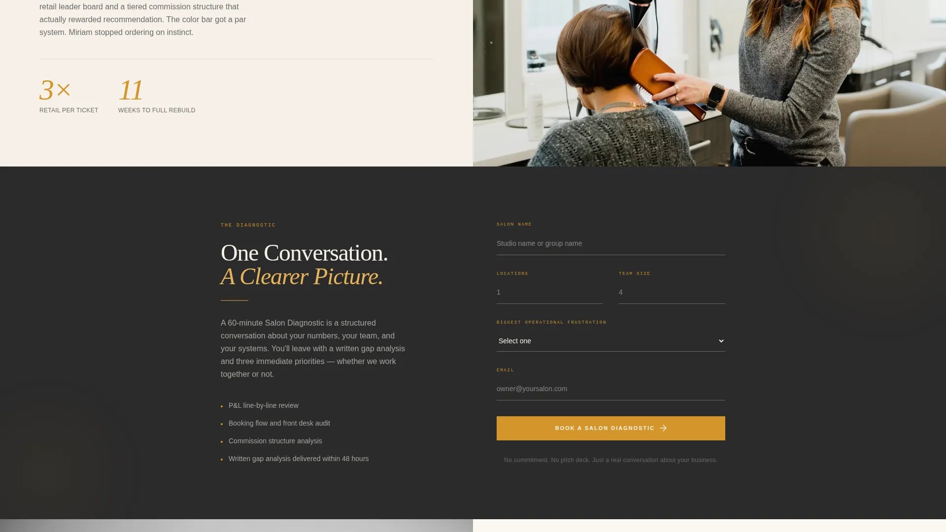
Diagnostic Booking Form
The primary call to action form collects salon name, number of locations, current team size, and the owner's biggest operational frustration. The frustration field uses a dropdown with four categories: staffing, profitability, systems, and growth.
Gated PDF Audit Download
A secondary conversion path offers the Salon Profit and Loss Audit Template as a downloadable PDF. It captures email address and salon revenue range, giving prospects a lower-commitment entry point before they are ready to book.
Editorial Charcoal and Amber Color System
The palette uses deep editorial charcoal for backgrounds, warm paper cream for page fields, liquid amber for pull-quote accents and rules, and soft graphite for body text. The combination reads like a heavyweight fashion editorial printed on uncoated stock.
Page sections overview
| Section | Purpose |
|---|---|
| Hero Header Split | Introduces consultant with editorial portrait and bold serif headline |
| Subhead Magazine Deck | Sets the consulting premise with a three-line positioning statement |
| First Zigzag Spread | Shows before state: cramped spaces and operational chaos |
| Second Zigzag Spread | Shows after state: composed teams and measurable turnaround |
| Primary call to action Block | Presents the Book a Salon Diagnostic form after transformation proof |
| Third Zigzag Spread | Deepens case study narrative with a third team story |
| Fourth Zigzag Spread | Continues alternating editorial spread with result numerals |
| Secondary Lead Capture | Offers gated PDF download for prospects not ready to book |
| Closing call to action Anchor | Repeats the Salon Diagnostic call to action to close the page |
Design & branding system
The visual identity draws directly from heavyweight print editorial. Every color and type choice is deliberate, built to feel like something worth tearing out and pinning above the back-bar.
- Deep editorial charcoal (#2B2B2B) for section backgrounds, warm paper cream (#F5F0E8) for breathing space, liquid amber (#D4952A) for pull-quote rules and accent lines, and soft graphite (#6B6B6B) for body text
- Large, unhurried serif typography for headlines and a magazine-deck subhead style for supporting copy
- Before-and-after team photography styled editorially, shot to show real spaces and real people rather than stock imagery
Mobile & speed optimization
The zigzag layout is structured to restack cleanly on smaller screens. Each spread remains readable and visually impactful without losing the editorial feel on mobile viewports.
- Image and text columns restack into a single vertical flow on mobile, keeping the before-and-after narrative intact
- Oversized amber numerals scale proportionally so result callouts remain legible at any screen width
- The two-form structure (booking form and PDF download) remains accessible and functional across device sizes
How this template helps you convert
The page is engineered so proof arrives before the ask. Salon owners are skeptical by habit. They have seen too many consultants promise systems and deliver slide decks. This template earns the click by making results visible first.
- The zigzag editorial spread shows transformation stories before any call to action appears, building trust through specifics rather than claims
- The diagnostic booking form appears only after the second alternating section, once the reader has absorbed enough proof to feel urgency
- The gated PDF path captures email addresses from prospects in the research phase, keeping them inside your funnel without forcing a premature commitment
Other information about this template
Chair is a purpose-built template for the beauty and salon consulting niche. It is designed for professionals who work at the intersection of salon operations, team performance, and business profitability.
- The template style is Zigzag/Alternating, suited to case-study storytelling and before-and-after content structures
- The theme follows an Editorial Magazine direction, making it distinctive in a category where most consultant pages feel generic
- The Partnership and Business-to-Business conversion direction means every design decision supports a longer-consideration sale, not an impulse click
- The creative direction is Team and People, so the page feels human and specific rather than aspirational and abstract
- This template works well for consultants who serve independent salon owners, multi-location beauty brands, and spa operations teams
Theme
Editorial Magazine
Creative direction
Team & People
Color system
Charcoal & Amber
Style
Zigzag/Alternating
Direction
Partnership/B2B
Page Sections
Half-page Hero Header Split
Zigzag Alternating Section Layout
Oversized Amber Result Numerals
Diagnostic Booking Form
Gated PDF Lead Capture
Editorial Charcoal and Amber Palette
Related questions
Who is this landing page template designed for?
What are the two conversion paths included in this template?
Can I use this template without before-and-after photography?
Where does the primary call to action appear on the page?
What makes this template different from a standard consultant page?



