Hair Salon Team Stylist Profiles Website Template
Chairs is a bento grid landing page template built for hair salon teams. It features a flip-card stylist grid, an interactive side-by-side comparison module, and a dynamic "Book With" call-to-action that responds to visitor behavior. The Electric Indigo color system and Startup Velocity theme give it an editorial, high-energy feel that matches a busy, in-demand salon.
by Rocket studio
Quick summary
Chairs is a single-page bento grid landing page designed for hair salon teams of multiple stylists. It opens with an animated portrait grid where hovering or tapping flips each card to reveal specialties and experience. Visitors then build side-by-side stylist comparisons before a dynamic booking call-to-action closes the loop.
Who this template is for
This template is built for established hair salons running a team of stylists, not a solo operator. It works best when the business needs to introduce each team member individually and guide clients toward a confident booking decision.
- Multi-stylist salons where six or more chairs are occupied daily
- Salons serving loyal rebooking clients, bridal parties, and walk-in traffic
- Salon owners who want a modern, high-energy digital presence that matches the pace of a busy floor
What problem this template solves
Most salon pages list stylists in a plain grid with a headshot and a phone number. That format does not help a first-time visitor choose, and it does not give a loyal client a fast path back to their preferred stylist. Chairs solves both problems at once.
- Replaces passive bios with interactive comparison tools that make the decision feel informed
- Removes the guesswork for walk-ins and new clients who need a clear reason to choose one stylist over another
- Gives undecided visitors a secondary path through a Style Match Quiz so no one leaves without a recommendation
What you get with this template
You get a fully designed, single-page bento grid layout built around a six-stylist team structure. Every component described below is part of the template as delivered.
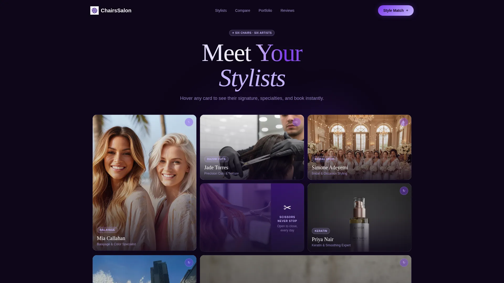
- An interactive header grid with flip-card stylist portraits, micro-animations, and a looping video cell
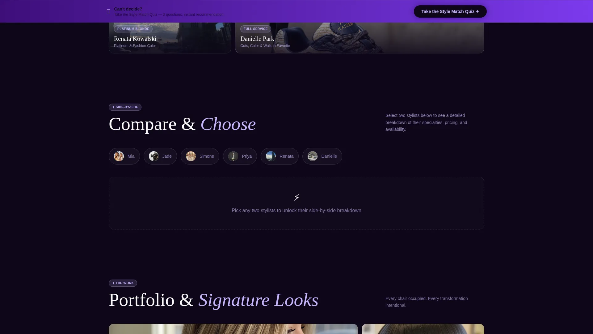
- A versus comparison module where visitors select any two stylists and see a side-by-side breakdown of specialties, pricing tiers, availability, portfolio shots, and review scores
- A sticky bottom bar with a Style Match Quiz path and a dynamic primary call-to-action tied to the last stylist a visitor engaged with
Feature list
This template is built around the idea that choosing a stylist should feel as intentional as the service itself. Each feature below is drawn directly from the template brief.
Animated Bento Grid Header
The header is a living grid of stylist portrait cells. Each portrait shows a stylist mid-motion, such as pulling a comb through wet hair or examining a part line. On load, the grid pulses with subtle micro-animations. One cell plays a three-second looping video of shears closing through copper hair, keeping the energy cinematic without overwhelming the layout.
Flip-Card Stylist Profiles
Every portrait cell responds to hover or tap with a card flip. The reverse side reveals the stylist's specialties, years of experience, and a signature look thumbnail. The interaction is immediate and tactile, giving visitors a reason to explore the full team before scrolling further.
Stylist Versus Comparison Module
Below the header, visitors can select any two stylists to trigger a dynamic side-by-side panel. The module renders a breakdown of specialties, pricing tiers, availability windows, portfolio shots, and client review scores. The scroll journey moves from personality to proof, helping visitors make a genuinely informed choice.
Dynamic "Book With" Call-to-Action
The primary call-to-action reads "Book With [Stylist Name]" and updates based on the last stylist card or comparison panel the visitor interacted with. This keeps the booking prompt personal and contextually relevant at every stage of the page.
Sticky Style Match Quiz Bar
A sticky bottom bar remains visible as visitors scroll. It invites undecided visitors to take a three-question Style Match Quiz covering hair type, desired change, and maintenance commitment. The quiz recommends a specific stylist and drops an instant booking calendar so the secondary path closes just as cleanly as the primary one.
Electric Indigo Visual System
The color system uses deep nightclub indigo, charged violet, hot highlight lilac, and clinical bright white. Indigo anchors grid gaps and the navigation bar. Violet drives hover states and active stylist cards. Lilac tags specialties and badges. White keeps each bento cell breathable and readable.
Page sections overview
| Section | Purpose |
|---|---|
| Animated Header Grid | Introduces all stylists through interactive flip-card portrait cells with micro-animations |
| Stylist Comparison Module | Lets visitors build a side-by-side breakdown of any two stylists |
| Specialties and Pricing | Displays each stylist's service focus, pricing tier, and availability window |
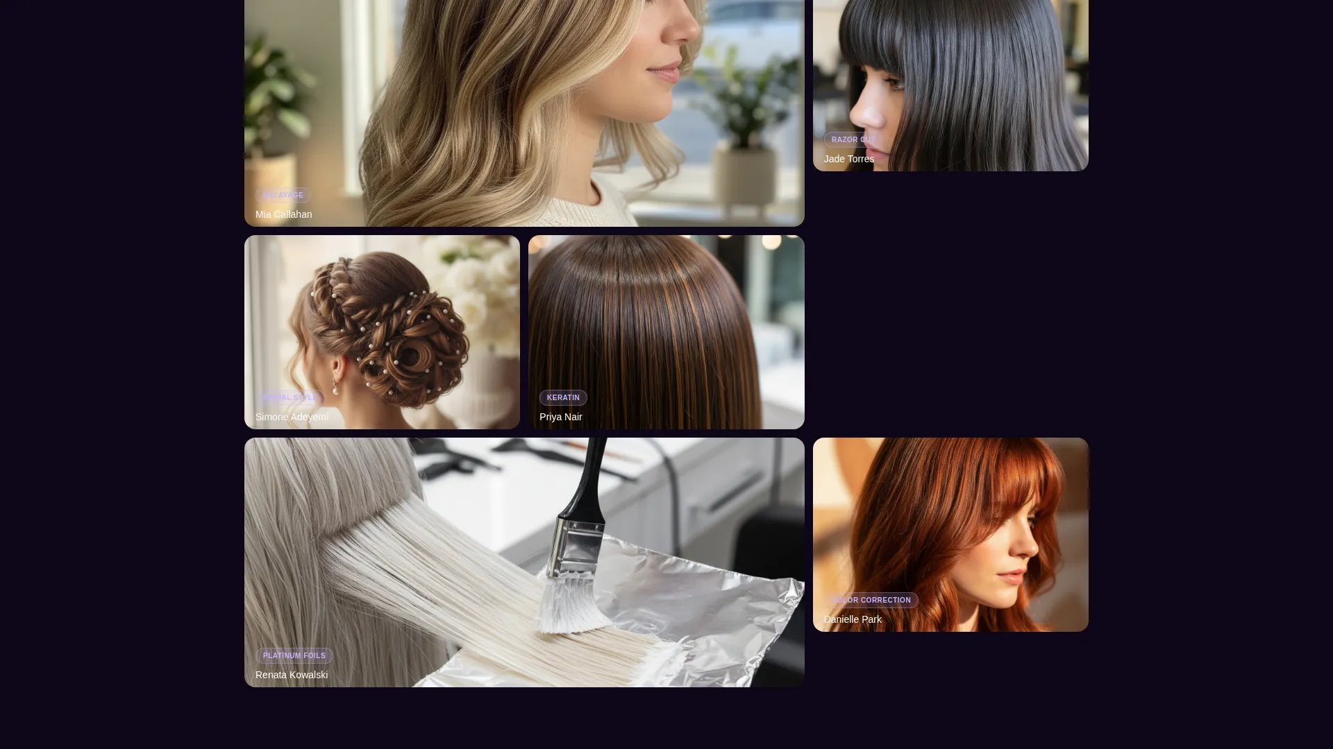
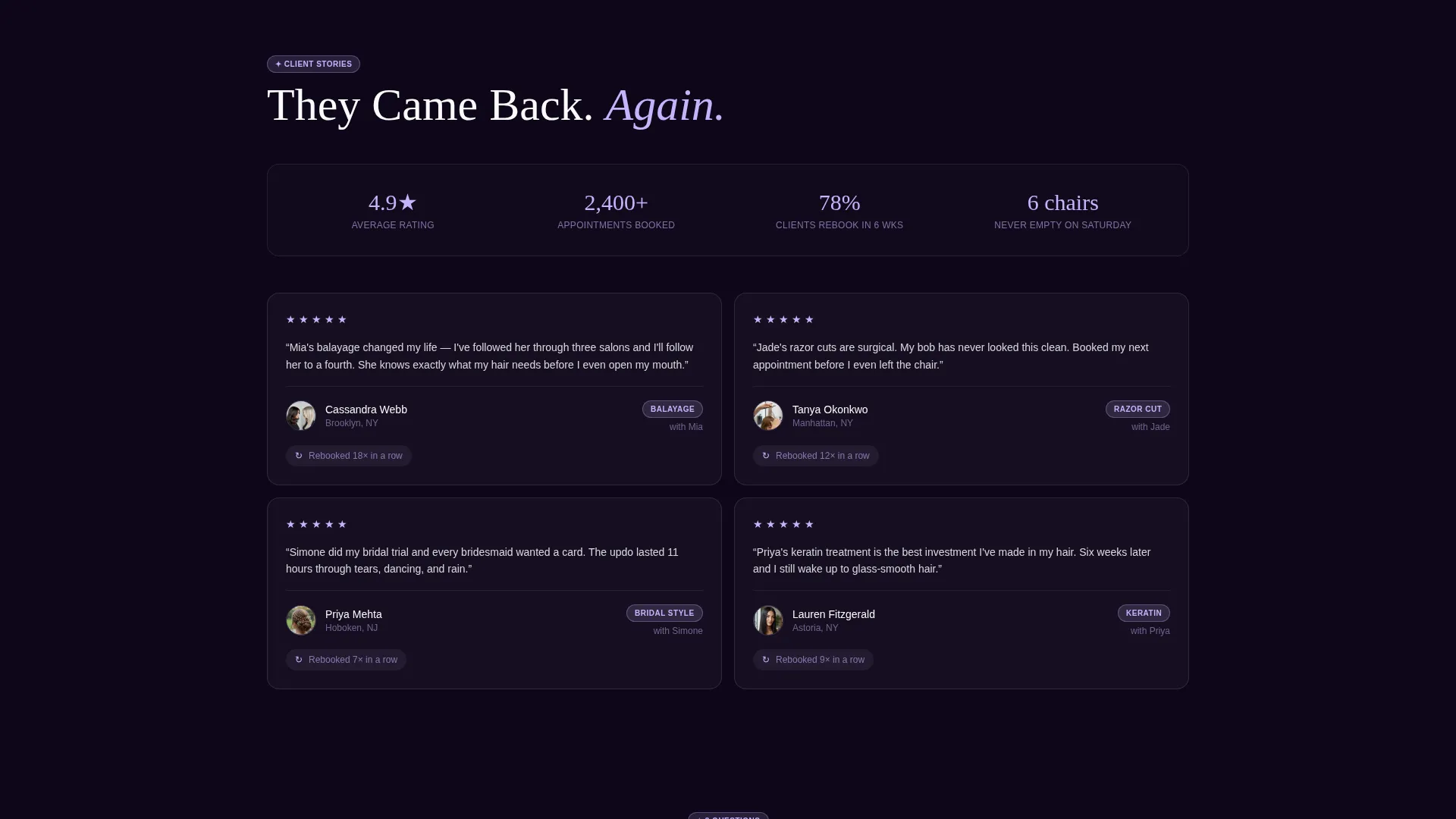
| Portfolio and Reviews | Shows signature look thumbnails and client review scores per stylist |
| Style Match Quiz Bar | Sticky secondary path that recommends a stylist via a three-question flow |
| Dynamic Booking Panel | Surfaces a contextual booking call-to-action tied to the last stylist engaged |
Design & branding system
The template follows a Startup Velocity theme with an Electric Indigo color system. The overall feeling is editorial and high-energy, like UV light bouncing off freshly toned platinum hair. Every color has a structural job in the layout so swapping one affects the entire visual hierarchy.
- Deep nightclub indigo (#3D0F7A) anchors grid gaps and the navigation bar for a grounded, dramatic base
- Charged violet (#7C3AED) drives hover states and active comparison cards, making interactions feel alive
- Hot highlight lilac (#C4B5FD) tags specialties and badges, while clinical bright white (#FAFAFA) keeps bento cells open and legible
Mobile & speed optimization
The bento grid layout is designed to reflow cleanly across screen sizes. Tap interactions replace hover states on touch devices, keeping the flip-card experience functional on mobile. The sticky quiz bar stays accessible regardless of scroll depth or screen width.
- Flip-card interactions convert to tap gestures on mobile so the core exploration experience stays intact
- The versus comparison module adapts to a stacked view on smaller screens so both stylist panels remain readable
- The sticky bottom bar is sized and positioned for thumb-friendly interaction on portrait-orientation mobile screens
How this template helps you convert
Chairs earns the booking click by making the decision feel informed at every step. The page architecture moves visitors through a deliberate sequence from discovery to comparison to commitment.
- The animated header grid creates immediate visual engagement and introduces the full team in one view, holding attention long enough for visitors to start exploring individual stylists
- The versus comparison module shifts the visitor from passive browsing to active decision-making, reducing hesitation by letting them measure specialties, pricing, and availability side by side
- The dynamic "Book With" call-to-action and the Style Match Quiz together ensure every visitor type, whether a confident returner or an undecided walk-in, has a clear and personal next step
Other information about this template
Chairs is categorized under Hair Salon Website Templates and is specifically designed for the Hair Salon Team Page niche. It sits within the Technology category on the template marketplace, reflecting its interactive and component-driven build approach.
- The template style is Bento Grid, a layout format that divides the page into modular cells of varying sizes for a modern, editorial look
- The creative direction is Interactive Explorer, meaning the page is designed to reward visitor engagement rather than deliver passive content
- The header concept is Interactive Preview, where the first thing visitors see is not static text but a responsive grid they can immediately interact with
- The conversion direction is Comparison/Versus, a model that builds buyer confidence through structured side-by-side evaluation rather than a single hero pitch
Theme
Startup Velocity
Creative direction
Interactive Explorer
Color system
Electric Indigo
Style
Bento Grid
Direction
Comparison/Versus
Page Sections
Animated Bento Grid Header
Flip-card Stylist Profiles
Stylist Versus Comparison Module
Dynamic Contextual Booking Call to Action
Sticky Style Match Quiz Bar
Electric Indigo Color System
Related questions
How many stylists does this template support?
Can the Style Match Quiz questions be changed?
Does the versus comparison module update without reloading the page?
Is this template a good fit for a single-stylist salon?
What does a visitor see after completing the Style Match Quiz?