Dentist Profile Booking Website Template
Chairside is an elegant dentist digital business card landing page built for dental professionals who want a first impression as refined as their practice. The horizontal scroll layout, obsidian and gold visual identity, and near-zero-friction call to action create a premium digital presence that moves visitors confidently toward booking a card builder or free trial.
by Rocket studio
Quick summary
Chairside is a single-page, horizontal scroll landing page template designed for dental professionals ready to replace paper cards with a sleek digital alternative. The Atelier Studio aesthetic, obsidian and gold color system, and immersive editorial photography combine into a page that feels as polished as the practices it represents. The primary goal is a low-friction click to a card builder or free trial.
Who this template is for
This template is built for dental professionals who take their brand as seriously as their clinical work. It suits practices that want their online presence to feel premium and intentional from the very first tap.
- Cosmetic dentists launching boutique practices who need a modern, trust-building profile page
- Orthodontists building personal brands and looking for a shareable digital card that works on social platforms
- Oral surgeons whose referral networks depend on instant, one-tap contact sharing
What problem this template solves
Paper business cards feel disposable. A generic profile page buried in a directory feels invisible. Dental professionals with strong reputations and refined aesthetics have no visual-first, low-friction way to hand someone their practice in a single tap. Chairside closes that gap.
- There is no existing template that combines editorial-quality dental photography with a horizontal scroll experience purpose-built for dentists
- Most dentist profile pages are form-heavy and visually generic, creating friction before the visitor even reads a word
- This template removes the form entirely and replaces it with a confidence-building visual journey that earns the click naturally
What you get with this template
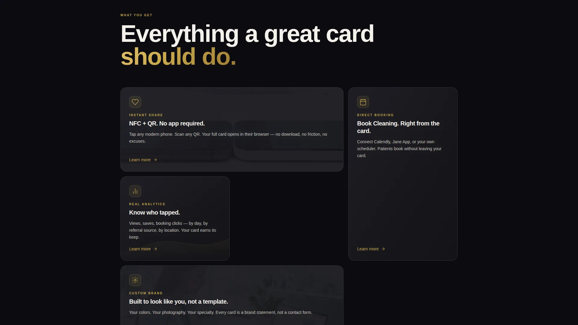
You get a fully designed, single-page horizontal scroll landing page ready to customize for any dental professional. Every panel is editorially composed, every color is intentional, and the page flow is structured to move a visitor from curiosity to conversion without a single form field.
- A full-bleed editorial header, multi-panel horizontal scroll journey, and a final full-width call-to-action block
- A persistent brushed gold pill button in the top-right corner and a phone-frame demo modal for the secondary call to action
- The complete obsidian and gold design system including typography, surface colors, and interactive accent states
Feature list
This section describes the core capabilities built into the Chairside template as defined in the source brief.
Full-Bleed Editorial Header
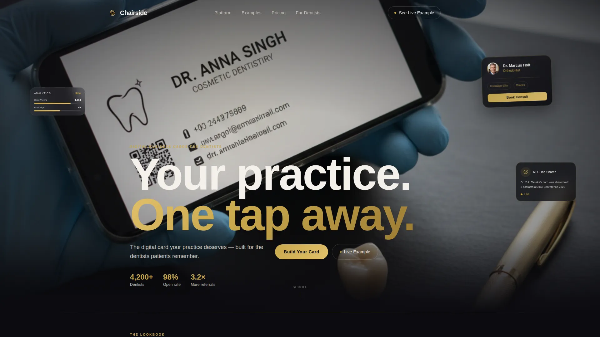
The opening section is a tightly composed, editorially lit photograph of a dentist's hands holding a smartphone displaying a digital business card. A razor-thin depth of field keeps the phone screen sharp while the background dissolves into creamy obsidian bokeh. A single line of porcelain-white type fades in after the image breathes: "Your practice. One tap away."
Horizontal Scroll Lookbook Experience
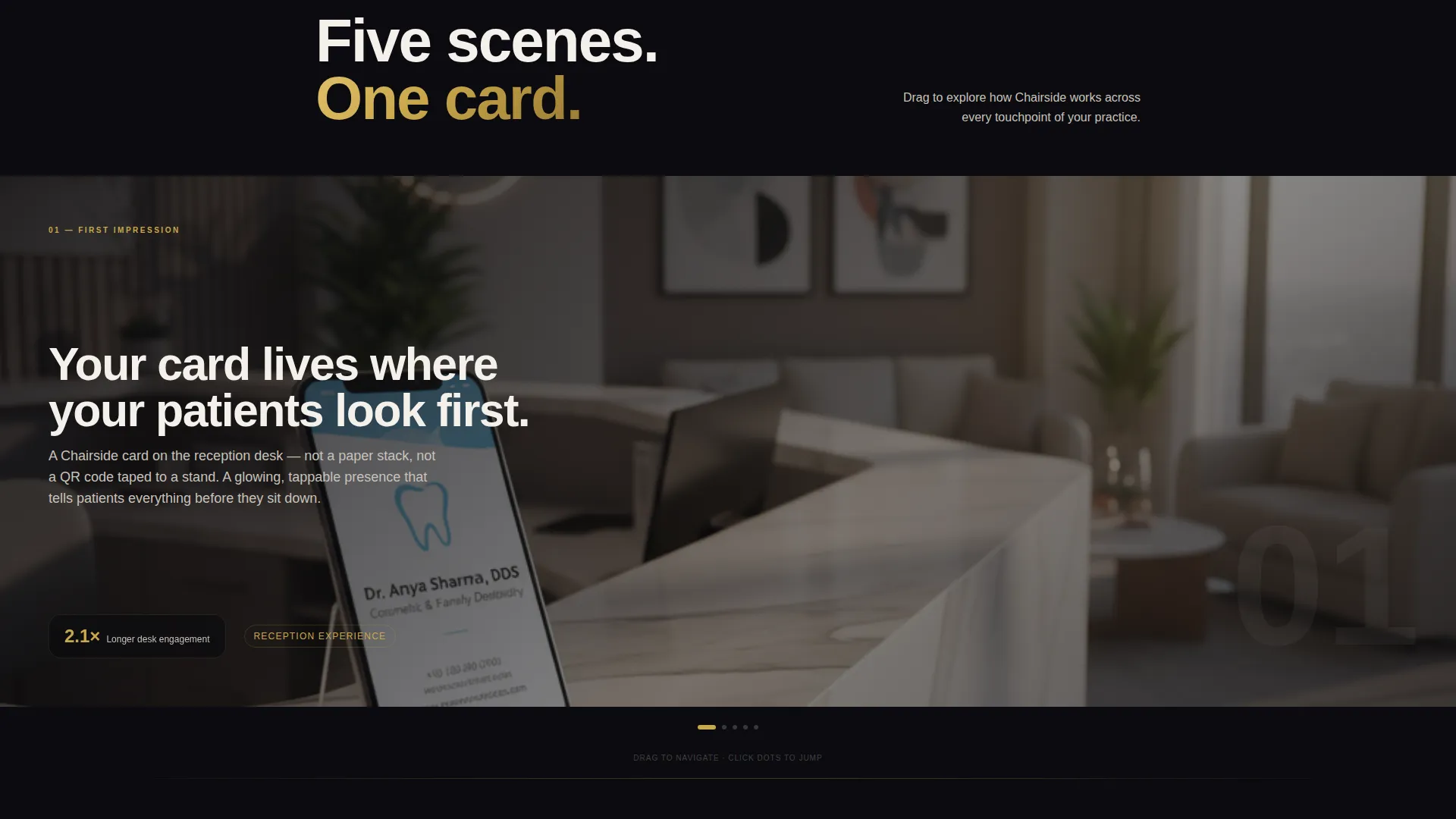
The page moves like flipping through a design atelier lookbook. Each panel renders a different dentist's digital card in a real-world context: glowing on a reception desk, shared via near-field communication at a dental conference, and pulled up on a patient's phone with a booking button visible. The scroll progression builds from aesthetic appeal to functional proof to urgency.
Persistent Pill Call-to-Action Button
A brushed gold "Build Your Card" pill button sits in the top-right corner and remains visible throughout the entire scroll. It provides a constant, low-pressure conversion point without interrupting the visual experience at any stage of the page.
Phone-Frame Demo Modal
The secondary call to action, "See a Live Example," opens a functioning demo card inside a phone-frame modal. Visitors can tap through a real card experience before committing. This removes uncertainty and lets dentists feel the product before they sign up.
Full-Width Closing Call-to-Action Panel
The final horizontal panel delivers the primary call to action at full width: "Build Your Card" in brushed gold on deep obsidian. After the scroll journey has built both desire and proof, this panel captures the click at peak engagement with maximum visual weight.
Obsidian and Gold Design System
The complete color system uses deep obsidian black as the dominant canvas, brushed gold for interactive accents and hover states, clinical porcelain for typography and card surfaces, and muted graphite for secondary containers and dividers. The palette is cohesive and purpose-built for a premium dental brand context.
Page sections overview
| Section | Purpose |
|---|---|
| Full-Bleed Header | Opens with editorial photography and the fade-in brand statement |
| Reception Desk Panel | Shows the digital card in a real clinical environment |
| Conference Sharing Panel | Demonstrates near-field communication card sharing in context |
| Patient Booking Panel | Displays the card with a visible booking button on a patient's phone |
| Closing call to action Panel | Delivers the full-width "Build Your Card" conversion block |
Design & branding system
The visual identity follows an Atelier Studio theme that feels like a private dental suite rendered as a design object. Every color, surface, and typographic choice is deliberate and cohesive.
- Deep obsidian black (#0B0B0F) anchors the canvas; brushed gold (#C9A84C) activates buttons, accents, and hover states; clinical porcelain (#F4F0EB) carries body type and card surfaces; muted graphite (#3A3A42) defines secondary containers and dividers
- Photography direction is editorially lit and styled with no wireframe grays or generic mockups, keeping every panel visually rich and contextually believable
- Typography is set in porcelain white against dark surfaces, creating a high-contrast reading experience that feels clinical without feeling cold
Mobile & speed optimization
The horizontal scroll experience is designed with mobile interaction in mind. Touch-based swiping maps naturally to the lookbook panel format, and the near-zero-friction page structure keeps load demands minimal.
- No form fields on the page means fewer interactive elements to render, keeping the experience fast and focused
- The phone-frame demo modal is built to display a real card interaction directly on mobile without redirecting the visitor to another page
- The persistent pill button remains accessible at the top-right throughout the scroll, ensuring the primary conversion path is always reachable on any screen size
How this template helps you convert
Every design decision on this page is oriented toward a single outcome: moving a dental professional from first impression to card builder click with as little resistance as possible.
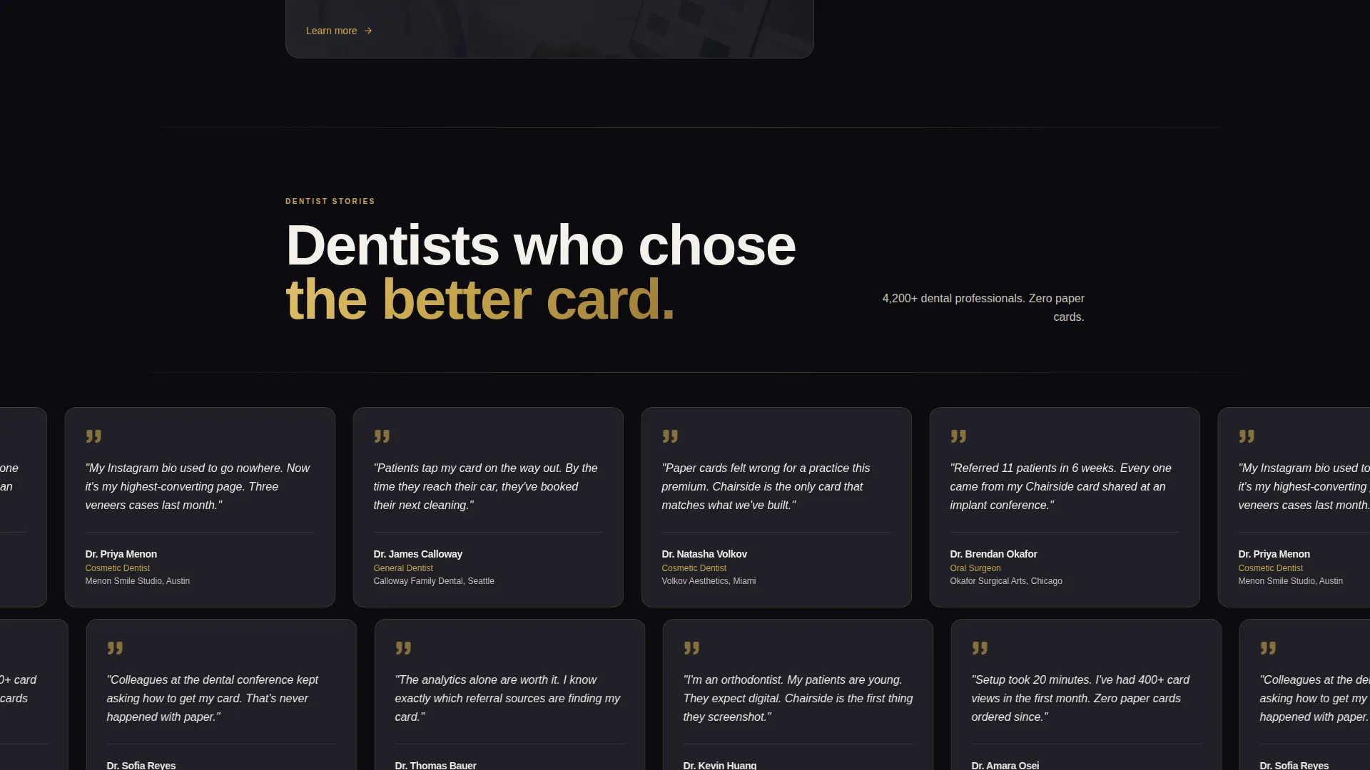
- The horizontal scroll journey builds trust progressively, shifting the visitor's emotional state from "this looks beautiful" to "this is already working for someone else" before the closing panel arrives with the full call to action.
- The phone-frame demo modal lets visitors experience a live card before committing, reducing the fear of the unknown and replacing it with informed confidence ahead of the free trial click.
- The persistent gold pill button and the full-width closing panel create two distinct conversion moments that match different visitor readiness levels, so the page captures both early deciders and late converters.
Other information about this template
Chairside is categorized under Personal and Resume templates, specifically within the Dentist Profile subcategory. It is purpose-built for the dentist digital business card niche and carries an Atelier Studio theme that distinguishes it from general medical or healthcare templates.
- The template style is horizontal scroll, which is uncommon in the dental profile space and creates a strong differentiation signal for practices that want to stand out
- The immersive visual creative direction means the template relies on editorial photography and scene composition rather than iconography or data visualizations
- The page direction is click-through, meaning it is optimized to send visitors to a next-step destination such as a card builder tool or free trial signup, with no conversion action completed on the page itself
- The intersection match across color system, creative direction, header concept, template style, landing page direction, and theme is fully consistent, making this a coherent and production-ready design system
Theme
Atelier Studio
Creative direction
Immersive Visual
Color system
Obsidian & Gold
Style
Horizontal Scroll
Direction
Click-Through
Page Sections
Full-bleed Editorial Header
Horizontal Scroll Lookbook Panels
Persistent Pill Call to Action Button
Phone-frame Demo Modal
Full-width Closing Call to Action Panel
Obsidian and Gold Design System
Related questions
Does this landing page include a contact form or booking form?
Can I use this template if I am not a cosmetic dentist?
What does the horizontal scroll experience feel like on a mobile device?
Is the phone-frame demo modal included in the template?
What is the primary call to action on this landing page?



