Creative Benefits Consultancy | Free Website Template | Rocket
The Advocate landing page template is built for creative and media benefits consultancies that translate complex group health, dental, and retirement plans into packages creative teams actually want to stay for. With a zigzag Testimonial Mosaic layout, Electric Indigo branding, a lead-gen form with a headcount slider, and a sticky call to action bar, this template converts studio owners and media CFOs into qualified consultation leads.
by Rocket studio
Quick summary
The Advocate landing page template gives a creative and media benefits consultancy a warm, editorial web presence that turns confused studio owners into booked consultations. It combines a slow-scrolling logo ticker, zigzag testimonial pairs, a bento-grid problem section, a three-step visual arc, and a smart lead-gen form into one focused, conversion-driven page built for HR decision-makers in the creative industry.
Who this template is for
This landing page template is built for a very specific kind of business. It speaks directly to the people who sit between creative talent and the paperwork keeping them from staying.
- Studio owners with 20 to 200 employees who have lost talent over benefits gaps, including parental leave shortfalls or unclear dental coverage
- Agency founders who promised great benefits in a job posting and now need someone to help them figure out what that actually means
- Media company chief financial officers juggling union and non-union plans on the same spreadsheet, and HR leads at post-production facilities managing competing coverage structures
What problem this template solves
Creative and media businesses lose talented editors, colorists, designers, and producers to larger shops every year. The reason is rarely salary. It is almost always benefits. The problem is not that good packages do not exist. It is that the people who need them most do not have time to decode the jargon.
- Studio owners and agency founders need a landing page that positions their benefits consultancy as the trusted translator, not just another vendor pitching group plans
- The page must convert visitors who are skeptical and time-poor, without burying the value proposition under generic marketing language or overly corporate web design
What you get with this template
This landing page template delivers every section a creative-industry benefits consultancy needs to move a skeptical visitor toward booking a free consultation. The layout is single-page, scroll-driven, and built around proof and clarity.
- A cinematic hero section with a slow logo ticker, a candid hero image, and a lead-gen call to action card, followed by a Testimonial Mosaic of three alternating quote-and-solution pairs that build social proof as the visitor scrolls
- A problem-specificity bento grid, a three-step visual arc showing how the process works, and a full lead-gen form section with a headcount slider, a frustration dropdown, a dual call to action, and a sticky bottom bar that appears after the third testimonial pair
Feature list
This template was designed with every component mapped to a specific conversion job. Each feature serves the page's primary objective: turning visitors into booked leads.
Slow-Scrolling Logo Ticker Header
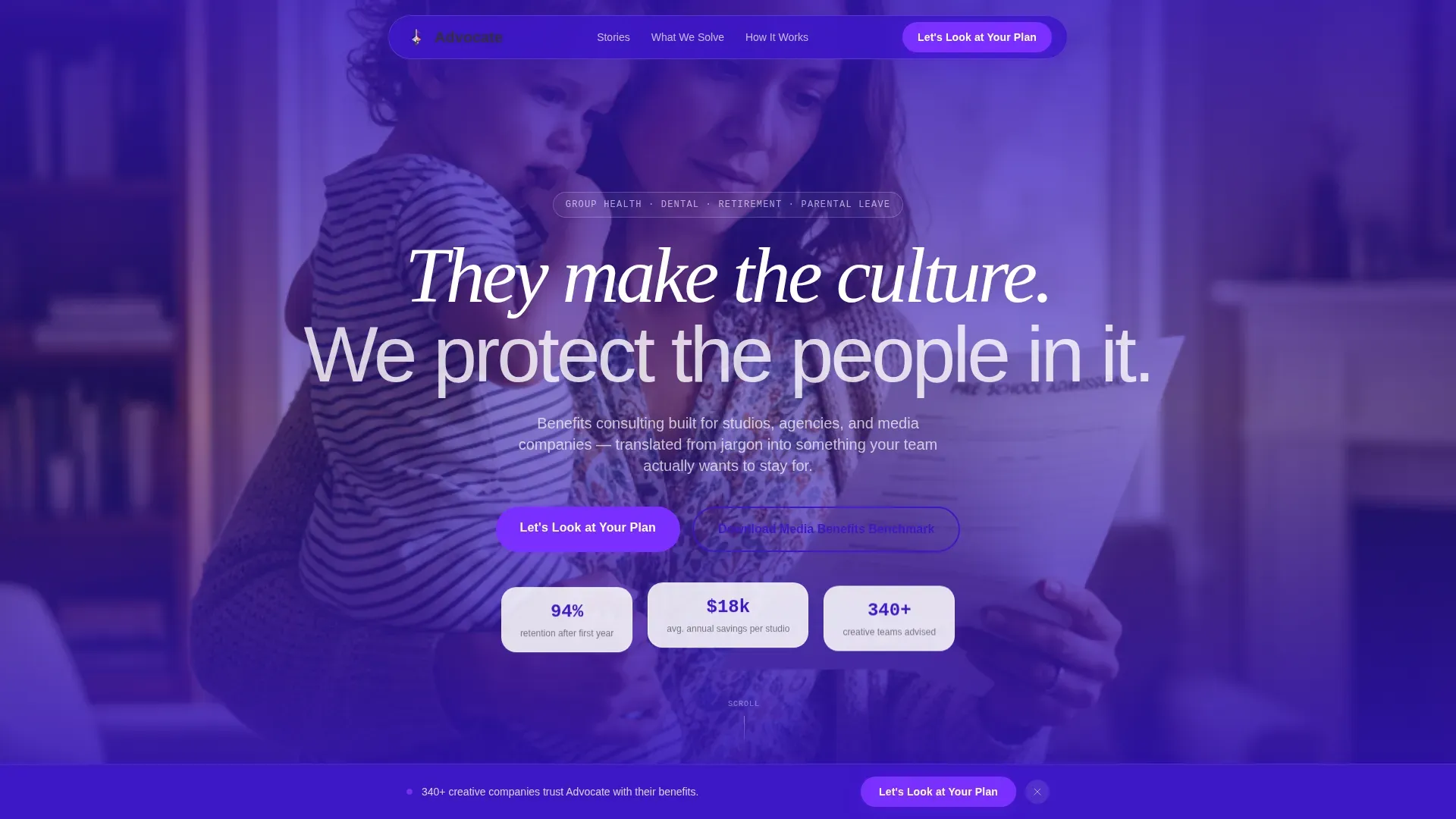
The header opens with a horizontal logo bar set against deep indigo. Recognizable creative and media company logos, production houses, post facilities, and agency wordmarks drift at a slow, confident pace. Above the bar, a bold white headline sets the tone immediately: "They make the culture. We protect the people in it." This above-the-fold area is critical for capturing the user's attention before they scroll. The compelling headline leads with the outcome, not just the service, which is what makes it hold attention.
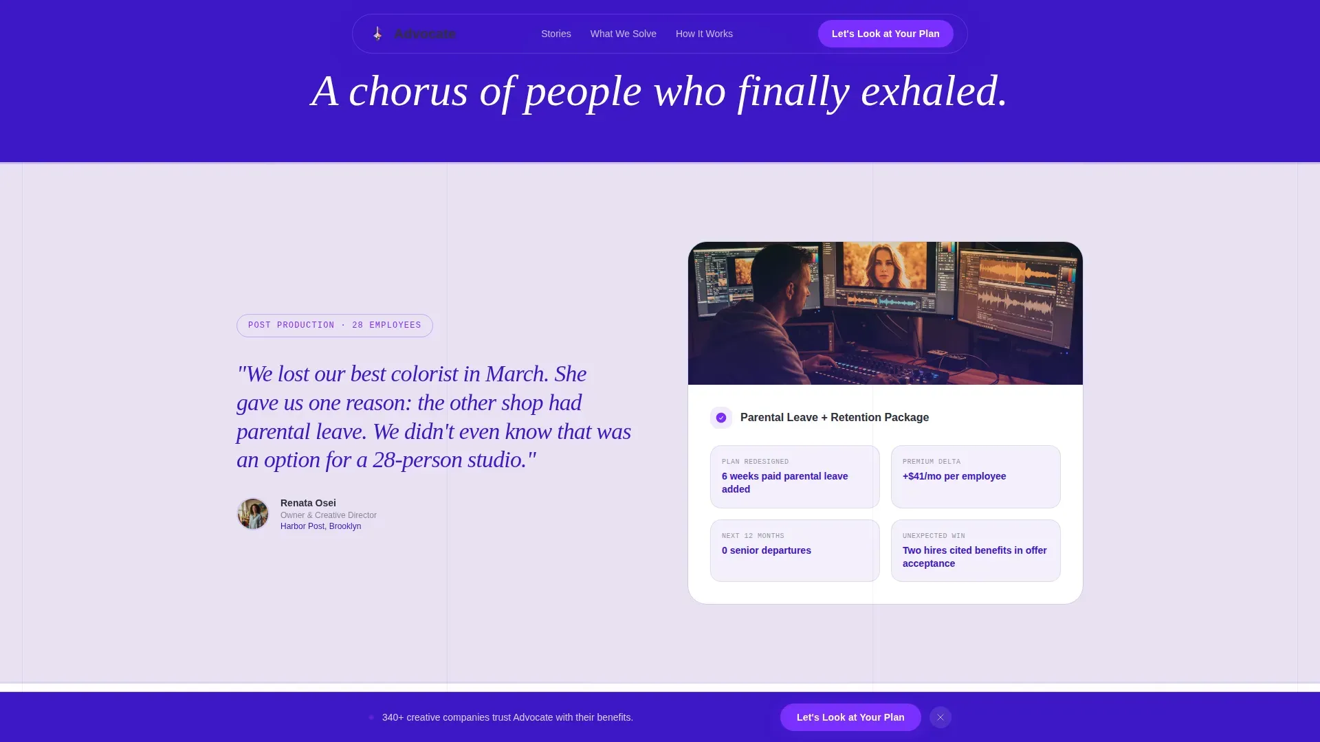
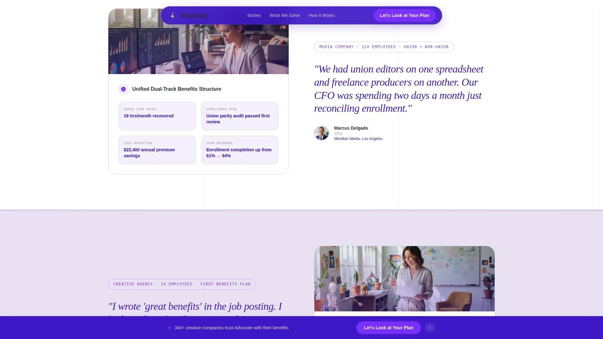
Zigzag Testimonial Mosaic Layout
Three alternating left-right section pairs build a chorus of social proof as the visitor scrolls. Each pair places a pull quote in large italic type on one side and the specific benefit solution that followed on the other. The quote names the person, their title, and their company. The solution panel breaks down what was redesigned, what it saved, and what changed for the team. Testimonials on the landing page highlight specific outcomes from HR leaders and studio owners, giving potential clients the confidence that this consultancy understands their world. Client testimonials placed this way can increase conversion rates by up to 34 percent.
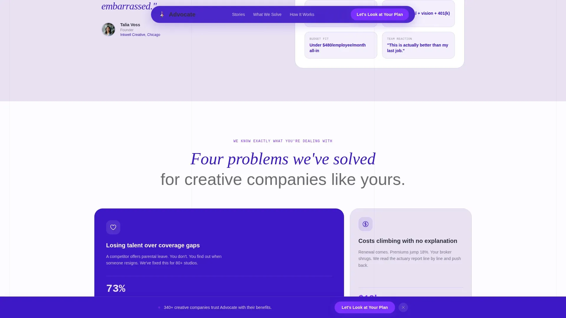
Problem Specificity Bento Grid
After the testimonial pairs, a bento-style grid section titled "We know your exact situation" names the three most common pain points creative businesses face: losing talent over coverage gaps, costs climbing with no explanation, and starting from scratch. This section speaks directly to the landing page visitor's pain point before presenting the service as the solution. It makes the page feel like a conversation rather than a pitch, which is exactly the sense the template is designed to create.
Three-Step Visual Arc
Rather than a flat timeline, the process section presents the consultancy's approach as a visual arc. Three stages move from diagnosis to design to delivery, each described in plain language that a studio owner can read and immediately understand. This section helps visitors see a clear path from "overwhelmed" to "this is handled," which is the emotional shift that drives form completions.
Smart Lead-Gen Form with Headcount Slider
The lead-gen form section is designed to engage the visitor before asking for contact details. It starts with company name, then a headcount slider covering ranges of 5 to 50, 50 to 200, and 200 or more employees. A single dropdown asks: "What's the biggest frustration with your current benefits?" with options that name real pain points. Email and phone number fields come last, after the visitor has already committed to the conversation. The form limits fields to essential information, which is the right approach for keeping bounce rates low and completion rates high. A secondary call to action, "Download Our Media Benefits Benchmark Report," captures leads who want proof before they are ready to talk.
Sticky Call to Action Bar
After the third testimonial pair, a sticky bottom bar appears and stays visible as the visitor continues to scroll. It carries the primary call to action: "Let's Look at Your Plan" in bright violet. This keeps the desired action visible without interrupting the reading experience. A strong call to action placed in a prominent place at the right moment is one of the clearest ways to lift the conversion rate on a single-page lead-gen landing.
Page sections overview
| Section | Purpose |
|---|---|
| Hero Logo Ticker | Establish credibility and set emotional tone above the fold |
| Hero Candid Image | Build warmth and human connection through authentic photography |
| Primary call to action Card | Capture early leads with a glassmorphic call to action block |
| Testimonial Pair One | Open the mosaic with the first quote-and-solution pairing |
| Testimonial Pair Two | Deepen social proof with a different company size and problem |
| Testimonial Pair Three | Close the mosaic rhythm and trigger the sticky bar |
| Problem Bento Grid | Name specific pain points the visitor already feels |
| How It Works Arc | Show a clear three-step path from problem to resolution |
| Lead Gen Form | Capture qualified leads with slider, dropdown, and dual call to action |
| Footer Arc Split | Close the page with contact information and secondary navigation |
Design & branding system
The visual identity for this landing page template follows a Family First theme expressed through an Electric Indigo color system. The palette was chosen to feel like warmth breaking through seriousness: a child's fingerprint streak across a tax form.
- Deep indigo at hex code #3D17C6 anchors headers, section dividers, and the logo ticker background; soft lavender at #E8E0F4 washes across alternating background panels to create visual breathing room between the zigzag sections; warm charcoal at #2E2E38 handles all body text so it reads as human rather than corporate
- Bright violet at #7B2FFF activates buttons, hover states, and the sticky call to action bar; typography pairs DM Sans for body readability, Fraunces as a serif for pull quotes, and JetBrains Mono for data and numbers, giving the page both editorial warmth and financial clarity
Mobile & speed optimization
The landing page template is built desktop-first to serve chief financial officers and studio owners working at their desks, but it is fully responsive across mobile devices and tablets. A well-optimized page load time reduces bounce rates and keeps visitors from leaving before the first testimonial pair loads. Research across personal injury law firm websites found the average loading time was around 2.44 seconds, demonstrating how page speed directly affects user experience. Creative industry clients researching benefits consultancies from mobile devices deserve the same quality experience as desktop visitors, and this template is structured to deliver it.
- Responsive layout adapts the zigzag testimonial mosaic and bento grid into stacked columns on smaller screens, keeping text legible and buttons touch-friendly on mobile devices
- Scroll reveal animations use blur and stagger effects tuned for medium cinematic pacing; client-side rendering is isolated to the form and slider components while the rest of the page uses server-rendered static sections, keeping the overall load time lean
How this template helps you convert
A landing page for a benefits consultancy only works if visitors feel understood and then trust the person offering to help. This template is structured to create that progression across every scroll depth. The primary objective is a single, clear action: book a consultation. Every design and content decision points toward that action.
- The hero section captures the user's attention immediately with a compelling headline, a warm candid photo, and an early call to action card, addressing the above-the-fold moment where the vast majority of visitors decide whether to keep reading or leave; the slow logo ticker adds instant credibility without any hard sell
- The Testimonial Mosaic builds trust section by section, using real voices with specific outcomes to show potential clients what relief actually looks like; social proof at this depth, with names, titles, and measurable results like cost savings and retention improvements, is one of the most reliable ways to lift the conversion rate on a professional services landing page; including client testimonials that highlight specific outcomes can increase conversion rates meaningfully
- The lead-gen form closes the loop by meeting the visitor where they are: the headcount slider and frustration dropdown let them self-identify their situation before giving contact details, which means the leads arriving through this form are pre-qualified and easier to convert into booked free consultations
Other information about this template
This section covers additional context about how the Advocate landing page template is positioned, how it compares with standard approaches to service-business landing pages, and what related best practices shaped its structure.
This template approaches lead generation the same way a well-built law firm landing page does: with a single, focused primary objective. A law firm landing page is designed to drive one specific action, such as booking a consultation or contacting an attorney. The same principle applies here. Every section, every button, and every form field on this page points toward one outcome: getting a qualified creative-business owner to say "Let's look at my plan."
The average landing page conversion rate is 5.81 percent across industries, but a well-targeted law firm landing page can reach 8.33 percent when it combines strong trust signals, a clear value proposition, and a low-friction form. The same logic applies to a creative benefits consultancy landing page template built with this level of specificity. Incorporating trust signals such as client testimonials and case studies can help build credibility with potential clients and push conversion rates meaningfully higher.
A lawyer landing page and a benefits consultancy landing page share structural DNA. Both serve a professional services audience. Both need a compelling headline above the fold. Both rely heavily on social proof to overcome skepticism. Both use a free consultation or a free case evaluation equivalent as the primary conversion offer. And both benefit from clean, professional design that helps website visitors focus on the offer rather than the interface.
A law firm landing page template built for a personal injury attorney, for example, follows the same pattern: a clear and compelling headline, prominent trust signals, case studies or testimonials, a phone number and contact form visible without scrolling, and a call to action that removes friction. What separates a good law firm landing page from a great one is specificity. The same is true here.
Law firm landing page design often serves as a reference point for professional services landing page best practices more broadly. When studying successful law firm landing pages, several consistent patterns emerge that also apply to this template:
- A clear and compelling headline leads with the outcome, not the service; a lawyer landing page that says "You focus on healing. We handle the legal fight." works for the same reason this template's headline works: it names the visitor's situation before making any promise
- Trust badges, awards, certifications, and media mentions reinforce authority on a law firm landing page; the equivalent here is the logo ticker, which shows the kinds of creative businesses the consultancy already serves
- Effective law firm landing pages use case studies and specific results rather than vague claims; this template uses the same approach through its Testimonial Mosaic, where every quote is paired with a concrete solution and outcome
Personal injury attorney landing pages and lawyer landing pages across legal services have demonstrated that responsive design is non-negotiable. Every website in a study of personal injury law firms was mobile-friendly. The same expectation applies to any professional services landing page built today. This template is structured with that standard in mind.
The Surfer optimization framework and search engine optimization principles that apply to a law firm landing page also translate to this template's web design approach. Strong page copy that speaks to the visitor's pain point, video content potential in the hero section, and clean site architecture all help search engines understand and rank the page correctly. While a video background is not the only way to create visual engagement, this template uses a cinematic entrance animation that achieves a similar emotional effect.
Beyond pure web design, this template works well for marketing teams at consultancies who want a landing page that is also useful as a home page or a campaign-specific destination. The page can serve as a standalone site for the business, capturing more traffic from paid campaigns, blog post referrals, blog articles, or social sharing. Because the page structure covers all core information in a single scroll, it reduces the need to send website visitors to multiple locations.
The template also reflects broader research on what makes a good example of a high-converting professional services landing page:
- The 'above-the-fold' area is critical for capturing user attention; this template uses that space for a headline, a logo bar, and a call to action card
- Minimalist navigation keeps visitor attention on a single conversion action; this page does not scatter focus across a full menu
- Including a contact form directly on the landing page increases the chances of converting visitors into leads; this template keeps the form on the page rather than routing to a separate site
- A primary call to action on the landing page should be a high-contrast button, like "Book a Strategy Session" or "Download Our Benefits Guide"; this template uses both
- Using authenticity in imagery, such as photos of real families and real workplaces, builds trust and evokes empathy; the candid producer-with-toddler photo at the top of this page is designed to do exactly that
- Core benefits highlighted on the landing page include flexible work arrangements, mental health support, and childcare solutions, which are the exact categories this consultancy addresses for creative-industry clients
- Quantifiable results, such as reduced turnover statistics, should be presented to illustrate the return on investment of family-first policies; the Testimonial Mosaic is structured to surface those numbers naturally
- An effective landing page includes a clear, benefit-driven headline that addresses the pain points of working parents and HR decision-makers; this template leads with that kind of clarity from the first line of copy
- A landing page for a family-focused creative benefits consultancy must balance professional consulting signals with a warm tone; the Electric Indigo palette and Fraunces pull-quote typography are the visual expression of that balance
- The headline of a landing page should lead with the outcome, not just the service; "They make the culture. We protect the people in it." is outcome-first by design
- The landing page should feature high-quality, authentic imagery depicting family life and professional success; the brief explicitly calls for a candid, warm, imperfect photo rather than stock imagery
- People tend to trust businesses that show real faces and real results over those that rely only on polished graphics; this template prioritizes authenticity at every visual touchpoint
For marketing teams who use this template for paid traffic campaigns, the page speed and load time are relevant to quality score and cost-per-click. Keeping the load time fast and the page focused reduces bounce rates and keeps more traffic moving toward conversion. A/B testing different elements of the landing page, such as the headline, the call to action color, or the form field order, can help identify which components drive the desired action most effectively.
This template supports the use of multiple languages if the consultancy serves markets outside English-speaking regions, though the default copy is in English. It is also adaptable for non-profit organizations or educational institutions that manage creative-industry employee benefits, though its primary design context is a for-profit creative and media benefits consultancy.
The template is a strong example of web design that does not separate warmth from authority. It shows that a professional services page can hold a large number of trust signals, case studies, social proof elements, and conversion components without feeling cold or corporate. That balance is what makes it a good example for any service business trying to reach a specific, skeptical, time-poor audience through a focused landing page.
Theme
Family First
Creative direction
Testimonial Mosaic
Color system
Electric Indigo
Style
Zigzag/Alternating
Direction
Lead Generation
Page Sections
Slow-scrolling Logo Ticker Header
Zigzag Testimonial Mosaic
Problem Specificity Bento Grid
Three-step Visual Arc Process
Smart Lead-gen Form with Headcount Slider
Sticky Violet Call to Action Bar
Related questions
Who is this landing page template designed for?
What sections are included in this landing page template?
Can I use this template without design or coding experience?
How does the lead-gen form qualify visitors before asking for contact details?
Why does the template use a zigzag layout instead of a standard column structure?


