EV Charging Network Landing Page Template
Charge is a dark, immersive EV charging network landing page built for conversion through demonstration. An interactive route configurator anchors the top, followed by a scroll-driven comparison journey covering speed, coverage, cost, and reliability. Designed for road-trip drivers, fleet managers, and commercial property owners, the page proves network value before asking for anything.
by Rocket studio
Quick summary
Charge is a single-page EV charging network template built around one idea: earn the click before you ask for it. The route configurator at the top gives visitors real data immediately. The scroll-driven comparison sections then build the case section by section, from charge speed to cost to uptime, until switching feels like the obvious move.
Who this template is for
This template is built for EV charging networks that need to convert visitors across multiple audience types at once. It handles the consumer driver, the fleet buyer, and the commercial property owner within a single, flowing page.
- Road-trip families and everyday EV drivers who need coverage proof before they commit to a route
- Fleet managers evaluating multi-state charging infrastructure and total cost of ownership
- Commercial property owners exploring revenue-sharing charging bay partnerships
What problem this template solves
Most EV charging pages ask visitors to trust a brand before giving them any reason to. Drivers arrive with range anxiety, fleet buyers arrive with ROI questions, and property owners arrive skeptical. A generic hero image and a list of bullet points do not answer any of those concerns.
- Visitors leave without confidence because they never see their specific route covered
- Fleet buyers cannot calculate savings without a tool, so they bounce to a competitor that offers one
- The page fails to build cumulative evidence, so the final call to action feels unearned
What you get with this template
This template delivers a full storybook landing page that guides every visitor type through a structured persuasion arc. Each section is designed to do a specific job, and nothing is decorative without purpose.
- A live-feel route configurator header with glowing station markers, real-time availability display, and charge speed cards
- A four-section comparison journey covering speed, coverage, cost per mile, and 365-day reliability
- Two conversion paths: a sticky "Map Your Route Free" bar for drivers and a multi-step "Calculate Fleet Savings" form for fleet managers
Feature list
A paragraph introducing the feature set: every capability listed below is grounded directly in the template brief and built to serve a specific visitor need within the charging network context.
Interactive Route Configurator Header
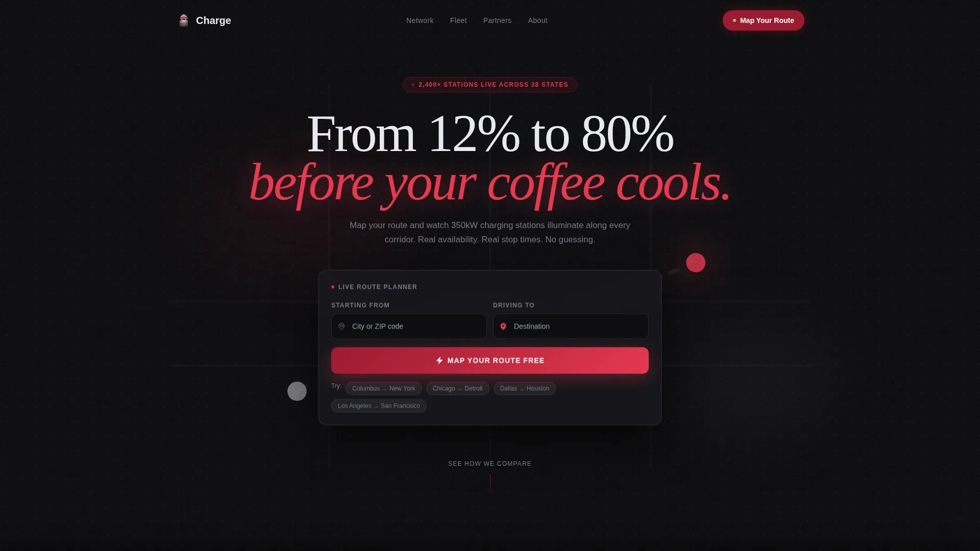
The header is a working tool, not a static hero. Visitors enter a starting point and destination into two floating input fields over a dark satellite-style map. Charging stations illuminate along the calculated route, each card showing availability, charge speed (150 kilowatts or 350 kilowatts), and estimated stop time.
Scroll-Driven Comparison Journey
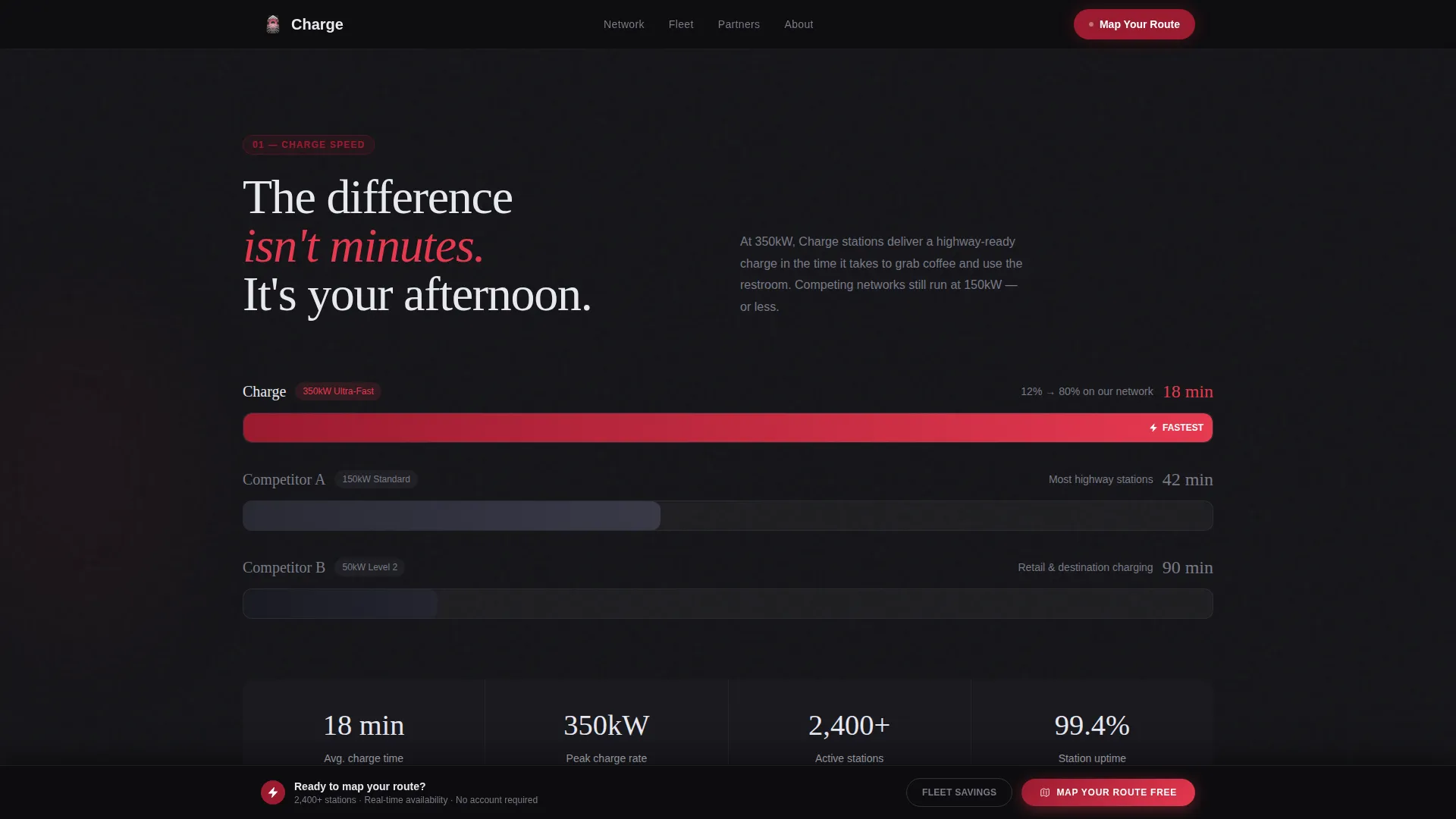
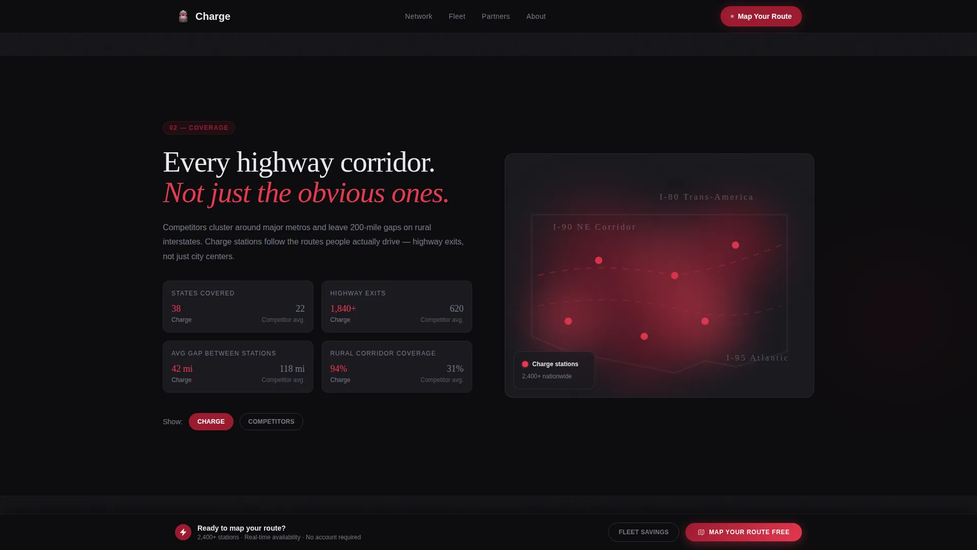
Four full-page comparison sections unfold as the visitor scrolls. Each one isolates a single competitive argument: charge speed shown as animated side-by-side progress bars, coverage shown as overlapping heat maps, pricing broken into cost-per-mile with a live calculator, and uptime shown as a 365-day grid.
Live Cost-Per-Mile Calculator
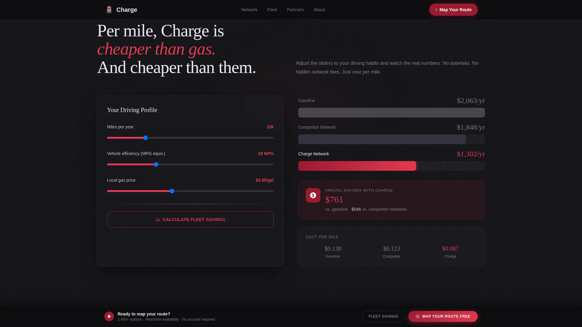
The cost section includes an interactive calculator that lets visitors compare charging costs against gasoline and competitor charging rates. The output is expressed in cost per mile, making the financial case concrete and personal.
Fleet Savings Multi-Step Form
Fleet managers have a dedicated conversion path. A multi-step form collects fleet size, daily mileage, and current fueling cost, then returns a savings estimate. This keeps the fleet buyer engaged with a tool built for their specific decision.
Sticky Conversion Bar
After the first scroll section, a sticky bottom bar appears and stays visible throughout the page. It anchors the primary call to action, "Map Your Route Free," keeping the configurator's promise present at every scroll depth.
365-Day Reliability Grid
The reliability section visualizes a full year of uptime data as a grid. Competitor outage days are highlighted in red. The network's own record displays in clean chrome. The format communicates infrastructure trust without a single claim needing to be read.
Page sections overview
| Section | Purpose |
|---|---|
| Route Configurator Header | Tool-first entry point showing live station data along a mapped route |
| Speed Comparison | Animated progress bars racing 150kW and 350kW speeds against a competitor |
| Coverage Heat Map | Overlapping state-level heat maps showing network reach versus competition |
| Cost Calculator | Live cost-per-mile comparison across gas, competitor charging, and Charge |
| Reliability Uptime Grid | Full-year grid visualizing outage history for Charge and competitors |
| Footer | Minimal single-row footer with essential links |
Design & branding system
The visual identity is built on a Dark Immersive theme that feels like a luxury EV cockpit at midnight. Every color and type choice reinforces that atmosphere without sacrificing readability or usability.
- Color palette: deep asphalt black (#0D0D0F) for backgrounds, polished chrome silver (#C0C0C8) for typography and dividers, charge-status ruby (#9B1B30) for interactive pulses, and electric rose (#E63950) for buttons, progress bars, and active highlights
- Typography: Fraunces serif for display headings to carry cinematic weight, DM Sans for body and interface text to keep functional elements clean and fast to read
- Animation and interaction: route line draw on load, station pulse on hover, progress bar race on scroll entry, and scroll-triggered section reveals throughout
Mobile & speed optimization
The template is designed desktop-first to give the route configurator and comparison visuals full screen real estate. Responsive behavior is built in so the experience holds together on smaller screens.
- GPU-accelerated transforms power the animated elements to keep motion smooth across the comparison sections
- IntersectionObserver handles scroll-triggered reveals, loading animations only when the relevant section enters the viewport
- The layout adapts from desktop to mobile without losing the core configurator or comparison functionality
How this template helps you convert
The conversion strategy is built on a principle of earning trust before making any ask. The page gives value first and gates nothing until the visitor is already convinced.
- The route configurator delivers a personalized, useful output in the first seconds of the visit, turning a skeptical driver into an engaged user before a single marketing claim is made.
- The four comparison sections build a cumulative case from convenience to economics to infrastructure reliability, so by the closing section the decision to switch feels like a logical conclusion rather than a persuasion effort.
- Two distinct calls to action serve two distinct buyer types simultaneously: the sticky bar keeps consumer drivers on a fast path to route planning while the fleet savings form keeps commercial buyers moving through a deeper qualification flow.
Other information about this template
This template is categorized under Automotive and Transport, specifically within the Electric Vehicle and EV charging network niche. It is structured as a storybook full-page landing page with a Comparison Journey creative direction, meaning the page is intentionally sequential and cumulative in how it presents evidence.
- The header concept is classified as a Configurator, meaning the primary interaction is a tool rather than a passive image or video
- The landing page direction is Comparison and Versus, designed to position the network against competing options using visual evidence rather than text-heavy arguments
- Social proof is woven into the page through uptime statistics, station counts, fleet client references, and state coverage numbers
- The template targets the United States market, with English language copy, USD pricing in the cost calculator, and highway corridor context baked into the map and station layout
- The footer follows a minimal single-row pattern suitable for keeping focus on the primary conversion actions above it
Theme
Dark Immersive
Creative direction
Comparison Journey
Color system
Ruby & Chrome
Style
Storybook/Full-Page
Direction
Comparison/Versus
Page Sections
Interactive Route Configurator
Scroll-driven Comparison Journey
Live Cost-per-mile Calculator
Fleet Savings Multi-step Form
Sticky Primary Call-to-action Bar
Day Reliability Uptime Grid
Related questions
Who is this landing page template designed for?
Does this template include the fleet savings form?
What makes the comparison sections effective?
Is this template suitable for a single charging location?
Can the color system and typography be customized?