Family Medicine Medicine Professional Website Template
Charting is a family medicine EMR and practice management landing page template built for independent physicians and small group practices. The single-column flow uses an expert panel creative direction, pairing real physician pull quotes with animated interface walkthroughs. It drives demo requests through a low-friction lead generation form and a sticky call-to-action bar.
by Rocket studio
Quick summary
Charting is a focused, single-column landing page template for a family medicine EMR and practice management platform. It introduces a peer-to-peer credibility structure, where practicing physicians narrate real workflow pain points. The page drives demo requests through a carefully placed form and a sticky call-to-action bar that appears as visitors scroll deeper.
Who this template is for
This template is built for healthcare software companies targeting independent family medicine practices. It speaks directly to the decision-makers inside those practices who feel the daily weight of documentation and fragmented systems.
- Independent family physicians running solo or small group practices
- Office managers inheriting legacy systems that do not communicate with each other
- Practice management software teams seeking a lead generation landing page for physician audiences
What problem this template solves
Selling EMR software to busy family physicians is hard. Physicians are skeptical of vendor claims and have almost no spare time to evaluate new tools. A generic product page fails because it speaks in features rather than lived experience.
- Physician visitors do not trust polished marketing copy from people who have never seen a 15-minute visit schedule
- Legacy system fragmentation makes the switching decision feel overwhelming before a demo is even booked
- Most lead generation forms ask for too much too early, killing the conversion before it starts
What you get with this template
The template delivers a complete, ready-to-customize single-column landing page structured around the expert panel creative direction. Every section is intentional and sequenced to build trust before asking for anything.
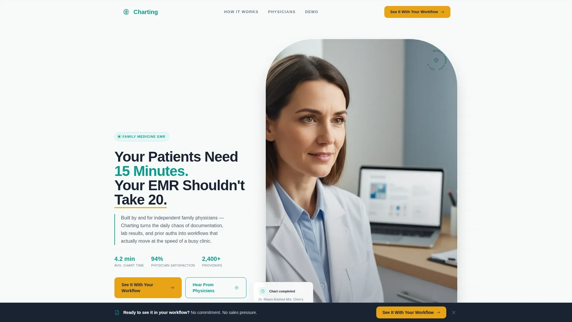
- A half-page hero section with a split headline and exam-room photography composition
- Five sequential expert panels covering charting speed, lab integration, patient portal adoption, prior authorization, and legacy system consolidation
- A lead generation form placed after the second panel and a sticky call-to-action bar that activates after the fourth panel
Feature list
This section covers the built-in functional and design components that define what the template delivers.
Half-Page Hero with Split Composition
The hero opens with a left-aligned headline and a right-side exam-room photograph. The layout is designed to feel like a real clinic Tuesday morning, not a stock photo set. The headline reads as a direct, resonant challenge to the physician reading it.
Sequential Expert Panel Sections
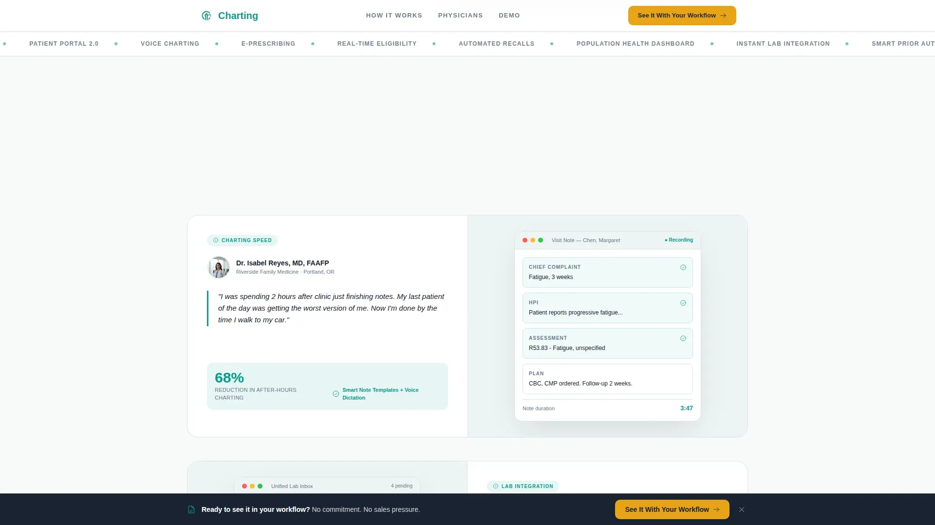
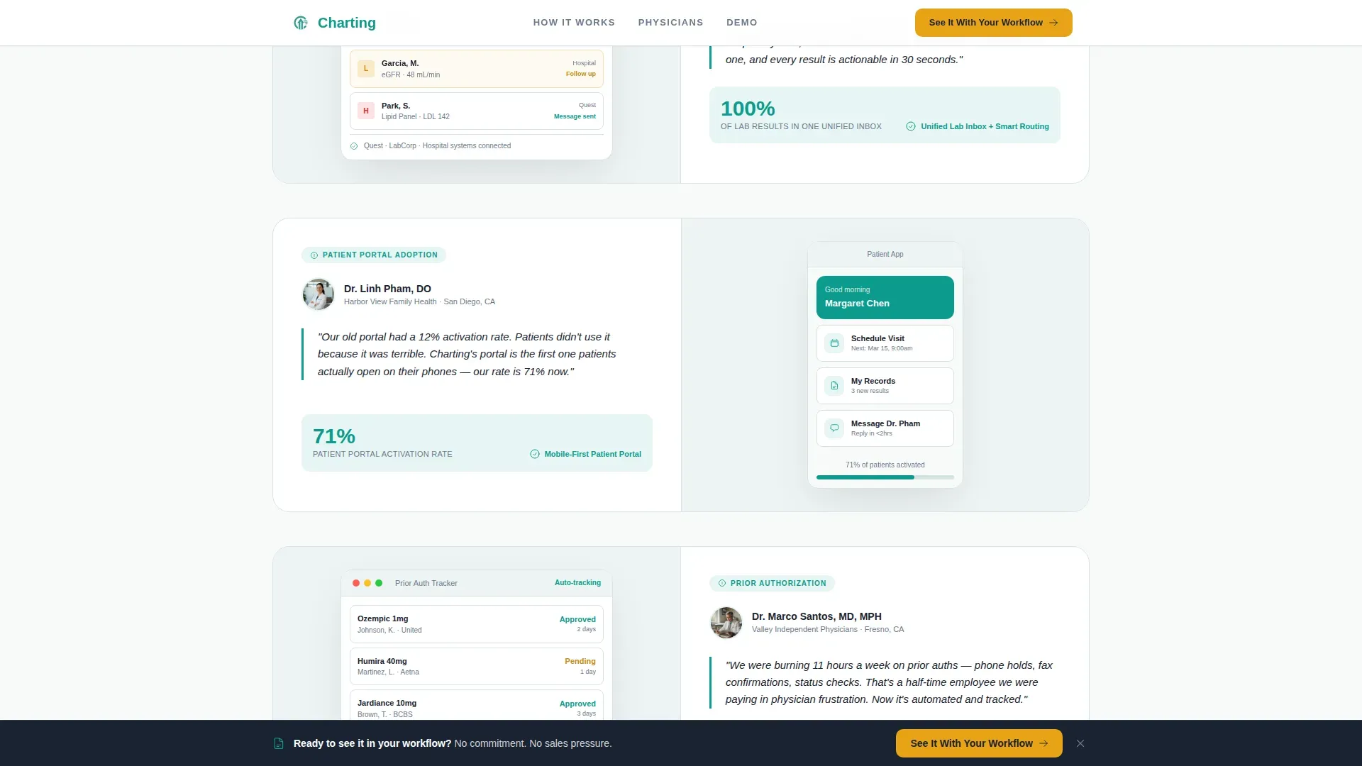
Five expert panels scroll in one by one, each featuring a named physician, a specific workflow pain point, and an animated interface walkthrough showing the relevant platform feature. The alternating rhythm of voice and evidence builds credibility through accumulated specificity.
Animated Interface Walkthroughs
Each expert panel includes a scroll-triggered animated mockup of the platform feature being discussed. These are not static screenshots. They show the workflow in motion, making the product feel tangible before a demo is booked.
Low-Friction Lead Generation Form
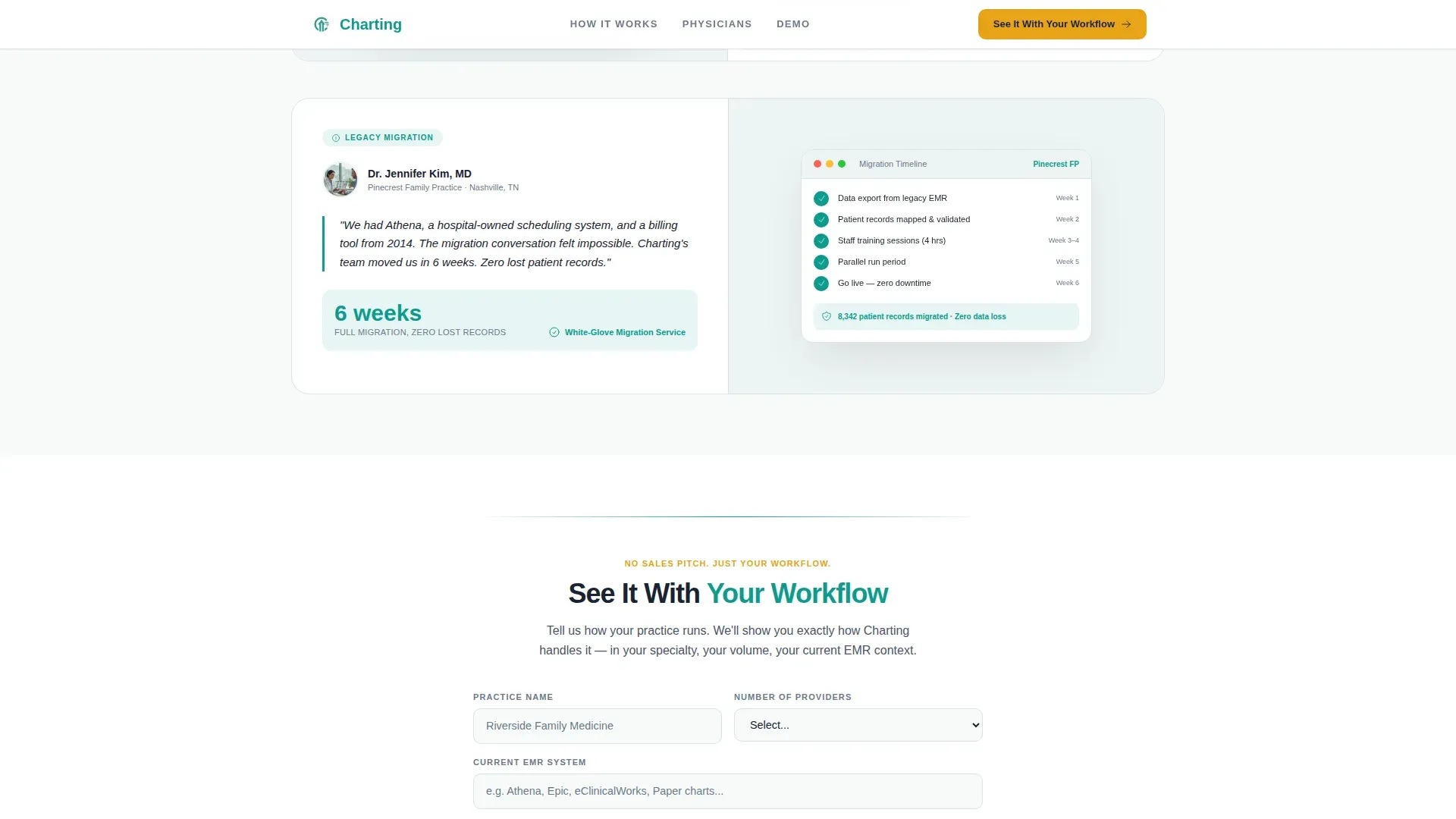
The demo request form collects four fields: practice name, number of providers, current EMR system, and preferred demo format. The dropdown for provider count and the demo format choice keep the form fast to complete. No pricing or commitment language appears anywhere near the form.
Sticky Call-to-Action Bar
After the fourth expert panel, a sticky bottom bar activates and follows the visitor through the rest of the page. It repeats the primary call to action without interrupting the reading experience, keeping the conversion opportunity present without feeling aggressive.
Teal Catalyst Color System
The visual identity uses clinical teal for primary actions and trust anchors, deep charcoal for all body text and navigation, soft exam-room white across backgrounds, and warm amber reserved exclusively for calls to action and urgent indicators. Amber appears sparingly so that every button reads as the one thing on the page that needs attention next.
Page sections overview
| Section | Purpose |
|---|---|
| Hero split layout | Establish credibility with headline and exam-room photo |
| Dr. Reyes panel | Charting speed pain point with interface walkthrough |
| Lead generation form | Capture demo intent after second expert panel |
| Dr. Okafor panel | Lab integration pain point with interface walkthrough |
| Dr. Pham panel | Patient portal adoption with interface walkthrough |
| Dr. Santos panel | Prior authorization workflow with interface walkthrough |
| Dr. Kim panel | Legacy system consolidation with interface walkthrough |
| Sticky call to action bar | Persistent demo request trigger after fourth panel |
| Footer section | Horizontal flow pattern with navigational links |
Design & branding system
The template follows a Medical Clarity theme. The aesthetic is described as freshly laundered scrubs against stainless steel: hygienic, purposeful, and calm without feeling sterile. Every color choice serves a functional role rather than a decorative one.
- Clinical teal (#0D9B8C) drives section dividers, iconography, and primary trust anchors; deep charcoal (#1A2332) carries all body text and navigation; soft exam-room white (#F7FAFA) fills backgrounds
- Warm amber (#E8A317) is used exclusively for calls to action and urgent indicators, appearing sparingly so each button commands attention naturally
- DM Sans is used for headlines and Manrope for body text, pairing clean confidence with readable warmth across the full page
Mobile & speed optimization
The template is designed desktop-first, reflecting the reality that independent physicians typically evaluate new software at their desk between patients or after hours. Mobile support is included and practical for office managers reviewing on a phone or tablet.
- Scroll-triggered reveals and staggered panel entries use a medium animation intensity, keeping the page lively without slowing the experience
- Server Components handle all static content blocks, while Client Components manage the demo request form, the sticky call-to-action bar, and the scroll animation triggers
- The single-column flow adapts cleanly to narrower screens without requiring a separate mobile layout
How this template helps you convert
The conversion strategy is built around reducing the psychological distance between "I am interested" and "show me the product." Every structural decision on the page serves that single goal.
- The expert panel sequence earns trust before asking for anything. By the time the lead generation form appears after the second panel, visitors have already heard a peer describe a pain point they recognize in their own practice.
- The form itself asks only what is needed to prepare a relevant demo. Four fields, a dropdown, and a format preference take under a minute to complete, respecting the time constraints of a physician audience.
- The sticky call-to-action bar after the fourth panel keeps the conversion opportunity visible without interrupting the credibility-building scroll, so late-stage readers are never more than one click away from requesting a demo.
Other information about this template
The template is localized for the United States market, using English, USD formatting, and MM/DD/YYYY date conventions throughout. It is built as a single-page flow, meaning all content lives within one scrollable experience rather than across multiple linked pages.
- The footer follows a horizontal flow pattern suited to a minimal footer treatment consistent with the Medical Clarity visual style
- The template is categorized under Health and Medical with a subcategory focus on family medicine EMR software and practice management tools
- Hover states are included for interactive elements, giving the page a polished, responsive feel during desktop review sessions
Theme
Medical Clarity
Creative direction
Expert Panel
Color system
Teal Catalyst
Style
Single Column Flow
Direction
Lead Generation
Page Sections
Half-page Hero Split Layout
Five Sequential Expert Panels
Animated Interface Walkthroughs
Low-friction Demo Request Form
Sticky Call-to-action Bar
Teal Catalyst Color System
Related questions
Who is this landing page template designed for?
What is the expert panel creative direction?
How does the lead generation form work?
Does this template include the sticky call-to-action bar?
Can I customize the physician names and pull quotes?



