Precision Rheumatology EMR Comparison Landing Page Template
This landing page template is built for rheumatology EMR and software platforms that need to convert skeptical clinicians into booked demos. It pairs a split-hero header, an authority-driven expert panel, and a full specialty workflow comparison table with a self-diagnostic quiz flow. The result is a single-page experience that earns trust before it asks for commitment.
by Rocket studio
Quick summary
This template gives rheumatology software teams a complete, conversion-ready landing page. It opens with a composed clinical hero, builds credibility through an expert panel, and anchors the argument in a side-by-side workflow comparison table. A five-question diagnostic quiz closes the loop by delivering a personalized efficiency gap report, turning passive readers into demo-ready leads.
Who this template is for
This template is designed for B2B SaaS teams marketing a specialty medical documentation platform to clinical buyers. It speaks directly to the people who feel the pain of general-purpose electronic health record (EHR) tools every single day.
- Practicing rheumatologists with five to twenty years of experience who spend significant after-hours time finishing patient notes and calculating disease activity scores manually.
- Clinic administrators and billing specialists who need to close revenue gaps caused by miscoded biologics visits and unclear documentation trails.
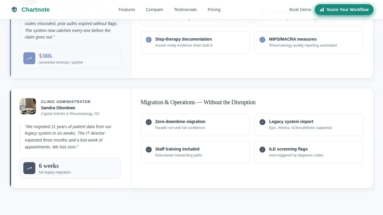
- IT directors at mid-size rheumatology practices who are responsible for migrating off legacy systems without disrupting a single day of patient flow.
What problem this template solves
Rheumatology documentation is not a general problem. It is a specialty-specific one. Clinicians toggle between disease activity indices, joint diagrams, biologic prior-authorization tracking, and medication histories in tools that were never designed for them. That friction compounds daily, and a generic landing page cannot explain it clearly enough to earn a demo.
- Generic EMR marketing pages fail to speak the language of rheumatology, leaving specialty buyers unconvinced that the platform understands their clinical practice.
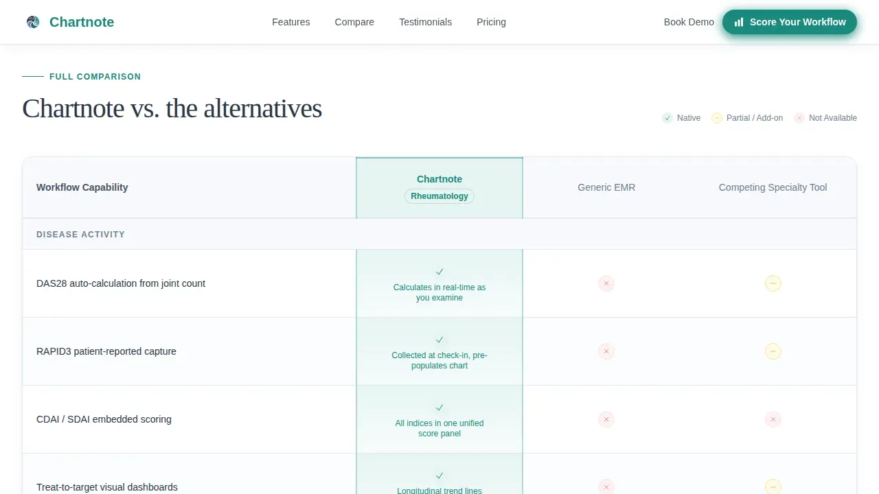
- There is no structured way to show side-by-side differences across rheumatology-specific workflows such as RAPID3 capture, treat-to-target dashboards, and interstitial lung disease screening flags.
- Most landing pages ask for commitment before giving value, which pushes skeptical clinicians away rather than drawing them in.
What you get with this template
You get a fully structured, single-page layout designed to guide specialty medical buyers from first impression to demo booking. Every section has a defined role, and nothing is left to guesswork.
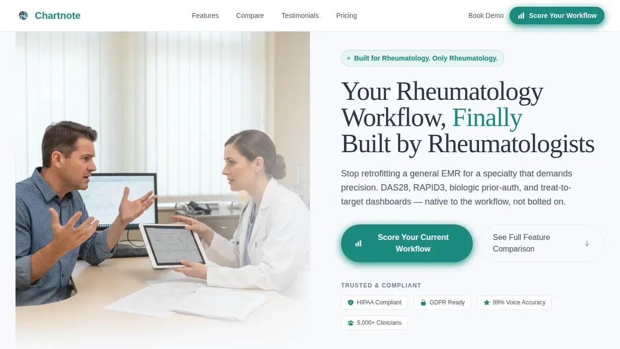
- A half-page photo and text hero with a decisive teal call-to-action button, an expert panel with three authority rows, a full comparison table, editorial-style testimonials, and a quiz launcher section.
- Custom AI note template-ready copy blocks that help buyers understand how tailored documentation tools improve accuracy and reduce paperwork across clinical visits.
- A quiz modal flow that asks five diagnostic questions, delivers a personalized efficiency gap report, and routes each respondent to the right demo track.
Feature list
This template ships with a tightly scoped set of built-in sections and interactive components. Each one is designed around a specific conversion objective for a specialty medical software audience.
Split-Hero Header with Clinical Photography Direction
The hero uses a half-page photo and text layout. The left side holds a directed photograph of a rheumatologist mid-encounter, stylus over a tablet showing a joint diagram. The right side delivers a headline and a single subhead that names the core pain. A pill-shaped call-to-action button in decisive teal sits below it. The format makes the platform's specialty focus clear before the reader scrolls. Every detail of the hero is tailored to signal clinical precision, not generic health-tech marketing.
Expert Panel with Embedded Comparison Rows
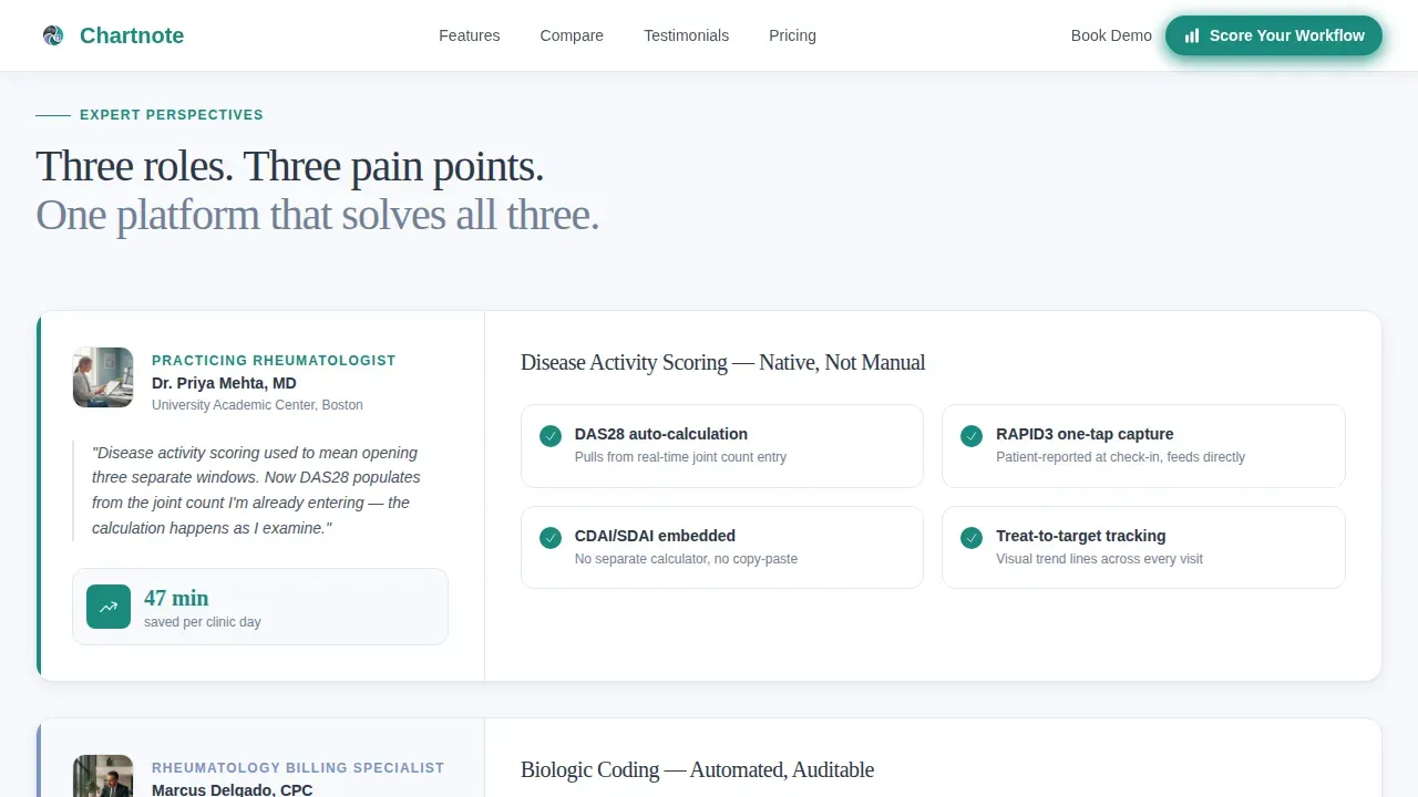
Three authority rows follow the hero. Each row introduces a different expert voice: a practicing rheumatologist explaining how disease activity scoring is embedded natively, a billing specialist walking through how biologics coding reduces paperwork, and a clinic administrator showing time-saved metrics. Each expert's section anchors a corresponding row in the comparison table below. The scroll accumulates evidence systematically. Clinicians engage with one voice at a time, which keeps the experience focused and credible.
Full Specialty Workflow Comparison Table
The comparison table is the backbone of this template. It contrasts the platform against generic EMRs and competing specialty tools across specific rheumatology workflows. Rows cover RAPID3 capture, biologic prior-authorization tracking, treat-to-target dashboards, and interstitial lung disease screening flags. Table row hover states and scroll-reveal animations are built into the interaction plan. The table gives buyers the side-by-side review they need to justify a switch to their teams.
Self-Diagnostic Quiz Flow
The quiz is the primary conversion mechanism. It launches from a dedicated section and opens in a modal. Five questions ask about current EHR platform, average after-hours charting time, whether disease activity indices are calculated manually, biologic patient volume, and biggest documentation frustration. Results deliver a personalized efficiency gap report and assign each respondent a recommended demo track. The quiz earns the click by promising self-knowledge before asking for any commitment.
Editorial Testimonials Section
The testimonials section presents quotes from rheumatologists alongside practice metrics. The editorial style gives each quote space and weight. Named clinicians, practice-level numbers, and real efficiency figures provide the social proof that clinical buyers need before they follow through with a demo request.
Linear Single-Row Footer
The footer follows a clean, single-row linear pattern. It keeps the page's Corporate Precision design intact without adding visual clutter at the close of the scroll.
Page sections overview
| Section | Purpose |
|---|---|
| Hero Split Header | Introduce platform with clinical photo, headline, subhead, and teal call to action |
| Expert Panel Rows | Build authority through three specialist voices tied to comparison table rows |
| Comparison Table | Show side-by-side workflow differences across rheumatology-specific tasks |
| Testimonials Block | Deliver social proof with named rheumatologists and practice metrics |
| Quiz call to action Section | Launch five-question diagnostic to generate personalized efficiency gap report |
| Linear Footer | Close page with minimal single-row branding and navigation links |
Design & branding system
The visual identity follows a Corporate Precision theme built on the Cloud Canvas color system. The palette signals clinical authority without feeling cold or impersonal. Every color choice has a defined role, and no decorative warmth is added for its own sake.
- Colors: clinical white (#F7F9FC) for backgrounds, calm slate (#4A5568) for body text and secondary elements, soft periwinkle (#7C93C3) for accents and table highlights, and decisive teal (#1A8A7D) reserved exclusively for calls to action and active interface states.
- Typography: Fraunces serif for headlines to communicate authority and specialty depth, paired with DM Sans for body text, user interface labels, and notes across the comparison table, ensuring strong legibility at every level.
- Animation style: medium-intensity scroll reveals and stagger effects for section entrances, comparison table row highlights on hover, and expert panel scroll interactions, all implemented as client-side components.
Mobile & speed optimization
The template is designed desktop-first, which matches how rheumatologists primarily use their tools during clinic hours. That said, over sixty percent of medical searches occur on mobile devices, so the layout is built to reflow cleanly on smaller screens without losing critical content hierarchy.
- Static sections such as the hero, expert panel, and testimonials are structured as server components for fast initial load, keeping the above-the-fold experience immediate and stable.
- Interactive components including the quiz modal, comparison table row hover states, and expert panel scroll behavior are isolated as client components, so interactivity loads without blocking the static content.
- The single-page architecture keeps navigation simple and removes unnecessary page transitions that would slow the experience on any device or browser.
How this template helps you convert
The page is built around a specific insight: rheumatologists diagnose for a living. The conversion strategy lets them apply that same diagnostic instinct to their own practice before asking them to book a demo.
- The expert panel accumulates evidence layer by layer, contrasting workflow details across specific clinical tasks until the case for switching feels self-evident. Each row reinforces the last, and the comparison table gives buyers the objective proof they need to follow through.
- The quiz flow transforms passive reading into active participation. By answering five focused questions about their current documentation process, buyers receive a personalized report that makes the efficiency gap concrete and assigns them a demo track that matches their specific situation.
- The secondary call to action, a subtle "See Full Feature Comparison" link anchored to the table, provides a lower-commitment path for buyers who are not ready to engage with the quiz, ensuring no reader leaves without a clear next step.
Other information about this template
This template is built specifically to market a platform like Chartnote, which functions as an AI-powered documentation layer designed to work alongside existing electronic medical record systems. Understanding how the platform operates helps clarify what this template is designed to communicate and to whom.
- Chartnote provides both an AI Scribe and a Voice Chart tool, giving clinicians two distinct paths for streamlining medical documentation during or after a patient visit.
- The AI Scribe capability is central to the platform's value: users report saving over an hour a day on documentation tasks, and 93% report a reduction in burnout symptoms after implementation.
- Voice Chart allows clinicians to dictate notes in their own words, and the platform generates structured clinical notes that typically require only minor edits, effectively making traditional transcription services obsolete.
- Custom AI Note Templates sit at the core of the documentation system. Clinicians can define the style of writing, add sections and subsections, set custom instructions for format and content, and incorporate preferences for how notes are structured across visit types.
- These custom templates follow a standard clinical structure, covering Subjective, Objective, Assessment, and Plan sections, while also allowing clinicians to add specialty-specific details such as disease activity scores and joint assessment notes.
- Smart templates in the platform can be integrated with both AI Scribe and Voice Chart, allowing the same carefully defined format to follow every note regardless of how the encounter is captured.
- Chartnote includes interactive, color-coded diagrams for joint assessments and built-in calculators for Clinical Disease Activity Index (CDAI) and Disease Activity Score 28 (DAS28), which are specialty tools that generic EMRs do not provide natively.
- Clinicians report generating notes in under 90 seconds using the platform, and 66% report greater overall job satisfaction after implementation.
- All AI Scribe users report increased patient interaction, a measurable outcome of reducing the time clinicians spend on paperwork during and after the clinical visit.
- The platform includes over 1,000 multi-specialty templates tailored for rheumatology, giving practices a strong library to select from and build upon.
- A Chrome extension is available to enhance the experience across web-based EHRs, allowing the documentation layer to function directly inside a clinician's existing browser environment without switching applications.
- Chartnote is designed to work alongside legacy systems, so practices do not need to replace their existing EHR infrastructure to begin using the AI documentation tools.
- The platform follows HIPAA, PIPEDA, GDPR, and SOC 2 requirements, and uses 256-bit AES encryption to protect Private Health Information (PHI). This security posture is relevant context for IT directors evaluating the platform.
- Pricing plans are tailored for different healthcare professionals, with options covering essential features for individual clinicians and advanced AI tools for larger practice teams.
- The Chartnote precision rheumatology EMR comparison landing page template is the structured starting point for communicating all of this to a clinical audience in a format that earns trust systematically.
Theme
Corporate Precision
Creative direction
Expert Panel
Color system
Cloud Canvas
Style
Comparison Table
Direction
Quiz/Assessment
Page Sections
Split-hero Header with Clinical Direction
Expert Panel with Comparison Table Integration
Full Rheumatology Workflow Comparison Table
Five-question Self-diagnostic Quiz Modal
Editorial Testimonials with Practice Metrics
Corporate Precision Design System
Related questions
Who is this landing page template built for?
What sections are included in this template?
How does the self-diagnostic quiz flow work?
Can this template be used for a platform that works alongside existing EMR systems?
What makes this different from a general healthcare landing page template?


