Pediatric Dentist Landing Page Template
Checkup is a split-screen pediatric dentist landing page built for practices that want to turn anxious first-time parents into booked appointments. An interactive parent readiness checklist, a teal progress bar, a warm testimonial card hero, and a persistent "Book Their First Visit" call to action work together to guide every visitor from uncertainty to scheduling their child's dental visit with confidence.
by Rocket studio
Quick summary
Checkup is a single-page dentist landing page designed specifically for pediatric dental practices. It uses a 50/50 split-screen layout and a Checklist and Audit creative direction to walk parents through what they already know, surface what they don't, and make booking an appointment feel like the obvious next step. The Cloud Canvas color palette and Medical Clarity theme keep the page soft, trustworthy, and easy to act on.
Who this template is for
This landing page was built for pediatric dentists who need a warm, parent-friendly online presence that converts visitors into booked appointments. The dental clinic audience is specific, and the template speaks directly to them.
- First-time parents of children aged zero to eight who are searching for guidance on early dental care
- Grandparents booking an overdue dental visit on behalf of grandchildren
- Pediatric dental practices looking to attract new patients without overwhelming families with clinical language
What problem this template solves
Most dentist landing pages talk at parents. This one listens first. A pediatric dental education landing page must bridge the gap between authoritative information and a warm atmosphere for parents, and that is exactly what this template does.
- Parents arrive with anxiety and unanswered questions; the page answers them before they're asked
- Generic dental clinic websites rarely address the emotional needs of first-time parents or grandparents booking on behalf of children
- Practices lose potential patients when a landing page fails to combine trust signals with a clear, friction-free path to scheduling
What you get with this template
You receive a fully structured, visually complete dentist landing page ready to be customized for your clinic. Every section is purpose-built and in sequence, so no layout decisions are left to chance.
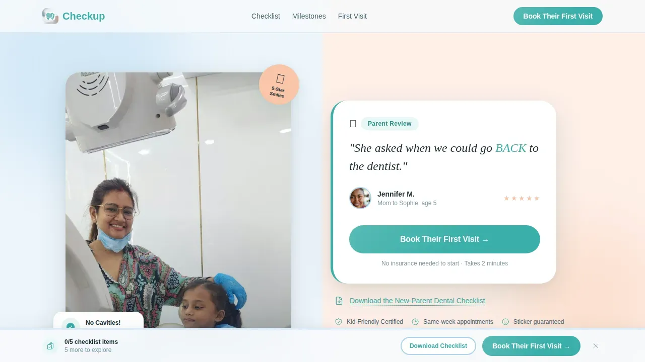
- A split-screen hero section with a testimonial card, a child photo panel, and a primary "Book Their First Visit" call to action above the fold
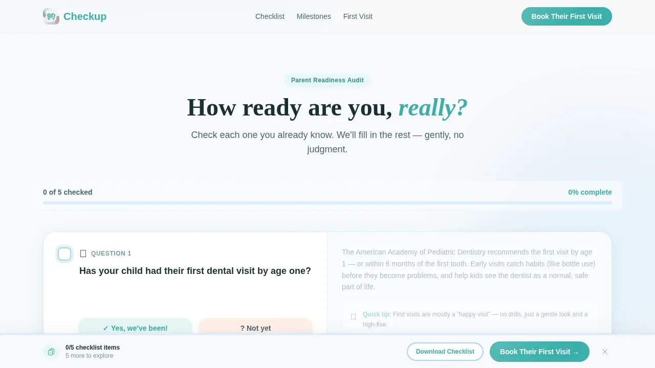
- An interactive parent readiness checklist with teal checkboxes, a progress bar, and a persistent sticky bottom bar that appears after the third checklist item
- Age milestone split panels, a three-step visit walkthrough, and a single-row linear footer
Feature list
This landing page includes purpose-driven features drawn directly from the template brief. Each one contributes to the page's ability to convert visitors into booked patients.
Split-Screen Testimonial Hero
The hero image section uses a 50/50 split frame. One side shows a smiling child mid-laugh in a dental chair. The other displays a handwritten-style parent quote, a small avatar circle, a first name, and the child's age. This layout delivers social proof and an emotional connection from the very first click. The hero image anchors trust before a single scroll happens.
Interactive Parent Readiness Checklist
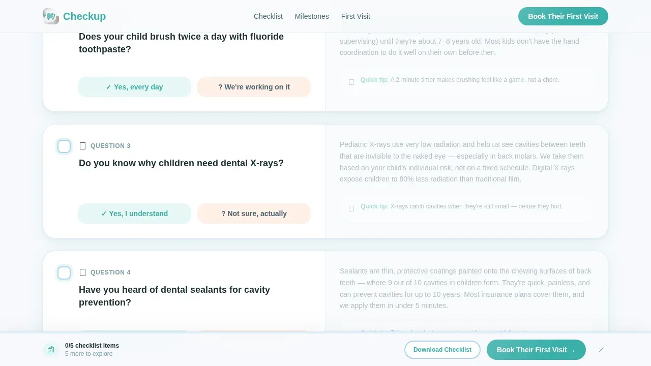
The scroll becomes a guided audit. Each section poses a yes-or-no question on the left panel, with a clear illustrated answer on the right. Checkboxes are interactive and teal-colored. Unchecked items pulse gently to surface knowledge gaps without shame. This feature gives the landing page its clear value proposition: parents leave knowing exactly what their child needs.
Teal Progress Bar and Persistent call to action Bar
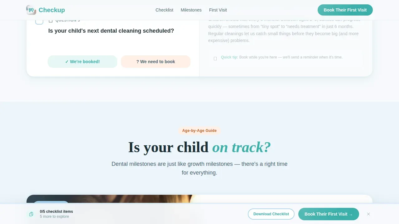
A teal progress bar fills across the top of the page as visitors complete checklist items. After the third item, a sticky bottom bar appears with a prominent "Book Their First Visit" button. This strategic placement of calls to action guides users toward scheduling appointments without interrupting the reading flow. The bar provides a clear call to act at exactly the right moment.
Age Milestone Panels
Split panels ask "Is your child on track?" and respond with milestone guidance for each age group. These panels are visually appealing and keep the content concise and parent-friendly, using plain language to explain dental care at every stage. Visual aids help explain what parents should expect, reducing anxiety before the appointment.
Three-Step Visit Walkthrough
A transparent three-step visual explains what happens during a first dental visit. This process section removes the fear of the unknown for both children and parents. It reinforces the dental practice's commitment to gentle, clear communication. Patient photos and engaging visuals make this section warm rather than clinical.
Secondary Lead Capture Link
A secondary "Download the New-Parent Dental Checklist" link captures email addresses from parents who are not ready to book immediately. This provides the dental clinic with more leads without relying on online forms embedded on the landing page itself. The link sits alongside the primary call to action, offering a lower-commitment entry point for potential patients still in the research phase.
Page sections overview
| Section | Purpose |
|---|---|
| Hero Testimonial Card | Captures attention with a split photo and parent quote above the fold |
| Parent Readiness Checklist | Interactive audit that surfaces dental knowledge gaps section by section |
| Age Milestone Panels | Split-panel guidance answering "Is your child on track?" by age |
| Visit Walkthrough | Three-step visual explaining what happens at a first dental appointment |
| Persistent call to action Bar | Sticky bottom bar with booking button, appears after third checklist item |
| Linear Single-Row Footer | Clean footer with contact buttons and essential practice details |
Design & branding system
The visual identity follows a Medical Clarity theme using the Cloud Canvas color system. Child-friendly themes utilize vibrant colors and cheerful fonts to create a safe, fun environment, and this palette delivers exactly that combination of warmth and clinical credibility.
- Colors: soft cloud white (#F7F9FC) for page backgrounds, calming sky blue (#A8D4F0) as a secondary wash, warm peach (#F9C5A8) for accent moments, and confident teal (#3AAFA9) for all interactive elements, calls to action, progress indicators, and checkmarks
- Typography: DM Sans for body copy and short paragraphs, Fraunces for display and serif headings to add personality without losing clarity
- Visual style: watercolor-soft illustration aesthetic with rounded corners, soft card shadows, and alternating cloud white and sky blue section backgrounds; the professional design feels like a children's health book, clinical enough to trust and soft enough to exhale into
Mobile & speed optimization
Parents searching for a pediatric dentist are almost always on their phones. This landing page is built mobile-first to meet them exactly where they are. A responsive design means the split-screen layout, interactive checklist, and sticky call to action bar all adapt cleanly to small screens. The page is built to be mobile friendly from the first scroll.
- The layout reflows from 50/50 split panels to single-column stacks on mobile devices, keeping all content readable and easy to tap
- Interactive checklist components use client-side rendering while static sections use server-side rendering, keeping the experience fast; the page is structured so it loads quickly and does not block engagement
- Mobile responsiveness extends to the persistent bottom bar, which remains accessible and tappable without obscuring key content on any screen size
How this template helps you convert
This is a high converting landing page because every design decision points toward one outcome: a booked appointment. The average conversion rate for health-related landing pages, including dental services, is 7.4%, and this template is purpose-built to reach and exceed that benchmark for pediatric dentists.
- The compelling headline and hero testimonial card deliver immediate social proof and a clear call to action above the fold, so potential patients feel confident from the very first click and are guided to book their child's appointment today
- The interactive checklist turns passive reading into active engagement; each completed item moves the teal progress bar forward and guides users closer to the booking button, converting visitors who arrived to learn into patients ready to easily schedule their visit
- The persistent sticky call to action bar appears with minimal distractions after the third checklist item, presenting a clear, high converting landing experience that captures attention at peak motivation and converts more patients without adding friction
Other information about this template
This template is part of a broader ecosystem of dentist landing page designs built for health and medical practices. It sits specifically within the Pediatric Dentist Website subcategory and is designed for the Pediatric Dentist Patient Education Hub niche.
- The Checkup trusted pediatric dental education landing page template is optimized for click-through traffic, meaning no form sits on the landing page itself; the primary call to action sends visitors to a separate scheduling tool, and the secondary link captures email for parents still researching
- Pediatric dentists can replace stock photos with authentic patient photos of staff, office interiors, and happy child patients to strengthen trust signals; authentic imagery significantly outperforms stock photos in building credibility with new parents
- Practices offering general dentistry alongside pediatric dentistry, or those expanding into cosmetic dentistry, can adapt the milestone and checklist sections to reflect their full range of dental services
- The template structure supports payment options and payment plans information within the footer or checklist sections, addressing parental concerns about affordability before they reach the booking step
- Cosmetic dentistry landing adaptations are possible by replacing milestone panels with treatment comparison panels; the layout is flexible enough to support a cosmetic dentistry landing variant without rebuilding from scratch
- Practices focused on implant dentistry can use the three-step visit walkthrough structure to explain implant procedures in plain language, making the template reusable across service lines
- The template's user friendly layout and clean layout make it easy to update as the dental practice grows, adds new services, or shifts its target audience; no advanced technical skills are required to swap colors, text, or images using drag-and-drop no-code platforms like Unicorn and Landingi
- Search engine rankings benefit from the template's structured headings, concise content hierarchy, and mobile-first build; no-code platforms often include features that help optimize landing pages for search engines and mobile devices together
- Patient reviews and customer testimonials are built into the hero section by design; practices should add real stories from satisfied patients and satisfied clients to maximize the trust impact of the testimonial card
- The frequently asked question section included in this landing page is designed to address common parental concerns about dental emergencies, insurance, and treatments, building trust before the booking click ever happens
Theme
Medical Clarity
Creative direction
Checklist & Audit
Color system
Cloud Canvas
Style
Split Screen (50/50)
Direction
Click-Through
Page Sections
Split-screen Testimonial Hero Card
Interactive Parent Readiness Checklist
Teal Progress Bar with Sticky Call to Action
Age Milestone Split Panels
Three-step Visit Walkthrough
Secondary Email Capture Link
Related questions
Does this landing page include a booking form?
Can I use my own photos instead of placeholder images?
Is the checklist actually interactive for visitors?
Who is this landing page best suited for?
Can this template be adapted for a dental practice offering other services?



